
On the surface, Annual Recurring Revenue (ARR) is a simple calculation: contract value divided by years. But as you spend more time mulling over things like net vs. gross ARR, per product vs. entire company ARR, determining whether you bake in current and predicted churn (and which way, exactly, you calculate that), the bottom line becomes tougher to calculate.
The more precise your ARR is, the more complex it is. And if you’re tracking this KPI in Excel, complexity means there are many opportunities to make a very expensive mistake.
Let’s dissect the points of failure for any given ARR spreadsheet:
- Maintaining the contract data is cumbersome--somewhere in your copy-and-pasting from the database, you may create manual errors. Ideally, you’d get the data right from the source where it is maintained.
- Calculating upstream KPIs, such as churn, upsells and downsells, is similarly prone to manual error, especially if these values change frequently.
- Connecting spreadsheets is difficult, often involving complex macros to pull down information. It then becomes very easy to work off of stale data.
- Getting the data out of Excel and presenting it to the people who need to see it requires manual work, and, often, more copy and pasting.
To avoid error and time waste, many teams have replaced manual work and spreadsheets with repeatable, secure KNIME workflows, using KNIME Analytics Platform, a free software that enables you to automate and simplify data access, data blending, and reporting. The visual programming environment makes both simple and complex financial analysis accessible to anyone, with or without programming experience.
Build a Reusable ARR Calculator with KNIME
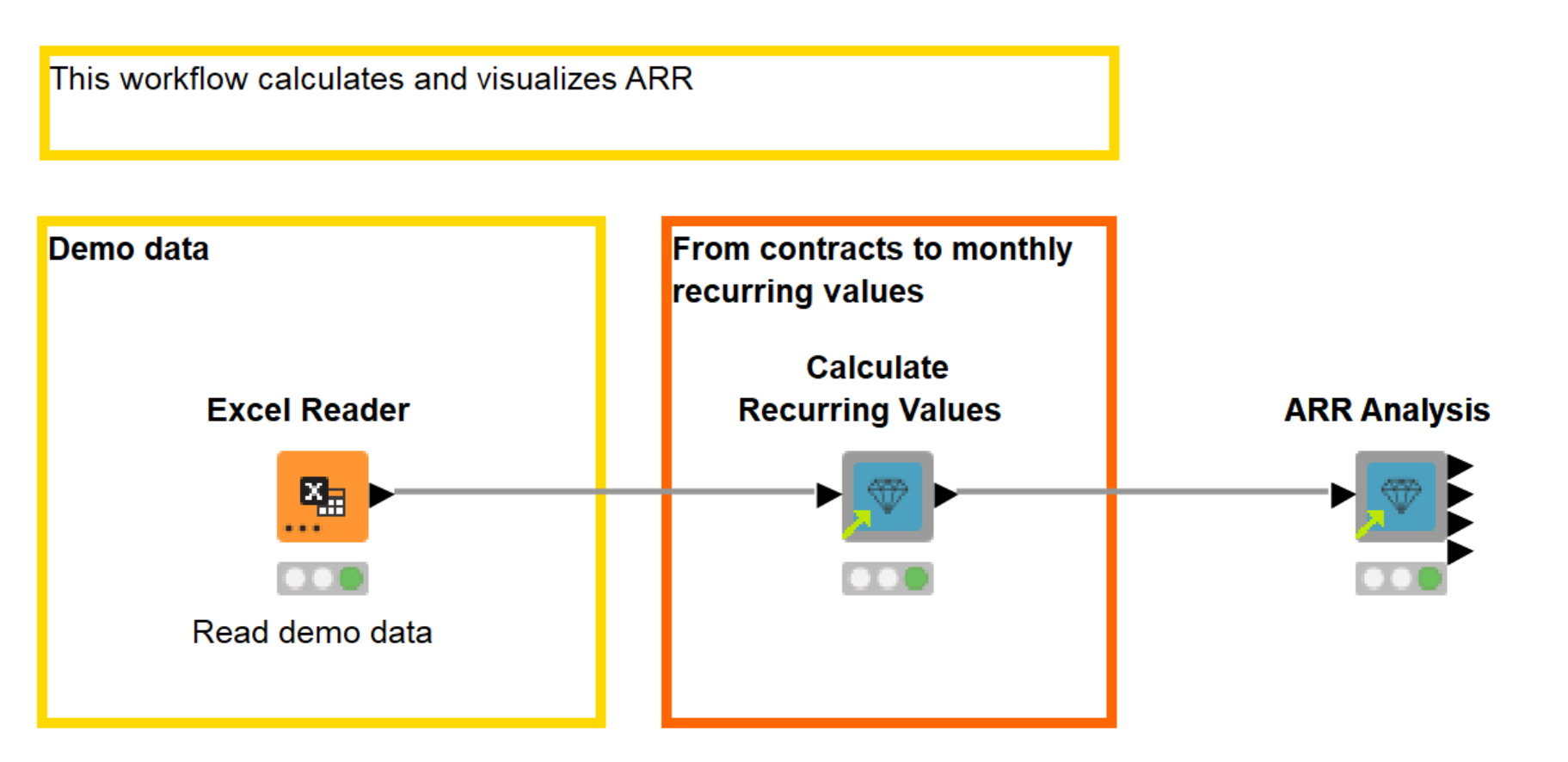
In this blog post, we’ll run through an example that demonstrates how KNIME can be used to monitor ARR on a regular basis. You’ll see a simple two-step workflow (which is available for download on the KNIME Hub) that, once built, can be reused consistently on new data, and also customized if needed.
We’ll be diving into the inner workings of these two steps, so that you can tweak and adjust the steps for your own workflow.
Download the workflow Annually Recurring Revenue Calculation and Analysis from the KNME Hub.
Our Example Dataset
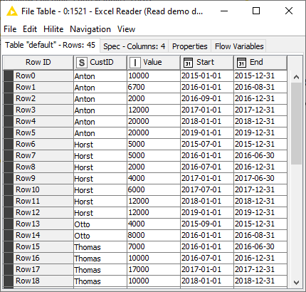
Our dataset includes new subscriptions, upsells, downgrades, and churn events. There are 45 contracts and 12 customers. Contract periods range from January 2015 to December 2019. Each row in the data shows the start and end date of the contract period, the contract value, and an ID that identifies the customer. You can see a sample of the data in (figure 2).
Step 1: Calculate recurring values
Once you’ve connected KNIME to the database where your data lives (in our example, it’s an Excel spreadsheet) you need to put it into the right shape. For us, that’s: the customer ID, contract value, start date, and end date of a given contract.
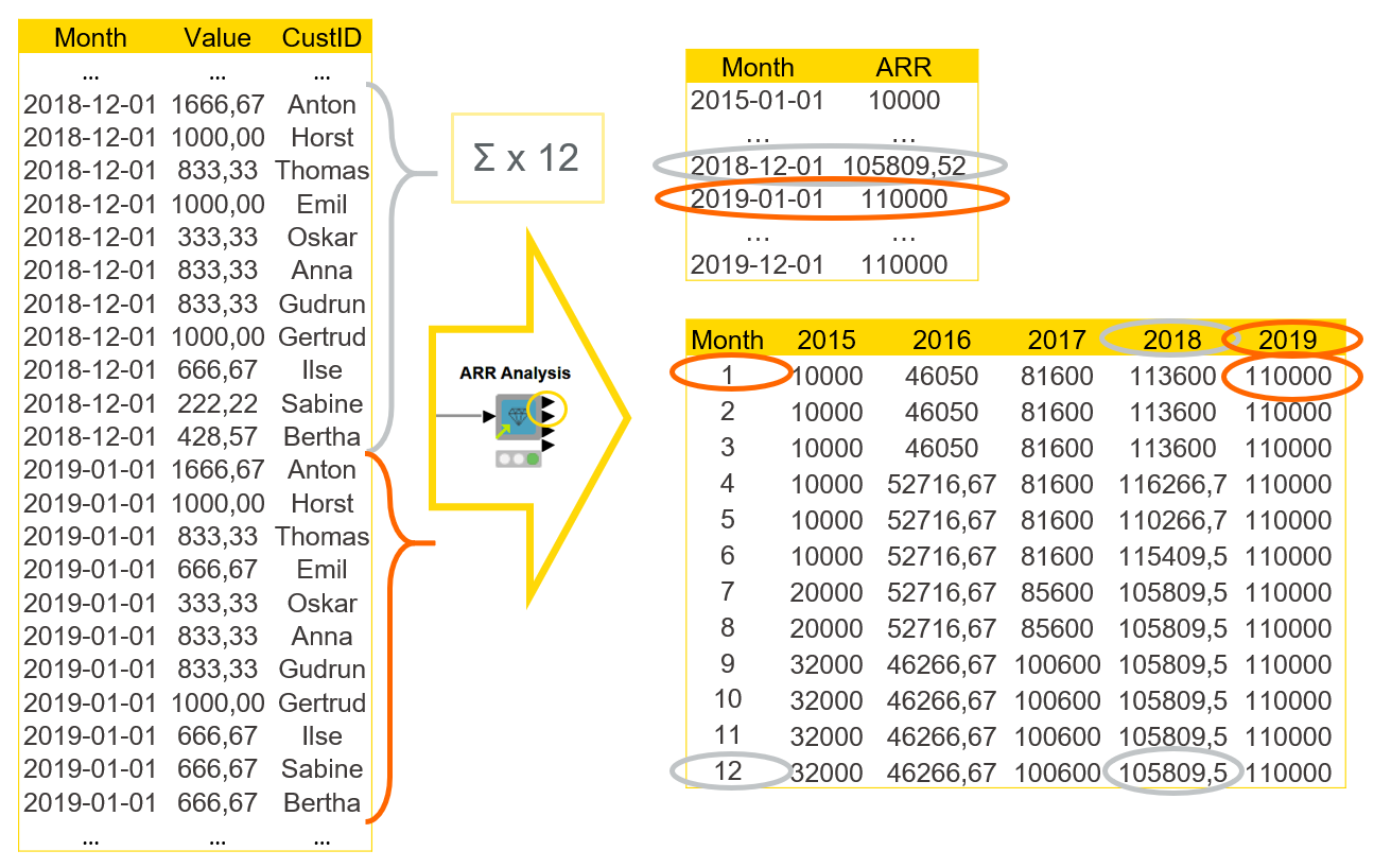
When we calculate recurring values, we format the original contract data into time series data where each row contains a single month, a recurring value, and a customer ID. We can do this calculation with the Calculate Recurring Values component.
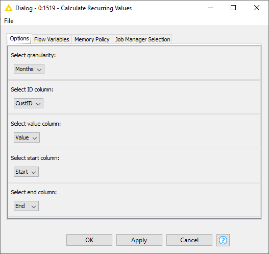
In the configuration of the component, we need to provide the desired granularity of the recurring values – months or days – and select the columns containing the customer ID, contract value, and start and end date of the contract (figure 3).
Download the component Calculate Recurring Values from the KNIME Hub.
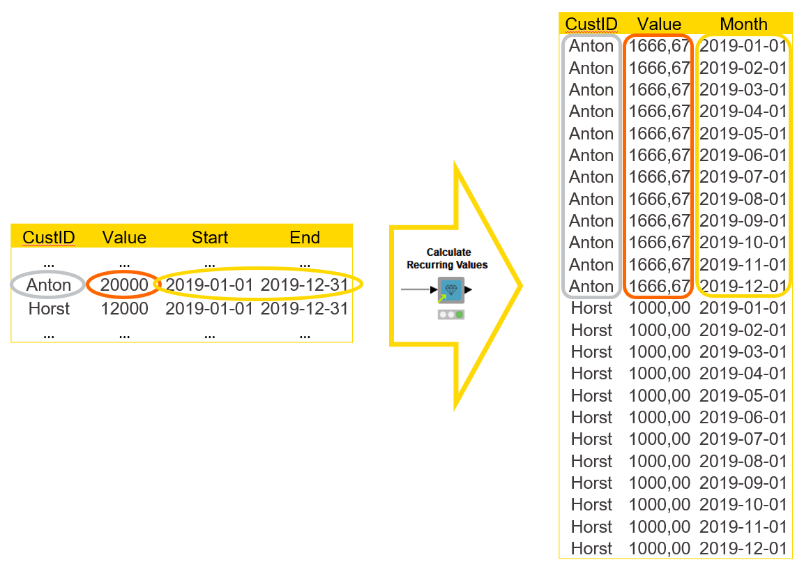
The output table of the component shows each individual month within the contract period, and the recurring values for each month. For example, if we had a row for a contract with a value of EUR 20,000 and a contract period of 12 months, the output table would show 12 rows for this contract, one for each month, and a monthly recurring value of EUR 1,667 (figure 4).
Download the component Calculate Recurring Values from the KNIME Hub.
Step 2: Calculate and visualize ARR
Now, after formatting the contracts data, we are ready to move on to the next step: calculate and visualize ARR. We will present ARR in three ways:
- Month by month over the whole time period together with a trend line for the general direction
- Month by month for each year separately
- ARR, by customer, in a given month and see, for example, who is the most valuable customer in that month.
We can do the entire financial analysis and visualization using the ARR Analysis component. All you need to do in the configuration window is to select the columns with recurring months/dates, recurring values, and customer IDs. For the detailed financial analysis, you can include/exclude columns to be shown at a customer level and select the month for which the details are shown in figure 5 below. If you don’t select any columns, only the total ARR in the selected month will be shown.
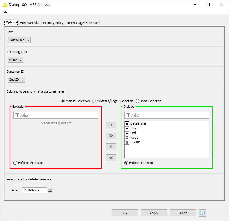
Download the component ARR Analysis from the KNIME Hub.
As an input table for the ARR Analysis component we use the monthly recurring values we obtained at the previous step.
Output interactive view of the ARR Analysis component visualizes the calculated ARR in the line plots and the tile view (figure 6).
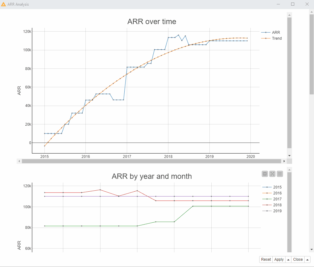
- The first line plot “ARR over time”, (figure 6) shows the ARR values month by month over the whole time period and also a trend line based on a polynomial regression model fitted to the data. We can see from the trend line that ARR increased rapidly since 2015 through 2018 and stagnated through 2019. In the actual ARR curve we can see that there were rapid movements in both directions in 2018, whereas in 2019 the ARR didn’t increase at all from the level it had reached at the beginning of the year.
- The second line plot “ARR by year and month” shows the development of the ARR within each year. In 2017 (green line) and 2015 (blue line), the ARR increased from the beginning to the end of the year. In 2018 (red line) it was the opposite. Overall the highest ARR could be reached in the middle of the year 2016. The company might need to reflect on the reasons for the decline in 2018 and stagnation in 2019 and address the revealed problems.
- The tiles at the bottom part of the view show the ARR for the selected month, in our case September 2018. The top tile shows the total ARR value, and the bottom tile shows the ARR values by customer. We can see, for example, that in September 2018, Anton was the most valuable customer with the ARR value of €20 000.
In addition to the interactive view, the ARR Analysis component outputs calculated ARR as KNIME tables (figure 7).
The first output table contains the data in the first line plot with each individual month and ARR for that month.
The second output table is a pivot table with months as row IDs, years as column headers and ARR values as cell values, corresponding to the second line plot.
The third and second output tables show the ARR in total and at a customer level in a selected month as in the tiles in the component’s interactive view.
Shared Components Simplify ARR Down to Two Steps
We finish the ARR analysis here, after just two steps. We had encapsulated a number of data aggregation, transformation, manipulation, and visualization tasks into components that perform more complicated tasks, such as visualizing the ARR.
In general, in KNIME, you can encapsulate workflow parts, e.g., routine repetitive processes, into reusable components. Since components have a configuration dialog just like KNIME nodes, when you create a component, you basically create a node performing your customized task.
You can create your components as well as use the components dedicated for the financial analysis created and verified by KNIME experts. You can drag and drop the components from the KNIME Hub and customize them depending on your data and tasks.
WebPortal Application for Financial Analysis
In addition to visual intuitive workflows that you can build in the open source KNIME Analytics Platform, the KNIME WebPortal (a commercial KNIME Server feature) allows you to execute the workflows step by step as interactive, browser based applications.
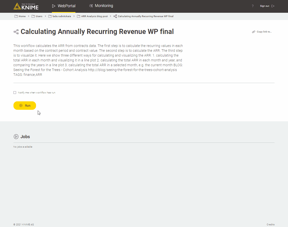
If you want to try ARR Analysis as a web application, you can find the slightly modified workflow for ARR Calculation and Analysis on the WebPortal on the KNIME Hub (figure 8). Notice, though, that you need to have access to KNIME Server to be able to execute it on the KNIME WebPortal.
Download the workflow Web Application for the ARR Analysis from the KNIME Hub.
More Finance, Accounting, and Audit Blueprints on the KNIME Hub
ARR analysis gives us a possibility to analyze revenue dynamics on a higher level and check if we're on a sustainable path with our business. Besides, it provides the foundation to dive into more specialized KPI analysis, e.g. cohort analysis, churn development, upsell behavior, etc., as well as make comparisons to a company’s costs and hiring plans.
Tip: Explore a Tutorial for Cohort Analysis to understand customer churn.
The steps for building ARR visualizations from contracts data include a number of ETL tasks: sorting, grouping, pivoting, and aggregation, along with other data preprocessing operations. The components introduced in this blog post modularize and automate these steps, while allowing us to define just the key settings.
Yet shared components dedicated for financial analysis aren’t the only way to conduct financial analysis in KNIME Analytics Platform. The workflows for today's use case can be found in the Finance, Accounting, and Audit space on the KNIME Hub. There you can also find other blueprints for financial analysis. Some use shared components for financial analysis to modularize repetitive tasks, while others combine standard KNIME nodes into extremely flexible and powerful workflows.
Read the Blueprints for Finance Data Aggregation blog article to find an overview about the other blueprints we have for Finance Teams