A marketing campaign or publication of a new release can make numbers of customers boom for a while. But what are the effects in the long run? Do the customers stay or churn? Do any of them return at some point? Does the overall revenue increase?
Patterns can be detected in customer behavior: for example, patterns in the regular behavior of customers i.e. behavior that is not affected by our marketing campaigns or other similar actions. We might want to try to find a critical contract duration that determines whether customers will become loyal customers or not. Another scenario worth analyzing is customer groups - to see if different conditions in contracts with different starting points cause these different customer groups to show equal loyalty - or not.
To answer these questions, we can analyze our sales data over time by time-based cohorts.
Identifying long-term customer behavior
Cohort analysis provides long-term feedback on our business decisions and customer engagement. Therefore, we use time as one dimension in the analysis. The second dimension is the metric that we analyze: contract value, customer count, number of orders, or anything else that quantifies the behavior of our customers. This “customer value” is shown separately for different cohorts. Cohorts are groupings in the data that share similar characteristics based on time, segment, or size. Given these three dimensions, we can identify patterns and trends that wouldn’t be visible in the individual records, thus providing a more complete look at our business.
Before starting the cohort analysis, we have to define:
- The cohorts that we consider in our data. They could be, for example, customers who started doing business with you within the same time frame (time-based cohorts), customers buying similar products (segment-based cohorts), or medium- and large-size companies (size-based cohorts).
- The information that we want to show for the different cohorts over time. It could be an established metric, such as annually recurring revenue or churn rate, or anything else that answers our questions about the customers, and serves the final goal to improve our business.
In this blog post we want to concentrate on time-based cohorts. In the next sections we introduce the steps you go through to build a cohort chart (Figure 1), from formatting the data to visualizing the selected metric by time and cohort.
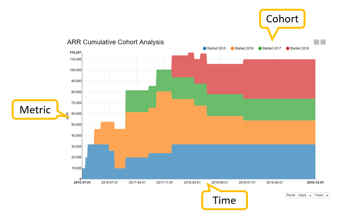
Fig. 1: An example of a cohort chart to analyze customer count, or any other metric such as ARR, by time and time-based cohort
Example: analyze the number, value, and duration of contracts
Let’s start by having a look at an example cohort analysis and see how the company’s business is doing. The company issues contracts - software licenses, mobile contracts, or magazine subscriptions, for example. Based on the starting time of the contract, we assign each customer to a time-based cohort.
The results of the cohort analysis enable us to answer questions such as:
- Can we detect a positive trend in terms of more customers and more revenue? Is the trend stable?
- Do customers who entered into a contract in a particular year generate more revenue than customers who started in other years?
- Which year(s) show the greatest customer churn?
- Does the value of the contracts remain stable over time?
- Has the average revenue per customer increased or decreased?
Data
In our example, the data contains information about contracts upsells, downgrades, and churn events. There are 45 contracts and 12 customers. Contract periods range from January 2015 to December 2019. Each row in the data shows the start and end time of the contract period, the contract value, and an ID that identifies the customer. You can see a sample of the data in Figure 2.
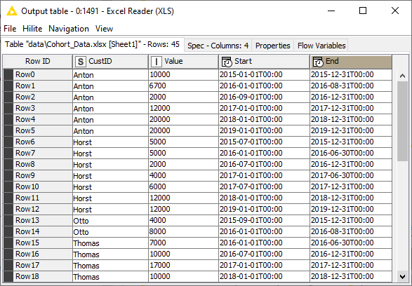
Fig. 2: Data containing information on contract IDs, values, and periods. In the first step of the cohort analysis, this dataset is transformed into time series by assigning recurring values to single months within the periods.
The first step in the cohort analysis is to assign recurring values to the single months within the contract periods. Recurring values exclude one-time events, that is, they only consider the services that are constantly provided over a limited time period: subscriptions to software, support, content, etc.
Step 1: Calculate recurring values
When we calculate recurring values, we format the original contract data into time series data where each row contains a single month, a recurring value, and an ID. We can do this calculation with the “Calculate Recurring Values” component shown in Figure 3. The component is available for download on the KNIME Hub.
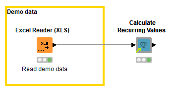
Fig. 3: Transforming contract data into time series data where each row contains a single month, a value, and an ID. The “Calculate Recurring Values” component which performs the calculation is available on the KNIME Hub.
Input table
An example of an input table for the “Calculate Recurring Revenue” component is shown in Figure 2. The table must contain two columns that define the start and end date of each contract period, one column for the contract value, and one column for the ID.
Output table
The output table of the component shows each individual month within the contract period, and the recurring values for each month. For example, if we had a row for a contract with a value of EUR 30,000 and a contract period of 12 months, the output table would show 12 rows for this contract, one for each month, and a monthly recurring value of EUR 2,500 (Figure 4).
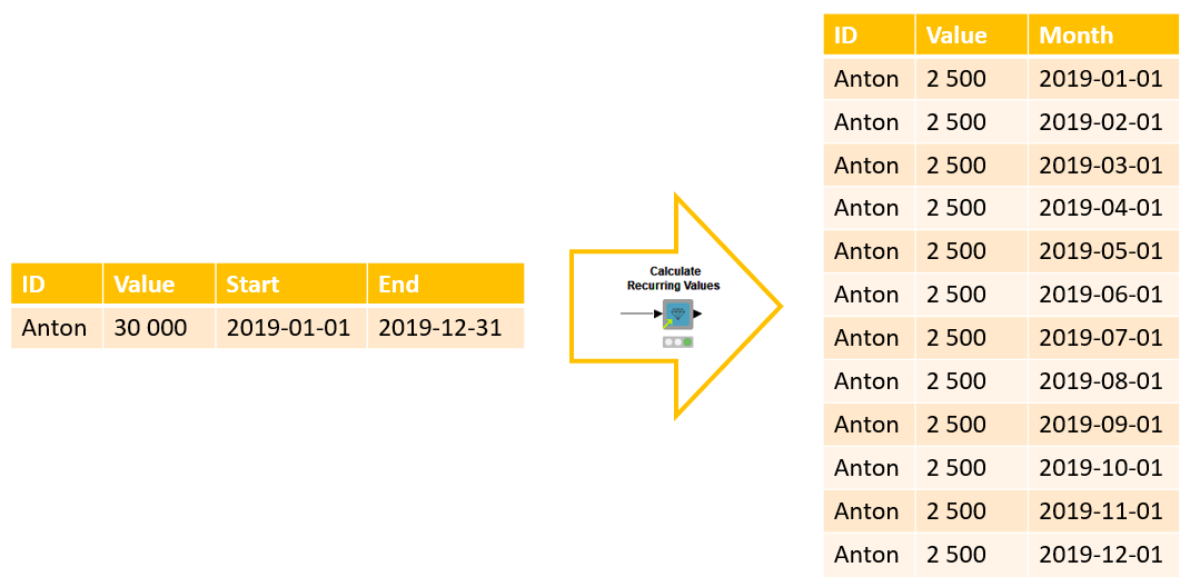
Fig. 4: Example input and output data of the Calculate Recurring Values component that converts contracts data into time series data: records by contract period and ID are expanded to monthly recurring values by single month and ID.
Now, after formatting the data, we are ready to move on to the next step where we build the cohort chart. We can subsequently use the chart to answer the questions about the state of our business.
Step 2: Inspect revenue and customer count by time and cohort
In this second step, we calculate the selected metric separately for each month and time-based cohort. For example, we could have two customers who started in 2018, one with a monthly recurring revenue of EUR 2,000 and the other with monthly recurring revenue of EUR 3,000. These two customers would then constitute a single time-based cohort called “Started 2018”. The monthly recurring revenue for this cohort is therefore EUR 5,000 until at least one of the two customers upgrades, downgrades, or churns.
The time series data could also come from any other source. It could be the daily sales coming from subscriptions or grocery stores, for example. Regardless of what the data actually show, note that in order to perform cohort analysis, each record must contain a timestamp, identifier, and a value.
The workflow in Figure 5 (which you can download from the KNIME Hub here) shows two components that enable you to analyze time-based cohorts using the following metrics:
- annually/monthly recurring revenue (ARR/MRR)
- annually/monthly recurring revenue relative to customer count
- customer count
- churn rate
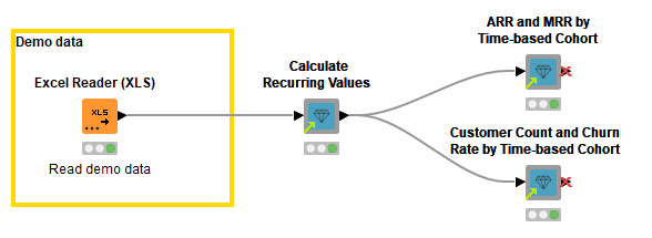
Fig. 5: Analyzing time-based cohorts with the ARR and MRR by Time-based Cohort and Customer Count and Time-based Cohort components available on the KNIME Hub. Both components produce an interactive view showing how the selected metric develops over time for each cohort.
Example outputs of these components are shown in Figure 6. The line plot on the left shows the ARR for each cohort over time. The stacked area chart on the right shows the cumulative customer count for the different cohorts over time. The metric, the granularity of the cohorts, and the chart type can be defined in the configuration dialogs of the components.
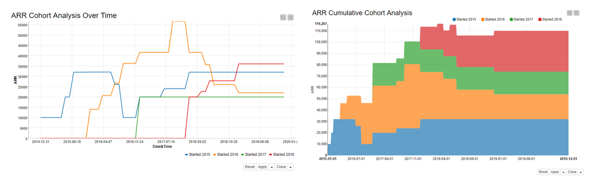
Fig. 6: Cohort charts as produced by the ARR and MRR by Time-based Cohort and Customer Count and Churn Rate by Time-based Cohort components. The line plot on the left shows the ARR for each cohort over time; the stacked area chart on the right shows the customer count for each cohort and in total over time.
From the line plot on the left in Figure 6 we can see that the ARR develops differently for the four time-based cohorts:
- The customers who started in 2015 (blue line) increase their ARR value in the first year, but reach a low in the second half of 2016. Their ARR starts increasing again in 2017 and returns to its original value at the beginning of 2018.
- The customers who started in 2016 (orange line) show an increase in ARR by the end of 2017. Their ARR starts to decline through to the beginning of 2019, where it then settles down to a constant value.
- The customers who started their contracts in 2017 (green line) have a constant ARR value over the whole time period from the beginning of 2017 to the end of 2019.
- The customers who started in 2018 (red line) increase their revenue until it sets to a constant value at the beginning of 2019.
From the stacked area chart on the right in Figure 6 we can see that the decreasing ARR of the “Started 2015” cohort (blue area) causes a low in total ARR at the end of 2016 but it starts increasing again due to the additional ARR coming from the “Started 2016” cohort (orange area) and the constant ARR coming from the “Started 2017” cohort (green area). The decreasing ARR for the “Started 2016” cohort cannot be compensated by the ARR coming from the “Started 2018” cohort (red area). This means that the maximum total ARR is reached at the beginning of 2018 before the ARR of “Started 2016” starts to decline.
Shared components
Now, it’s your turn to analyze your own customer data and build the cohort charts. Drag and drop the components from the KNIME Hub, and follow the steps as described above. You can use the configuration dialogs of the components to customize your cohort analysis: create time series with daily recurring values, extract cohorts based on the starting month, calculate the churn rate, or some of the other available metrics. If you want, you can also change the functionality of the components for your purpose: add new metrics and charts, for example.
Check out these videos What is a Component?, Component Configurations, and Sharing and Linking Components for more details on components.
Cohort Analysis for a Comprehensive View of the Business
Cohort analysis gives us a robust and comprehensive view of the state of our business. Cohort analysis gives us feedback over a long cycle of business. It smooths occasional fluctuations, giving us perspective on our customers’ behavior in the long term. Cohort analysis can reveal patterns in customer behavior that are only visible when we analyze customers by groups. For example, an increase in actual numbers could still mean a decrease in loyalty.
The steps in building a cohort chart from contract data include blending data, filling gaps in time series and checking for zero values, sorting, and pivoting, along with other data preprocessing operations. The components introduced in this blog post automate these steps, yet they let us define the key settings, such as the granularity of the cohorts and the metric to analyze.
Try another cohort analysis tutorial in the article Get Started with a Cohort Analysis Tutorial in KNIME to build time-based cohorts for a customer retention example.