
Analyzing customer decisions to see if they like your products – and purchase repeatedly, or churn after the first buy helps organizations reduce churn and improve retention.
Cohort analysis enables companies to group customers with more intuition and nuance enabling you to ask more specific, targeted questions and get a finer understanding of the customer. It’s the key to data-driven product decisions.
In this article, we provide a step-by-step guide to cohort analysis in KNIME Analytics Platform focusing on the intuition behind the actual technique. We create time-based cohorts of customers to analyze and compare their retention ratio over the course of the customer lifetime.
In order to follow this tutorial you need to download KNIME. No previous knowledge is required. We'll be using basic nodes for data wrangling, which we introduce as we go.
Tip: To learn more data wrangling, try the KNIME Analytics Platform for Data Wranglers: Basics course. Find it in our catalog of courses: https://www.knime.com/knime-courses.
What is Cohort Analysis?
Cohort analysis refers to analyzing the chosen aggregated metric by groups, i.e. cohorts, over time. The cohorts are defined based on time or preference, such as:
-
the customers started in the same month
-
or customers subscribed to the same service.
The aggregated metric could be, for example, the revenue, customer retention or any other metric that changes over time based on the behavior of the cohorts.
One of the most popular applications of cohort analysis is retention analysis, which means tracking the persistence of customers and looking for indicators of churn given by time or cohort.
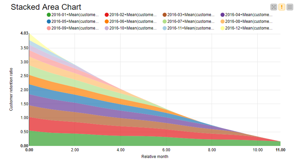
The results of cohort analysis can be represented in a stacked area chart as you can see on Figure 1. Each cohort's aggregated metric (y-axis) is plotted as a colored area against time (x-axis). In that example, the cohorts are defined by the month of first purchase and the time on the x-axis shows the months passed after it.
We'll now guide you through a workflow tutorial for cohort analysis.
Note. If you want to follow us hands-on, you can download the workflow from the KNIME Hub.
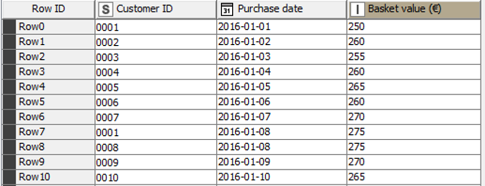
Our example is based on the dataset “Transactions_2016.xlsx”. It contains 983 fictitious transactions with the information on the purchase date and the basket value (EUR), for the year 2016. Each row represents a single transaction performed by the customer, identified by a customer ID (Figure 2). The dataset and the example were originally provided by Dr. Joakim Nägele for a 'Cohort Analysis in KNIME' workshop, at HMS Hamburg Media School GmbH.
Cohort Analysis Step-by-Step to Understand Customer Churn
The workflow contains 4 metanodes, each devoted to a particular sub-ask of cohort analysis (Figure 3):
-
Access data and calculate cohorts.
-
Calculate customer retention ratio.
-
Calculate relative months.
-
Visualize the results.
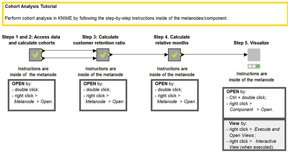
We’ll now open one metanode at a time and demystify the node configurations within them.
1. Access data and calculate the cohorts
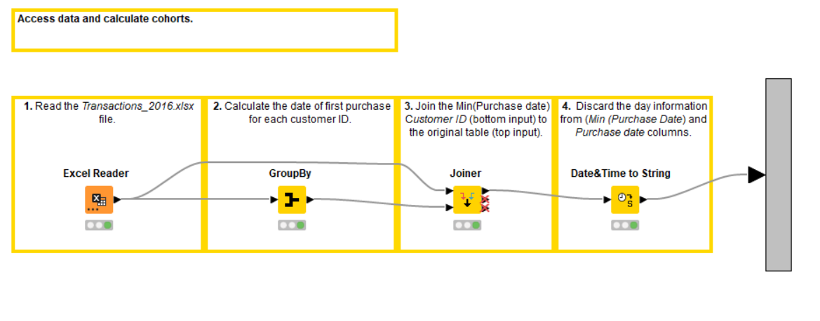
We open the first “Access data and calculate cohorts” metanode (Figure 4) and perform the following steps:
-
Access the data in an Excel file with the Excel Reader node.
-
Calculate the minimum purchase date for each customer with the GroupBy node. This is the month when the customer made their first purchase (see configuration on Figure 5).
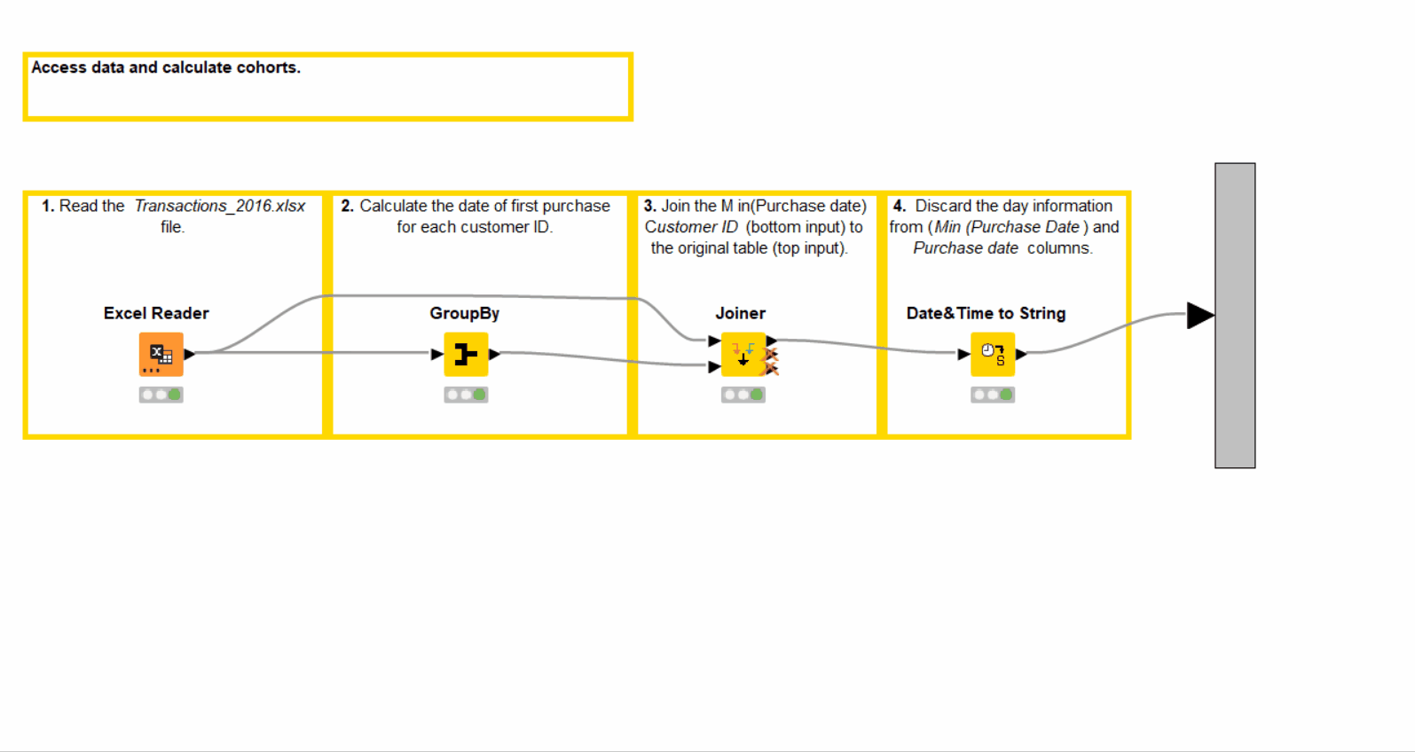
-
Join the calculated minimum purchase date into the original table with the Joiner node based on the customer IDs.
-
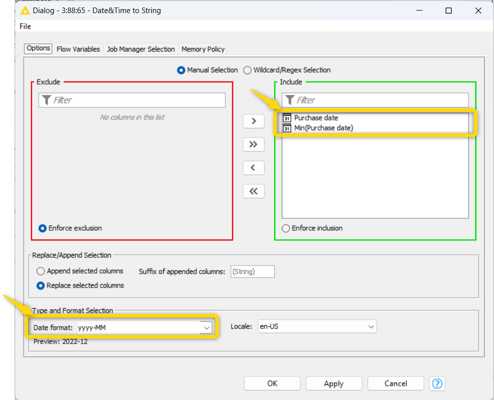
Discard the day information from the “Purchase date” and “Min(Purchase date)” columns with the Date&Time to String node (Figure 6). This leaves us only with cohort-relative information - months.
In the output table of this metanode we now have the “Min(Purchase date)” column, containing cohort information for each purchase and customer ID. Next, we calculate the customer retention ratios for each cohort.
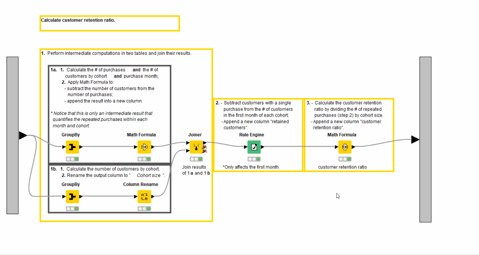
2. Calculate customer retention ratio
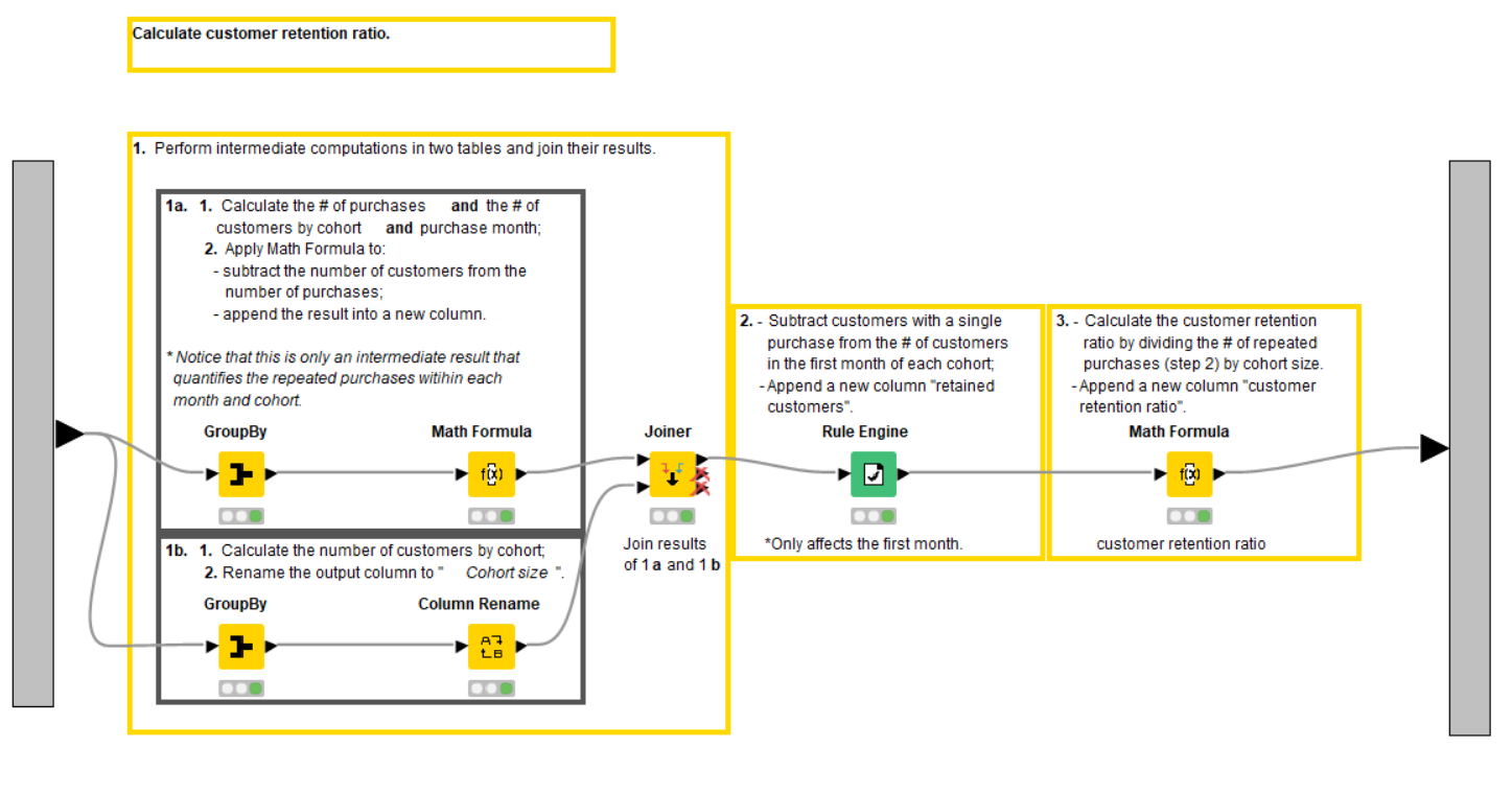
We open the second, “Calculate customer retention ratio” metanode (Figure 7). The customer retention ratio is the percentage of customers who came back and repeated a purchase. We calculate it by month and cohort via the steps:
-
Use the GroupBy, Math Formula, Column Rename, Joiner and Rule Engine nodes to obtain the number of repeated purchases and the cohort size - the numerator and denominator of customer retention ratio, respectively.
-
Calculate the customer retention ratio with the Math Formula node.
Let us go through the calculation in more detail.
For start, we calculate the number of purchases (Count) and the number of customers (Unique count) by month (“Purchase date”) and cohort “(Min(Purchase date))” with the GroupBy node and, then, find their difference with the Math Formula node. The quantity we obtain is the number of repeated purchases within each month and cohort. We name this result ”new column” because it’s just an intermediate outcome.
In parallel, we calculate the size of each cohort with the GroupBy node and rename the column as “Cohort Size” with the Column Rename node. Additionally, we rename the “Min(Purchase date)” column in this aggregated table as “Cohort” to distinguish it from the actual minimum purchase date that we work with in the next metanode. After that, we join the cohort size information into the actual table with the Joiner node.
After that, we assign the number of retained customers in each month with the Rule Engine node (Figure 8). We set it to the difference between the number of purchases and the number of unique customers in a cohort (“new column” obtained in the previous step) when it's the starting month of each cohort. Otherwise, we set it to the number of unique customers.
As the last step, we calculate the customer retention ratio as the percentage of the retained customers of the cohort size with the Math Formula node.
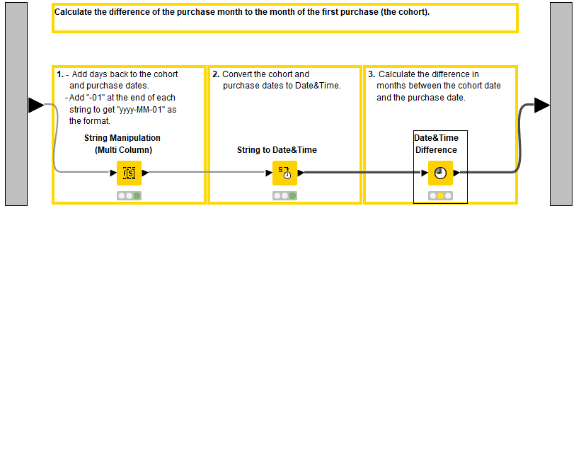
3. Calculate relative months
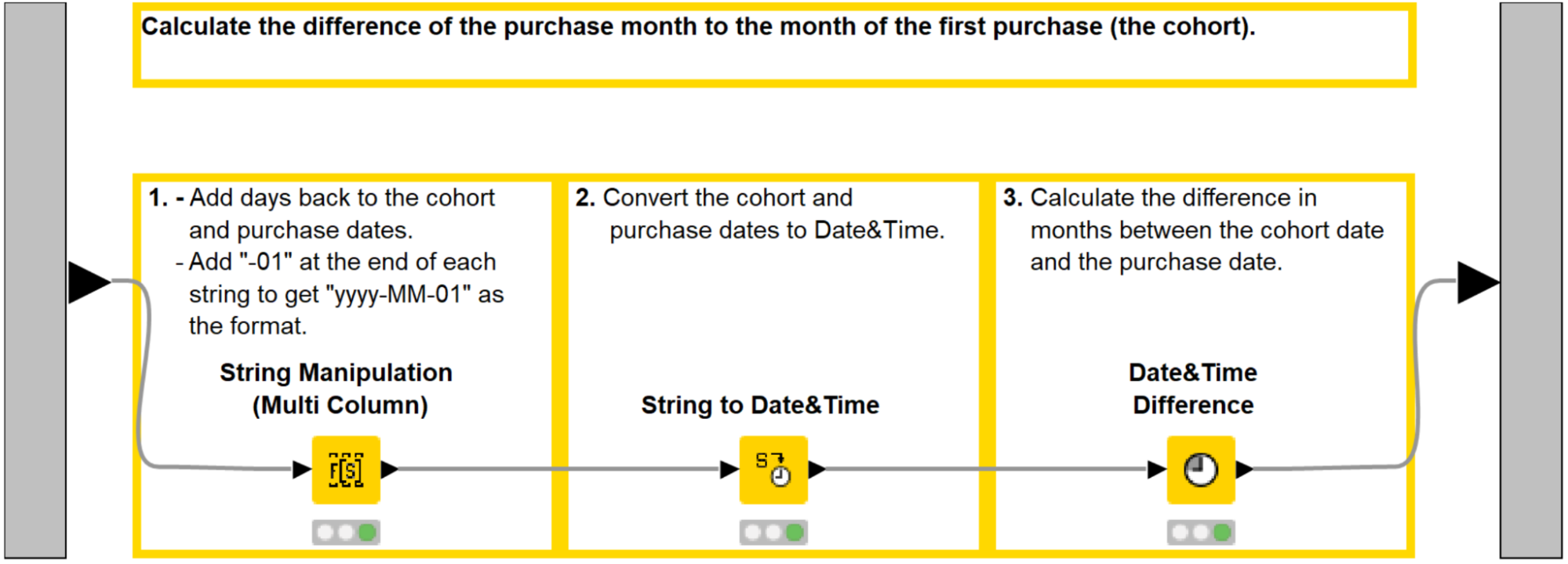
To compare cohorts that started at different times we compute the relative months, that is the difference of the purchase month to the month of the first purchase. Let’s go inside the third “Calculate relative months” metanode (Figure 9), consisting of the following steps:
-
Add the first day of the month, i.e. the string "-01", to the “Min(Purchase date)” and “Purchase date” columns with the String Manipulation (Multi Column) node.
-
Convert the manipulated columns to Date&Time with the String to Date&Time node.
-
Calculate the number of months between these columns with the Date&Time Difference node (Figure 10).
4. Visualize the results
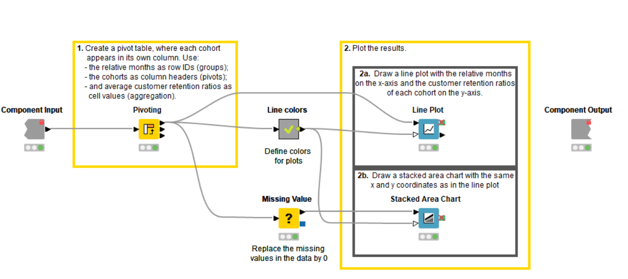
Finally, let’s plot the results!
We do that with “Visualize” component (Figure 11), consisting of the following steps:
-
Calculate the mean of the customer retention ratio by relative month and cohort with the Pivoting node.
-
Assign custom colors to cohorts with the “Line colors” metanode (optional).
-
Replace the missing values in the Pivot table with zeros via the Missing Value node.
-
Visualize the results of the cohort analysis with the Line Plot and Stacked Area Chart nodes.
Let us look again at the Stacked Area Chart, displayed already on Figure 1. We see that the highest retention ratio across time was preserved by the clients entering the company in the first month of the observed period - January 2016. The later the customers joined, the fewer of them returned in the following months.
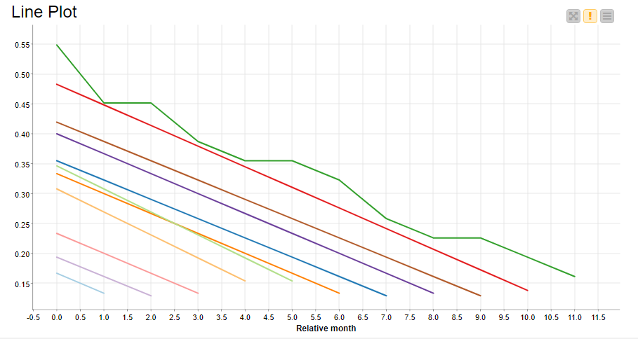
If you are interested in precise average customer retention rates for each cohort you can take a look at the Line plot on Figure12. We see that 55% of the cohort with the highest retention ratio (January 2016) came back during their first month, and 17% even 11 months after that.
Get started with Cohort Analysis in KNIME Yourself!
Now that you know how to perform a cohort analysis in KNIME, you can not only replicate the workflow we just discussed, but analyze your own business data and build your own cohort graphs. Create time-based cohorts, as we just did, and also group your customers by age, education, marital status or by other actions with your products performed over time.
Instead of customer retention ratio, you can analyze the KPI and/or total purchases per group. Also you can track the annually/monthly recurring revenue (ARR/MRR) by following the blogpost of Maarit Widmann and Felix Kergl-Räpple “How cohort analysis reveals a comprehensive view of our business” and applying the verified components “Customer Count and Churn Rate by Time-based Cohort” and “ARR and MRR by Time-based Cohort”.
Regular Cohort Analysis for Insightful Data-Driven Product Decisions
In this tutorial we've walked through how to perform cohort analysis with an example workflow. We obtained a dynamic of an average customer retention ratio across the months after the first purchase for each cohort of clients, united in accordance to the month of first interaction with our product.
The visualization of our analysis showed the tendency of customers to churn and return less and less with the time passing after their first purchase. To confirm this kind of seasonal behavior we could study more data from this imaginary company. In general, we recommended performing cohort analysis regularly over a long period of time to establish a steady inference.