
Takeaways: Learn how an interactive view can be used to explain a black box model for credit scoring. We show the interactions and charts necessary to explore the view, summarize our credit scoring use case, and explain how all of this is implemented via a reusable KNIME workflow and component. You can download our XAI View component from KNIME Hub and start explaining your own classifier predictions!
If you have trained an ML classifier before, you will have gone through these steps (or similar):
- Access the data from one or multiple sources
- Blend and prepare the data
- Partition between train and test set and validation set
- Train on the train set
- Optimize the model further on the validation set by fine tuning the model parameters and/or the input features
- Compute predictions on the test set based on the optimized model
- Measure performance statistics by comparing your predictions with ground truth data
Imagine now you have finished all of the above tasks (congrats!) and the performance you measured at the end is simply awesome (great!). You could now involve business analysts and domain experts to start measuring your model’s impact in business terms (via KPIs) and start talking about its deployment.
But before you do that...
Shouldn’t you be sure the model is going to behave as expected? Have you already checked how it’s using features to compute those predictions in the test set? Did you look at the few misclassified instances and understand what went wrong there?
If your model is simple, that’s an easy thing to do. For example, if you used a logistic regression you could look at the weights in the trained function. If you used a decision tree, you would need to inspect the split in the trees close to the root or simply those used for a single prediction.
If inspecting those simple algorithms sounds cumbersome to you, just imagine how hard it becomes with more complex models — with neural networks of many layers, or with a random forest consisting of many trees. With these algorithms, the final trained model feels like a black box: Data goes in, predictions come out, and we have no clue about what happens in between.
If you train such a black box model e.g., with deep learning, how can you explain its decision-making?
By combining different eXplainable AI (XAI) methods you can build an application that explains the predictions you provide. Those techniques extrapolate which feature is used in what case based on the input-output relationships of your black box model. And by applying Guided Analytics, you can design interactive visualizations and combine XAI results from different techniques.
We have designed the XAI View which does exactly that. This interactive view combines different charts to go from local explanations to global explanations, SHAP explanations, partial dependence, and a surrogate decision tree. Please notice that the view works with any ML classifier. This means you can use it for your own black box model.
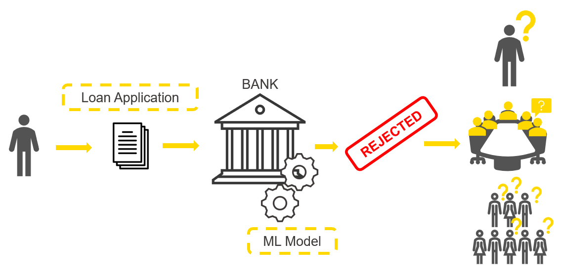
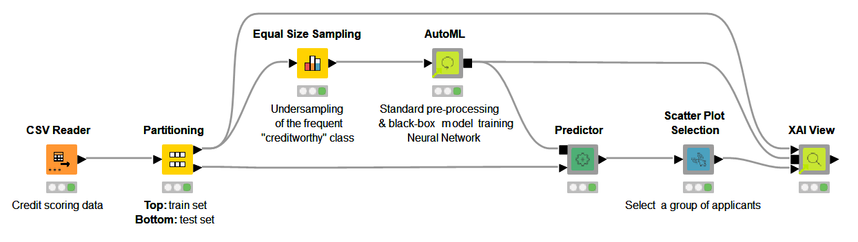
To show properly how the XAI View works, let’s have a look at the ML use case that we’re going to explain with our XAI View. We want to train a neural network to take care of credit scoring (Fig. 1). The goal is to predict whether a loan application is either risky or creditworthy. Based on the prediction the bank can then decide whether the loan should be granted or not. Given the huge consequences those predictions have, it is important that we are sure there is no terrible flaw in the black box model we have created.
We want to explain four predictions and answer the following questions:
- How is the feature “Times in Debt for 3 Months or More” used by the model over all the visualized predictions?
- How is the feature used for those visualized loan applications predicted to be risky?
- How is the feature used for those visualized loan applications predicted to be creditworthy?
Let’s now answer those questions with our XAI View.
How the XAI View works
Our XAI View uses a Partial Dependence Plot (PDP), an Individual Conditional Expectation Plot (ICE), and a SHapley Additive explanation (SHAP).
Both PDP and ICE plots show the dependence between the target column and a feature of interest. PDP varies the feature of interest and, in a line plot, shows the average prediction change of all the available instances (global explanation). The ICE plot also varies the feature of interest and displays a curve, but it is only related to one instance (local explanation).
SHAP is a technique adopted from game theory. It has a solid mathematical background, can explain models locally and then by summing out the results on many instances also globally. In short, for the instance of interest, SHAP method estimates Shapley Values that show the contribution of the feature values towards shifting the prediction from the average prediction.
In the animation below (Fig. 2), we investigate the feature “Times in Debt for 3 Months or More” for four instances of interest using PDP, ICE, and SHAP. We can interactively select another feature or explain way more than only 4 instances, but for the purposes of this article, we are going to focus on this simpler use case: 1 feature and 4 instances.
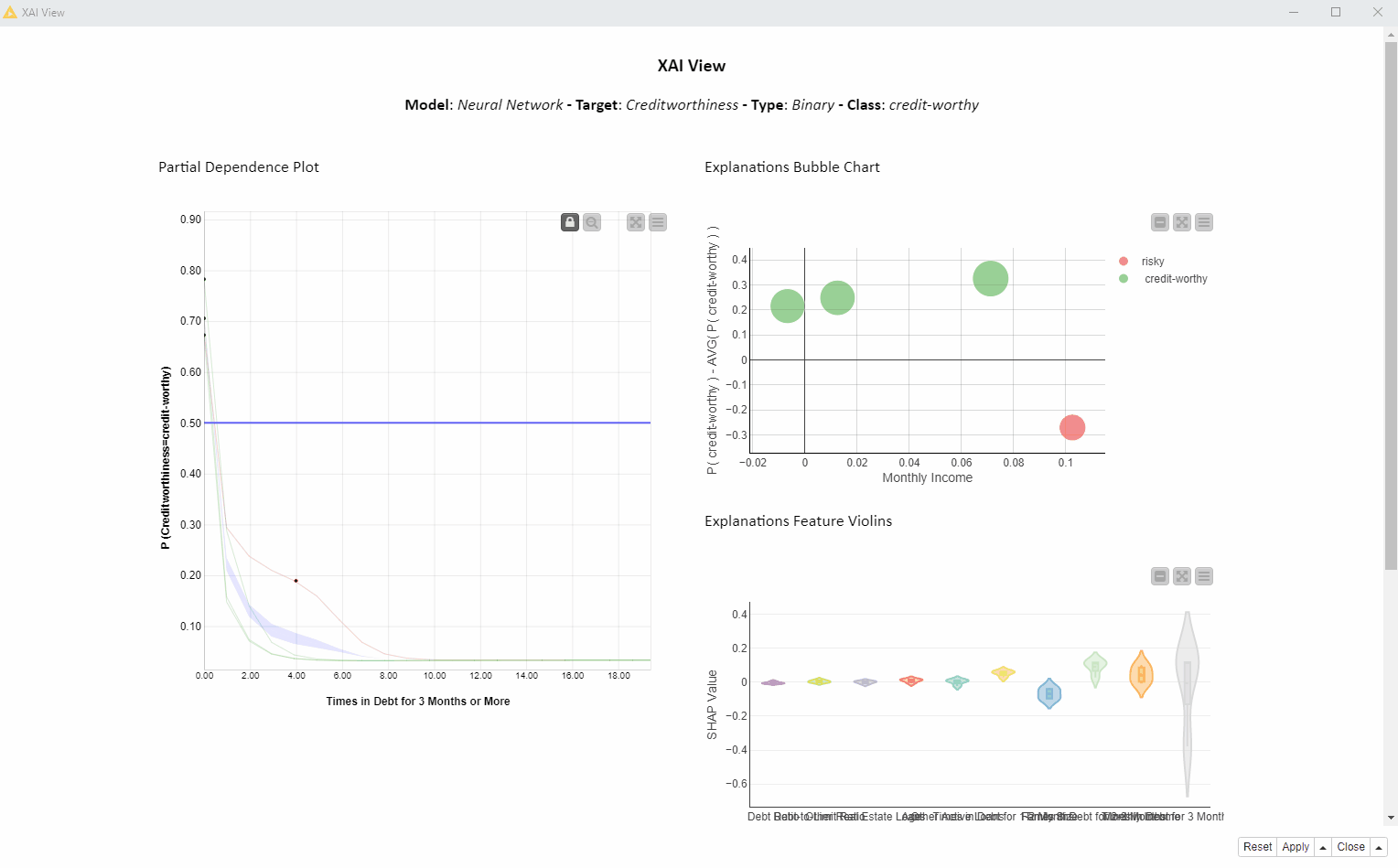
In the bubble chart below (Fig. 3, top) each bubble is a SHAP explanation. The x axis shows the SHAP value for “Times in Debt for 3 Months or More” and the y axis is the difference between that prediction and the average prediction. On the x axis we can see that the SHAP values for “Times in Debt for 3 Months or More” are significantly larger than zero for the creditworthy applicants (green bubbles), whereas the SHAP value for the risky applicant (red bubble) is significantly lower than zero.
The violin plot (Fig. 3, bottom) displays a violin for each feature SHAP values distribution. The gray violin (Fig. 8) for “Times in Debt for 3 Months or More” (far right) shows a high variance in SHAP values for all four instances, basically summarizing the bubble chart x axis of 4 values.
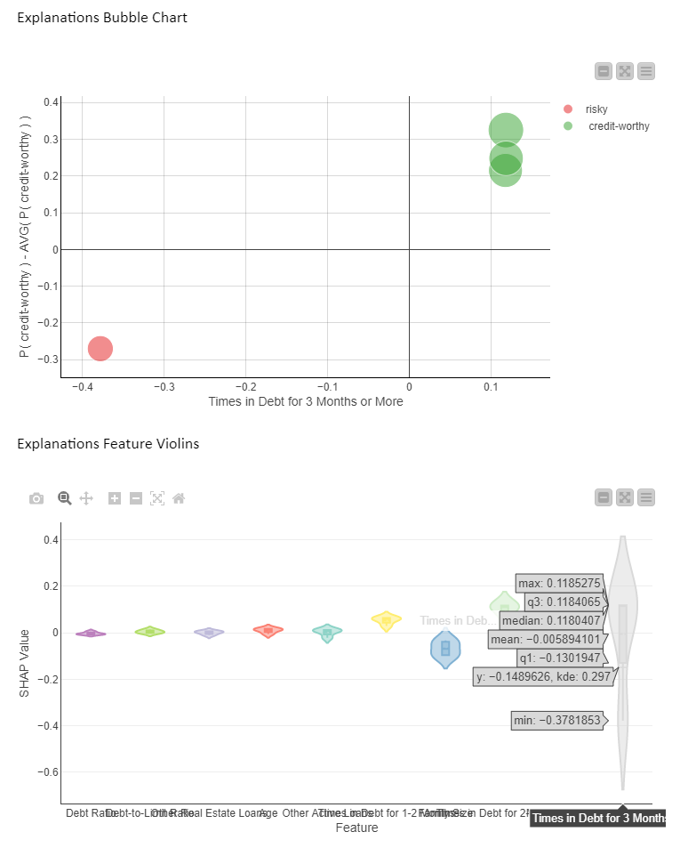
What does it tell us? SHAP indicates that this feature is used in all 4 predictions, but in opposite ways. This probably has to do with the original value of “Times in Debt for 3 Months or More” which differentiates between the creditworthy and risky applicants (red vs green bubbles).
In Figure 4 below, we see the PDP/ICE plot (Fig. 4). For the feature “Times in Debt for 3 Months or More” the overall trend is that as soon as the feature exceeds 0 on the x axis (applicant has been in debt at least once over a period of 3 months) the probability of being creditworthy (y axis) decreases immediately. Not surprisingly, our model advises against granting a loan if the applicant has been in debt before.
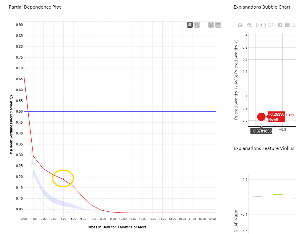
When selecting the red bubble (Fig. 4) for the SHAP explanation, the relevant red ICE curve is highlighted, predicting creditworthiness of this instance to be risky. A red marker is also displayed on the ICE curve, with the original value of both the feature plus prediction for that particular instance. The value of the feature “Times in Debt for 3 Months or More” is equal to four, as shown by the red dot position on the x axis. It means this applicant has been in debt four times in the past. This explains why SHAP gives this prediction a negative value explanation.
This altogether confirms that the feature “Times in Debt for 3 Months or More” is important for the four instances of interest and decreases the probability to get the loan drastically once the number of debts starts to grow.
Let’s now answer our questions:
-
How is the feature “Times in Debt for 3 Months or More” used by the model over all the visualized predictions?
Given the high variance in SHAP values, which are never close to 0, we can tell that this feature is used more than any other feature to determine both risky and creditworthy predictions for our four applicants. Please note that the above cannot be generalized to every prediction the model would make.
-
How is the feature used for those visualized loan applications predicted to be risky?
From the PDP and red ICE curves we can see that when “Times in Debt for 3 Months or More” is greater than 0, the model predicts these loan applications to be risky. This rule holds only for the subset of applications visualized in the view.
-
How is the feature used for those visualized loan applications predicted to be creditworthy?
From the PDP and green ICE curves we can see that when “Times in Debt for 3 Months or More” is equal to 0, the model predicts those loan applications to be creditworthy. This rule holds only for the subset of applications visualized in the view.
The workflow behind the XAI View component
The interactive views are produced by this workflow (Fig. 5). The workflow takes care of the following:
- Imports the black box and any other data preparation steps — via the KNIME Integrated Deployment extension
- Computes each XAI technique — via the KNIME Machine Learning Interpretability extension
- Visualizes all the charts and establishes interactive events — via the KNIME JavaScript Views and KNIME Plotly extension
All the extensions mentioned above provide nodes which, when combined in a KNIME component, create an interactive view. The view can be executed either locally — or remotely, if using a KNIME Server, as a data app in any web browser via the KNIME WebPortal.
The resulting XAI View component is available for you to download from the KNIME Hub. It was developed as part of KNIME’s Verified Component project. You can find more Verified Components on eXplainable AI in the Model Interpretability folder on KNIME Hub.
Now use the XAI View component yourself
All you need to do to use the XAI View is:
- Provide a sample of data that is representative of the underlying distribution
- Provide your black box model and the data preparation processing via a Workflow Object
- Provide a set of predictions you would like to explain
---------------------------
Explainable AI Resources At a Glance
Download the workflow and components from the KNIME Hub that are described in this article and try them out for yourself.
- How Banks Can Use Explainable AI (XAI) For More Transparent Credit Scorrng (overview article)
- Explaining the Credit Scoring Model with Model Interpretability Components (workflow)
- Global Feature Importance - Try the component and read the related blog article
- Local Explanation View - Try the component and read the related blog article
- XAI View - Try the component and read the related blog article