
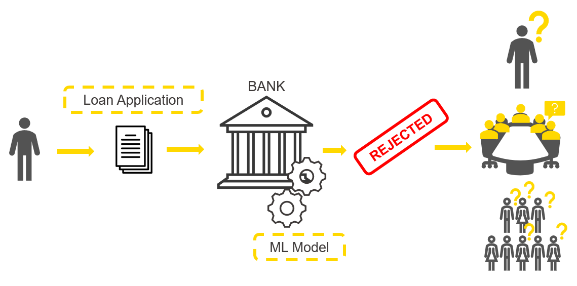
Imagine this: Your ML model is trained and deployed via REST API. It is scoring predictions in record time and everyone involved in its application is grateful for your work. But one day, the model returns an alarming prediction: For example, the biggest customer of your firm is predicted to churn, or a major failure is about to happen in a manufacturing plant, or an important transaction of money is predicted to be fraudulent.
Given what is at stake, a decision must be taken immediately based on this prediction, but first you need to know if you can trust the prediction. How was it computed? What feature values is the model using to compute such an alarming prediction?
Unfortunately the model is too complex to simply inspect like you would do with a decision tree or a logistic regression. You might then look at the single instance feature values yourself and try to guess what happened. However, this is imprecise and often not possible when you have hundreds of features, which might even be transformed via data preparation and feature engineering techniques.
How can you explain how this important prediction has been computed by your black box model?
With a Local Explanation View component: By adopting a method for eXplainable AI (XAI) and creating an interactive view via Guided Analytics we have built a reusable and reliable Local Explanation View. The view displays a user interface to explain a single model prediction using two techniques: a local surrogate model and counterfactuals instances.
KNIME Component to Understand Why Credit Scoring Model Rejects Loan Application
In this article, we want to show you how the Local Explanation View works. We are going to train a model for credit scoring (fig. 1). Our model will be designed to predict whether a loan application and its applicant are risky for a bank or not. The prediction of this model is used by a bank employee to influence its decision.
In our example we take a negative prediction - where the loan application has been rejected by the model - and use the Local Explanation View to explain why it was rejected.
As part of the credit scoring example we have chosen the following questions to answer:
- Which features are the most important for one particular rejected applicant?
- If a loan is rejected, what should the person change to get it approved by the bank?
- When the machine learning model predicts an applicant as risky, is this discriminating or fair and objective?
To answer these questions we can adopt a Local Surrogate Model and Counterfactual Explanations: two XAI techniques that generate local explanations. Local explanations are able to explain a single prediction, that is they are not valid for general behavior of the model, but only for one prediction at a time.
A Local Surrogate Model provides us with the local feature importance, relevant for the instance of interest. In our case, surrogate GLM was trained on a neighborhood of similar data points to mimic the original model local behavior. The generated local explanation is similar to another XAI technique called LIME, but a different type of neighborhood sampling was adopted.
A Counterfactual Explanation defines minimal changes to the features of the instance of interest so that its prediction is changed to the desired one. The intuition behind this technique is that the difference between the original feature values and the counterfactuals feature values will tell the applicant what should change in her application in order to get it approved.
In the animation below (fig. 2), we can see the interactive view that contains the information about the data point of interest (in our case the rejected applicant).
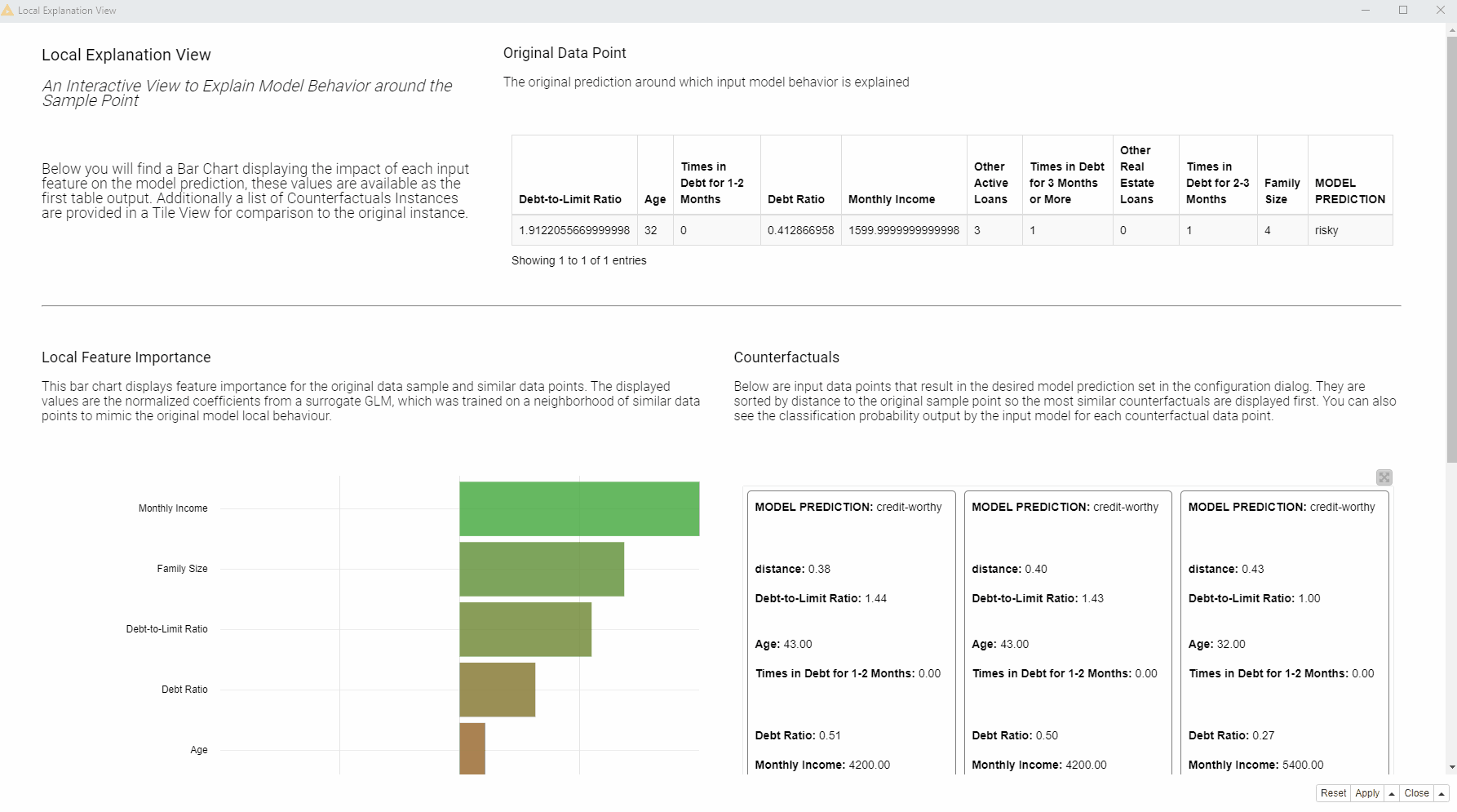
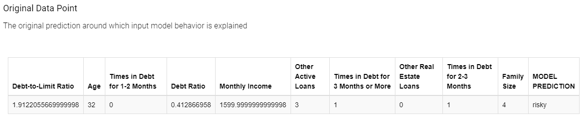
At the top of the view, a table (see fig. 3 below) displays the input and output of the black box model: The original instance with its feature values and the predicted class. The goal of this view is to explain the connection between the two.
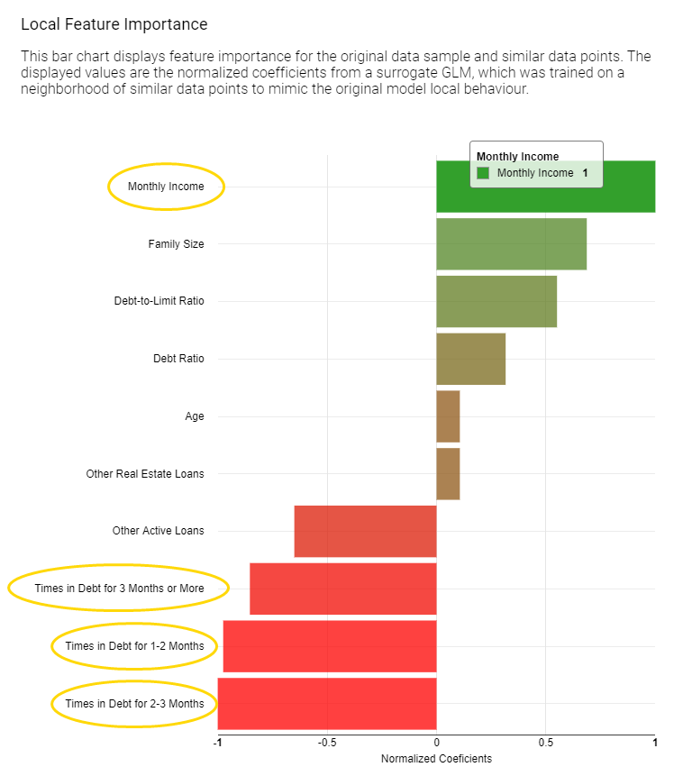
On the left, a bar chart (see fig. 4 below) of the GLM’s normalized coefficients is indicating the local feature importance. The bigger the bin the greater the local feature importance for this particular prediction. In the bar chart green bins are related to features that are influencing this prediction towards the positive class (creditworthy applicants), red bins towards instead the opposite class (risky applicants).
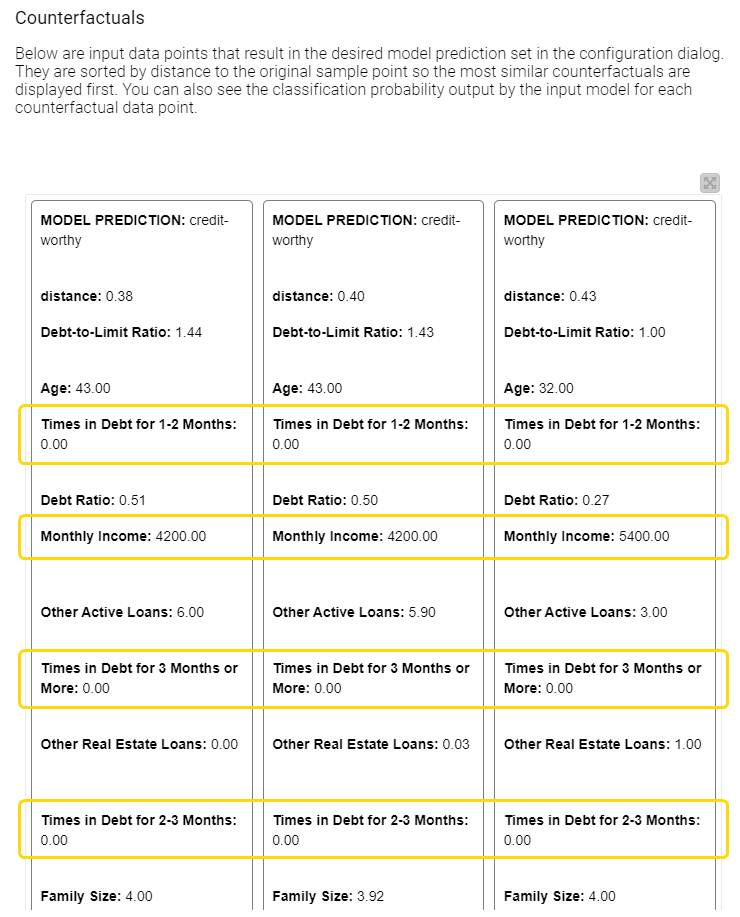
On the right, the tile view (see fig. 5 below) displays one card for each counterfactual found for this prediction. Each counterfactual has similar feature values to the input instance we are trying to explain, but with small variations in order to lead to the opposite prediction. Comparing those values with the original feature value can provide an explanation. For example, you can understand what features should be changed in order to get the opposite outcome.
Currently in the view we are explaining an applicant that was rejected (see fig. 4 below).
By comparing a few of those counterfactuals in the tiles with the original feature values displayed at the top of the view and looking at the bar chart we can understand a few things and answer our three questions:
1. Which features are the most important for this particular rejected applicant?
According to the displayed bar chart (fig. 5), “Monthly Income”, “Times in Debt for 1-2 Months”, “Times in Debt for 2-3 Months”, and “Times in Debt for 3 Months or More” are locally the most important features.
2. What should the applicant change to get approved by the bank?
Compared to the applicant of interest, the created counterfactuals applicants (fig. 6), predicted as creditworthy, earn more and never had debts in the past. While the debt history cannot be changed, the applicant can try to increase monthly income in order to get approved by the model.
3. When the machine learning model predicts an applicant as risky, is this discriminating or fair and objective?
Two sensitive features in our data set are “Age” and “Family Size”. According to the bar chart (fig. 5), “Age” is not the most important feature, “Family Size” has lower importance than financial characteristics about income and debts. The approved applicants have the same family size as the rejected applicant. Therefore, at least according to these two techniques, we don’t see any evidence that our credit scoring model used sensitive personal characteristics to discriminate against the applicant, for example, by rejecting people with many dependents..
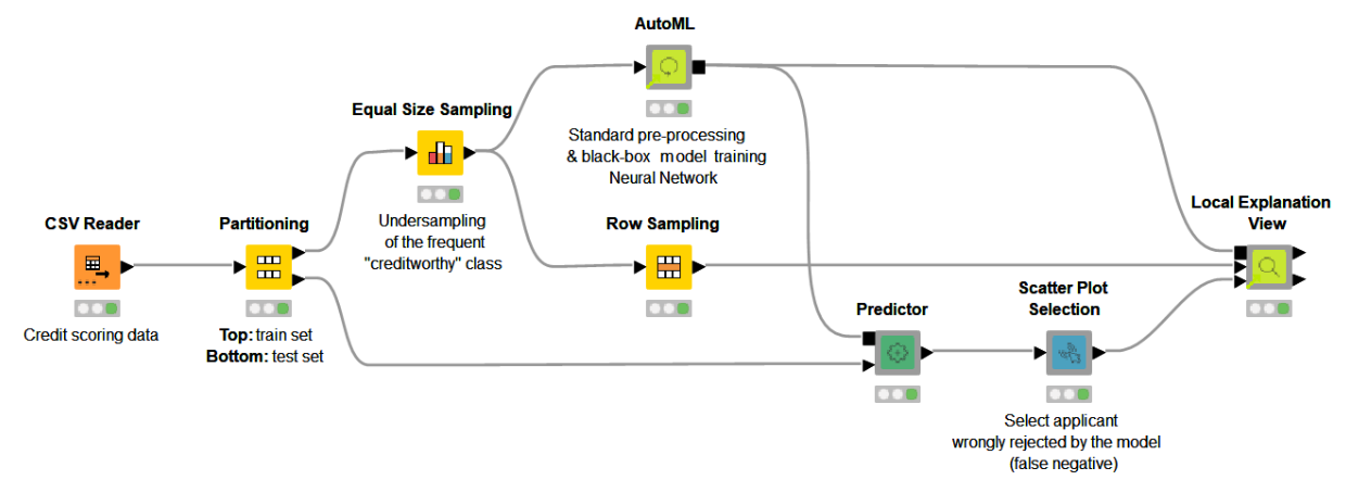
The KNIME Workflow behind the Local Explanation View
The Local Explanation View we have shown was created in the free and open source KNIME Analytics Platform with this workflow (fig. 6). By combining Widget nodes and View nodes, as well as machine learning and data manipulation nodes, we have built a workflow able to explain any ML classification.
The demonstrated techniques and the interactive view are in fact packaged as the reusable and reliable Local Explanation View component, as part of the Verified Component project. The reason why this component can work with any ML classifier is due to the adoption of the KNIME Integrated Deployment Extension — to capture the model and all the data preparation steps. Read more about Integrated Deployment in the blog “Five Ways to Apply Integrated Deployment”.
More Verified Components on eXplainable AI are available in the Model Interpretability folder on KNIME Hub.
Find the KNIME workflows Finding Counterfactual Explanations and Local Feature Importance for a Selected Prediction of a Credit Scoring Model and Local Interpretation Workflow, as well as the component Local Explanation View available for download on the KNIME Hub.
To use the component you need to:
-
Connect the Workflow Object containing your model as well as the data preparation steps
-
Connect a data partition, usually the test set, which offers a sample representative of the distribution.
-
Provide the instance you would like to explain
Once executed the component outputs the local feature importance weights and the counterfactuals feature values at its output ports in table format. The component also generates the interactive view we previously showed. If you would like to add more features to the component you can easily do so by opening, inspecting the KNIME workflow inside and editing both the view and the XAI backend as needed.
In this blog post we illustrated the need for local explanations using a credit scoring example, we showed an interactive view and explained the use case and finally we summarized how all of this is implemented via reusable KNIME workflows and components. Download the component from KNIME Hub and start explaining your classifier predictions!
-----------
Explainable AI Resources At a Glance
Download the workflow and components from the KNIME Hub that are described in this article and try them out for yourself.
- How Banks Can Use Explainable AI (XAI) For More Transparent Credit Scorrng (overview article)
- Explaining the Credit Scoring Model with Model Interpretability Components (workflow)
- Global Feature Importance - Try the component and read the related blog article
- Local Explanation View - Try the component and read the related blog article
- XAI View - Try the component and read the related blog article