
I’m a content marketer who writes about data science. My acquaintance with data science began when I started working as an assistant at the Chair for Bioinformatics and Information Mining at Konstanz University. Initially, copywriting papers about pruning and decision trees, fuzzy logic, or bisociative information networks, I gradually became more familiar with information mining and increasingly in awe of the data scientists around me.
Since then, I’ve moved into a marketing role, and have written 20+ articles, edited over 1,000, and interviewed dozens of data scientists. But I’ve never done much analysis myself. I occasionally look at Google Analytics, but I don’t download .csv files, use Tableau, or even always check the traffic to my blogs. Curious to finally step into this world of data science myself, I wanted to see how I could use data analytics to make our content stronger.
KNIME is one of the low-code tools making data analytics accessible to even non-technical users, like me. So I decided to set myself a challenge: Build a data app with the low-code KNIME Analytics Platform (that would be more helpful than Google Analytics).
A shareable data app to measure web traffic growth
My solution will be an interactive dashboard showing the following metrics:
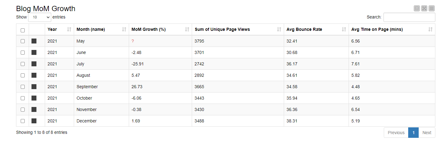
Month-over-month (MoM) web traffic in %
-
Why this is important: It will show how the blog is growing, and give insight into monthly trends. Getting this figure as a percentage lets me compare it more easily with industry benchmarks. Such insights will help me plan content better.
-
Why Google Analytics doesn’t quite hit the mark: In Google Analytics, this involves manually setting time frames for each comparison, and not all metrics can be combined in custom reports.
-
Why my workflow helps: I only need to do the manual work once, configuring the workflow to query Google Analytics correctly. And my dashboard can combine data from any level of Google Analytics. Even in custom-built GA reports, combinations of data are restricted depending on whether the data is user-level, session-level, or hit-level.
Average time spent and bounce rates
-
Why these are important: They should give me an indication of how interesting our content is. Are people arriving and staying to read, or are they arriving, looking, and leaving?
-
Why Google Analytics doesn’t quite hit the mark: While I can set a custom report to get me these figures and send a report to my boss to review, the report is static. She can’t delve deeper if she wants to compare a different time period.
-
Why my workflow helps: The dashboard produced by my workflow is interactive, enabling further analysis. I can also share it with my colleagues as a browser-based app.
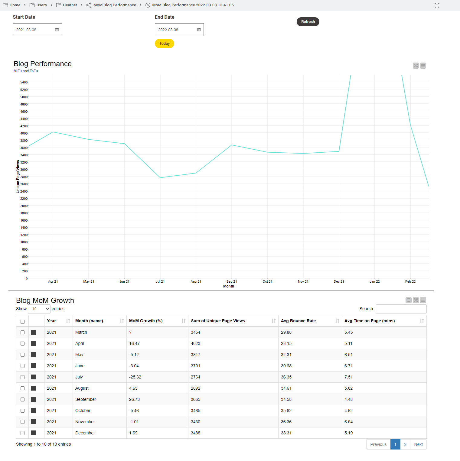
A dashboard as a browser-based app
The dashboard will be served up as a browser-based data app, giving my workflow an interface I and my colleagues can use to access and explore the data. I can construct this app within my workflow and share it by uploading it to a webportal. Anyone with the link can access the app independently, exploring the data for further analysis. We won’t need to have KNIME running in the background to use it. And in the future, if I need to adjust the underlying workflow, add more metrics, or change a chart, I can do so without bothering my colleagues, who can continue to access the app via the link.
Getting started with KNIME
I was not totally unaware of how to use KNIME, but I had never used it for a real-life project. So before I started building the workflow, I took advantage of these resources:
-
Self-paced online courses: I took L1 for Data Scientists and L1 for Data Wranglers, which covered most of what I needed to know to wrangle my project — connecting to databases, cleaning and filtering data, the basic concepts of data science and reporting. At the end I took the L1 Certification exam (free of charge) to check my knowledge.
-
KNIME Hub has hundreds of blueprints, which meant I didn’t have to start from scratch. I could explore and download marketing analytics workflows contributed by other marketers and business analysts, and get ideas for my own workflow.
-
Maarit Widmann, my mentor! I'm lucky enough to work with her directly, but she regularly teaches courses and her peers run Data Connects, where you can directly ask data scientists questions and discuss projects you’re working on.
From an outline to a complete workflow
Maarit suggested working out what I needed to do and creating these steps: 1. Access Google Analytics and get the data → 2 Explore the data to remove articles that conceal trends in the blog → 3. Get the data into the right format for calculations → 4. Calculate metrics and display them in a dashboard.
These four steps ultimately translated into different sections of my workflow. I’ll describe now how I got there, what was easy, and what stumbling blocks I encountered.
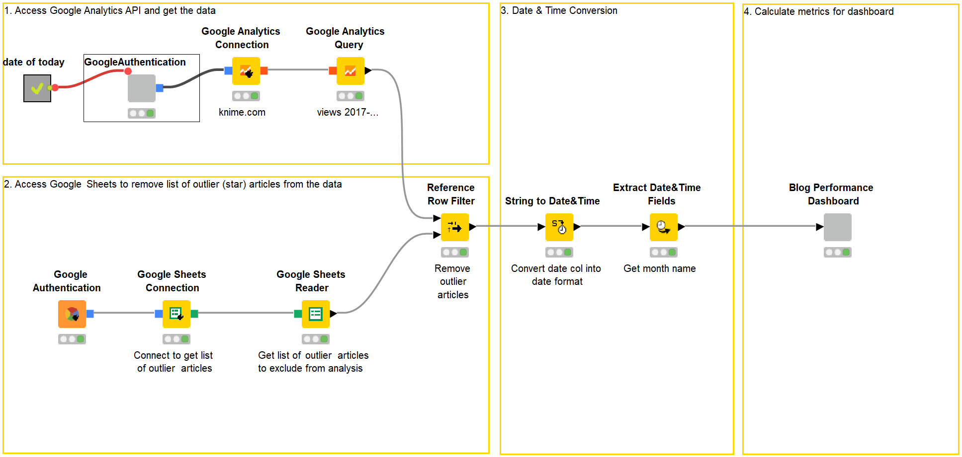
1. Connect to Google Analytics
There’s a lot of information on the Internet about APIs and why they are useful to marketers. It’s how platforms like Facebook, Twitter, & Co make data available to applications in our martech stack. Connecting to them sounds a little scary, so I was a bit concerned about this first step.
KNIME has a Google Authentication (API Key) for this, which lets you connect to various Google services. Before I could start configuring this node, I had to create a project on Google Cloud Console. I found some useful instructions on how to do this in blog articles about Querying Google Analytics and connecting to Google BigQuery, which I could adapt for my purposes.
However, I was able to benefit from using a so-called "component". One of my colleagues already had a workflow that connects to Google’s API. She preconfigured some nodes with the right settings to connect to the API and Google Analytics, and wrapped them together into a component. All I had to do was insert this component into my workflow, and I was ready to go.
After connecting to Google’s API, I needed two more nodes to connect with Google Analytics (the Google Analytics Connection node) and fetch the data I needed (the Google Analytics Query node). This is where the Querying Google Analytics article came in handy. To specify the metrics and dimensions for a query, you have to know the terms. I kept this overview of the names of dimensions and metrics on hand while doing this.
2. Remove articles that hide trends
Articles that perform well over a long time and one-off well-performing pieces are outliers and conceal the actual trends on a blog. To avoid distorting the picture, I had to remove them from my analysis. Checking the data makes much more sense than relying on my gut feeling.
Exploring the data in Google Analytics is very time-consuming — even just knowing what to include takes work. It’s much easier to maintain data tables about the best-performing pieces which you can then keep checking in on. You can then decide whether these potential outliers should be included or excluded from your KPI.
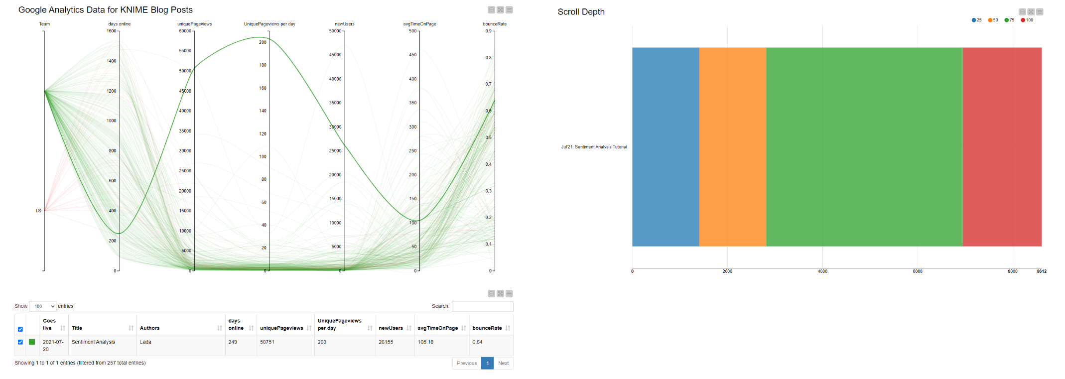
To explore the data, I used a data app developed by a colleague. It automatically collects data from Google Analytics once a week and shows blog views over time. On the left (in fig. 2), I can spot the outliers. Clicking the respective curve gives me the name of the article, which I can analyze further for scroll-depth (right). A good scroll-depth indicates that the article is not just being clicked on, but also read.
I used this app to identify five well-performing articles to remove from my analysis, and I then manually listed them in a Google Sheet. My workflow could now be configured to access this sheet (with the Google Sheets node), take whichever articles are listed there, and remove them. The Reference Row Filter node performs this task. Finding this node was my first major stumbling block. Searching the Node Repository for anything to do with “Row” helped me find it, but it took a lot of trial and error.
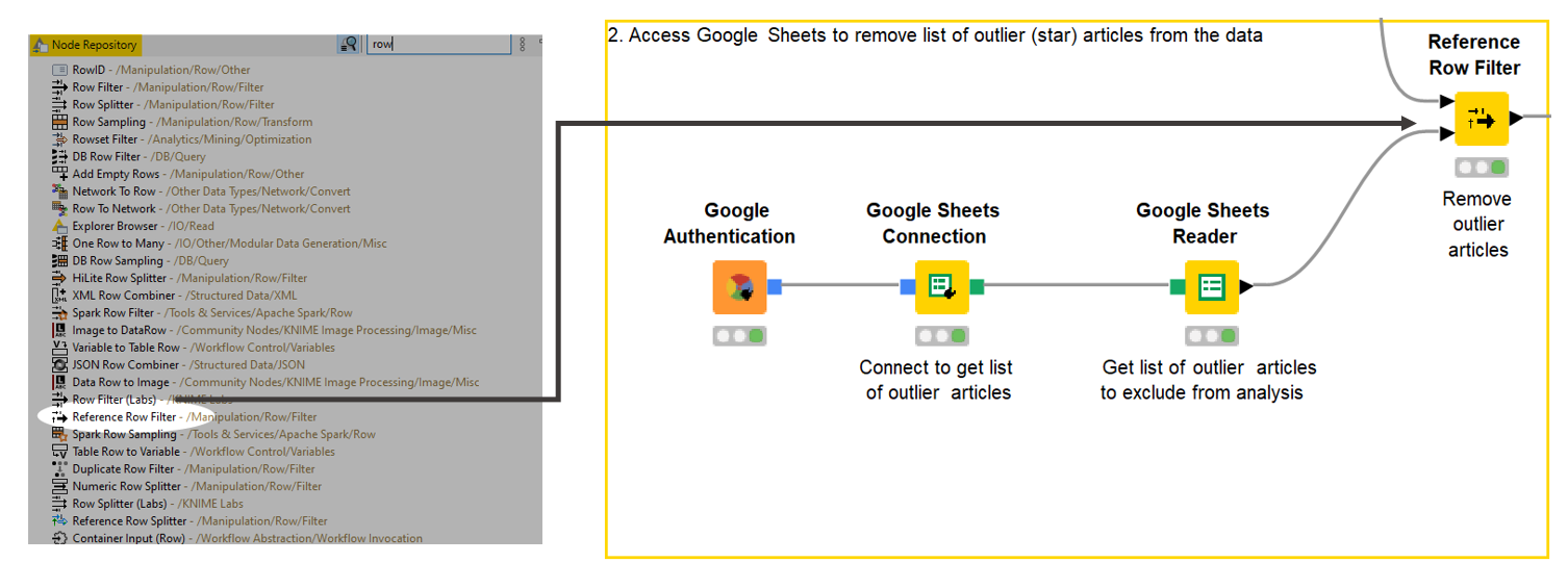
Tip: Setting the search box in the Node Repository to enable fuzzy searches was a useful hint I got on the Forum to make finding things easier. You get all the results for the word you enter, not just specific names.
3. Check the progress of my data
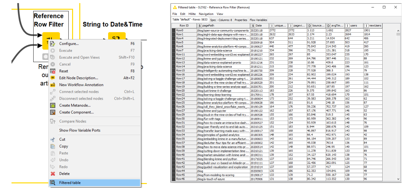
As the data about the articles flows through each node in the workflow, I can check how it’s looking. This helps me work out whether I’ve done something wrong — or even right! A right-click on the Reference Row Filter node and selecting “Filtered table” shows me all the articles with my list of outliers removed. I can see that the date column is a string. Maarit pointed out that I wouldn’t be able to set time frames in my interactive dashboard if the format of that column stayed as a string.
So I had to do a bit of so-called “data processing” and convert the date column — a “string” — into a “date” format to enable me to enter a given time frame for later analysis.
4. Calculate the metrics for my data app
Now to tackle the part I had been dreading: finding — and more importantly, configuring — the nodes to calculate the MoM comparison as a percentage and enable the app to fetch data for a given time frame.
Calculate MoM Growth
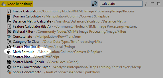
I found a formula to calculate MoM growth online (I’m not so hot at math). Searching the node repository for the respective node was time-consuming, since I used the wrong search terms (“MoM growth” and “Metrics”). Finally, the word “Calculate” brought up the Math Formula node.
Translating “Subtract the first month from the second month, then divide that by the last month’s total, then multiply the result by 100” into a mathematical expression was tricky. I had vague memories of formulas from school, but I needed help to configure the node. (Thank you, Maarit!)
Throughout my challenge, I kept forgetting that I had to tell the workflow each step of the process. For example, I discovered I needed another Math Formula node to convert the average time in seconds to minutes. I also stumbled when working out how to enter MoM growth percentage “one row down” in my table. Such a simple thing, but it was hard to know what to search for in the Node Repository. My mentors came to the rescue and told me about the Lag Column node to enter values “lagged” by one row.
Add interactive data app
Working out how to set the workflow to perform the analysis on any given time period was the most complicated step. How could I even begin to explain to the workflow which reference date it should use as a basis? I learned about variables: how to set them up, and how to configure nodes to take variables as input. To be honest, I found this really hard. The reference date problem was ultimately resolved when I was able to copy a colleague’s component that works out “today’s date.”
I found a solution of inserting interactive fields to set time frames by reading articles about the Wonderful World of Widgets. Designing the layout of a data app is explained clearly in the Cheat Sheet: Components with KNIME Analytics Platform. I liked the fact that I could preview all my layout designs by right-clicking “Interactive View.”
A shareable data app and lessons learned
After three weeks of working on this project alongside my normal day-to-day tasks, my shareable browser-based data app was ready.
My main stumbling block was “codeless does not mean mathless.” A lack of background in math made it harder to know what I needed to perform tasks. First of all, I didn’t think of names such as “Math Formula” to search for the right node in the repository. Secondly, it’s been a long time since I did any math in school, and I had forgotten things like how to order mathematical operations properly.
Developing a more logical approach to the required steps will help prevent stumbles in future, too. I frequently left out steps, then didn’t understand why the workflow wasn’t doing what I wanted. Maarit’s initial advice to break down my project into steps was spot-on. I realize now that going forward, splitting things into even smaller steps will help.
Non-technical marketers might shy away from learning a data science tool, fearing it will be too time-consuming, but a low-code environment helps here. It’s intuitive. If I needed to leave the project for a few days, it was easy to pick it up again later, with all my progress documented visually.
Shareable components were my friends, not just for getting non-technical people like me started, but also for easier team collaboration. Components can be built to bundle any repeatable operation. Standardized logging operations, ETL cleanup tasks, or model API interfaces can be wrapped into components, shared, and reused within the team.
Want to see the underlying workflow for my data app? You can download it from the KNIME Hub!