
For me, the data analysis is always the fun part. And it provides a lot of valuable information to enable the data driven decisions.
But the most important part is communicating the results effectively. Good data visualizations are key to showing insights and features that are difficult to point out in a raw table. They make it easier for users to detect patterns, trends, and outliers.
Data analytics has accompanied me for over 15 years already. I started my career as a data analyst in a controlling department and I now work as a data scientist providing consultancy services for a range of different fields. It’s my job to build solutions that surface actionable business intelligence in a way that is easy to understand with the right data visualization.
Here are my tips on how to match the right type of visualization technique to the character of your data.
Know your data: Is it univariate, bivariate, or multivariate?
It’s important to know the “character” of your data. Data scientists talk about your data being univariate, bivariate, or multivariate.
Univariate analysis is like looking at a single piece of the puzzle instead of the whole picture. Each puzzle piece – variable – is analyzed individually and we don’t look at more than one variable at a time. This type of analysis is the simplest form of analysis. It’s the type of data in which analyses are made based on only one variable.
With bivariate data your focus will be on exploring the relationship between two things, analyzing two variables to explore the association between them.
And with multivariate data you’ll be considering lots of different factors altogether. Your analysis will handle more than two variables and you’ll be dealing with multidimensional data.
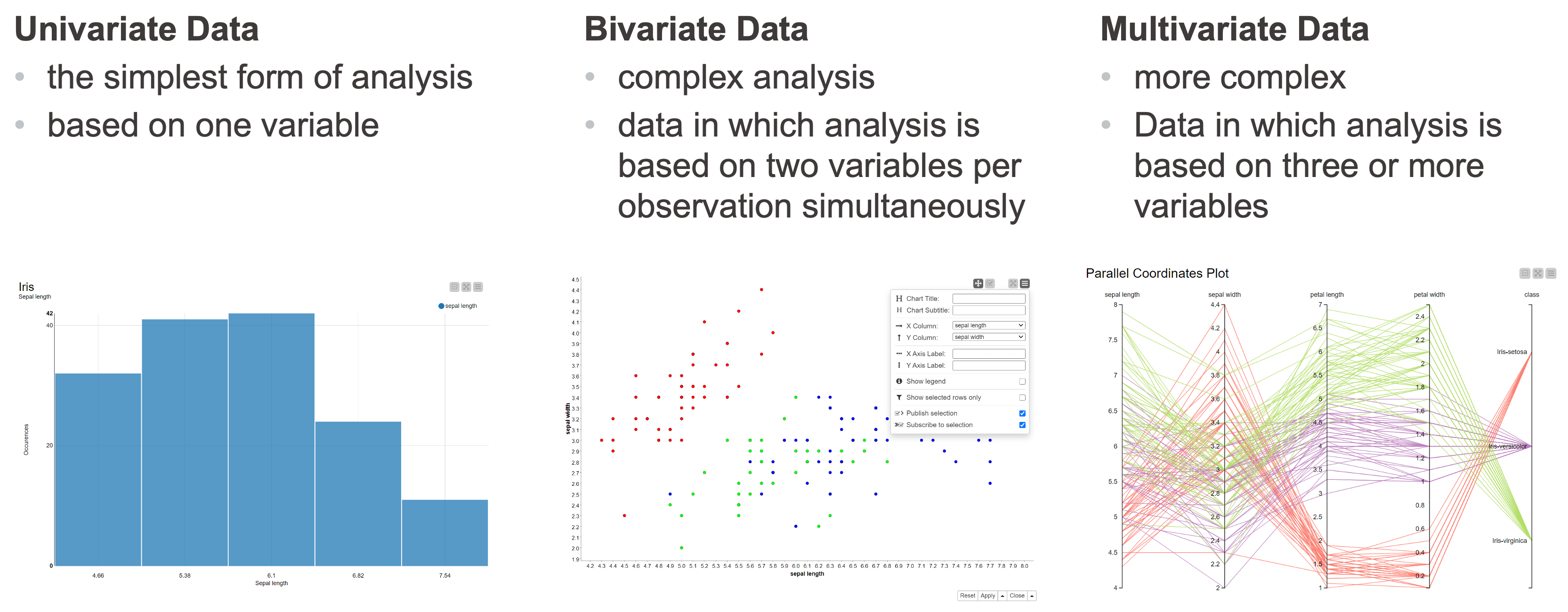
To determine whether your data is univariate, bivariate, or multivariate, you can use statistical techniques to know your data.
Choose the right visualization type
The visualization type will depend on what you want to show. There are three main categories:
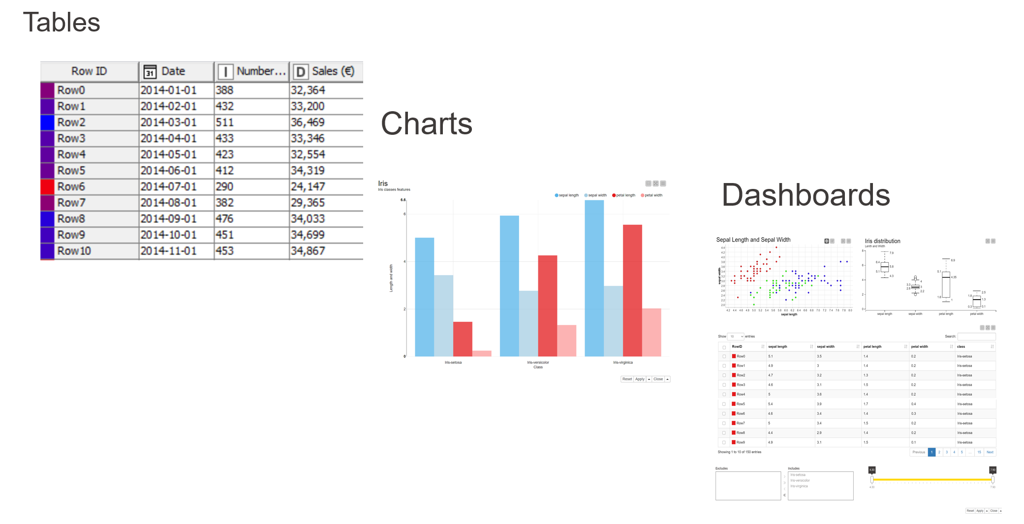
Tables
Tables are a two-dimensional array-like structure in which each column contains values of one variable and each row contains one set of values from each column. Rows include observations and are always in a standard structure, where the structure is given by the columns, illustrating values of different features of each observation. Tables enable accurate searches of a certain value or values.
Charts
Charts illustrate data in graphs or plots. It’s very important to select the right type, depending on what you want to show.
Evolution: Here you want to show how a certain series develops with respect to a second quantity. Popular charts for this are the line plot, area chart, and bar chart (vertical).
Distribution Here you want to illustrate how the data is distributed and compare data to learn how they differ from each other. Popular charts for this are the bar chart, histogram, box plot, violin plot, and statistical indicators
Relation: Here your aim is to show (the strength of) a relationship between two variables. Popular charts are the scatter plot, heatmap, and bubble chart.
Dashboards
Dashboards typically contain different visualizations. They are interactive and the dashboard should be sharable.
Static or interactive data visualization
When I’ve completed my data analysis results, I always ask myself “how should I present the results?”. Very often people just take a screenshot of the charts and present them in a PowerPoint presentation, or a PDF.
The problem here is that this is a static representation of the results and they cannot be presented in real time. We can only show the past.
Today, it is important to have the data and results available now and present them in real time.
When we run our visualizations as a browser-based application we are able to have the data and the results available immediately and present in real time. You can do this with data apps.
About Barbora Stetinova
Barbora has worked in the Automotive Industry for many years and has extensive experience in data science, machine learning and business intelligence, leading small teams, controlling, and developing strategical projects. She develops and publishes e-learning courses for Udemy and other similar platforms and cooperates on e-learning projects with Packt Publishing Hub that focus on data science with Python and KNIME Analytics Platform. She is motivated by learning new things, achieving goals, and helping others.
Get more visualization inspiration in Data visualization 101: 5 easy plots & charts.