
In today’s world, data helps us with almost everything, from making informed decisions to improving people's lives. The beauty of data is that the same dataset can be used to tell different stories. How can we tackle the challenge of work giving a voice to the important story in the data?
The key is to Know Your Data.
The first step to turning the information from your data into knowledge is to summarize and describe the data. This is important because not understanding your data can cause complications further down the road. It can lead to misinterpretations of the data and the existence of outliers. For example, when you build a machine learning model to learn a certain aspect from your data and predict or create a forecast, the existence of outliers can skew the accuracy of your model.
If you know your data – if you conduct a preliminary inspection of the data with descriptive statistics – this is easily spotted and treated.
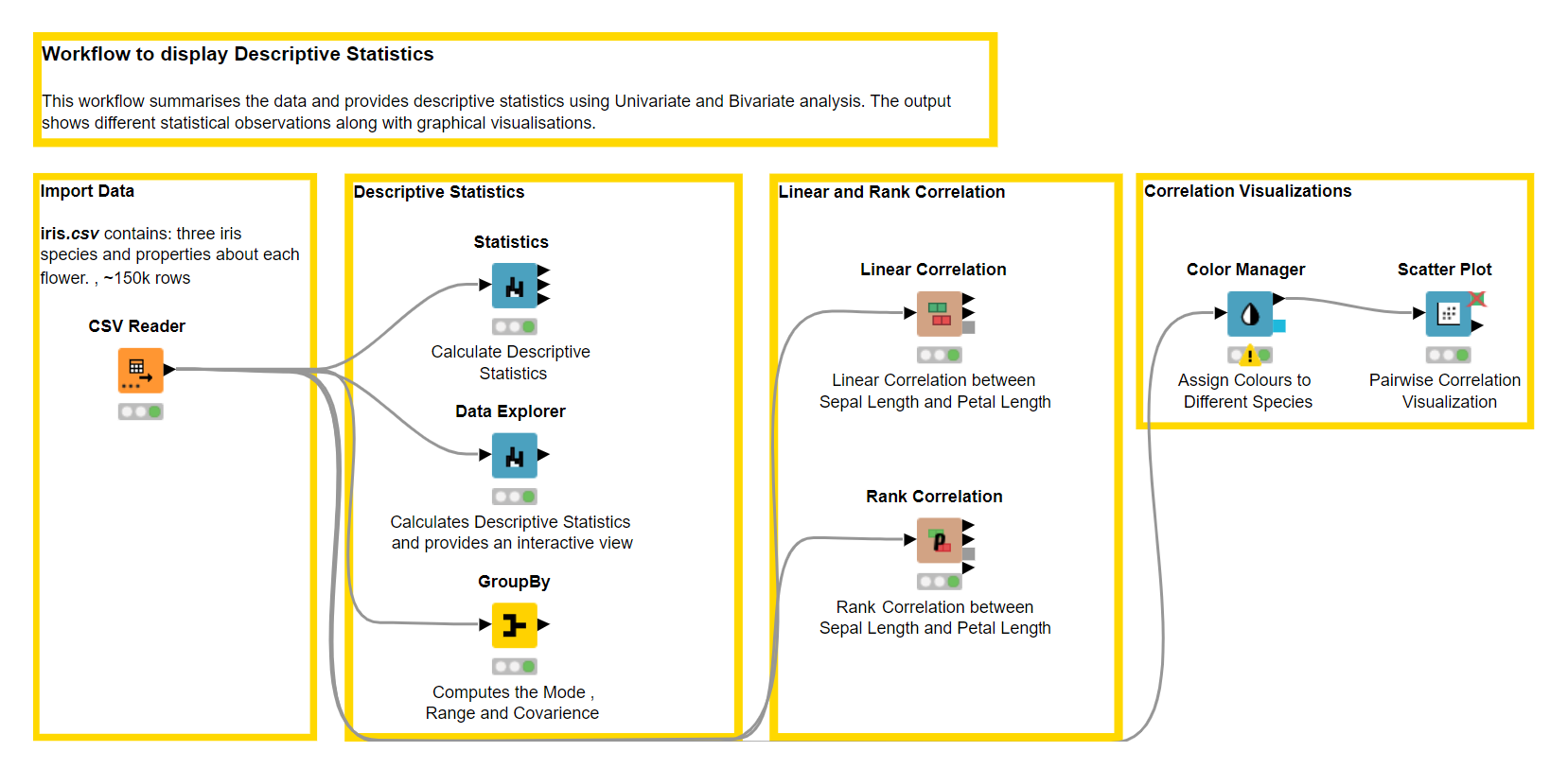
In this blog post, we want to show how you can use KNIME software to extract insights from the Iris.csv dataset by generating graphical and numerical summaries of the data. And in order to help explain the importance of descriptive statistics we will:
- Provide a theoretical background about univariate and bivariate descriptive statistics
- Provide an overview of the nodes we can use in KNIME Analytics Platform
- Build a workflow using KNIME
Tip: Download the Data_Summarization workflow for free from the KNIME Hub.
What is KNIME?
KNIME Analytics Platform is free and open-source software that you can download to access, blend, analyze, and visualize your data, without any coding. Its low-code, no-code interface makes analytics accessible to anyone, offering an easy introduction for beginners, and an advanced data science set of tools for experienced users.
Descriptive Statistics with KNIME
Descriptive statistics is used to describe the key features of your dataset. It helps understand your data better and present it in a more meaningful way. Descriptive statistics can be:
- Univariate – involving one variable
- Bivariate – comparing two variables to determine whether there are any relationships between them, or
- Multivariate – analyzing whether there are relationships between more than two variables
Univariate descriptive statistics encompasses: measures of central tendency, measures of variability, and measure of shape distribution and Bivariate descriptive statistics usually relies on correlation and covariance. In this blog, we will focus on univariate and bivariate descriptive statistics only, exploring these measures to understand them in detail.
Let’s first load the Iris dataset into KNIME Analytics Platform using the CSV Reader node. Below, you see a small snippet of the data.
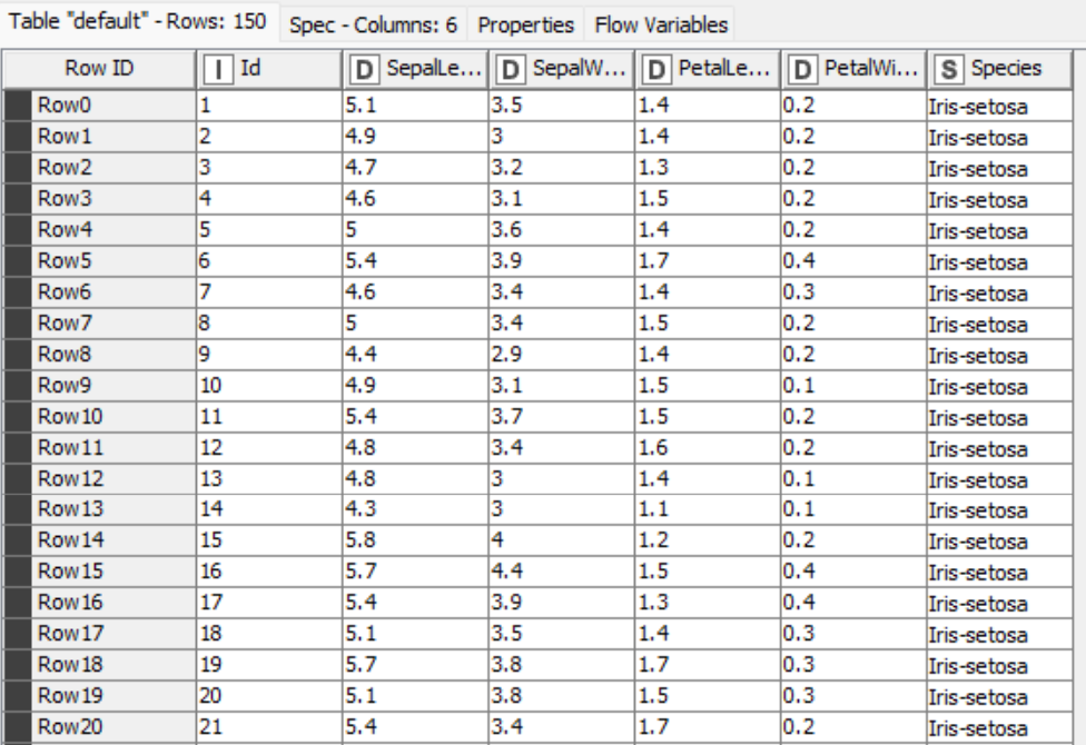
The Iris dataset was used in R.A. Fisher's classic 1936 paper, The Use of Multiple Measurements in Taxonomic Problems and can also be found on the UCI Machine Learning Repository. It includes three iris species with 50 samples each as well as some properties about each flower. The columns in this dataset are:
- Id
- SepalLengthCm
- SepalWidthCm
- PetalLengthCm
- PetalWidthCm
- Species
Next, we use KNIME Analytics Platform to get heaps of information to summarize our dataset, such as the minimum and maximum value, mean, standard deviation, variance, skewness and kurtosis, and much more with just a few clicks, using a handful of powerful nodes:
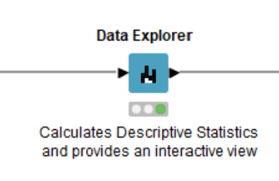
The Data Explorer node can be used for univariate interactive data visualization. This node provides us with different statistical properties, and histograms for numerical and nominal columns. The output port consists of a Filtered Table with the filtered columns the user chooses to retain in the interactive view.
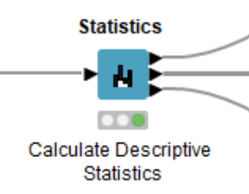
The Statistics node calculates different statistical moments such as minimum, maximum, mean, standard deviation, variance, median and so on. The key difference between the Data Explorer node and the Statistics node is that the Statistics node has three output ports consisting of the Statistics Table with numeric values; a Nominal Histogram Table with histograms for nominal value, and the Occurrences Table with all nominal values and their counts.
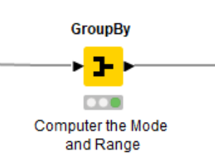
The GroupBy node groups the rows of a table by the unique values in the selected group columns and performs aggregations on columns that can be selected manually, by a user-defined pattern, or based on the data type. In descriptive statistics, we can use the GroupBy node to compute additional descriptive statistics, such as mode, range, and quantile, that are not available in the Statistics or the Data Explorer node.
Explainer: Univariate Descriptive Statistics
Univariate descriptive statistics refers to the analysis of one variable. Univariate analysis can be classified into three categories namely:
- Measures of Central Tendency which describes mean, median and mode
- Measures of Variability referring to the variance, standard deviation and range
- Measures of Shape Distribution that include skewness and kurtosis. In this section, we will focus on the Sepal Length column of the Iris dataset to explore univariate descriptive statistics.
1. Measures of Central Tendency
Measures of Central tendency describes the whole dataset with a single value that represents the center, or the middle of the distribution. The three main measures are the mean, median and mode.
Mean
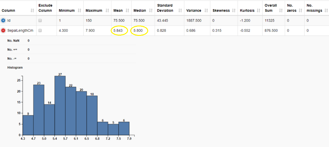
The mean is calculated by taking the sum of a set of values and dividing it by the total number of values. It is often referred to as the “average”. The advantage of mean is that it can be calculated for both continuous and discrete numeric data whereas, but we cannot calculate it when the data is categorical since the values cannot be summed. It is also important to note that when calculating the mean, we include all the values, and hence it can be influenced by the presence of outliers and skewed distributions. The mean of the sepal length is 5.843 cm.
Median
The median is the middle value in the dataset when the values are either arranged in ascending or descending order. The median is less affected by outliers and skewed data than the mean, and is usually the preferred measure of central tendency when the distribution is not symmetrical. The key disadvantage of median is that it cannot be calculated for categorical nominal data since it cannot be logically ordered. The median of the sepal length gives us the middle value in this data column which is 5.800 cm.
Mode
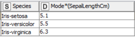
The mode is the most commonly occurring value in the dataset. Mode can be found for both numerical and nominal data. It is worth noticing that when calculating the mode there can be more than one in a selected column i.e, bi- or multi- mode. This can be detrimental when we want to describe the center value. When working with continuous data, where all values are more likely to differ, there may be no mode at all. In this case mean and median are a better choice to describe central tendency.
Using the GroupBy node we can calculate the mode for each class in a selected column. The table below displays the mode of sepal length for the three different Iris species.
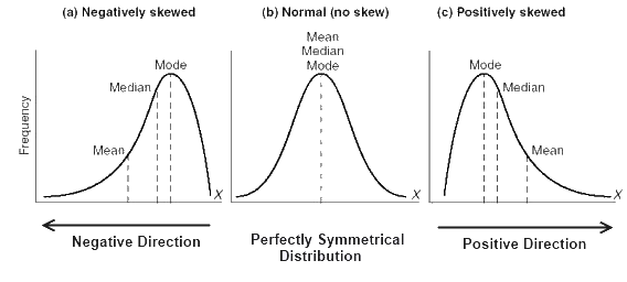
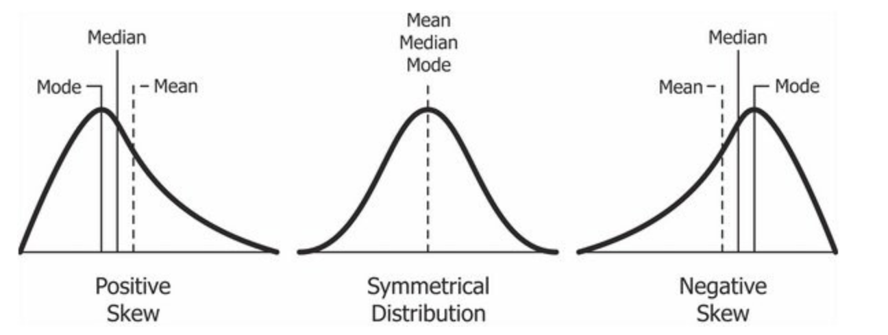
The figure below provides a visual representation of mean, median and mode when the data is symmetrical and not skewed, that is the data is normally distributed, and when the data is positively or negatively skewed.
2. Measures of Variability
Measures of Variability or Spread helps us summarize the data in such a way that it shows how scattered the values are and how much they differ from the mean. The most important measures are range, variance, and standard deviation. Measures of Variability are important because they tell us how well we can generalize results from our sample to the population.
Range
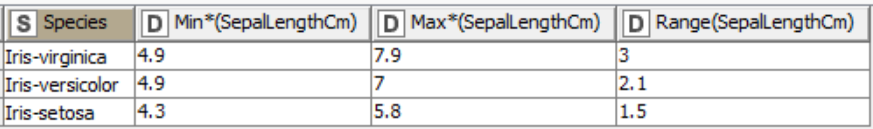
The range describes the spread of the data from the minimum value to the maximum value. It can be calculated by subtracting the lowest value from the highest value. In our example, the minimum sepal length is 4.300 cm, and the maximum is 7.900 cm, and so we get the range as:
7.900 - 4.300 = 3.600
Hence, the range of our data for the Sepal length column is 3.600cm. The range is useful to understand the span of the distribution but it is influenced by outliers.
Using the GroupBy node we can group the column into different species and find the range of sepal length for each species.
Variance and Standard Deviation
Variance and standard deviation describe how close each value is to the mean, giving a hint of how dispersed the data is.
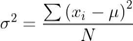
Variance describes the degree of spread in the dataset, and is calculated by taking the average of squared deviations from the mean. The more the spread of data, the larger the variance is in relation to the mean. It is calculated using the formula below:
-
σ is the population variance
-
N is the size of the population
-
xi is each value from the population
-
μ is the population mean
Standard deviation is derived from variance by taking the square root of variance. It measures the dispersion of the dataset from the mean. If the data points are away from the mean, the standard deviation is higher, i.e, the more the data is spread out, the higher the deviation. Standard deviation is calculated with the following formula:

-
σ is the population standard deviation
-
N is the size of the population
-
xi is each value from the population
-
μ is the population mean
When the data is less spread, its values are closer to the mean, suggesting that the variance and standard deviation are also small. When the data is spread out, its values are “far away” from the mean, and hence the variance and standard deviation are larger. The mean value is a more representative measure when the variance and standard deviation are small. If all data points have the same value, then the variance and standard deviation are equal to zero.
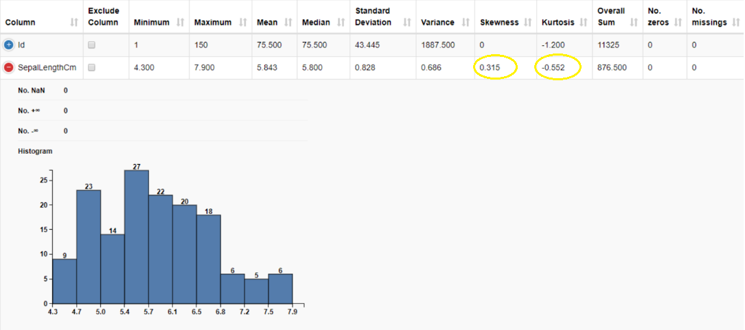
We can compute the variance and standard deviation using the Data Explorer node. The variance of sepal length is 0.686 cm2, and its standard deviation is 0.828 cm.

How do we decide which one to use? Variance is expressed in squared units (e.g, km2, min2), whereas standard deviation is expressed in the same units of the original dataset (e.g., km, min). As such, standard deviation is often preferred because it’s easier to interpret. Although the units of variance are harder to intuitively understand, variance is important in statistical tests.
3. Measures of Shape Distribution
Measures of shape distribution are useful if we want to test whether the data follows a normal distribution. Histograms are typically used to visually evaluate the shape of the distribution, but if we are interested in a more precise evaluation, we need to introduce the concepts of skewness and kurtosis.
Skewness
Skewness is a measure of the symmetry or asymmetry of a distribution. The data is considered symmetric if its skewness is close to zero. If skewness is > 0, the data is not symmetric, and it is said to be positively skewed or right-skewed, that is the tail of the distribution is on the right. If the skewness value is

- μ̃3 is the skewness
- N is the number of variables in the distribution
- Xi is a random variable
- X̅ is the mean of the distribution
- σ is the standard deviation
To understand and interpret the severity of skewness, we can use the following rule of thumb:
- If the skewness is between -0.5 and 0.5, the data is fairly symmetrical.
- If the skewness is between -1 and -0.5 or between 0.5 and 1, the data is moderately skewed.
- If the skewness is less than -1 or greater than 1, the data is highly skewed.
To understand skewness better, think of exam results of college students. For a particularly difficult exam, student grade distribution is generally positively skewed: the majority of students tend to obtain low grades, and only few of them manage to obtain high grades. Similarly, for an easy exam, student grade distribution is negatively skewed: the majority of students tend to obtain high grades, and only few of them do not.
Kurtosis
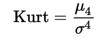
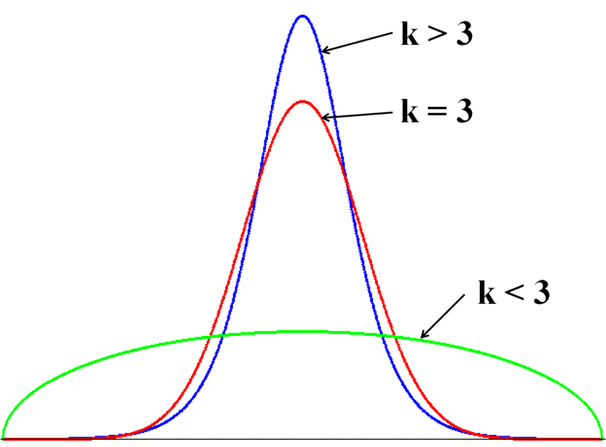
Kurtosis tells us how heavily the tails of a distribution differ from the tails of a normal distribution. Kurtosis is a measure of the combined sizes of the two tails. The value is often compared to the kurtosis of the normal distribution, which is equal to 3, also known as mesokurtic distribution. If the kurtosis is greater than 3, also known as leptokurtic distribution, then the dataset has heavier tails than a normal distribution which is referred to as positive kurtosis. If the kurtosis is less than 3 also known as platykurtic distribution, then the dataset has lighter tails than a normal distribution which is referred to as negative kurtosis. Kurtosis is often used to check for the existence of outliers in the dataset, and larger kurtosis indicates a more severe outlier problem. Kurtosis can be calculated using the following formula:
- Kurt is the kurtosis
- μ4 is the fourth central moment
- σ4 is the standard deviation
Using the Data Explorer node, we can compute skewness and kurtosis of the sepal length column. Skewness is 0.315, suggesting a fairly symmetric data distribution. We have a negative kurtosis of -0.552, implying that this is a “light-tailed” column. Light-tailed means that the distribution has lighter tails than the normal distribution. As a result, more data values are located near the mean and less data values are located on the tails.
Explainer: Bivariate Descriptive Statistics
Unlike univariate descriptive statistics, bivariate descriptive statistics is concerned with two variables to determine whether there are any relationships between them. For this section, we will consider the columns Sepal Length and Petal Length, and dive deep into the concepts of covariance and correlation.
Covariance
Covariance is the measure of how two random variables vary together. Covariance can be calculated with the following formula:

- covx,y is the covariance between variable x and y
- xi is the values of the x-variable in a sample
- x̅ is the mean of the values of the x-variable
- yi is the values of the y-variable in a sample
- y̅ is the mean of the values of the y-variable
- N is the total number of data values
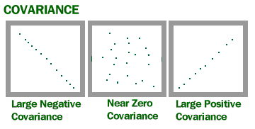
If an increase (decrease) in one variable reflects an increase (decrease) in the other variable, then both are said to have a positive covariance (> 0). On the other hand, if an increase in one variable reflects a decrease in the other variable, they are said to have a negative covariance (
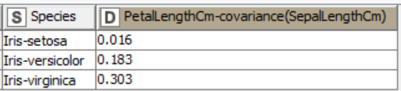
For example, in the Iris dataset we can calculate and look into the relationship of Sepal Length and Petal Length for different species using the GroupBy node. In the table below, we can see that Iris-versicolor and Iris-virginica have positive covariance. This means that an increase in Petal Length follows an increase in Sepal Length. On the other hand, for Iris-setosa, we observe a covariance value close to 0, indicating independence of the two variables.
Covariance helps us to understand how variables react to change. It is also important to note that the presence of outliers can affect the value of covariance since they can overstate or understate the relationship dramatically.
Correlation
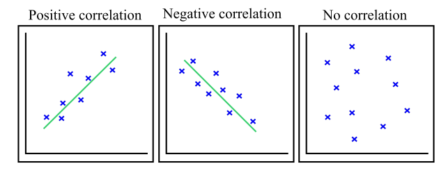
Correlation is a function of the covariance, and measures both the strength and the direction of the relationship between two random variables. In terms of the strength of the relationship, correlation is bounded in the range of -1 (negative correlation) to +1 (positive correlation). A correlation coefficient of 0 indicates absence of correlation. In this section, we will look into Linear and Rank Correlation.
Linear Correlation
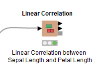
Linear correlation exists if the ratio of change between the two variables is constant. We can use the Linear Correlation node to find if the Sepal length and Petal length are linearly correlated. This node uses Pearson's correlation coefficient, one of the most widely used correlation statistics to measure the degree of the relationship between linearly related variables.
The formula for calculating the Pearson's correlation coefficient is given by:

-
r is the correlation coefficient
-
xi is the values of the x-variable in a sample
-
x̅ is the mean of the values of the x-variable
-
yi is the values of the y-variable in a sample
-
y̅ is the mean of the values of the y-variable
The linear correlation matrix shows the strength of association (+/-) between pairs of variables and also indicates a predictive relationship, e.g. the longer petal length is, the longer the sepal length is. We can find the exact linear correlation coefficient in the node output table. The correlation coefficient between sepal length and petal length is equal to 0.87 which indicates a strong positive linear correlation.


Rank correlation
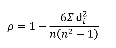
Rank correlation is another method for calculating the correlation coefficient. We can use the Rank Correlation node to calculate the strength and the direction of the monotonic relationship between the two variables, and for this we use the Spearman's correlation coefficient. Monotonicity is less restrictive compared to a linear relationship and the Spearman's correlation coefficient is less sensitive to the influence of outliers as it limits the outlier to the value of the rank. The formula for calculating the Spearman's correlation coefficient is given by:
-
is the Spearman's rank correlation coefficient
-
di is the difference between the two ranks of each observation
-
n is the total number of observations
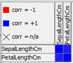
We can inspect the rank correlation table output by the Rank Correlation node, which returns a high correlation value of 0.88.

Note that the node allows for the calculation of additional correlation coefficients, such as Goodman and Kruskal's gamma, and Kendall’s tau. Goodman and Kruskal's gamma tells us how closely two pairs of data points match and is useful when there are many tied ranks in the dataset. It is also particularly advantageous when there are outliers since it is not affected by them. Kendall’s tau is used to understand the strength between two variables which are either continuous or ordinal and have a monotonic relationship.
Visualization
To visualize the linear correlation between the two variables we can color code the data points for each species and plot them using the Scatter Plot node.
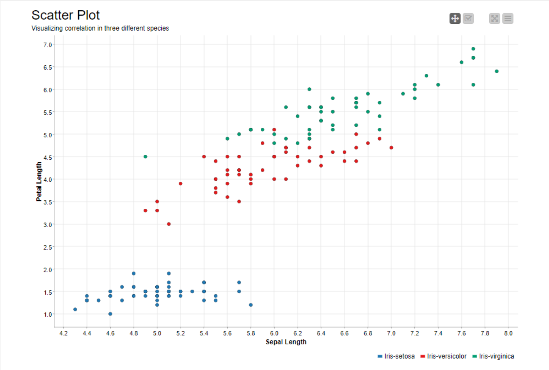
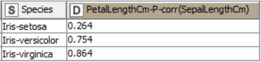
We can see that the scatter plot of the Iris-setosa data points (blue colored) show very low positive correlation. This is confirmed by a low correlation coefficient of 0.264. On the other hand, the other two species, Iris-versicolor and Iris-virginica, show high positive correlation coefficients. This can also be seen in the scatter plot, where Sepal Length strongly changes together with Petal Length.
The Importance of Descriptive Statistics
In this blogpost, we illustrated how to obtain descriptive statistics measures and why they play a key role in understanding your data. We've looked into not only the theoretical aspects of different measures in univariate and bivariate descriptive statistics but also how they impact our understanding of the data.
We described the Measures of Central Tendency, Measures of Variance and the Measures of Shape Distribution, and how these measures can be used to summarize and extract insights from raw datasets. We explored the relationship between two random variables, and the meaning of this relationship through Correlation and Covariance.
We also show how to implement them using KNIME Analytics Platform in a codelss fashion. We explored various powerful nodes that we can use to obtain descriptive statistics such as the Data Explorer node, the Statistics node and also the Groupby node for univariate analysis, and further the Linear Correlation node and Rank Correlation node for bivariate analysis. We also used the Scatter Plot node to visualize the linear relationship between two variables.