Time series: Reading the story hidden in sequential data
Every day, thousands of sensors record temperatures, CO2 levels, and sea heights. Each measurement on its own tells you very little. But line them up over years and decades, and patterns start to emerge. This is time series analysis: studying data collected over time to spot trends, seasonal patterns, and anomalies.
Climate scientists use it to separate what's normal (seasonal temperature swings) from what's not (a steady upward trend over 150 years). Businesses use the same approach to spot shifts in sales or forecast demand.
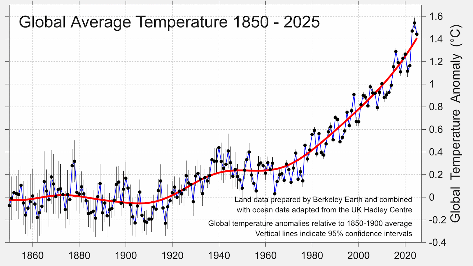
A single warm January doesn't prove global warming. A single cold snap doesn't disprove it. What matters is the long-term direction. Scientists use moving averages to strip away the noise (random variation) and reveal the signal (the real trend). The lesson for anyone working with data: don't react to individual spikes. Look for the trend underneath.
When data makes the invisible visible
Ed Hawkins, the climate scientist behind the famous "warming stripes" visualization, turned decades of global temperature data into a single, instantly readable image. No axes, no labels — just a sequence of colored stripes from blue (cooler) to red (warmer).

It's a powerful example of how the right visualization can communicate a time series trend more clearly than any chart. The stripes have appeared on everything from the cover of The Economist to scarves and murals around the world.
Worth reading: The Signal and the Noise
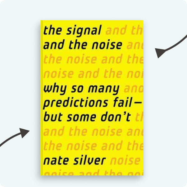
Nate Silver explores why so many predictions fail — from financial crashes to earthquake forecasting — and what separates good predictions from bad ones. The core message connects directly to time series analysis: the world is full of noise, and finding the real signal takes patience, humility, and the right approach.