
The focus today is to show how to perform data exploration and visualization on a large dataset using KNIME Big Data Extensions and make the whole process interactive via the KNIME WebPortal. The data that we will use is the hugely popular NYC taxi dataset.
The idea of this workflow is to explore the taxi dataset step by step. We start with a general overview of the entire dataset and then, in the following step, we filter directly right on the interactive view, e.g select the specific years we want information on, or choose a particular taxi type, then zoom in on the particular subset of data that we are most interested in. The next step involves visualizing the selected subset subsequently. The last step shows visualizations of taxi trips of a certain taxi type in a specific certain NYC borough over during certain years. All the visualizations are accessible via the KNIME WebPortal and the computation is done on a Hadoop cluster using the KNIME Big Data Extension.
The NYC taxi dataset contains over 1 billion taxi trips in New York City between January 2009 and December 2017 and is provided by the NYC Taxi and Limousine Commision (TLC). It contains not only information about the regular yellow cabs, but also green taxis, which started in August 2013, and For-Hire Vehicle (e.g Uber) starting from January 2015. In the data, each taxi trip is recorded with information such as the pickup and dropoff locations, datetime, number of passengers, trip distance, fare amount, tip amount, etc.
Since the dataset was first published, the TLC has made several changes to it, e.g renaming, adding, and removing some columns. Therefore, a few additional ETL steps are needed before analyzing the data. This part is executed in the preprocessing workflow.
To summarize - what this workflow does is:
- Get the dataset URLs from the official website and load them into Apache Spark for preprocessing
- The preprocessing includes unifying similar or equivalent columns (names, values, data types), reverse geocoding (assigning GPS coordinates or location IDs to their corresponding taxi zones), and filtering out values that don't make sense
- Finally, the cleaned data are stored on an Amazon S3 bucket in Parquet format, ready for further analysis which we will discuss in detail below
Workflow Overview
Let’s have a look at the analysis workflow, shown in Figure 1. At the beginning, we are presented with an option to use a local or remote environment for the execution of the Spark jobs.
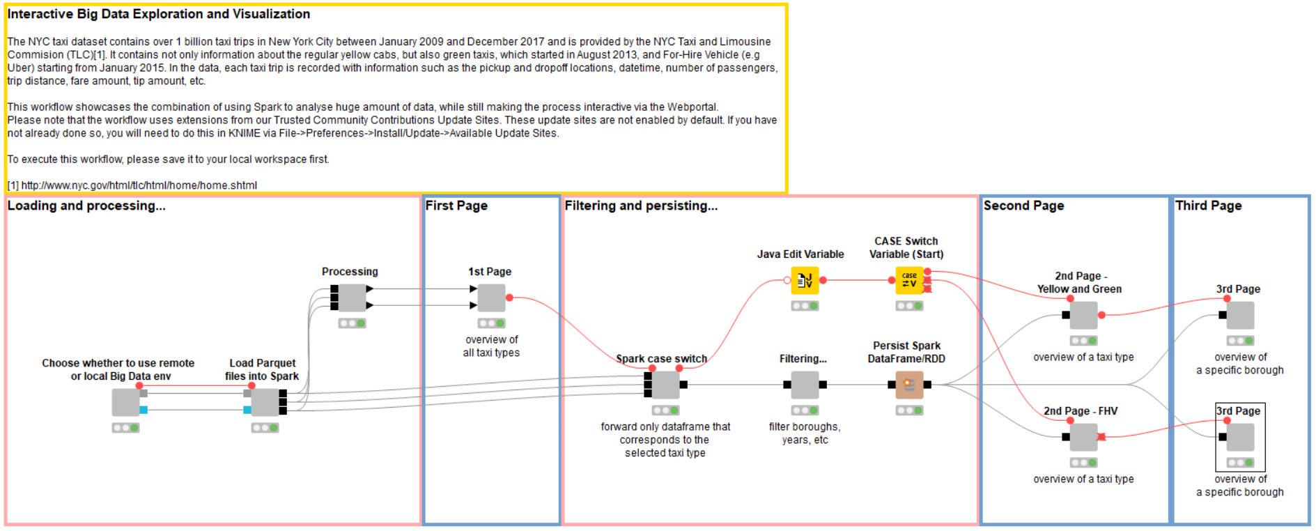
This workflow uses the new Create Spark Context via Livy node, which enables us to use Apache Livy, an open source REST interface for interacting with Apache Spark, to run all Spark jobs.
Create Local Big Data Environment
The good news for those of us who don’t have access to an Apache Hadoop cluster: you can now use the Create Local Big Data Environment node to construct a fully functional local big data environment right on your machine that includes Apache Spark, Apache Hive, and HDFS.
If you are running a Hadoop cluster with Livy installed, then select the remote option, and add the cluster information in the dialog of the Create Spark Context via Livy node. The input requires a connection to the remote file system where the dataset is stored. In the preprocessing workflow mentioned above, we store the preprocessed dataset in an Amazon S3 bucket, so we need an Amazon S3 Connection node here (you would need to input your own Amazon S3 credentials in the node dialog). If you don’t have a cluster and prefer to run everything locally, we provide a sampled dataset in Parquet format in the workflow folder, ready to be loaded into Spark.
Parquet Files to Spark Dataframes
The next step is to load the preprocessed Parquet files into Spark dataframes. Each taxi type is stored in one Parquet file, and each file is loaded onto a Spark dataframe, so at the end we have 3 Spark dataframes, each containing one taxi type. The reason we store each taxi type in a separate dataset is because each type has (slightly) different columns which would result in a giant table with many columns containing mostly missing values should we merge all of them into one dataset.
Visualization on the KNIME WebPortal
Now that we have loaded the dataset, it's time to do some visualizing (or more preprocessing) which we do via KNIME WebPortal! KNIME WebPortal is an extension to KNIME Server, providing a web interface that lists all accessible workflows and enabling you to execute them and investigate the results.
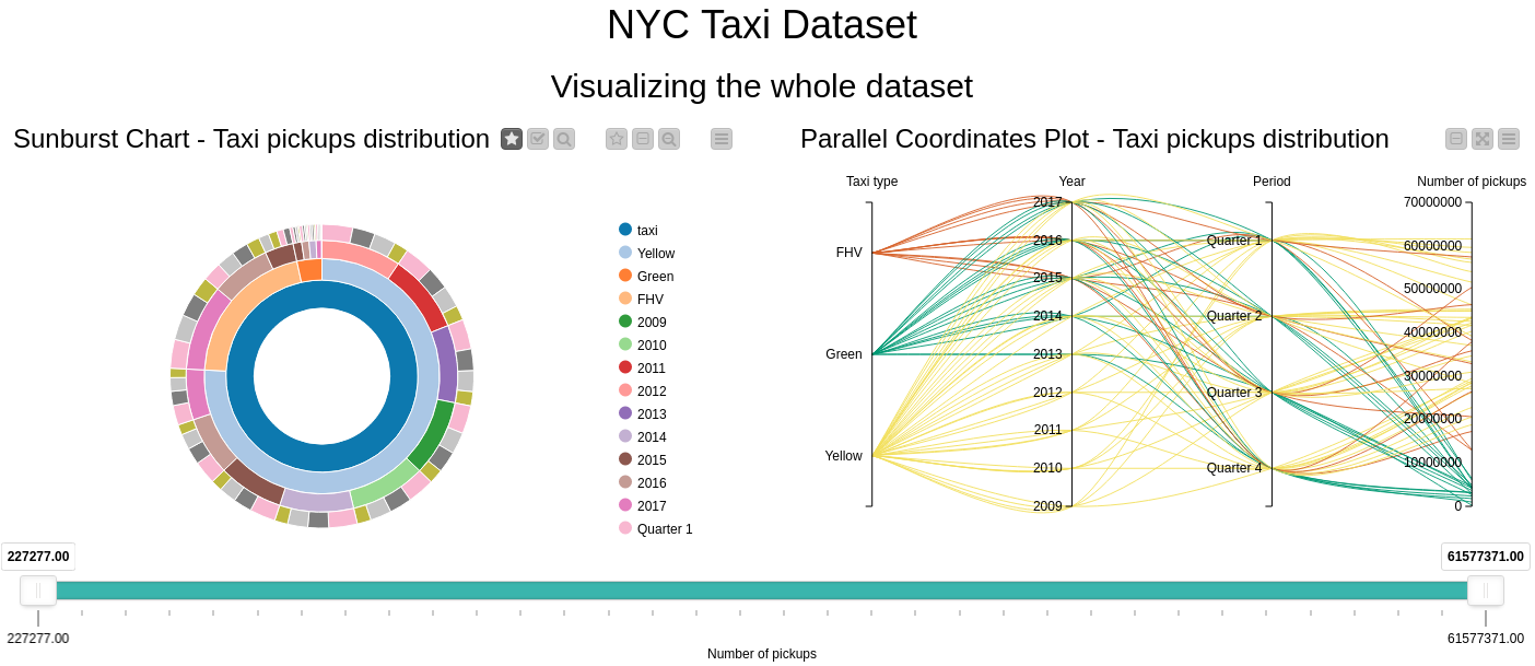
First Page - Visualizing and Comparing Taxi Types
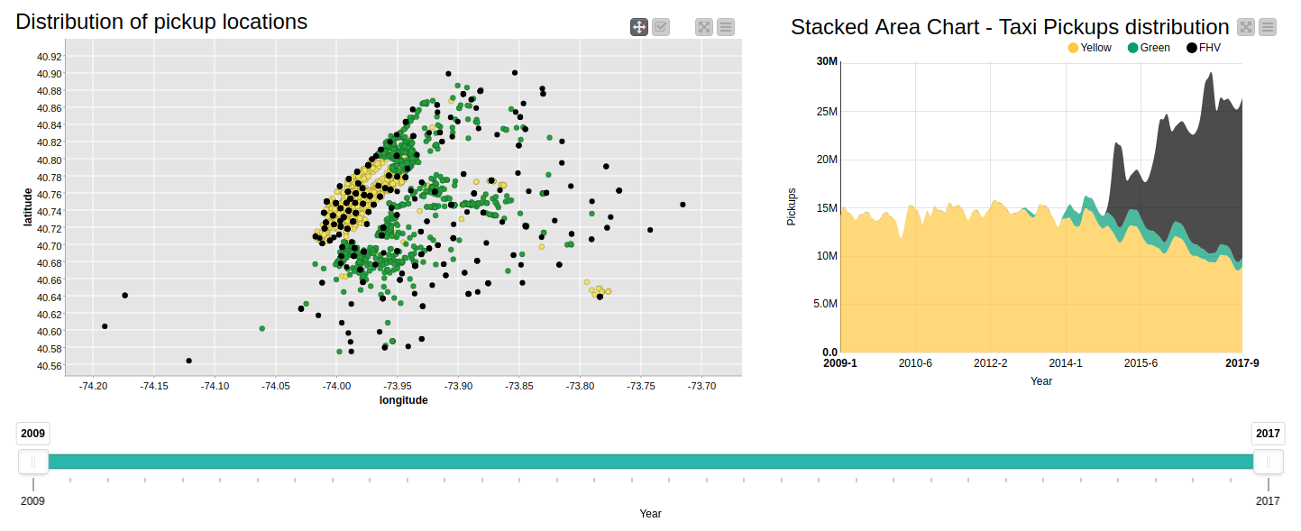
The first page visualizes each of the taxi types and compares them (see Figure 2). For example, a scatter plot with longitudes and latitudes as the axis shows the distribution of pickup locations of each taxi type. We can see that the plot slightly resembles the area in NYC where the yellow cabs are mostly concentrated i.e. Manhattan, and fewer taxis outside of it. Note that because of the huge size of our data, it is not possible to fit all of the locations in the scatter plot map, hence this chart shows only a distribution of sampled data.
You can also see a Stacked Area Chart, which shows the yearly pickups distribution for each taxi type. We can see here that the yellow taxi was the sole taxi operator in the game until 2013 when it started to slowly decline because of the green taxis entering the competition. Business obviously got even worse from 2015 when the For-Hire taxis (depicted in black) began operating. The charts are interactive so users can filter the number of pickups or years, and the charts will react accordingly.
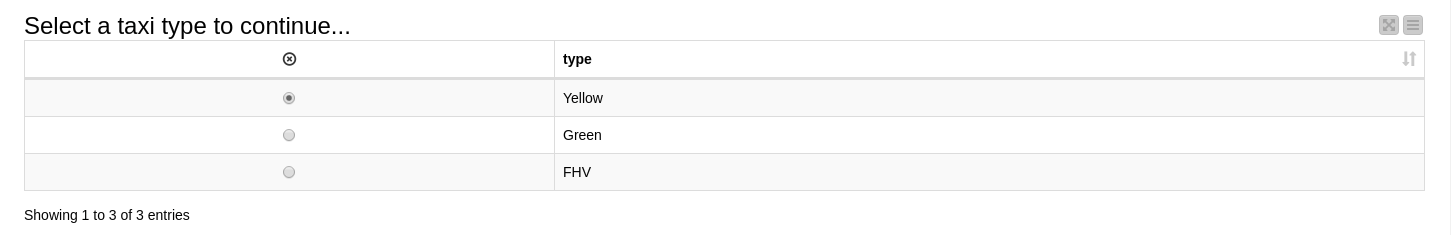
At the bottom of the page is an option to choose a particular taxi type to investigate more in depth results. Note that the dataset can also be filtered according to the selected years. We might want to check out the slowly declining yellow cab activities between 2009 and 2017, for example.
Second Page - In-depth Visualizations by Taxi Type
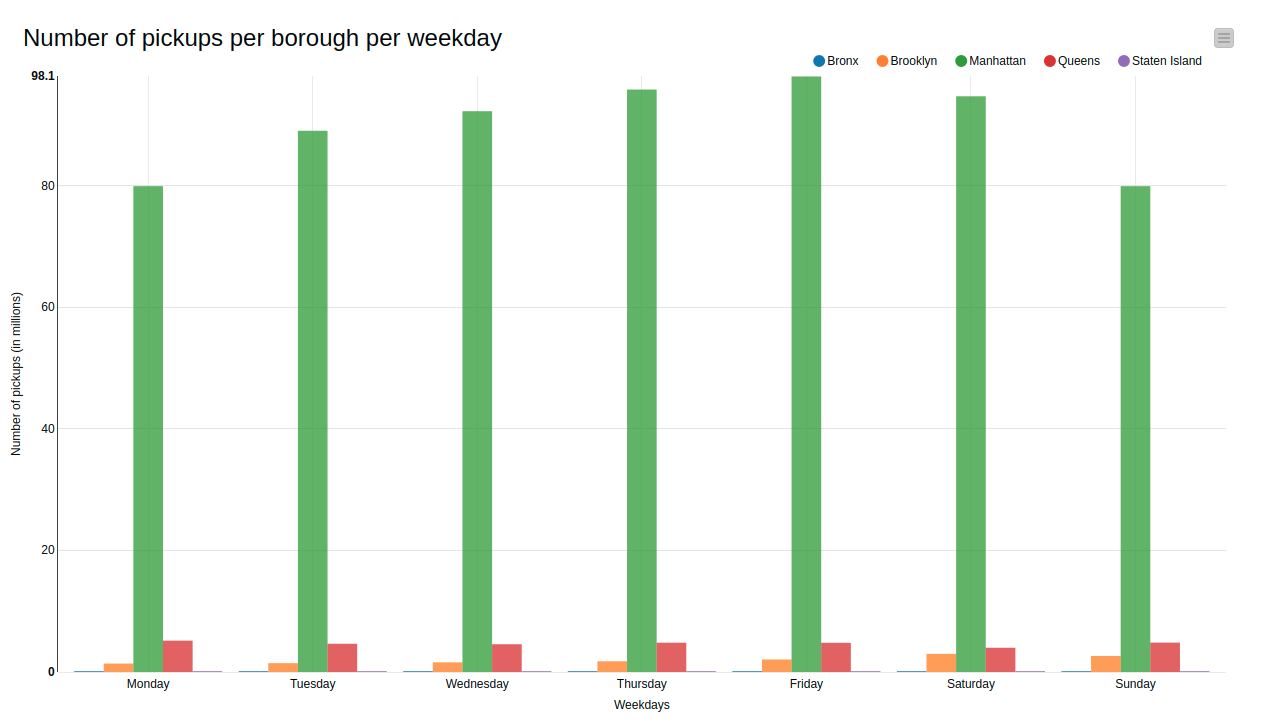
The second page displays the activities of yellow taxis in more detail in all of the five NYC boroughs. Figure 3 shows one of the available graphs, which features the number of pickups in each borough for each weekday. Apparently, even though yellow taxis are technically allowed to operate anywhere in the five boroughs of NYC, there tends to be a huge concentration of pickups in the Manhattan area (green bar), which is way more in comparison with the rest of the boroughs. One reason is because there is always a high demand for cabs in Manhattan, being the center of the metropolis, so taxi drivers tend to cluster there where they can easily pick up passengers. Another reason is perhaps because green taxis started up operations to serve the other boroughs and are therefore not allowed to serve most of Manhattan (northern Manhattan is the exception).
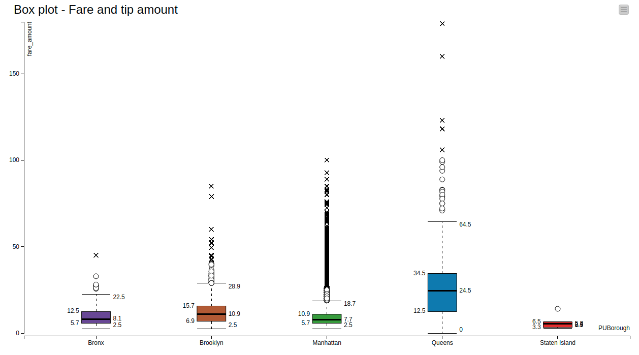
Another graph from the second page is the Box Plot in Figure 4, which shows the distribution of fare trips per borough. Manhattan (green box) interestingly has the lowest fare median in comparison to other boroughs, while it also has the most and highest extreme outliers. Low fare median could mean that most trips in Manhattan are short trips, while the outlier values might represent occasional longer trips that were taken from Manhattan to other boroughs, or even to other cities. Staten Island (red box) has mostly uniformed fares, where perhaps most taxi trips stay inside the borough.
At the end of the page, there is an option to choose to view the taxi activities in a particular borough. Since the yellow taxis mostly operate in Manhattan, we will choose Manhattan and see more about this borough in detail on the third page.
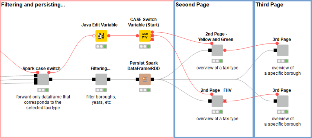
Going back to the workflow, after choosing a certain taxi type, we forward only the dataset of the selected type, and then proceed to filter the years according to the years we have selected (see Figure 5). At this point we use the Persist Spark DataFrame/RDD node to persist (cache) the filtered dataset. This trick is needed because the DataFrame we have at this point will be used in several visualizations. Due to lazy execution in Spark all previous operations would be executed several times if we didn’t cache the result.
Third Page - Activities and Growth by Taxi Type and Borough
This page is the last page and provides more insight into the activities and growth of a specific taxi type in a certain borough, selected in the previous pages.
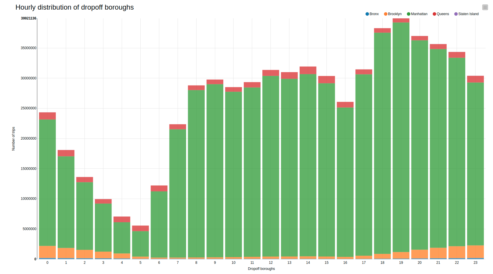
The bar chart in Figure 7 shows the distribution of drop-off boroughs when the pickup location is Manhattan. It seems that most of the trips tend to stay inside the borough, which would explain the low fares earlier. However depending on the hour of the day, people would venture more out of Manhattan, especially in the evening until late at night.
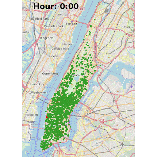
Another highlight of KNIME WebPortal is that it can display an animated GIF created in the workflow, as shown in Figure 8. The GIF animates pickups locations around the Manhattan borough at all hours. The red dots represent a larger concentration of pickups in near proximity in a certain area.
Note: To create the GIF in the interactive view, we first need to create the images (one image for each hour) and put them together in the correct order in one column. Later we use the Java Snippet node to generate the GIF and convert it into a base64 encoded string, which then can be visualized using the the Generic JavaScript View node. To write the hour on the images, the KNIME Image Processing plugin and its ImageJ bigintegration can be used.
Summary and Conclusion:
The point of this post was to explore and visualize data interactively from a large dataset using KNIME Big Data Extensions and the KNIME WebPortal.
First we described how to preprocess the data before storing it as Parquet files in the S3 file system. This included unifying similar or equivalent column names, reverse geocoding, and filtering out nonsensical values.
We used the Create Spark Context via Livy node to interact with Apache Spark running on an Amazon EMR cluster.
We also described the Create Local Big Data Environment node to create a fully functional local big data environment on our machine that includes Apache Spark, Apache Hive, and HDFS.
In the final step, you can see how easy it is to combine the visualization capabilities of the WebPortal with the distributed processing power of the Big Data Extensions.
We visualized subsets of the data interactively via KNIME WebPortal to show comparisons of taxi types, distributions of pickup locations in different graphs. We went on to provide more individual and in-depth visualizations according to specific specifications. All the preprocessing was done at scale using KNIME Big Data Extensions.
It was a relatively simple process to create a workflow that enables users to show the results of their data exploration in a variety of different visualizations and pushing down the data processing into Apache Spark. We hope you will enjoy using this example workflow to try out your own visualizations.
The workflow is available on the KNIME Hub here
Requirements:
- KNIME File Handling Nodes (KNIME & Extensions)
- KNIME Big Data Extension
- KNIME Image Processing and its ImageJ integration (https://www.knime.com/community/imagej)