
During her degree in Mathematics, Swetha Kannan gained considerable experience in applying a wide range of data analytics tools – from spreadsheets, and scripting languages, to low-code data science tools – to solve diverse challenges in mathematical modeling, numerics, and statistics. She enjoys using her experience to identify the best tool for the task at hand. In this article, she investigates 5 common data analytics tasks and gives her tips on how they can be automated.
When I first started working with data, Excel was one of the first tools introduced to me. The simplicity of creating spreadsheets and conducting basic analyses made it a perfect choice. However, as my proficiency in handling data has grown, I’ve learned to use many different tools, including data science tools, such as R, SQL, Python, and KNIME. Today, we want to have all our critical data available to use easily but we’re dealing with a lot more data, data types, and data sources. In my experience, data science tools enable me to handle today’s unwieldy data with more advanced data science techniques and have brought a new level of efficiency and flexibility to my work.
In this article, I’d like to share insights into five common data analytics tasks you probably do every day and show you how you can automate them. In all my examples, I’ll be using the open-source KNIME Analytics Platform. This tool allows you to access, blend, and visualize data without any coding.
Data import
One of the most common CSV import errors is “incompatible data type”. When that yellow warning triangle shows up telling you “Potential lost conversion from…” you have to go back and fix the incompatible source, which slows down the first crucial step of your data analysis. Before you can investigate your data, you have to ensure that the data is consistent. Importing data efficiently, even if it’s from different sources, ensures that relevant information is quickly available for analysis.
Data sources or file formats that are not directly supported or easily integrated into your spreadsheet are typically referred to as incompatible sources. For example, data stored on cloud platforms such as Google Drive requires a series of additional steps to be imported into the spreadsheet. Writing a "one-size-fits-all macro" to import data is challenging because of the variability in data structures. For example, when importing a CSV file, it can use different kinds of delimiters (commas, semicolons, and so on) or some files have a header row that labels the columns. Navigating these nuances would require significant time and expertise. Alternatively, you can use data science techniques, which are specifically designed to make it easier to import data from various sources.
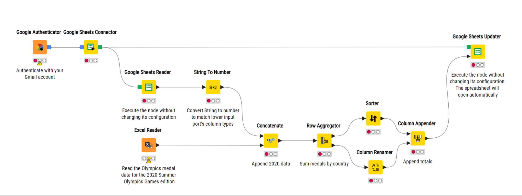
Let’s imagine that each month you have to access two different files, invoice information stored in an Excel file, and a product list that’s maintained centrally in a Google Sheet. In the screenshot below, you can see a KNIME workflow that accesses the Google Sheets and the Excel file to import the data.
KNIME offers over 300 supported data sources, and you can access data from anywhere. It has dedicated nodes available which allow you to load data making data import easy and accessible.
Read more about data access:
- Check out this article to get an overview of all the different data sources and databases you can access with KNIME.
- Download the Connectors with KNIME Analytics Platform cheat sheet for a quick guide to the database connector nodes.
- Check out the e-book “Will they blend?” to combine six different database sources.
Data cleaning & formatting
Accurate, consistent, clean data is an essential part of your analytics process. You can bet that if your data has inconsistencies or errors, these will follow through with your results.
Macros to clean data are one of the most popular because the manual process is painful. Your data contains dates, times, prices, batch quantities, and more, but they all have to be converted from string in your .csv file to the correct format.
The problem with the macro, however, is that every month, when new records flow into your dataset and are then automatically imported into your spreadsheet, you still have to make sure the macro is underlying the cells of your new data. If the macro only applies through to row 11,000 and your new data goes over, the macro will no longer apply.
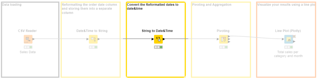
In KNIME, we build the data formatting process by dragging and dropping “step-by-step instructions” or “nodes” into a workflow. We run our process by sending the data through it. We can rerun this process on any amount of data because the workflow easily takes into account any changes made at source level.
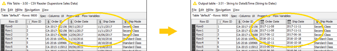
In the example below, you can see how you can convert the initial string values of our .csv file automatically into the correct formats for our order dates and shipping dates. Because of the intuitive low-code environment, the process is transparent; you can add additional documentation if you want, and easily share this “macro” – the KNIME workflow – with colleagues or just continue using it each month when your new sales data comes in.
Using a low-code data science tool you can automatically blend and process all different types and volumes of data - strings, integers, images, text, networks, audio, molecules, and more.
Tip: You can use the “Guess data type and format” to automatically detect the types and formats of your data. This will save you another step of the process.
Here are 3 resources I find useful to reference when I’m cleaning and formatting date&time data:
- Find out more about Date&Time in KNIME & Get Best Practices
- Watch a video for explanations on how to do Data Manipulation: Numbers, Strings, and Rules
- Check out this example workflow on Date&Time manipulation
Remove duplicates
Duplicates can create inconsistencies in your dataset. This can affect the reliability of your data analysis and the quality of your results. Duplicates can also create a bias by skewing the results and making it appear that certain observations or values are more frequent and important than they are. Removing duplicates from the data ensures that each data point is unique. In other words, your dataset would consist of a single consolidated data point.
In your spreadsheet, you would either have to go through all the rows of data and delete the duplicates after their first instance appears, which can be difficult when working with a large dataset, or write a macro to do this for you. However, experience has shown that using a macro can result in a loss of data. That is, your macro to remove duplicates permanently deletes duplicate rows and you will not be able to undo it and bring it back without recreating the data yourself.
In KNIME, there is a dedicated node called Duplicate Row Filter which maintains a clear data flow history, allowing you to backtrack, revise, or undo any operation, including removing duplicates. This provides a safety net to recover data in case of accidental mistakes. Below is a simple workflow where you can choose whether to remove or just flag duplicate rows. Further, there are options on which rows are removed: the first, last, minimum of, or maximum of.
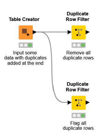
Try this example workflow using the duplicate row filter on your own data.
Joining spreadsheets
For any ETL process, joining spreadsheets is a common task. When you have data stored in multiple tables that are related to each other with a common key value, joining them before analysis will save you a lot of time and effort in the long term. In other words, learning how to join tables correctly is an important skill for managing and analyzing data. There are multiple ways to join two tables together, each with its specific use case and functionality.
Writing a macro to join tables can be a cumbersome task. This is because, more often than not, tables may not align correctly due to discrepancies in the structure, column names, or data types. A simple typo in the macro e.g. “Sheet3” instead of “Sheet 3” results in an error. If you need to perform different join types, you find yourself having to go through multiple extra steps to get the data into the form you desire.
In our KNIME example, you can easily choose how you want to join your data by selecting the respective configuration of the Joiner Node e.g. Inner Join, Left Join, Right Join, and Full Outer Join. The workflow below is a simple example of joining two different datasets together, a text file and a CSV file by using the inner join.
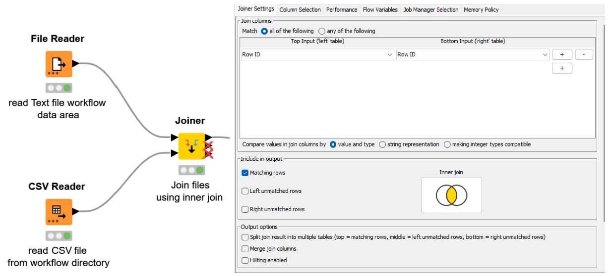
You might like to try this example workflow using the Joiner node.
Generate charts from raw data
The process of creating charts from data holds significant importance when it comes to conveying insights effectively through visualization. Let’s say you are a marketing analyst and would like to evaluate how well an online advertising campaign is doing. You need to collect data on various metrics like how many people are clicking on the ad, how many clicks are turning into actual sales, and how much money is spent on this ad campaign. By converting these rows of numbers into colorful, visual representations such as line graphs, bar charts, or pie charts, you can effectively communicate trends and insights to your team. These charts help identify which advertising channels are performing best, where adjustments are needed, and where budget allocation should be optimized.
Writing a macro to produce a meaningful visualization often involves a steep learning curve and it is not compelling enough to justify the efforts and the complexity for users without programming expertise. Going past these milestones, a major drawback in spreadsheets Excel is that macros often create static visualizations that lack interactive features. That is, it would only create an image and you cannot communicate and play around with them.
Using KNIME, you can create dashboards that are neat, fast, and straightforward. Below is an example of an interactive dashboard for your data in the KNIME Analytics Platform. You can click, zoom, select, and more.
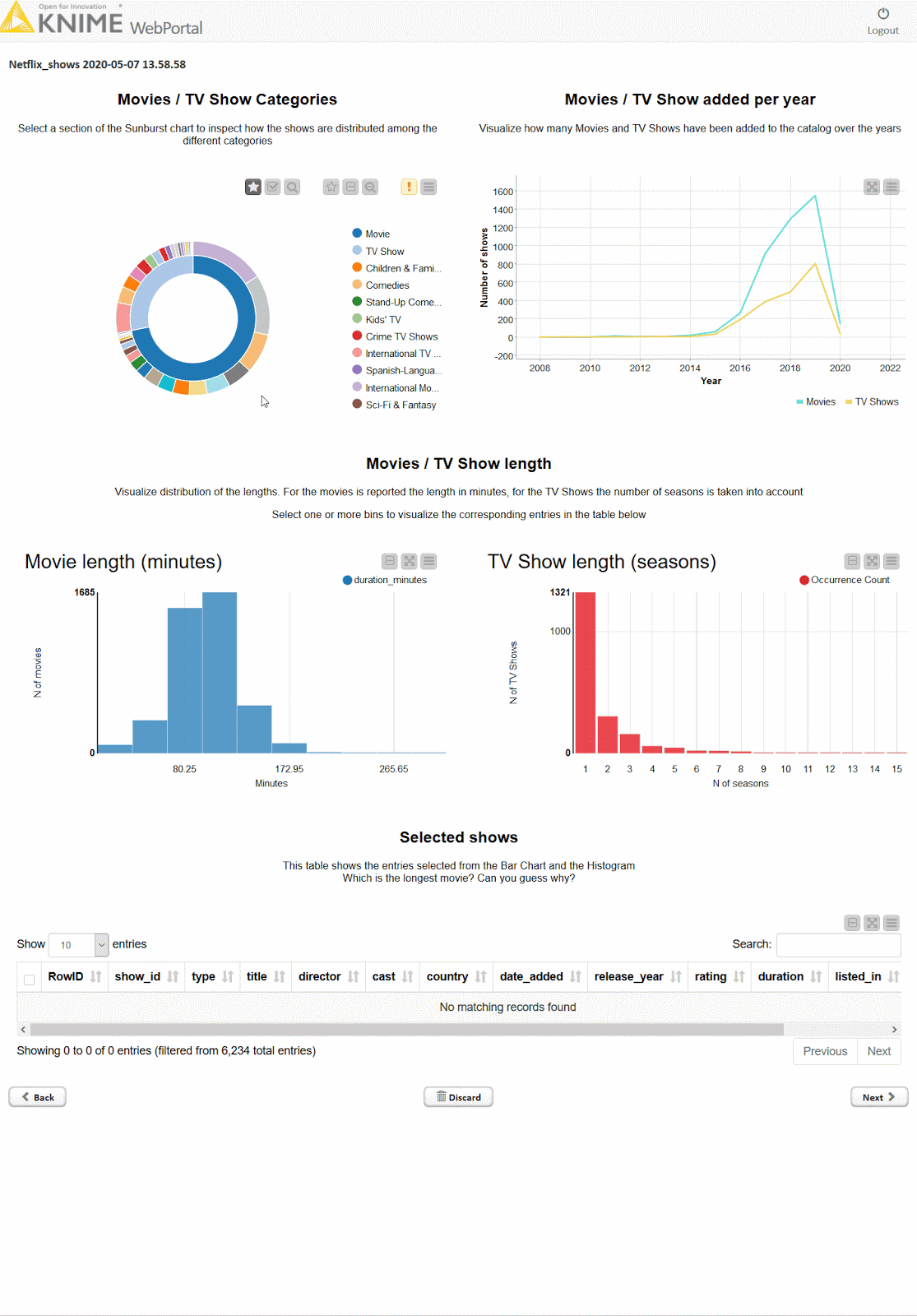
KNIME allows you to explore your data with interactive data views, choosing from dozens of graphs & charts including bar charts, lines, ROC curves, scatterplots, and more. You can also extend visualization options with other tools such as Tableau, PowerBI, and others.
Explore more resources about visualizing data:
- Find 5 different plots and charts in Data Visualization 101
- Watch a video showing the 3 steps to build an interactive dashboard
Simplify your daily data endeavors
The journey to find the best solution is important. With each data wrangling step, you can gain confidence in drawing conclusions from your data. In this blog post, I've explored five common automation tasks, highlighting how KNIME simplifies these processes. Find more automation inspiration in KNIME for spreadsheet users.