
Exploring the Wonders of the GroupBy Node for Statistical Aggregations
Welcome back to our conversation on data aggregation. In the last blog post Aggregations, Aggregations, Aggregations! - Part 1, we showed how to aggregate data with basic aggregation operations such as “Count” and “Sum”. We also demonstrated how easy these operations are thanks to the simplicity of the two-step configuration of the GroupBy node.
Now learn about statistical data aggregation - summary statistics
Statistical aggregations take advantage of the statistical properties of the data to extract valuable insights. As a result, statistical aggregations produce a compressed description of the data, also known as summary statistics. Summary statistics usually contain information obtained from four different measures:
- Measures of Central Tendency – e.g. median, mean, mode, etc.
- Measures of Dispersion – e.g. variance, standard deviation, etc.
- Measures of Shape – e.g. kurtosis, skewness, etc.
- Measures of Dependence (if more than one variable is measured) – e.g. covariance, correlation, etc.
Summary statistics are often used as a general strategy to deal with large datasets, to help communicate the largest amount of information and to solve memory and storage problems. Unsurprisingly, they are a very popular preliminary data exploration tool in many statistical and machine learning-oriented approaches.
Statistical aggregation: basic to advanced
Part 1 of this article focused on:
Basic Aggregations
- Count vs. Unique Count
- Percent vs. Percent from Unique Count
- Sum
- Range
Part 2 now looks at:
Statistical Aggregations
- Covariance vs. Correlation
- Measures of Central Tendency
- Measures of Dispersion
The Dataset and the GroupBy Node
Before we dive into the core of this article, here's a quick reminder of the dataset we are using. The Olympics Athlete Events Analysis dataset is freely available on Kaggle and it contains comprehensive information on the athletes, sports, and events of the modern Olympic Games from 1896 to 2016.
The dataset contains 271,116 rows and each entry refers to the participation of an athlete to one or more Olympic Game editions or sport events, identified by a unique ID and described by several attributes such as name, sex, age, height, weight, Olympic Team, National Olympic Committee (NOC), sport, etc.
Alright, that’s enough talk. Time to get started!
Let’s have a look now at how easy it is to implement complex statistical measures with the GroupBy node.
For example, do you know what the difference between covariance and correlation is? If not, let’s continue with the next example.
1. Statistical Aggregations: Covariance vs. Correlation
Let’s have a look at the concepts of covariance and correlation.
The concept of covariance
Covariance indicates the direction of the linear relationship between two variables. In simple terms, given two random variables, if the greater values of one variable mainly correspond to the greater values of the other variable, and if the same behavior is replicated for lesser values, then the covariance is positive (> 0).
In the opposite case, when greater values of one variable mainly correspond to lesser values of the other variable, the covariance is negative.
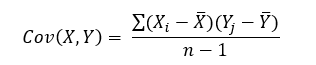
The formula for the covariance between two random variables X and Y can be calculated using the following formula (for sample):
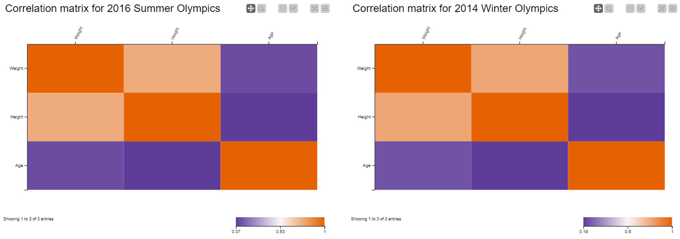
In our dataset, we have numerical attributes concerning the age (in year), weight (kg) and height (cm) of athletes. We intend to explore the behavior of these three variables and the strength of their linear relationship during the 2014 Winter and 2016 Summer Olympics. For that, we use the covariance measure.
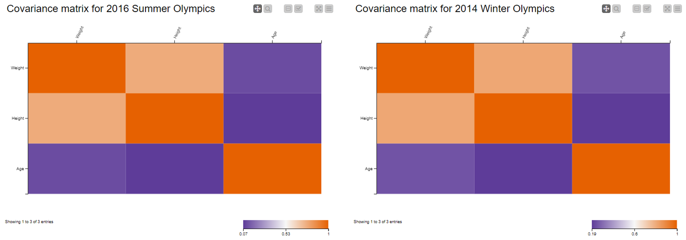
Note. All attributes have been normalized (z-score standardization) to avoid that those with larger range dominate the final results. This also shows that the covariance of two standardized attributes is in fact equal to the correlation between two attributes.
The covariance measures the direction of the relationship between two variables. However, if we want to determine the strength of the linear relationship, we need to measure their correlation.
The concept of correlation
Correlation is a function of the covariance, and measures both the strength and the direction of the linear relationship between two variables. Essentially, it is a normalized version of the covariance, whose magnitude is bounded in the range of -1 (negative correlation) to +1 (positive correlation), also known as Pearson’s correlation coefficient. A correlation coefficient of 0 indicates absence of correlation.
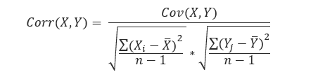
The formula for the Pearson’s correlation coefficient between two random variables X and Y (for sample) is:
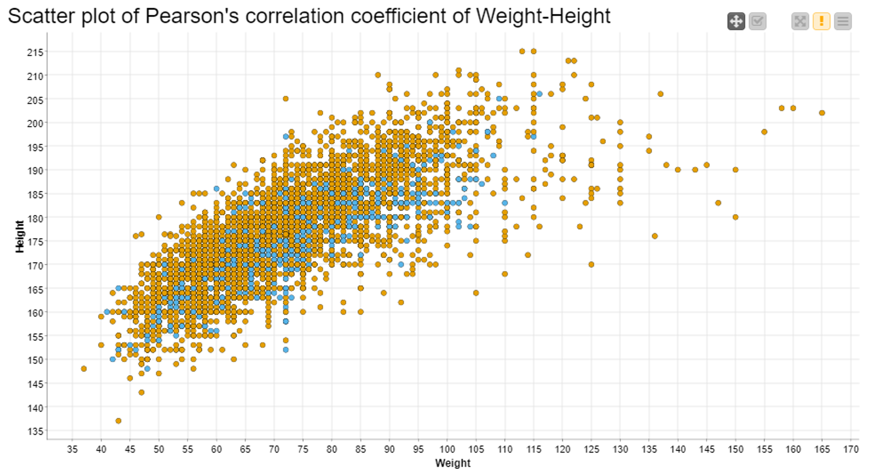
In Fig. 1, above, we see a strong, positive correlation between “Height” and “Weight”, that is to say to greater values of height mainly correspond to greater values of weight. This is especially true for athletes who competed in the 2014 Winter Games. At the same time, we can affirm that there is barely any correlation between “Height” and “Age”, or “Weight” and “Age”. Again, the two matrices seem similar, but they refer to two different scales.
Note. Three aggregating attributes: “Age”, “Weight”, and “Height”; and two aggregation methods: “Covariance” and “Correlation”.
2. Measures of Central Tendency
The next statistical aggregation methods are known in statistics as measures of central tendency and include mean, median, and mode.
- Mode is the most frequent value
- Median is the middle value in an ordered set of values
- Mean is the sum of all values divided by the total number of values
Choosing one measure or the other has both advantages and disadvantages. One problem with the mode is that it is not unique, so it may be misleading when we have two or more values that share the highest frequency. One problem with the mean is that it is susceptible to the influence of outliers since it includes all data in the calculation. The median is less affected by outliers and skewed data, but it does not include each observation and hence does not use all information available. Moreover, unlike the mean, the median is not suited to further mathematical calculation and hence is not used in many statistical tests.
Illustrate the behavior of the mode
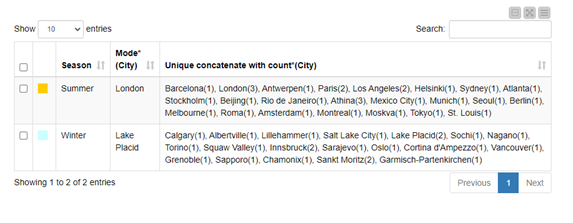
To illustrate the mode's behavior, let’s find out which city hosted the most Winter and Summer Olympic Games. After removing row duplicates according to the values in the column “Game”, we then group the data by “Season” and determine the mode for attribute “City”. Note that the mode is the sole measure of central tendency that can be used with nominal attributes.
In Fig. 3 you see a table view of the cities that hosted the most Games, i.e. the mode: London, 3 times, and Lake Placid, 2 times.
When aggregating data with the mode, we recommend also including the “Unique concatenate with count” method. This way, we can double-check the reliability of our results.
Note. For values that share the highest frequency, the GroupBy node returns the first-encountered value as the mode.
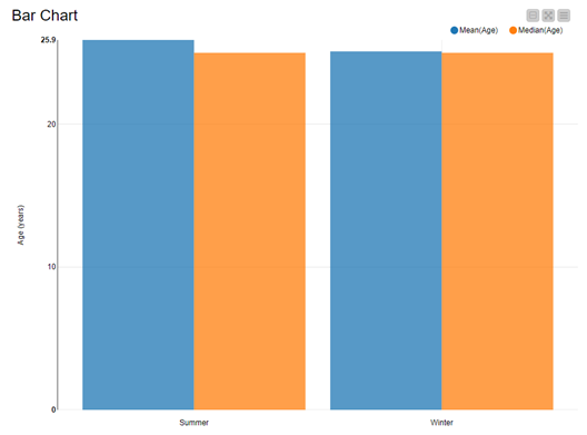
Let’s now extract now the mean age of athletes in the Summer and Winter Games. We have to compute the mean or the median. These are feasible aggregation methods for numerical attributes. We group by “Season” and compute the mean and median on “Age”.
Note. Two pairs of aggregation methods: “Mode” and “Unique concatenate with count”, and “Mean” and “Median”.
Have a look at Fig. 4, which shows that in this dataset there is very little difference between median and mean. This is due to the fact that athletes constitute a fairly homogeneous group and are sufficiently well represented across the dataset.
3. Measures of Dispersion
The last statistical aggregations that we are going to look closely at are known as measures of dispersion. The most-widely used are the variance, and standard deviation (SD). In this section, we are going to focus on the SD.
The standard deviation is a measure of how close the values of our dataset are to the mean. If the SD is large, then the data is more “diverse”. On the other hand, if the SD is small, then the data is more similar to the mean.
Let's check for dispersion in our dataset
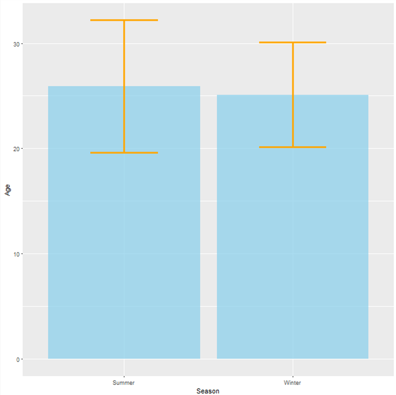
Let’s use the GroupBy node to check for dispersion in our Olympics dataset. More specifically, we want to determine the standard deviation of the attribute “Age”. This time, we use the R View (Table) node to produce a nice visualization.
Below, in Fig. 5 we can see that the age of athletes competing in the Summer Games is sensitively more diverse with respect to the mean age (y-axis) of 25.9 and 25.1 years in the Summer and Winter Games, respectively. This can be seen by looking at the orange SD error bars.
An SD error bar is usually a T-shaped line, which represents variability of data and is used on graphs to indicate the error around a reported measurement. Smaller error bars as in that of the Winter Olympics indicate that the data is crumpled around the mean (SD = 4.96).
On the other hand, larger error bars as in that of the Summer Olympics indicate that the data is more spread around the mean (SD = 6.28). This is not surprising if we consider that the Summer Olympics host more sport events, more athletes (of different ages) participate, and that in general the mean and the SD are susceptible to the influence of outliers.
To Wrap Up: Aggregation Methods for Insightful Analysis
In these two blog articles (Part I and Part II), we have explored a few aggregation measures, from simple ones to more complex statistics-based measures. What they all have in common is that they are all calculated with one GroupBy node.
In the first blog post, we have illustrated how to create data aggregations using basic methods, such as “Count”, “Percent”, “Sum” and “Range”.
In this blog post, we have implemented more advanced aggregation methods, that allow for insightful statistical analysis. Just a few nodes allowed us to reach the measure we wanted in the shape we wanted.
Often underestimated, the GroupBy node actually offers several aggregation methods for numerical (37) and nominal attributes (15) in its Aggregation tabs. It is highly likely that the aggregation operation you need, it is contained in the list of methods the node offers.
Now it is your turn to get your hands dirty and use the GroupBy node to bring the information hidden in your data to the open!
Aggregation Workflows You Can Download
The work described in these two blog posts has been grouped in two workflows which are freely available to download from the KNIME Hub: