“Open for Innovation” is more than just a tagline. KNIME encourages us to add even more functionality to KNIME Analytics Platform by allowing us to create our own nodes and facilitates integrating other software that is outside the core capability.
In this post I will discuss a workflow and scripts demonstrating how to use Blender to visualize data from KNIME and seamlessly return an image so it is available in a Python View node. My aim was to control the attributes of a 3D model using variables created from a KNIME workflow.
You can download and try out the workflow Blender_Integration_Map from the KNIME Hub
KNIME as a user-friendly front-end to Blender
Blender is a powerful open source 3D modeling and animation program capable of creating exquisite images. In the same way as KNIME Analytics Platform, the open nature of Blender means that it is used for an ever-growing range of applications, from short films to medical imagery, through to 3D printing.
The user interface of Blender is written in Python. There is a Python package that allows any of those operations to be called from a script, which can then be run from the built-in interpreter. I wanted to see if I could use KNIME to drive Blender as a powerful, user-friendly, data science front-end. This would allow me to change elements of a 3D model directly from my analyses and to automatically return images in KNIME.
Engaging 3D visualization of map regions based on single variable
Since everyone is familiar with maps from elections where regions are used as bars, and they only require a single variable, this seemed like a good choice as a proof of concept. Ordnance Survey has a variety of shape files (points, lines and polygons of geographical features mapped onto a coordinates system), which are open data (check out OS OpenData support on the Ordnance Survey website). I chose European regions because 11 areas are enough for visual interest, but sufficiently few to allow a manual check.
As you’d expect from Ordnance Survey, these are highly detailed representations of the areas. I used R to simplify the polygons to reduce the geometry going into Blender and convert it into an SVG file, which would produce a cleaner model than an SHP file.
Position cameras and lights for best pictures of scene
In figure 1, below, you can see the top view of the simple scene created for the project. The square boxes at the bottom of the image are cameras and the star shaped objects are lights. This enables us to take three pictures of the scene and choose the best one. This is important because depending on the relative height of the different regions, some angles can be better than others with respect to the data.
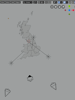
Fig. 1. Top view of simple scene created for project. Square boxes are cameras and star shaped objects are lights.
JSON file defines elevation of map region
Each of the divisions you can see in Fig. 1 (above) can be adjusted independently. Importantly, the names have been preserved from the original shape file. We can read those names from the shape file in KNIME and assign to them the outputs of our analysis (or in this case random number generator). That data is written to a JSON file by KNIME, before being picked up as input to Blender. Due to the alignment of the region names in the data and the 3D model, we know which data belongs to which region and can transform an attribute of that region. In this case we want to vary the height.
In Fig. 2, below, you can see a preview of the scene. All regions are set at their “resting” zero state. The regions have been extruded beneath the water level and will be raised by an amount dictated by the JSON file. The material applied to the regions is height-sensitive and changes colour based on its elevation. This could have been another attribute set from KNIME via the JSON file and would make sense to do so if we were visualizing a shifting political landscape.
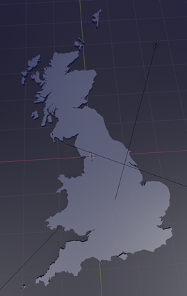
Fig. 2. Preview of the scene. All regions are set at their “resting” zero state.
KNIME workflow integrates 3D output
Below is the workflow that controls the scene. We read in the shape file to gather the names of the regions, then apply a random value to generate our dummy dataset.
When we generate our JSON, it takes the Row ID as the key, so we set it to the region name.
The flow variable connectors from the JSON writer ensure that the JSON file has been written before any nodes attempt to access it.
Each of the Python View nodes runs a script to render from one camera. The downside to this approach is that three separate instances of Blender are being opened in the background, which will cause a spike and competition for resources.
Another approach would be to have a single script render all three views. However, the view nodes used in this way allow us to bring the images back into KNIME. Since Blender is run in the background to generate the images, this provides a seamless integration of the 3D output with KNIME: This benefit outweighs the small cost in elegance and performance.
I’ve also added four nodes to the bottom of the workflow to demonstrate how easy it is to create a choropleth from a shape file in KNIME. This provides a convenient check for our 3D images.
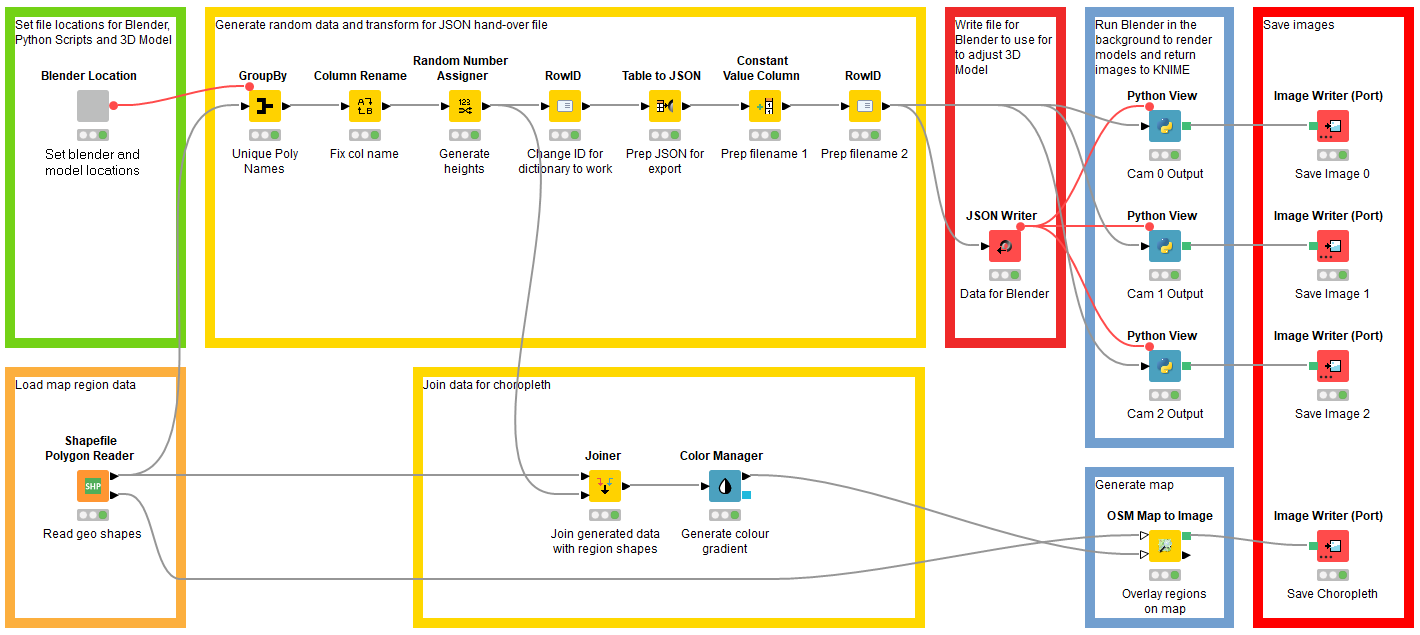
Fig. 3. Blender is run in the background to generate images and the KNIME workflow controls the scene.
Background script picks up image and passes it to KNIME
Each of the “Cam x Output” Python Viewer nodes contains a script to complete three main tasks:
- Run Blender as a background operation, loading the 3D Model and a Python script to make the changes to the model
- Open the image file generated by Step 1
- Make the image data available to the Python Viewer node for display and saving
These steps are the transaction between KNIME and Blender. The second Python script passed to Blender in step 1 is the transaction between Blender and the data we prepared and saved as a JSON file in KNIME.
This script has four tasks:
- Load the JSON data
- Group together regions which ought to move together (for example islands are distinct objects, but the data will treat them as a single region, so they must be grouped accordingly)
- Raise the region polygons by the amounts specified in the JSON file
- Save the image for the first script to present back to KNIME
3D image returned in Python View node
Once run, we have our images which we can view in KNIME and save elsewhere. To the user, this is seamless, Blender is never seen.
As it's that time of year, we've hidden an Easter Egg inside the workflow.
Happy hunting :-)
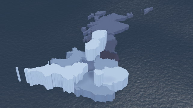
Fig. 4 The 3D image of the UK generated by a mix of Blender and KNIME
Performance
On a modern computer, the image generation aspect of the workflow takes between 3 and 15 seconds for all three at a resolution of 1536 x 864 px. This is using Blender’s fast rendering engine Eevee rather than the slower, more accurate Cycles engine.
What comes next? Mapping onto 3D models, sensor data, and predictions
At this point a Devil’s Advocate would point out that we’ve successfully created the kind of crime against data visualization that Tufte warns us against. The data-to-ink ratio is abysmal. I agree, but the point of the exercise was to establish how we can manipulate variables in Blender from KNIME. Now we have the methodology down, we can start to think how it can be more usefully implemented:
- KNIME would be an ideal platform for generating predictions that could be mapped onto a 3D model and then viewed using augmented reality. This might be part of a Digital Twin project.
- Analysis of a complex object such as a jet engine, for example, with measures of temperature or stresses is likely to be enhanced from the context given by a 3D representation.
- Viewing predictions of floods, landslides, fish spawning grounds etc would benefit from mapping back onto the applicable geography to gain further insight. Highly detailed landscape models are now available thanks to LIDAR imaging.
- In Life Sciences, there might be an application of modelling protein folding after analyses.
If this post has sparked any other ideas with you, I’d be interested to hear from you.
--------------
About the author: Rob Blanford is a Data Scientist and head of Artificial Intelligence and Machine Learning at digital consultancy Atos UK.
Atos is a leading international IT services company with a client base of international blue-chip companies across all industry sectors. Atos is focused on business technology that powers progress and helps organizations to create their firm o the future. Atos is proud of the collaboration with KNIME where clients have been empowered to derive value from their data using the best of breed KNIME Analytics Platform.
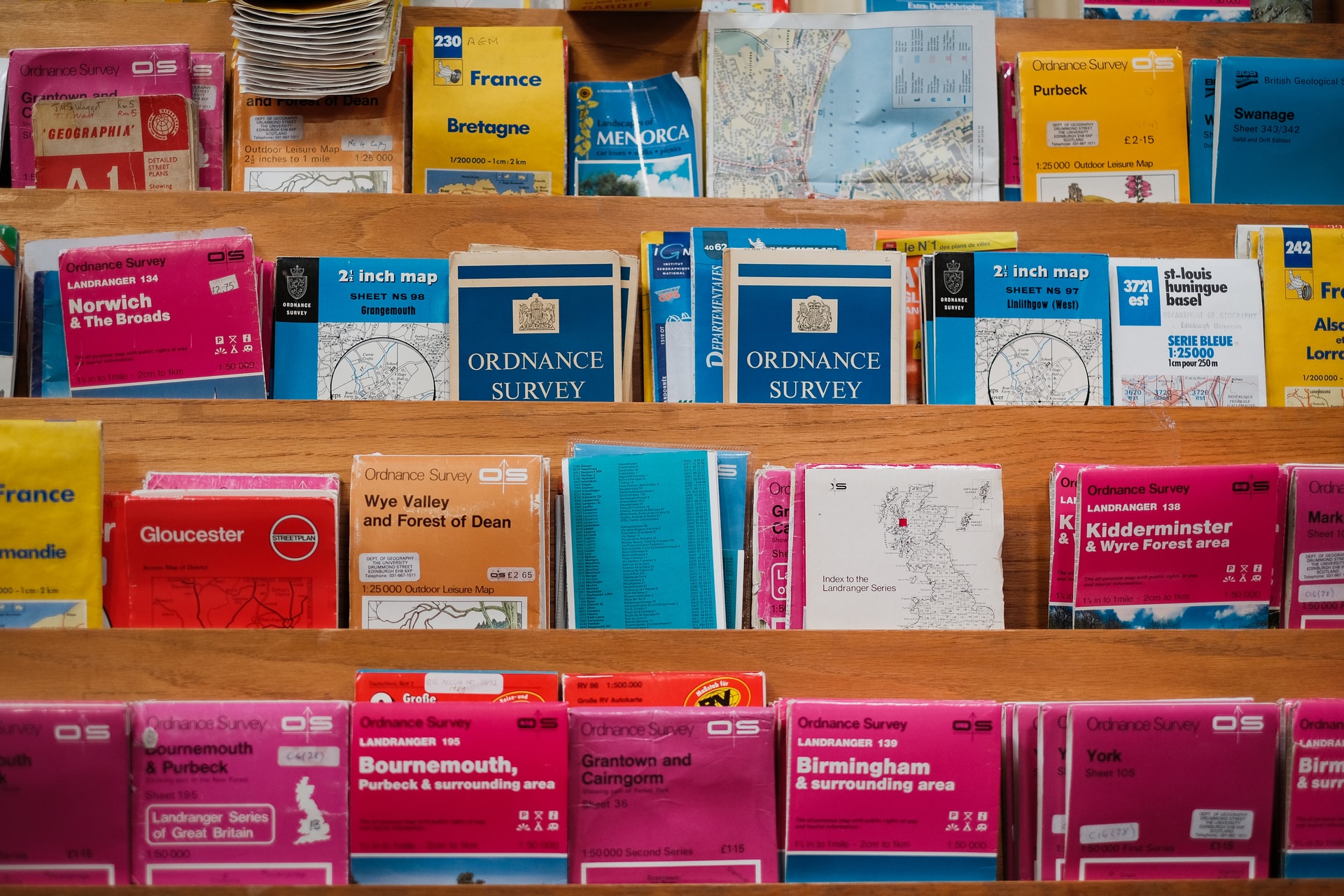
Please note the maps above are derived from Ordnance Survey Boundary-Line data, OS data © Crown copyright and database right (2019)