KNIME Analytics Platform is extremely flexible. It offers not only a number of pre-packaged functionalities for prototyping or routine work, but also a number of integrations for the free coding days. One of these integrations imports the power of JavaScript code into the platform.
This blog post aims at providing nuggets of JavaScript code to implement more creative drawing and plots than what is already available with the pre-packaged nodes. The nuggets of JavaScript code proposed here implement only one functionality and are explained step by step for all, even JavaScript beginners, to understand.
The Plot
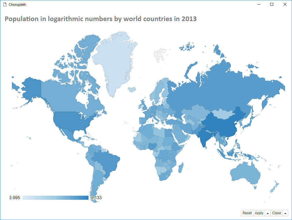
Today we want to draw the choropleth map as shown above. So what do we need?
- A map of the countries of the world and the corresponding numbers of population.
- A short JavaScript code to load the Google Charts library and draw the choropleth map based on the population numbers of each country.
- A Generic JavaScript View node to execute such code within a KNIME workflow.
Our dataset is the CSV file population2013.csv and it contains a list of 214 world countries with their corresponding population numbers as of 2013.
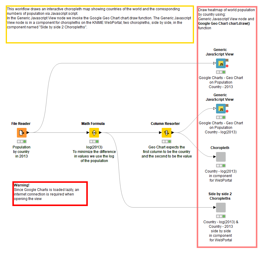
We also have a generic JavaScript View node. The smallest workflow would simply include a File Reader node to read the CSV file and a Generic JavaScript View node with the right JavaScript code nugget to draw the choropleth map. So let’s now have a look at this nugget of JavaScript code.
The JavaScript Code Nugget
The JavaScript code nugget, which will draw a choropleth world map, consists of three parts, which do the following:
- Import a dataset from the KNIME input data table object to be used with the Google libraries
- Transform the dataset into a Google object, define a visualization.GeoChart object named “chart”, and draw the chart with the function chart.draw(). This part is encapsulated in the DrawChart() function, which is used as a callback function when loading the Google visualization module and its corechart package.
- Load the Google JavaScript API via jQuery getScript() function
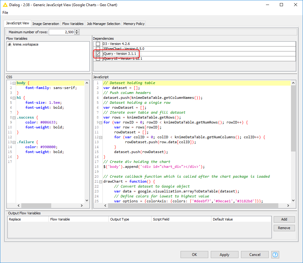
Below is the final JS code nugget to insert in the JavaScript editor of the Generic JavaScript View node’s configuration dialog.
The function chart.draw() from the Google Charts library assumes that the first column in the data contains the country names and the second column the population numbers. When feeding the Generic JavaScript View node make sure that the column order in the dataset is correct.
Note. When you copy this code into the JavaScript editor in the configuration dialog of the Generic JavaScript View node, remember to check JQuery dependency, since the Google JavaScript API is loaded using the getScript() function of the jQuery library.
The getScript() method from jQuery is great to load a single JS library. However when more concurrent, possibly dependent, JS libraries are needed, other load methods might be more suitable. We will talk about those in another post. Stay tuned!
Also, note that we have defined a heat map going from light blue (least populated countries) to dark blue (most populated countries).
It is common practice to use a monochromatic color scale. We chose the scale from light blue to dark blue as recommended in the “Color Brewer 2.0” website.
The KNIME Workflow
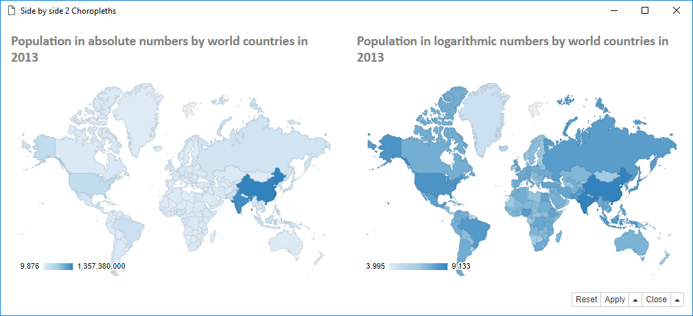
If we actually apply the above code in a Generic JavaScript View node directly to the data of the population2013.csv file, the map will be colored light blue with only 2 countries (India and China) in dark blue, due to their very large populations. This is because we are dealing with populations in absolute numbers.
In order to appreciate the differences in population a bit better, we could use a logarithmic scale. In this case a Math Formula node calculates log(2013) for each country to append to the original dataset.
After re-ordering the columns so as to have the log(2013) column at the second position from the left, we feed the Generic JavaScript View node containing the code above. This produces the choropleth map displayed in Figure 1.
Note. The Google Geocoding API is loaded lazily. An internet connection is required when opening the view of the Generic JavaScript View node. Also, the map will take a longer or shorter time to load depending on the speed of your internet connection.
Now it would be nice to add a title to the plot. However, I think we have done enough JavaScript for today. Let’s use a good old Text Output node and add the following tiny bit of HTML code:
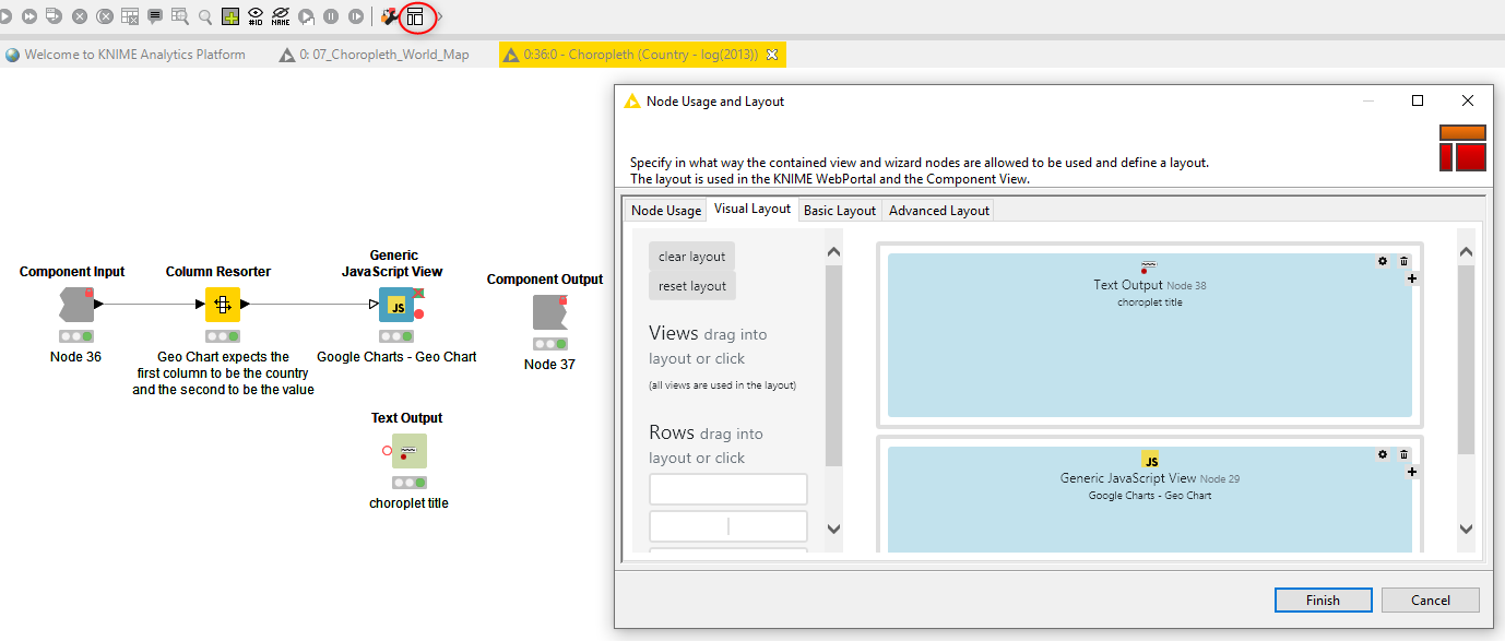
Then let’s wrap both nodes – the Generic JavaScript View node and the Text Output node – into a component for a composite view. To make sure that the title is at top of the page, open the component, select the button for the component layout in the toolbar, and set the position of the two nodes in a 2x1 matrix: Text Output node at (1,1) and Generic JavaScript View node at (2,1), as shown in Figure 3.
Find out more about components in this YouTube video What is a Component? or in the blog article, Time Series Analysis with Components which discusses components that have been created for time series analysis.
Find out more about components in this YouTube video What is a Component? or in the blog article, Time Series Analysis with Components which discusses components that have been created for time series analysis.
or in the blog article, Time Series Analysis with Components which discusses components that have been created for time series analysis.
which discusses components that have been created for time series analysis.
Indeed, now, if we right-click the component and select its “Interactive View” item, we can see the same choropleth map with a gray title, exactly as in Figure 1. Also, if we execute the workflow from a KNIME WebPortal, the final web page will also contain this interactive view with choropleth and title.
We can also go one step further and combine the two plots: the one plot with pure numbers and the other with logarithmic numbers, and display them side by side, each with its own title, in the same view. This is achieved in the last component, which contains two Generic JavaScript View nodes and two Text Output nodes, placed on a 2x2 layout grid. The final composite view is shown in Figure 4.
Again if running on a KNIME WebPortal, this composite view translates into a web page with multiple choropleths and titles.
The final workflow is shown in Figure 5 and is also available on the KNIME Hub here. You will also find the Choropleth World Map component on the KNIME Hub which you can drag and drop to your installation of KNIME Analytics Platform.
Summary and Next Steps
Today we drew a choropleth map of the world showing population numbers. To do this we used a short JavaScript code nugget to load the Google Charts library and color code the world map areas according to the input numbers and countries. As a bonus, we also showed how to add a title and/or another world map choropleth in the composite view of a component.
Below is a quick video of how to drag and drop a component from the KNIME Hub (Figure 6).
If you enjoyed this, please share it generously and let us know your ideas for future JavaScript based visualizations at willtheyblend@knime.com
Resources:
- The workflow Choropleth on World Map using Google Charts and JQuery Library on the KNIME Hub
- The component Choropleth World Map on the KNIME Hub
- The video What's a component on the KNIMETV YouTube channel
- The blog article Time Series Analysis with Components by Daniele Tonini (Bocconi University), Maarit Widman (KNIME), Corey Weisinger (KNIME)