Visualizations tell the story. But you need a fast way to generate and distribute that story.
KNIME Analytics Platform, an open source tool for low-code data science, includes a KNIME Reporting extension for you to generate and distribute static reports for both one-off and recurring needs. You can use it to customize content within the report and tailor it to your specific requirements. The experience of building a report is as intuitive as building data apps.
Generate & distribute reports faster
KNIME Analytics Platform already includes powerful visualization features. The KNIME Views extension, for example, provides several types of interactive charts which can be assembled into dashboards showing multiple views or data apps.
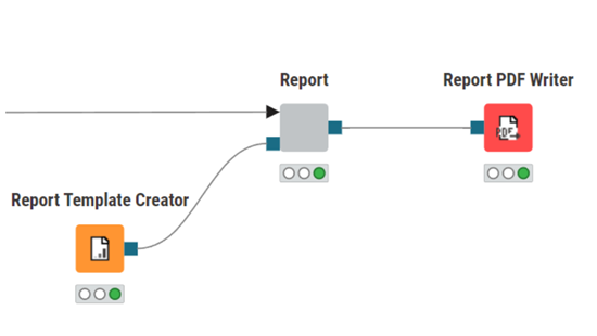
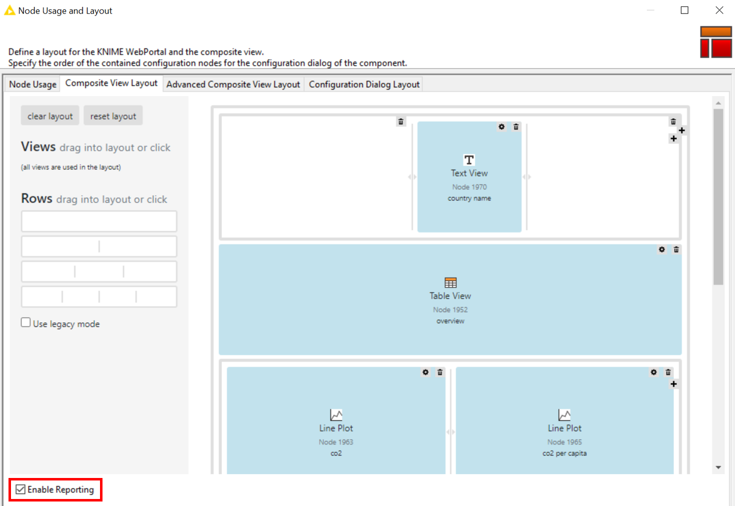
The KNIME Reporting extension allows you to take multiple visualizations and quickly turn them into static PDF reports. The best part is that you don’t need to learn anything new. You just have to enable reporting in the layout settings of the component with the view.
In the screenshot below you can see where we clicked "Enable Reporting". This will give you a report output port which you can use to connect to the Report PDF Writer node and generate a PDF file.
Let’s take a look at how it works!
Build a CO2 emissions report with KNIME Reporting
To give you an example of how to use the KNIME Reporting extension, we'll generate a CO2 emissions report, focusing on the highest producers of CO2 emissions in the year 2020.
First, we have to build a CO2 emissions report workflow that generates one page of the report for each country, limiting our report to the top 3 countries.
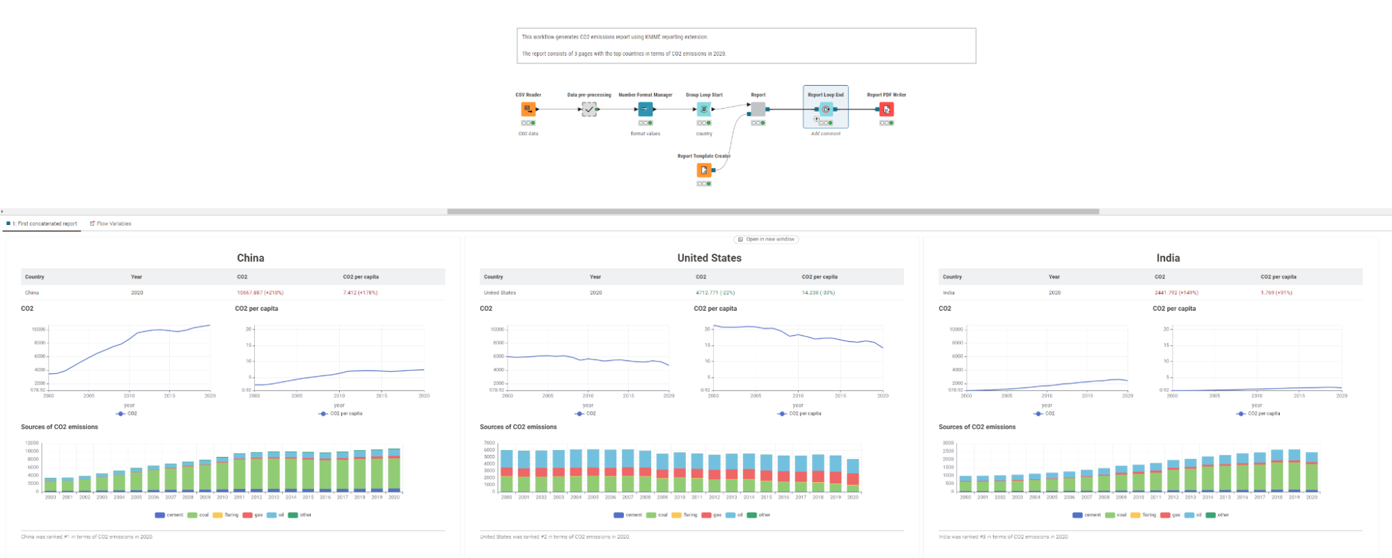
Our workflow uses open source data from the World in Data project. This data encompasses information on countries, years, CO2 emissions, and emission sources.
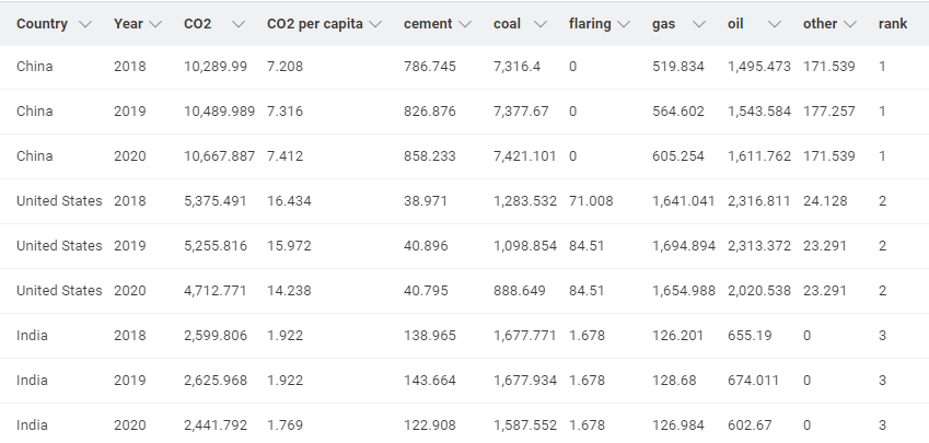
Inside the data pre-processing metanode, we read and clean up the CO2 data. We limit our data to the period from 2000 to 2020, and select only the countries with the highest emissions in 2020 (China, the United States, and India).
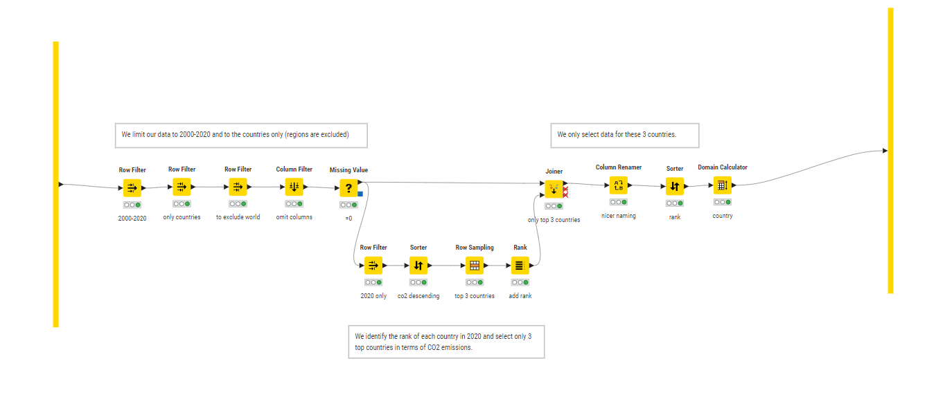
To create a report where each page represents the statistics for one country, we use the Group Loop Start node to iterate over countries.
After the data preprocessing is done, we are ready to continue with the next step to build the report. We will display a few visualizations, a table view, and text views in our report. Let’s take a look inside our component to see how it’s done.
We can set the HTML column type to apply styling to our text and render it as HTML.
For example, we want to change the text color of CO2 values. If the growth rate of CO2 emissions is positive (“+”), then the value will be displayed as red. If the growth rate is negative (“-”), then the CO2 emissions in the country are decreasing, and the values will be displayed as green. We use the Column Expressions node, inside the "Add growth" metanode to change the text color of our CO2 values.
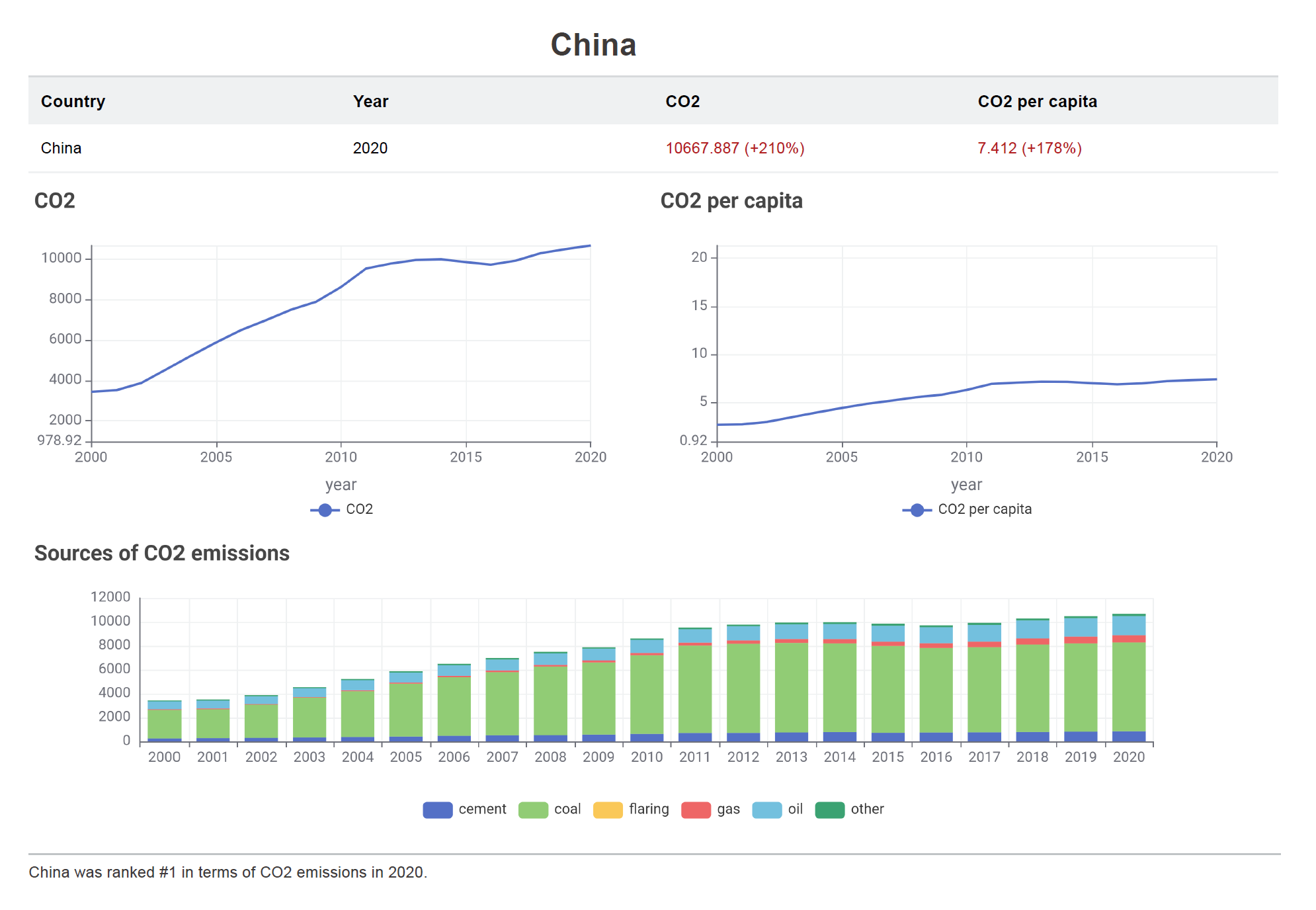
We also want each report to have the name of the country as title, and add a footnote to the bottom of each page. We can use the Text View node to do this.
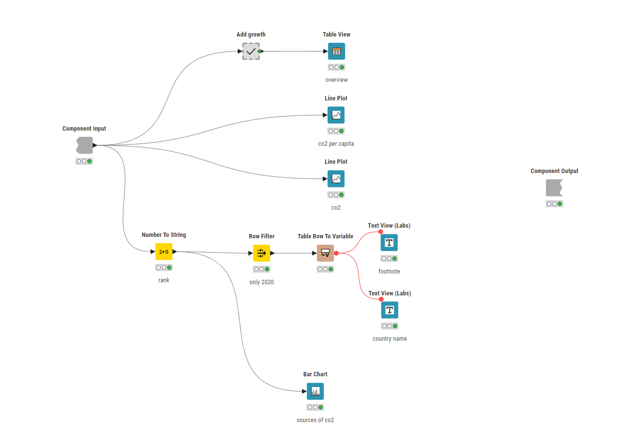
After we finish all of our table and views, we wrap our visualizations and table inside of the component and "Enable Reporting" in the Layout Editor.
We want to define the basic layout of the report – here page size and page orientation – and use the Report Template Creator node to do so. If we now preview the output of the component, we will see the first page of our generated report.
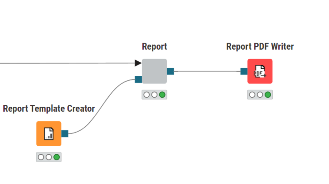
To close the loop, we will use the Report Loop End node. The last step of the workflow is to export the pdf report. To do so, we use the Report PDF Writer node where we specify the output location (path and file name) of the file.
And that’s it! You can see how easy it was to generate a static PDF report with the KNIME Reporting extension, it’s very easy to generate static PDF reports in KNIME. You can download the extension and our CO2 emissions report workflow to play around with it yourself.
Take first steps with KNIME Reporting
Try out the Reporting extension to automatically generate and distribute static reports for regular events such as month-end close, quarterly performance, or on-demand statistics.
Explore this collection of workflows that use the Reporting extension and try them out yourself.