
Assigning color to data rows in plots and tables using KNIME Analytics Platform is easy with the Color Manager node. It takes care of allotting colors to groups of data rows and the points in plots and rows in tables are then colored accordingly.
But how do we color columns in a bar-based chart? How can I obtain bars in three shades of green as in figure 1? In this short "how-to" article we show the three nodes you need to create the bar chart and then assign a color to each column.
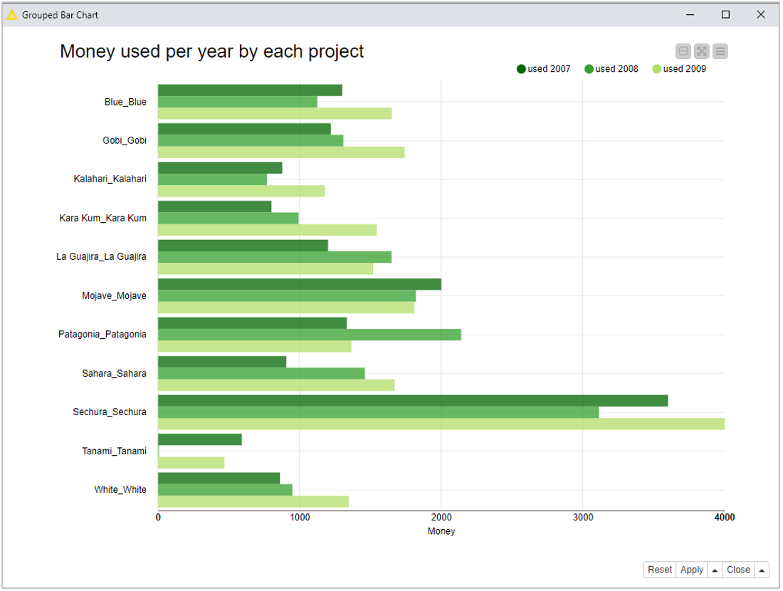
The bar chart in figure 1 is obtained with a Bar Chart node on project budget data. On the x-axis - the vertical one in this case, since the bar chart is set to display horizontal bars – we have the project names and on the y-axis - again the horizontal one in this case – the money used for each project in 2007, 2008, and 2009.
The Input Data We Have
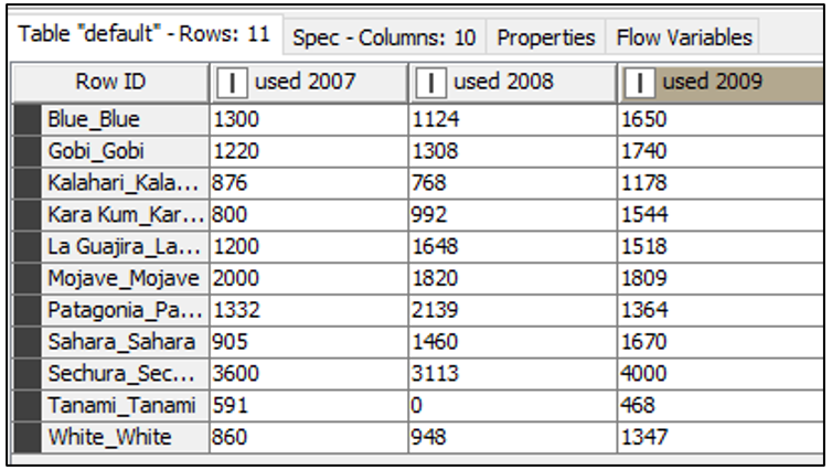
The input table has one row for each project and one column for each year, which you can see in figure 2. Each bar set (y-values) in the bar chart corresponds to the value set for a given year, that is to the value set in one column. So, if we manage to assign a custom green to each column of the input data, we should get the bars in the bar chart correspondently colored.
The Color Map We Need
If you noticed the Bar Chart node has one additional optional input port (the white triangle port). This is the port that accepts the color mapping. A color map consists of the list of columns and assigned colors, as in figure 3.
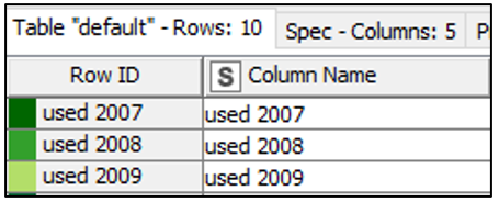
The trick then is to transpose the column headers as to get just a list of column names. Such list can then pass through a Color Manager node for color assignment. The node that performs such a transpose of the column headers is the Extract Table Spec. This node indeed takes the column headers and other column information and reports them as rows into a new table, something like figure 3 without the colors.
The Nodes We Used
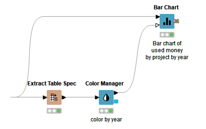
Thus, we need three nodes to create the bar chart in figure 1, with the three shades of green (Fig. 4). The links behind the nodes take you to the specific entry on the KNIME Hub for that node, which includes a description of what the node does, plus links to example workflows featuring that specific node.
To assign a color to each column, we transpose the column headers (“used 2007, “used 2008”, “used 2009”) into values of a column through the “Extract Table Spec” node. This node extracts the column properties – column headers, maximum and minimum values, etc… - and puts such information, including the column header names, on data rows.
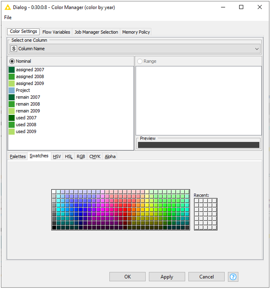
This table is then passed through the Color Manager node for color assignment to each value in the newly created column “column names”. Here, we become a bit more graphically creative, and we assign dark green to value “used 2009”, mid green to value “used 2008”, and light green to value “used 2007” (Fig. 5).
This map is now sent to the second input port of the Bar Chart node to color the bars in the chart. Indeed, the second input port of the Bar Chart node, and of many other visualization nodes, accepts a map (
The result is the bar chart we wanted, shown in figure 1, with the three shades of green.
Download the workflow KBL:Producing Dashboards that we used for this example.
The Book We Wrote
This and more tricks have been added to the new chapter 6 of the updated edition of the ebook, “KNIME Beginner’s Luck”. “KNIME Beginner’s Luck” helps you take the first steps into basic usage of KNIME Analytics Platform. The ebook has been updated to version 4.4 of KNIME Analytics Platform and expanded with more features and procedures to build dashboards. The new chapter 6 shows you how to build simple yet dashing dashboards on your data. This post is just an extract of a small trick described in the new version of the ebook.

As a bonus for having read this post till the end, use the promotion code BLOG-KBL to download a free copy of KNIME Beginner's Luck from KNIME Press 😃