
Climate change is probably the greatest challenge humanity has ever faced. As a student of politics, I was often confronted with this issue during my exchange semester in Glasgow. In November 2021, the city was a hotbed of climate protest due to playing host to COP26. That conference brought together around 40,000 participants, including 120 world leaders and myself.
It fascinated me to observe these figures in this decision-making process, debating dilemmas like how to meet the policy targets of the Paris Agreement. Climate change is affected by many drivers — political, social, economic and more. To make informed decisions, leaders need information from many disciplines. Social scientists can help, but need to analyze a lot of very different data to answer questions. This type of advanced data analysis often involves learning a programming language, which takes time away from core study and research.
Analyzing world emissions data with a no-code tool
I started an internship at KNIME to learn how to analyze data with a visual programming language. Data analysis workflows are developed intuitively by dragging and dropping nodes into a workbench to create a data flow, with no coding required. Mentored by my colleague Marina Kobzeva, we started developing an interactive data app with KNIME to show what we have to do to keep the promises of COP26.
Here I will walk you through some of the analysis we did of world emissions using the Starter Perspective KNIME Analytics Platform Version 5. It includes an improved UX/UI and specific features to improve the experience for beginners to analytics tools, like myself.
Our carbon emission data app
In our data app, you can see carbon emissions from different countries over time in different aggregations, such as per capita or annual sums. You can see when a country wants to reach carbon neutrality, compare different countries, see the sources of different emissions, and more. My source was the World in Data project.
We will now go through the steps of building this app. For the purposes of this walk-through of the data app, you’ll see screenshots showing a slightly simplified version of the workflow, but you can find both the simplified and the full workflow, which includes additional interactive functionality for the data app, in my space on KNIME Community Hub.
Import CO2 emission data
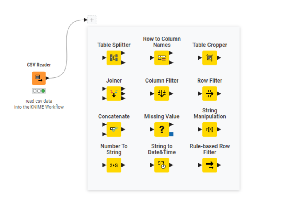
After downloading the data to your local workspace, drag and drop it into your workflow. The CSV Reader appears automatically, and no configurations are required.
Note. To share this workflow with a colleague, configure the Reader node with a relative path to the data. That way the workflow can be run (and access the data) from any machine.
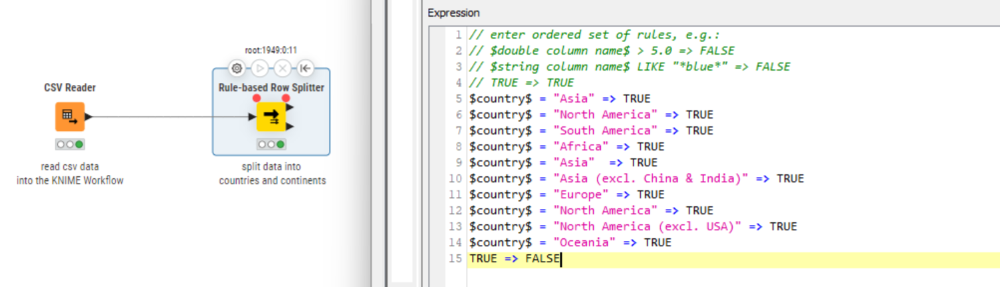
In the screenshot below, you can see how KNIME Analytics Platform Version 5 makes recommendations about which nodes we could use next. I found this helpful to build my workflow without needing to keep looking up nodes myself all the time. We continued the workflow with the Rule-based Row Splitter.
Pre-process by filtering continent data
Now we filter our data and get it into the right format for visualization. For the preprocessing, we use the Rule-Based Row Splitter node to split the data into two parts: data on countries and data on continents. For this visualization, we limit our data to the 1950-2020 period, for continents only.
Visualize annual CO2 emissions
We can create a simple plot showing the growth of CO2 emission for one continent and one year, but why limit ourselves? We want to add more flexibility and enable the user to select different continents and different years. A slider in the app lets you select a range of years (Interactive Range Slider Filter Widget node), and you can select the continent you want to analyze from a pull-down list (Interactive Value Filter Widget node). In the configuration dialogue for the Interactive Range Slider Filter Widget node, we set the minimum and maximum date values, as well as the default values to be shown.
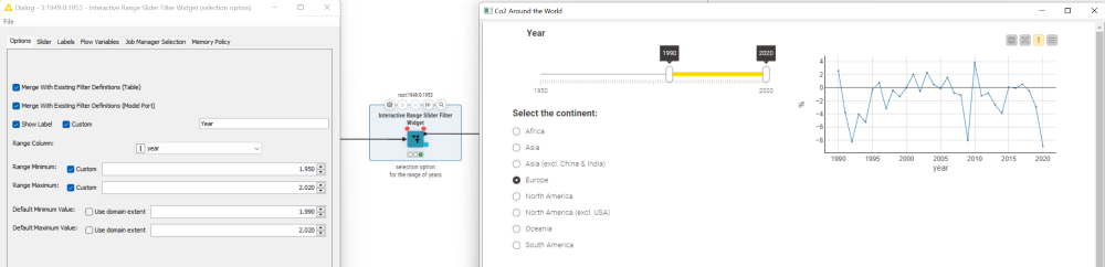
Next we will use the Interactive Value Filter Widget. This node allows the user to select a certain string value, “continent” in our case. We select the Filter column in the configuration dialogue and one of the continents (for example, Europe).
Finally, we decide what type of visualization to show. We chose the Line Plot node because it clearly shows the dynamics of the growth rate over the years. We configure the node by selecting the X-axis column, (“years”) and the value to be shown (“growth”).
Now we bundle the entire workflow into a component which we can share and deploy as a browser-based data app. We select all the nodes in our workflow, right-click, and select “Create component.” We can make changes to how the data app looks with the Node Usage Layout.
Download the full data app from the KNIME Community Hub: CO2 Around the World
Download the simplified version of the data app: CO2 Around the World (short version)
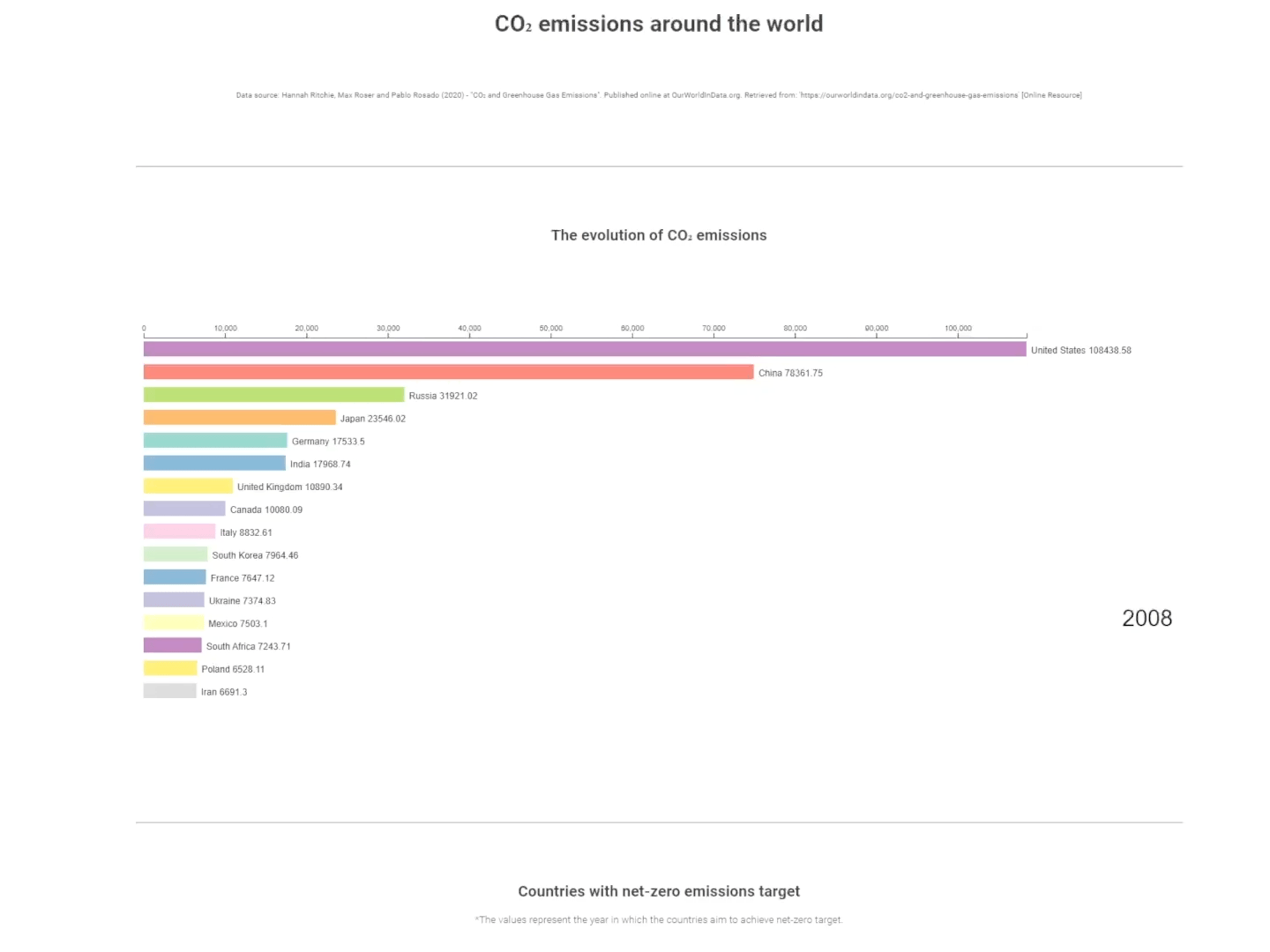
How are worldwide emissions changing?
Let’s now use the data app to see how worldwide emissions are changing on each continent. For example, let’s select Europe and Asia and compare their annual growth/reduction of emissions.
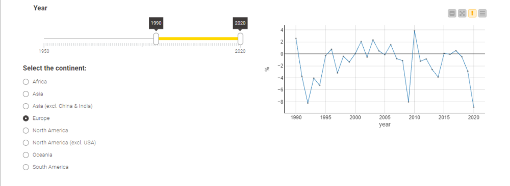
We have to keep in mind that 2020 saw the first wave of the COVID-19 pandemic. Because of quarantines, carbon emissions went down considerably, but this will not persist as a trend.
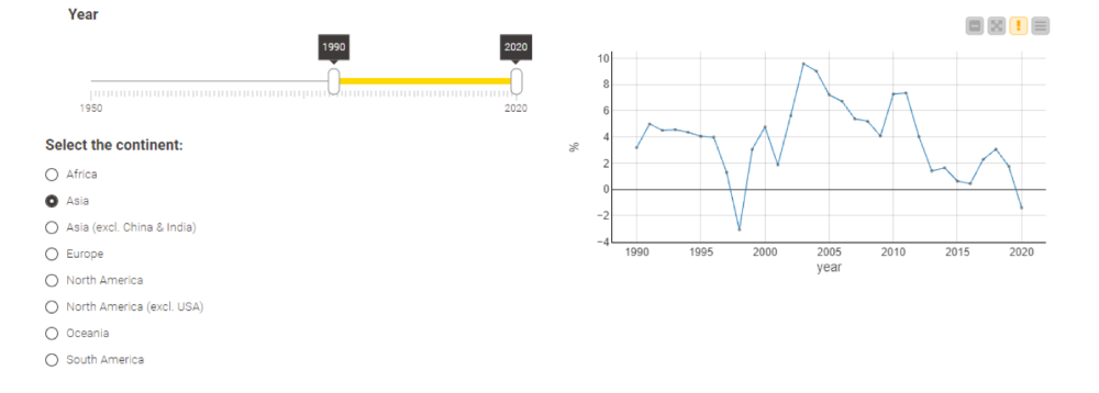
In general, we can see that emissions in Europe have decreased since 2000, while emissions in Asia have grown. Are we in Europe on a long-standing greenway, or are we outsourcing emissions to Asia? Asian countries at COP26 argued the latter. To get more insight into our data, we should look next at emissions produced by individual countries.
Explore emissions by individual countries
To create a second visualization, we follow the same steps as before. Because we have already prepared most of the data preprocessing steps the first time around, now we just have to focus on the visualization. To make this step even more visual, we display the values on a world map. Simply drag and drop the KNIME Verified Component into our workflow. From there we can get an overview of data for the different countries in a certain year. How many emissions does Germany produce in a European context? And can we compare those values to the emissions of an Asian country like China? Here we will use a Row Filter node to filter our country-based data for the year 2019.
We see that Germany produced 8.5 tons of emissions per capita (production-based emissions) in 2019. To achieve carbon neutrality, we need to know how many emissions a single person could produce, and how much we still have to do to reach such a goal by 2045. It is around 3 tons of carbon dioxide emissions per person per year.
To be climate neutral, every German citizen needs to reduce their carbon footprint by 5.5 tons on average. Of course, this is not just the task of every citizen, but for our economy and numerous companies.
In comparison, China produces 7.3 tons of emissions per capita. China produces more emissions than Germany, but even on a production-based level, the personal impact per capita is lower. This is one reason Germany should be a pioneer in climate protection, even if its total impact is smaller than that of other countries. On a per capita basis (and even on a historical basis) Germany is still a major contributor to climate change.
Self-service analytics for interactive & transparent insight
Data visualizations like this are vital to making this information transparent and accessible for everyone. After all, climate change affects all of us. That is why we built an app that lets you analyze the data yourself. And you can build your own apps as well. Just go through the data and think about how you want to visualize it.
If you want to build your own data app for your next research project, download the free and open source KNIME Analytics Platform and learn basic data science skills, like I did, to start exploring your data.