
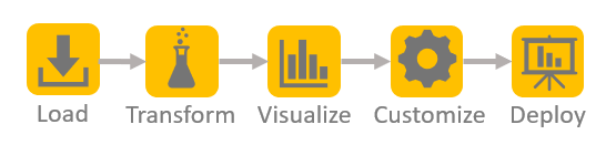
No matter if we are experienced data scientists or business analysts, one of our daily routines is the easy and smooth extraction of the relevant information from our data regardless of the kind of analysis we are facing.
A good practice for this is to use data visualizations: charts and graphs to visually summarize the complexity in the data. The required expertise for data visualization can be divided in two main areas:
- The ability to correctly prepare and select a subset of the dataset columns and visualize them in the right chart
- The ability to interpret the visual results and take the right business decisions based on what is displayed
In this blog post we will see how visual interfaces for business intelligence, i.e. Guided Analytics, can help you in creating visualizations on the fly and also identify complex patterns via those visualizations.
Guided Visualization is about guiding the business analyst from raw data to a customized graph. The business analyst is led through the process and prompted to select the columns to be visualized, while everything else is automated. In contrast, Guided Exploration navigates the data scientist from large masses of data to an automatically computed set of visualizations showing statistically interesting patterns.
In the final section of this article, we summarize the common practices and strategies used to build those Guided Analytics applications, such as re-using functionalities by sharing components.
Guiding a business analyst from data selection to the right graphs
The challenges of data visualization
Often our data at hand contain values in data types that are not suitable for our analysis. For example, how do we calculate the number of days between two events, if the the date values are reported as String? The numbers “6” and “7” make more sense as String, if they indicate Friday and Saturday, don’t they? These kinds of data quality issues affect not only how successful we are in further analyzing the data, but they also affect our choice of graphs for reporting. For example, if we want to plot values by time, or assign a color to a day of the week, these columns have to have the appropriate data types.
However, even with perfect data, we don’t always end up with an optimal visualization that shows how the data have developed or highlights relationships in the data. The right graph depends on our purpose: Do we want to visualize one or more features? Are the features categorical or numeric? Here it comes down to our expertise as a business analyst to select the graph that best communicates our message.
The task of selecting the best graph has not necessarily become easier with the increasing number of graphs and visualization tools available. Additionally, the easier we make it for ourselves to build a graph (visualization), the more difficult it becomes to intervene in the process (guided). Ideally, we would like to combine our business expertise - allowing the business analyst to intervene and add their knowledge - with the automated data science tasks - i.e automatically creating the visualization based on the expertise supplied.
Guided Visualization: automating when possible and interacting when needed
The cost of many all-in-one visualization solutions is that they don’t consider the whole process of data visualization from accessing the raw data to downloading a customized graph. Using these types of tools we would get a graph despite having provided unclean data. And if we wanted to visualize only a subset of the data, we would probably have to filter the input data first. Without filtering the input data first, a graph showing sales developments for the last year could be our only choice, given that the data consists of sales for the whole year: not that useful if we’re only interested in developments in the last quarter.
Guided Visualization provides a more comprehensive view of the process of building graphs as shown in Figure 1.
In the data cleaning phase, even advanced business analysts can easily overlook columns that contain only constant values or numeric columns with few distinct values. Date&Time values are easier to spot, but we need to make sure that we don’t lose or change any information when we convert their data type. Given these challenges, we want to automate as many of these tasks as possible, yet not trust the results blindly. In the process of Guided Visualization, the business analyst can check the results after each process step and, if needed, apply further changes.
After the data preparation and column selection step, we are ready to move on to building the first version of the graph. If we were asked whether we preferred a line plot, a bar chart, etc., few of us could build these options in their minds and make the decision. In the Guided Visualization process, selecting the relevant graph is made easier by way of a dashboard, which shows a collection of potential and relevant graphs. At this point, the expertise of a business analyst is brought back into the process: Which graph serves my purpose best? Are the title and labels informative? Is the range of the graph appropriate? These changes can be applied via the interactive dashboard. Once ready, the final step is to download the graph as an image file.
Guided Visualization workflow
The Guided Visualization process as described above requires a logic that automates the process steps from data cleaning to selecting the columns to be visualized, accessing a set of relevant graphs, selecting and customizing the graphs, through to downloading the final graphs as image files. The process is partly affected by the business analyst’s decisions at the interaction points.
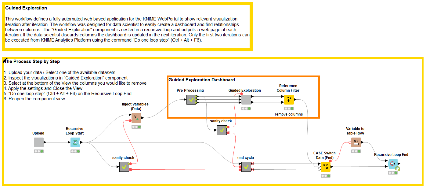
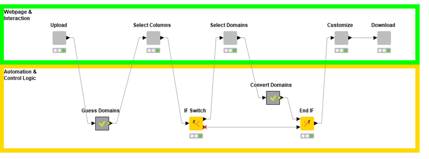
So let’s have a look at the Guided Visualization workflow itself and the steps that are involved. Figure 2 shows these steps. Each component enables user interaction during the process, whereas the calculations between the components take place fully automatically in the background. You can download the workflow from the KNIME Hub.
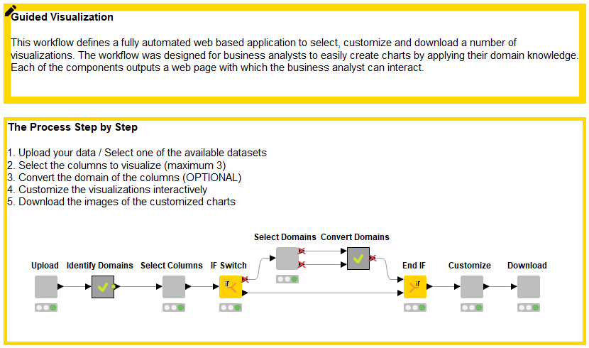
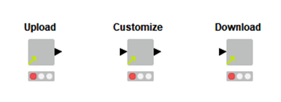
Components enable interaction: Upload -> Select Columns -> Select Domains -> Customize -> Download
- The first interaction point is enabled by the “Upload” component where the business analyst selects a data file
- The second interaction point is enabled by the “Select Columns” component. It produces an interactive dashboard, which the business analyst can use to select which column(s) to visualize
- The third interaction point, the “Select Domains” component, is optional. At this point, the business analyst can manually change the data types of the selected columns
- The fourth interaction point is the “Customize” component. It shows a collection of relevant graphs based on the number of columns and their data types. Here the business analyst can select one or more graphs, change their labels, zoom them, and apply other visual changes
- The fifth and final interaction point is the “Download” component that enables downloading the selected and customized graphs as images.
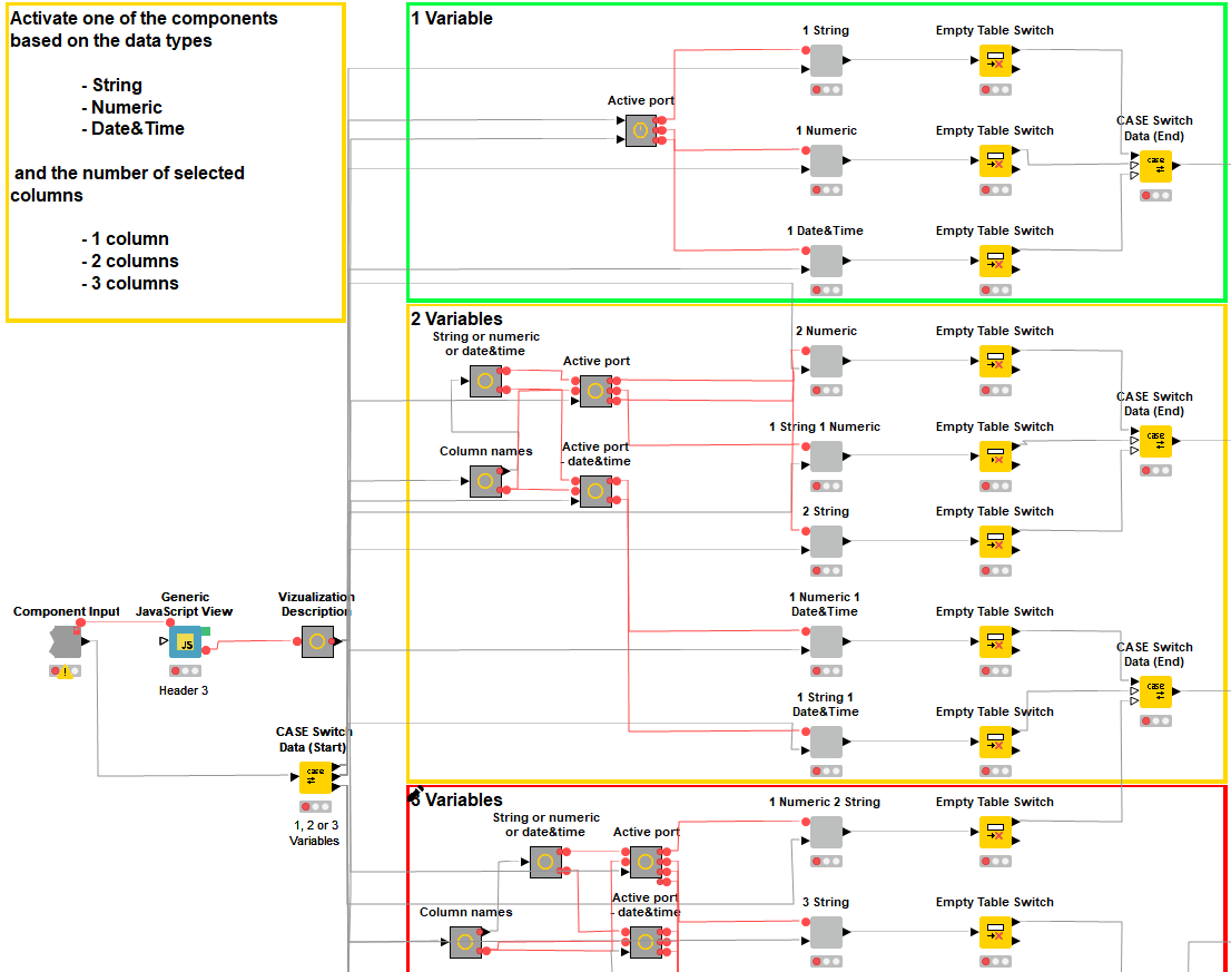
Of course not all of the specific requests of the business analyst will match the steps of guided visualization we’ve described above. However, the same logic remains useful in extended and modified versions of the same process. For example, it’s easy to insert more interaction points as components into our workflow (in Figure 2). We could also provide more graphs than are provided by the process so far (Figure 3). We would do this by adding new nodes inside the nested components shown in Figure 4.
Guiding a data scientist from unexplored data to interesting data
More experienced users, like for example data scientists, might also find the process of visualizing data challenging, especially if the data come from an unexplored and complex dataset. By complex we mean hundreds of columns with cryptical names for example. This problem is common in the earliest stage of the analytics process where the expert needs to understand the data before making any assumptions. Data visualization is a powerful tool for data exploration, however, if we have hundreds of unknown columns what needs to be visualized first?
Automatically visualizing interesting patterns between columns
One approach to quickly find the interesting columns to visualize is by using statistical tests. Here, we take a good sample of our really large dataset and we start computing a number of statistics for single columns, pairs of columns, and even groups of columns. This is usually computationally expensive so we should make sure that the sample we take isn’t too big.
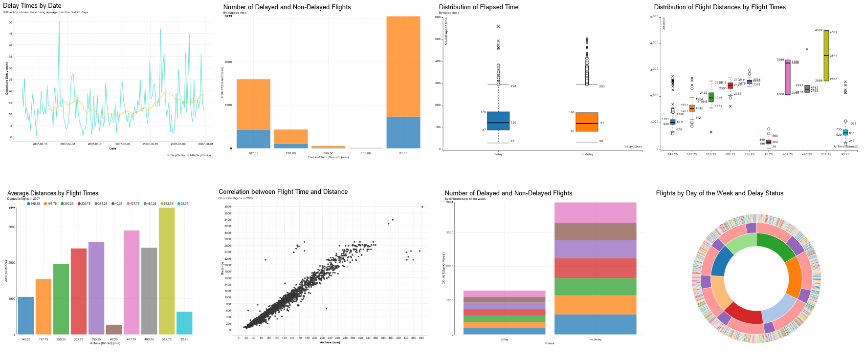
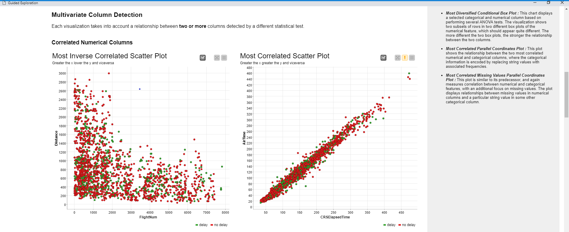
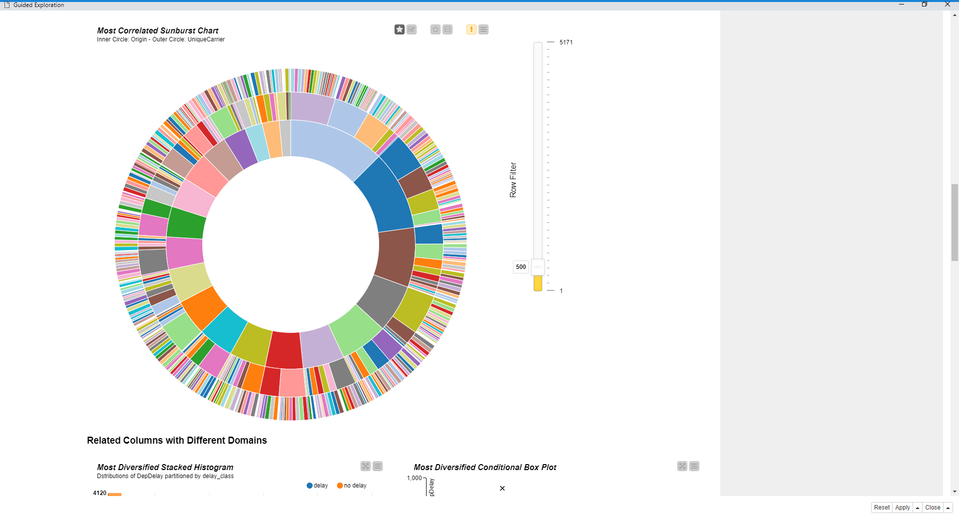
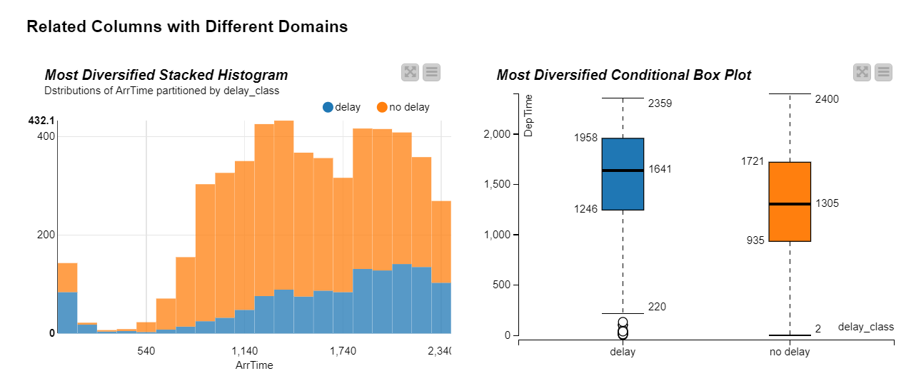
Using this approach we find interesting patterns - for example the most correlated pair of columns (Figure 6), a column with a skewed distribution, or one with a profusion of outliers. The statistical tests naturally take the domain of the data into account. For example, if we want to find an interesting relationship between a categorical and a numeric column, we wouldn’t use correlation measures but the ANOVA test (Figure 7) instead.
Ultimately, we will find a long list of patterns and relationships to be visualized. What then? Well based on what we want to visualize, we can find the best visualization for each interesting pattern. How do we visualize the most correlated columns? We can use a scatter plot. How can we show outliers in a column? We could use a box plot. Finding the best visualization for each interesting pattern is a crucial step and might need some visualization background. But what if we had a tool able to automatically first find those patterns and then also visualize them in the most suitable chart? All we then have to do is to provide the data and the tool gives us visualizations in return.
Guided Exploration workflow
This is what our KNIME workflow for Guided Exploration does.You can see it in Figure 5: it reads the data, computes the statistics, and creates a dashboard (Figure 6), which visualizes them. Nice right?
The human in the loop
In raw data, the most intense patterns are actually the result of columns of a bad quality: two columns that are practically identical would subsequently give high correlation; or columns with too many constant or missing values, and so on. Furthermore we might have columns with obvious relationships because they, for example, measure the same thing but with different units. Examples of these patterns are shown in Figures 6 and 7.
Whatever the cause, it is likely that the first time we visualize statistics calculated on raw data our results will be disappointingly boring. That is why our dashboard is in a Recursive Loop, as shown in the workflow in Figure 5.
The way this works is that we can iteratively remove the columns that are not interesting for some reason. We become the Human-in-the-Loop and iteratively choose which data columns should be kept and which should not, based on what the dashboard shows us. After a few iterations we will see a good number of interesting charts. All we need to do now is sit back, relax, let the workflow take us through a univariate and multivariate analysis, and extract the important information.
Executing from the KNIME WebPortal
You can download the workflow from the KNIME Hub, deploy it to your KNIME Server and execute it from the KNIME WebPortal, and - iteration after iteration - discard columns from any web browser. At the end of the loop it is up to you what you want to do with the few relevant columns that are left. You could simply output the results, or add more nodes to the workflow and immediately extend your analysis with other techniques. You might for example train a simple regression model given the lucky correlation with your target that you’ve just found - thanks to this process. Let us know what you come up with and share your solution on the KNIME Hub!
Customizable and reusable process steps
If you look closely at the two workflows presented above (as well as the Guided Automation workflow available on the KNIME Hub) you’ll notice that there are quite a few similarities between them. Things like the layout, internal documentation, overall style, and functionality are consistent across these workflows. This is by design, and you can incorporate this consistency in workflows too - you just need to take advantage of a few features that KNIME offers.
Layouting and page design
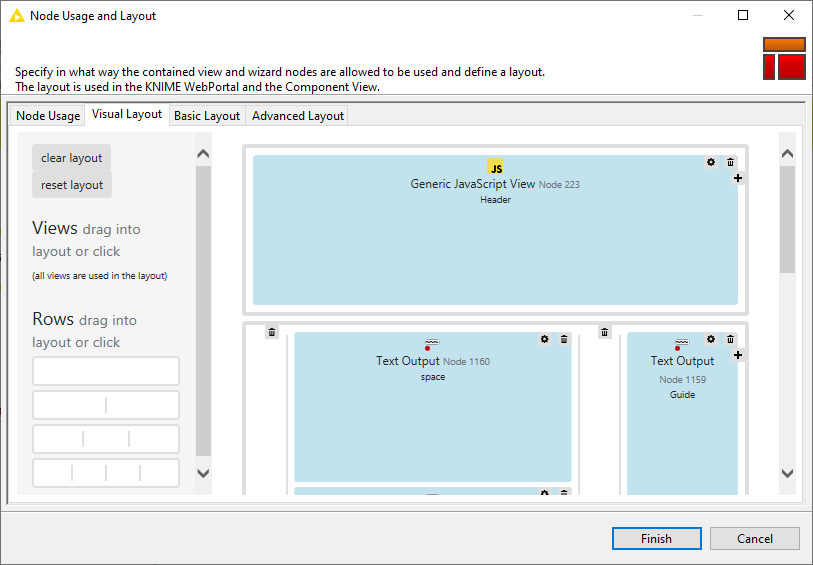
By using the newly updated layout panel in WebPortal preparation, we have the ability to make consistently formatted pages, complete with padding, titles, headers, footers, sidebars - everything needed to make a professional looking combined view.
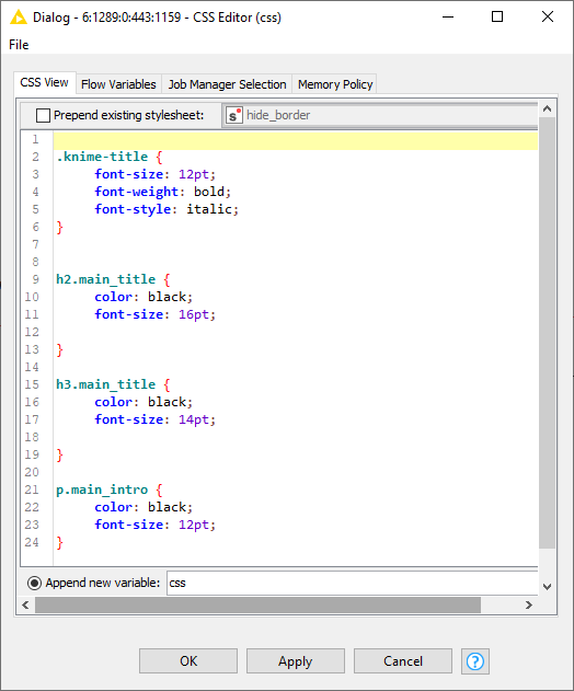
When combined with an initial CSS Editor node, we can define presentation elements like font selection, size, and placement in a single component and then pass those downstream to all subsequent nodes for a consistent display.
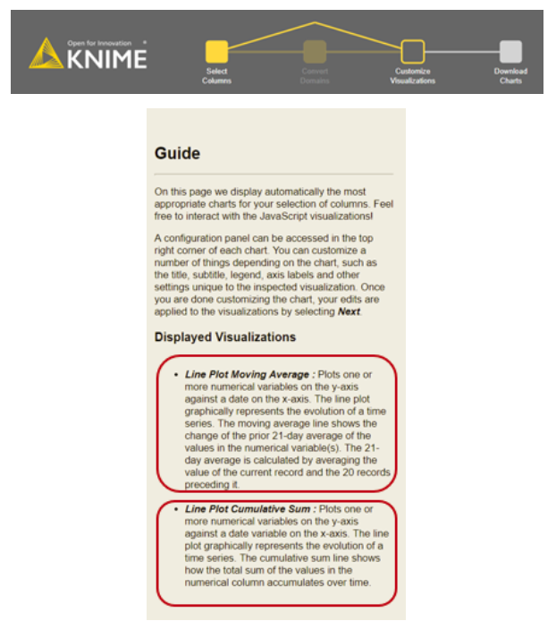
We can even develop custom HTML to create dynamic headers. This HTML can be passed as flow variables to add additional descriptive content too, like context senstive help text that appears next to visualizations.
The above are all elements of layout and page design that were used in the Guided Visualization and Guided Exploration workflows: arranging the components' views that correspond to web pages, enhancing the display and consistency with CSS styling and customizing the appearance of the KNIME WebPortal with dynamic headers and sidebars.
Component re-use and sharing
Beyond just similarity in look-and-feel between workflows, we also re-used functionality between workflows where it made sense to do so. After all, why create workflow functionality from scratch if it has already been implemented and tested in an existing workflow? There’s no need to re-invent the wheel, right?
For common tasks that we needed to implement in these workflows - things like uploading files, selecting columns, saving images, and so forth - we built a component. KNIME makes it simple to save components in your local repository or in your personal private/public space on the KNIME Hub for easy reuse, which can save a lot of time.
Now, with the new KNIME Hub, we also have the ability to import components and nodes directly into our own workflows! Give it a try yourself.
Components vs. metanodes
Another area of consistency in these workflows was the way we used components, as opposed to metanodes. We made a conscious decision early on to make use of components whenever we knew a user interaction point in the webportal would be required. So whenever the user is asked, for example, to choose columns for a model, or perhaps select a particular graph for visualizing data, this option was always included in component form.
We used metanodes regularly too, but for different reasons. Where logical operations, automated functions, or just simple organization and cleanup were needed, this is where metanodes were brought in. When needed, we would nest metanodes within each other - sometimes multiple times. This process is all about making sure the workflow has a clean look, and is easy to understand.
Workflow design considerations
When you’re designing your own workflows, you might even want to think about this method for using components and metanodes from the very beginning. Before dragging and dropping individual nodes into a workflow, start first with empty components and metanodes that represent the overall functionality. It might look something like this:
By first considering what your interaction points will be, along with what type of logic and automation might be required, you have an overall roadmap for what your end workflow could look like. You can then go back and “fill in” the components and metanodes with the functionality you need. The advantage of designing this way is that it can massively speed up future workflow development, because you’ve built in potentially reusable components right from the start.
Another thing to consider in your workflow design is the tradeoff between user interaction and automation. Your users will often do some amazing things when running workflows, and some of the choices they make may be quite unexpected. The more user interaction you offer, the more potential there is for unknown behavior - which will require you to develop additional control logic to anticipate such behavior. On the other hand, fewer interaction points will lead to less complex workflows that aren’t as flexible. You’ll have to decide where the sweet spot is, but in practice we’ve found that a good approach is to focus on only those interactions that are absolutely necessary. It turns out that even with minimal interactions, you can still build some very impressive webportal applications!
Summary
The processes of Guided Visualization and Exploration require a number of decisions: What are the most important columns for my purpose? How do I visualize them? Are all columns necessary to keep in the data? Do they have the appropriate data types?
A business analyst might easily explain the development shown by a graph, but comparing different ways of visualizing the development might be outside of his/her interest or expertise. On the other hand, someone who’s an expert in building fancy graphs doesn’t necessarily have the best understanding for interpreting them. That’s why an application that automates the steps that require out-of-domain expertise can be practical in completing day-to-day tasks.
Here we have shown how a business analyst can start with raw data and generate relevant and useful visualizations. On top of that, we’ve presented a workflow that can help a data scientist gain better understanding of complex data.
Resources
- Watch a recording of the talk Visualizing with Guided Analytics: for End Users and Experts, by Phil Winters