
Systems that automate the data science cycle have been gaining a lot of attention recently. Similar to smart home assistant systems however, automating data science for business users only works for well-defined tasks. We do not expect home assistants to have truly deep conversations about changing topics. In fact, the most successful systems restrict the types of possible interactions heavily and cannot deal with vaguely defined topics. Real data science problems are similarly vaguely defined: only an interactive exchange between the business analysts and the data analysts can guide the analysis in a new, useful direction, potentially sparking interesting new insights and further sharpening the analysis.
Therefore, as soon as we leave the realm of completely automatable data science sandboxes, the challenge lies in allowing data scientists to build interactive systems, interactively assisting the business analyst in her quest to find new insights in data and predict future outcomes. At KNIME we call this “Guided Analytics”. We explicitly do not aim to replace the driver (or totally automate the process) but instead offer assistance and carefully gather feedback whenever needed throughout the analysis process. To make this successful, the data scientist needs to be able to easily create powerful analytical applications that allow interaction with the business user whenever their expertise and feedback is needed.
Environments for Guided Analytics
What is required to enable a team of data scientists to collaboratively merge their expertise and build such an interactive, potentially even adaptive analytical application? Applications that give the business users just the right amount of guidance and interactions?
Ideally, such an environment would have a few properties:
- Openness. The environment does not post restrictions in terms of tools used – this also simplifies collaboration between scripting gurus (such as R or Python) and others who just want to reuse their expertise without diving into their code. Obviously being able to reach out to other tools for specific data types (text, images, …) or specialized high performance or big data algorithms (such as H2O or Spark) from within the same environment would be a plus;
- Uniformity. At the same, the experts creating data science can do it all in the same environment: blend data, run the analysis, mix&match tools, and build the infrastructure to deploy this as analytical application;
- Flexibility. Underneath the analytical application, we can run simple regression models or orchestrate complex parameter optimization and ensemble models – ranging from one to thousands of models. This (or at least some aspects of it) can be hidden completely from the business user;
- Agility. Once the application is used in the wild, new demands will arise quickly: more automation here, more consumer feedback there. The environment that is used to build these analytical applications needs to make it intuitive for other members of the data science team to quickly adapt the existing analytical applications to new and changing requirements.
In a nutshell: we want to enable a team of data scientists, with different preferences and skills, to collaboratively build, maintain and continuously refine a set of analytical applications exposing highly different degrees of interaction to the business users. Some of these applications will simply present an overview or forecast at the press of a button. Others will just allow the end user to choose the data sources to be used. Others again will query the user for feedback that ends up refining the model(s) trained underneath the hood, taking the users’ expertise into account. Those models can be simple or arbitrarily complex ensembles, or entire model families, and the end user may or may not be asked to help refine that setup. The control over how much of such interaction is required lies in the hands of the data scientists who designed the underlying analytical process with their target audience, the actual business users’ interests (and capabilities) in mind.
Auto-what?
So how do all of those driverless, automatic, automated AI or machine learning systems fit into this picture? Their goal is either to encapsulate (and hide!) existing expert data scientists’ expertise or apply more or less sophisticated optimization schemes to the fine-tuning of the data science tasks. Obviously, this can be useful if no in-house data science expertise is available but in the end, the business analyst is locked into the pre-packaged expertise and the limited set of hard coded scenarios.
Both, data scientist expertise and parameter optimization can easily be part of a Guided Analytics workflow as well. And since automation of whatever kind tends to always miss the important and interesting piece, adding a Guided Analytics component to this makes it even more powerful: we can guide the optimization scheme and we can adjust the pre-coded expert knowledge to the new task at hand.
Guided Analytics in KNIME
Guided Analytics using KNIME software is straightforward: the team of data scientists collaborate using KNIME workflows and give their business analyst colleagues access to those workflows through the web interface of KNIME Server. There is no need to use another tool to build the web application; the workflow itself models the interaction points (simple UI elements or sophisticated, interactive visualizations) that comprise the analytical application. Workflows are the glue holding it all together: different tools used by different members of the data science team, data blended from various sources by the data engineering experts, and interaction points modeling the UI components visible to the end user.
The figure below shows an illustrative example of such a workflow:
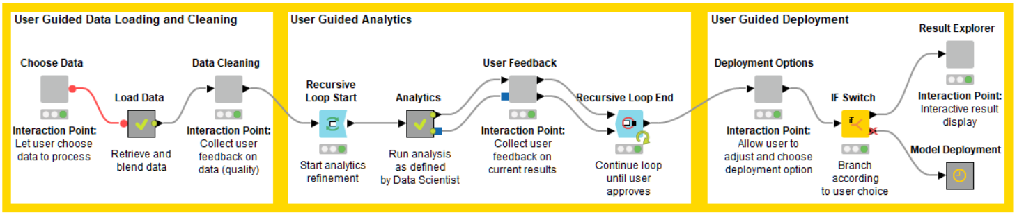
Several of the gray metanodes represent the “interaction points” of the workflow: the data scientist who built this workflow designed them so that the workflow, when executed on KNIME Server, allows for interactions with her fellow business analyst at these points in the analysis. In the example workflow, the first interaction point allows the business analyst to select the data set(s) to analyze (“Choose Data”). After the data have been loaded, a second interaction point (“Data Cleaning”) displays a data overview and allows the business analyst to interact: remove useless columns, deal with outliers, fix skewed distributions – whatever the data scientist deemed interesting and relevant at this point. The part in the middle now runs through an analysis and allows the business analyst to provide feedback until a result is reached that is satisfactory. The workflow concludes by allowing the analyst to either deploy the model directly into – in this case - a database or inspect the result in an interactive dashboard. Each one of these nodes models user interaction through a of set of interactive visualization nodes, which, using the exact same workflow paradigm as everywhere else in KNIME, allow the data scientist to essentially design a web page that captures the business analyst’s feedback. The figure below shows the internals of our “Analytics Interaction Point” together with the page that is automatically created from this node for the guided analytics application. The arrangement of the views can be customized using the layout configuration editor of the metanode.
Deploying the analytical application via KNIME Server is one aspect of collaboration across team boundaries. Another important aspect is reusability: KNIME Server also allows the sharing of metanodes across data science teams, enabling others to build on top of existing pieces: interaction points as described above but also other metanodes, which may encapsulate prepackaged pieces of data blending, different types of analysis and, obviously also incarnations of (semi) automated ML or driverless (assisted) AI.
Guided Analytics: Where is the journey heading?
At KNIME, we are seeing a lot of interest in Guided Analytics. Initially, often this is really only used as a powerful and interactive data exploration and cleaning mechanism but increasingly users are starting to add analytics into the mix and allow users to not only wrangle data but also fine tune their analyses. It is also great to see how much collaboration this triggers: through the consistent use of visual workflows for the entire design, data scientists keep re-using existing pieces and create increasingly sophisticated guided analytics workflows. Managing model factories, interactively refining models by incorporating active learning methods, semi-automated machine learning are all just components of this framework. It will be fascinating to see how data scientists continue to build increasingly powerful analytical applications that work side-by-side, assisting the expert user to create truly useful analyses. Rather than taking the expert out of the driver’s seat and attempting to automate her wisdom, Guided Analytics aims to combine the best of both and is truly open for innovation.