
Stockout is detrimental to the customer experience. If a consumer experiences at least three out-of-stock events with retailers they are likely to switch to a new retailer.
It happens when customer orders exceed available inventory. This can occur at any time – right at the beginning when a product is being created, or at the end when it’s in its final form. But it’s most visible when it occurs at the retail end, when a finished item is ready.
There can be multiple causes for stockout to occur, but some of the common ones are:
-
Human error e.g., errors that occur during counting the inventory
-
Stock shrinkage e.g., unreported, damaged, or stolen goods
-
Inadequate forecasting e.g., poor forecasting of stocks consumption in the future
Stockouts cannot be entirely avoided, but their count can be minimized and a good KPI accounting for its frequency should be close to zero.
To monitor KPIs for out-of-stock events, companies can build dashboards to monitor stockout trends. For this article, we use data from a fictional company named Abc Inc., which measures its stockout for each month. The head of the supply chain department requested the creation of a dashboard to monitor the stockout trend for 2020 and 2021. He has requested two charts: One to account for trends for each warehouse category given a selected year, and a second dashboard to monitor selected categories for 2020 and 2021.
A dashboard to monitor stockout trends
Abc Inc. has warehouses in five locations in the USA. Each location has three different item categories:
-
Critical Items
-
Regular Items
-
Slow moving Items
The two requested charts are created as shown in fig.1. This chart is helpful for business managers to carefully observe trends and prepare inventory accordingly.
You can try out this dashboard yourself. Click to access it on the KNIME Community Server.
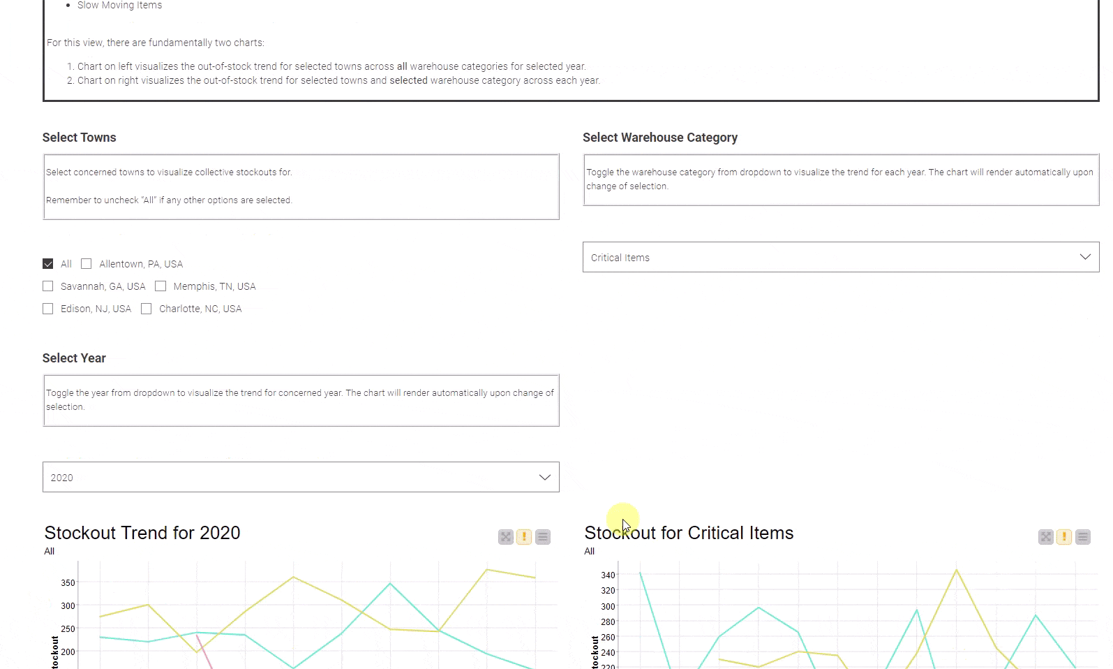
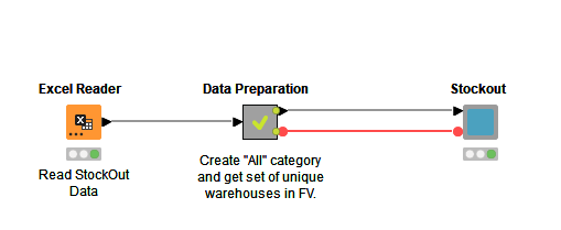
The dashboard is created with a KNIME workflow (fig.2) with various visualization widgets, put together in a component. The data is read using the Excel Reader node and is preprocessed to create an additional category for warehouses: "All". This category gives users the flexibility to measure aggregated trends for all the warehouses. The list of warehouses is converted into a flow variable of type “set”, and is propagated in the visual component of the workflow.
But what is a visual component? KNIME Analytics Platform provides a diverse set of views and widgets to create interactive charts in KNIME. One of the special features of the widgets is to create customizable HTML-based visuals for better appealing layouts. All these can be configured inside a component to produce a consolidated view in the browser. We refer to such components as visual components.
As you can see in the dashboard shown in fig.1, the trend in stockouts for the selected year and item category is relatively stationary except for a few spikes. The deviation is higher for “Regular Items” as compared with other categories for all the years available. Otherwise, trends are similar for others with slight overlaps. One thing to note here is that missing values for any given month are not filled in. This can be adjusted based on decisions from stakeholders on how to treat such values.
Avoid the “how do I get started” moment with solution starters
To start doing stockout analysis yourself, download the workflow KNIME Community Hub. Explore the Supply Chain space for more solution starters for inventory valuation, ABC analysis, inventory management, and more.