An intrusion in network data, a sudden pathological status in medicine, a fraudulent payment in sales or credit card businesses, and, finally, a mechanical piece breakdown in machinery are all examples of unknown and often undesirable events, deviations from the “normal” behavior.
Predicting the unknown in different kinds of IoT data is well established and high value, in terms of money, life expectancy, and/or time, is usually associated with the early discovery. Yet it comes with challenges! In most cases, the available data are non-labeled, so we don’t know if the past signals were anomalous or normal. Therefore, we can only apply unsupervised models that predict unknown disruptive events based on the normal functioning only.
In the field of mechanical maintenance this is called “anomaly detection”. There is a lot of data that lends itself to unsupervised anomaly detection use cases: turbines, rotors, chemical reactions, medical signals, spectroscopy, and so on. In our case here, we deal with rotor data.
The goal of this “Anomaly Detection in Predictive Maintenance” series is to be able to predict a breakdown episode without any previous examples.
Today we want explain what a control chart is, and then build this simple prediction model. Our analysis builds on the first part of the series, where we standardized and time aligned the FFT preprocessed sensor data, and explored its visual patterns. In the third part we’ll implement an auto-regressive model.
What is a control chart?
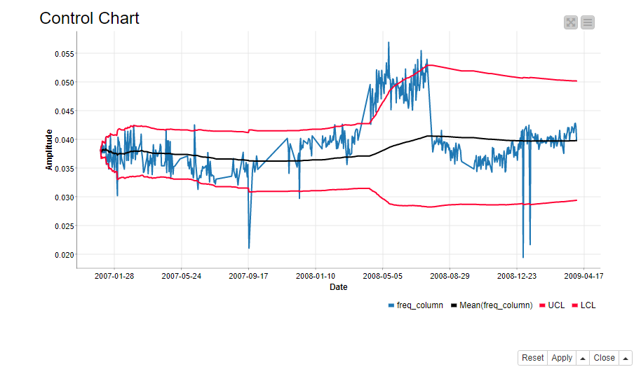
A control chart defines the normal functioning of a process. It is a common statistical tool to determine if the variation in the process is a part of the process itself, or caused by some external factor. In our case the external factor could be a deteriorating rotor. In its simplest form, a control chart consists of a line plot of the process itself, the process average, and the upper and lower limits to the normal process behavior (Figure 1).
We define the control chart for each frequency band and sensor separately. Furthermore, we define the normal functioning as the cumulative moving average of the signal +/- 2 times the cumulative standard deviation. If the signal is wandering off from this normal area, an alarm should occur. Cumulative means that the measure is calculated on all values of the time series prior to the current value. So, a cumulative sum is the sum of past values up to the current value, a cumulative average is the average calculated on all past values up to the current value, and so on.
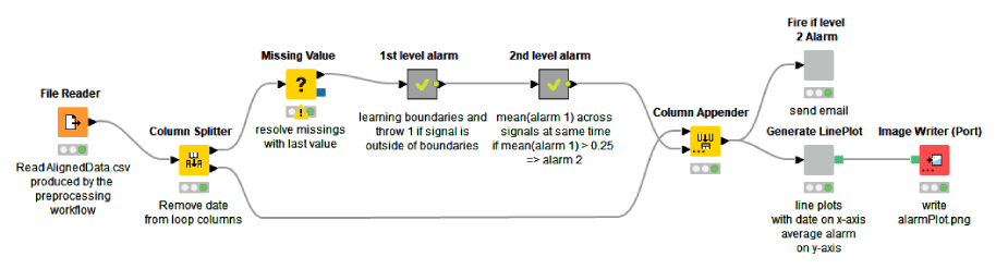
The Anomaly Detection. Control Chart workflow shown below implements the procedure. This predictive maintenance example workflow is publicly available to download from the KNIME Hub.
We start by accessing the data, which was preprocessed in the first part of the series. The preprocessed data contain 313 spectral amplitude columns originating from 28 sensors that monitor 8 mechanical pieces of a rotor. Next, we replace the missing values in the data by the last available values.
Inside the “1st level alarm” metanode, we loop over the 313 spectral amplitude columns, define the control chart within each column, flag the offsets as 1st level alarms, and finally collect the 1st level alarms column-wise. Inside the “2nd level metanode”, we aggregate the 1st level alarms column-wise, and flag the aggregated values as 2nd level alarms, if they exceed a threshold (0.25). Finally, we visualize the 2nd level alarms over time and send an email to the person in charge of mechanical checkups if a 2nd level alarm is active.
Calculate 1st level alarm
For each spectral amplitude column, we calculate the cumulative average (avg) and standard deviation (stddev). We do this with the Moving Aggregation node that aggregates data by time windows, similarly to what the GroupBy node does by groups. We then use the cumulative metrics to calculate the boundaries to the normal functioning. The upper (UCL) and lower (LCL) limits for the normal functioning are calculated as:

Notice that the boundaries also evolve over time, because the average and standard deviation evolve. We check for every single frequency value if it’s inside the boundaries. If not we flag it with “1” indicating a 1st level alarm. Otherwise we flag it with “0”.
However, a 1st level alarm on a single frequency band doesn’t mean much. The brief signal wandering of only one time series outside the established boundaries could be due to anything temporary: an electricity spike, some turbulence in that part of the rotor, or something else quick and unexpected. What is much more worrisome is a sequence of 1st level alarms across all frequency bands and across all monitored rotor parts.
Calculate 2nd level alarm
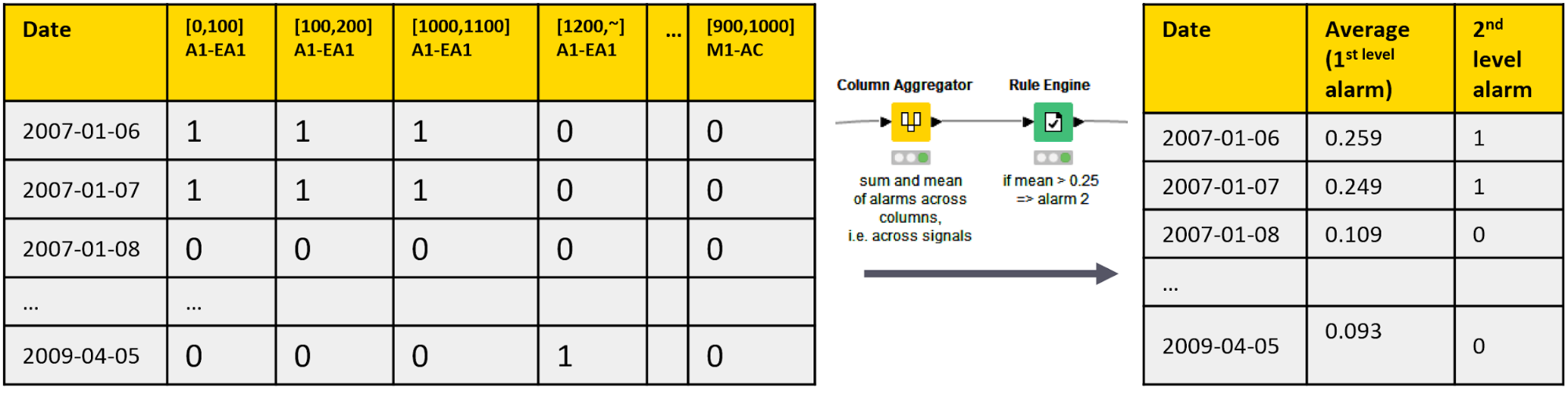
A 2nd level alarm indicates a more consistent wandering of the signal from its normality, being therefore more worrisome and triggering a serious alarm situation.
We calculate the 2nd level alarms by aggregating the 1st level alarms on all frequency bands. We use the Column Aggregator node to calculate the average of the 1st level alarm flags on all frequency bands on all dates, and the Rule Engine node to raise a 2nd level alarm if the row average exceeds 0.25. This means that a 2nd level alarm is only raised if at least 25% of all single amplitude columns deviate from their normal functioning at the same time. (Figure 3)
Model testing
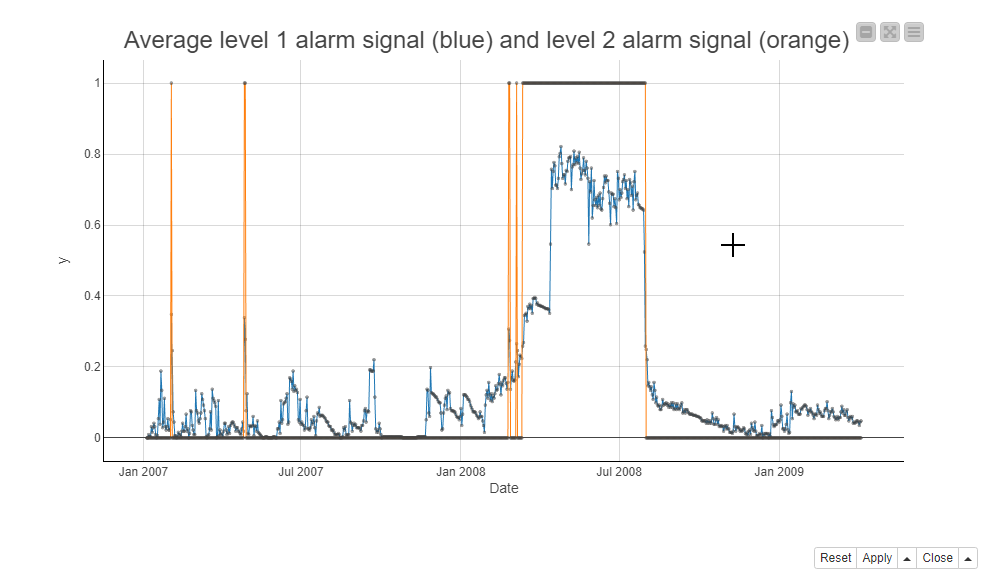
Next, we take a look at the 2nd level alarm series before the rotor breakdown on July 21, 2008. Below, the screenshot shows the 2nd level alarms during the maintenance window in a line plot. The blue line is for the average of the 1st level alarms and the orange line is for the 2nd level alarms. It seems that the 2nd level alarm signs are visible first just briefly at the beginning of 2007 and more substantially starting in March 2008, a couple of months before the rotor breakdown.
Taking action
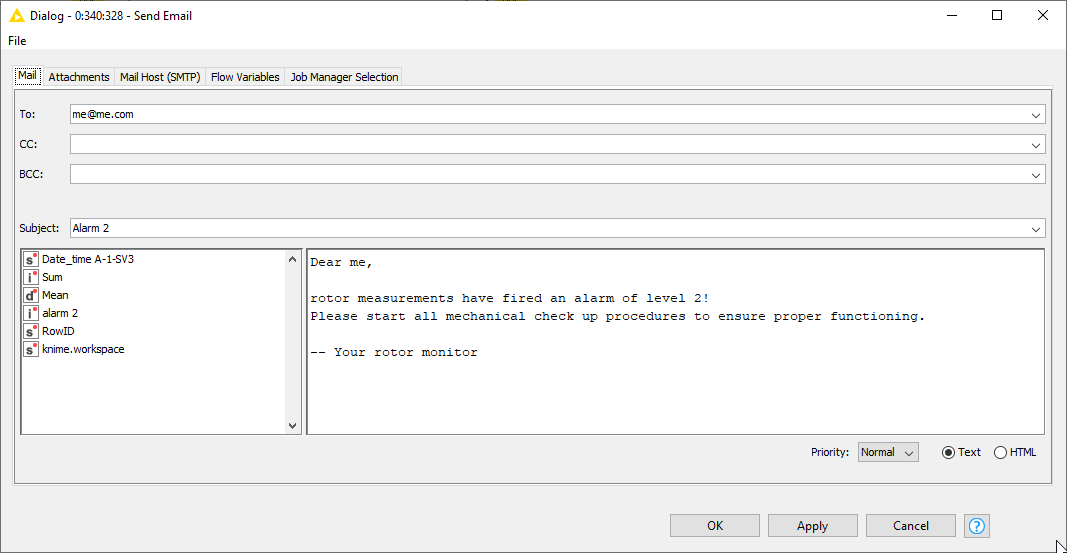
The final step is to decide what to do if an alarm is active. We’ve found out that a 2nd level anticipates a rotor breakdown reliably, but not at short notice. On the one hand we want to keep the motor running as long as possible – mechanical pieces are expensive! ‒ on the other hand, we want to avoid the motor breaking down completely, producing even more damage. Therefore, we decided to not howl sirens or switch off the system, but send an email to the mechanical support. This is implemented inside the “Fire if level 2 alarm” metanode, using the Send Email node (see below).
Control chart: A simple technique to predict rotor breakdowns
In this article, we built a Control Chart to monitor the functioning of a rotor. We reported each deviation from the normal functioning on a single frequency band as a 1st level alarm. We then aggregated the 1st level alarms over all frequency bands and sensors, and raised a 2nd level alarm if multiple frequency bands showed anomalies. We visualized the 2nd level alarms over time, and implemented an automatic email to the mechanical support as the consequent action of a 2nd level alarm.
A Control Chart is a simple technique to predict the rotor breakdowns. Its advantage is the independence of the underlying distribution, which is often unknown for IoT data. However, we could possibly do even better with more complex analytics techniques, such as auto-regressive models. We’re going to look into this in the next part of the series.