
Exploration, analysis, visualization: this article highlights this functionality in KNIME Analytics Platform using sunburst charts, tag clouds and networks. We’ll use life-science data for this blog post, but all of this can be applied to diverse kinds of datasets. So if you have a different background, we warmly invite you to keep reading. Fair warning though: if you are snacking in front of your computer, you might want to swallow first.
Before we dive into the workflow itself, here’s a bit of background information on the problem. Many human diseases are caused by genetic factors. Learning more about these factors is important, because the insight we gain can improve the chances of finding cures and help guide treatment decisions. Here we want to show an example of how to investigate disease-related genes.
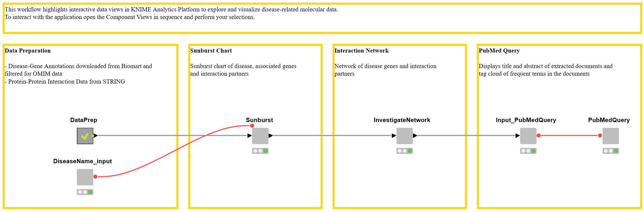
First, we’ll give a quick general overview of the workflow (see Fig.1) and then explain each step using a particular disease as an example. The interactive views we describe here are accessible in two ways: via the KNIME WebPortal, and by showing the interactive view of the wrapped metanodes in KNIME Analytics Platform. The interactive views are practical because even someone who is not a KNIME user can use the workflow to interactively explore data and generate knowledge.
Figure 1. Workflow to Interactively Investigate Disease Genes. Interactive views are generated by the wrapped metanodes and are accessible via the KNIME WebPortal or via the node view. Download the Disease Genes workflow from the KNIME Hub.
Overview
Data Preparation
For any disease of interest, we investigate disease-associated genes from the Online Mendelian Inheritance in Man (OMIM, https://www.ncbi.nlm.nih.gov/omim) database. Genes encode proteins, which interact with other proteins in the body. To examine those interactions we joined protein interaction data with the extracted disease-related genes. For more details on the data, please see the Data section below.
Sunburst Chart
We display the disease and the gene names in a sunburst chart using the wrapped metanode “Sunburst” (Figure 1). In the same sunburst chart we also show protein-protein interactions of the protein encoded by the disease-associated genes. For simplicity, the gene names, rather than the protein IDs are shown.
Interaction Network
The next step reveals the network of disease genes and their interaction partners. You can filter the node degree (the number of connections a node has to other nodes) using a range slider. Information about the nodes themselves is also displayed in the table below.
PubMed Query
Selected genes in the network or in the table are subsequently used to query information from the biomedical literature that is stored in the database PubMed. For that, we use the node Document Grabber and display the titles and abstracts of the resulting papers in a table. Frequent terms in these documents are then presented in a tag cloud.
Maple Syrup - Always Yummy?
We will now use the example of the disease “Maple Syrup Urine Disease” to guide you through the workflow step by step. Maple Syrup Urine Disease is a metabolic disorder that can lead to sweet-smelling urine.
In the first step, we type in the disease we want to investigate. Here, we use a wildcard - “Maple syrup*” - to retrieve all diseases in the database OMIM that have names starting with “Maple syrup”. In this case, our search yields MAPLE SYRUP URINE DISEASE as well as MAPLE SYRUP URINE DISEASE, MILD VARIANT.
Now we can look at disease-associated genes in the displayed table (see Figure 1). The table also shows the WikiGene description, which we downloaded from the Ensembl Biomart.
Figure 2. Disease Associated Genes and their Interaction Partners. The table shows the disease of interest, the known associated genes from the OMIM database, and the WikiGene description. The sunburst chart illustrates the disease, the associated genes, and the interaction partners in the STITCH database.
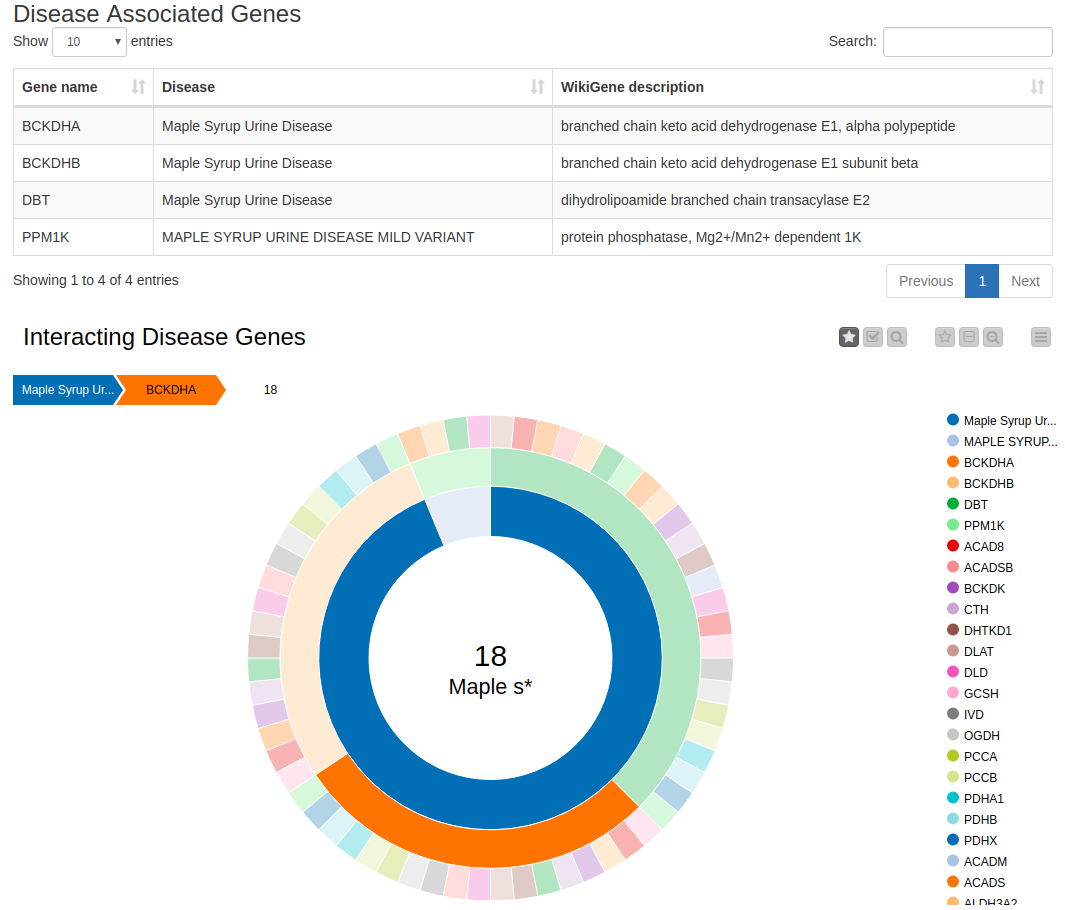
The sunburst chart contains the disease name in the first (inner) circle and the disease’s associated genes in the following (middle) circle. The third (outer) circle depicts the protein-interaction partners of the proteins encoded by these genes. Protein-protein interactions indicate functional relationships between proteins. Hence, if one protein interaction partner is associated with a disease, the other one might be as well. By clicking on any entity, you can select it and investigate the associations. By selecting, for example, Maple Syrup Urine Disease and then the gene BCKDHA, we find 18 interaction partners of the protein encoded by that gene. Using the sunburst chart, we can investigate these data in a simple way, as it provides us with a compact, interactive visualization.
Network of Disease Genes
KNIME’s network representations offer another useful way of exploring and visualizing these data. We use the Network viewer node to depict the protein-protein interaction network of the proteins encoding for genes that are associated with Maple Syrup Urine Disease (Figure 3).
Figure 3. Network of Disease Associated Genes and their Interaction Partners.
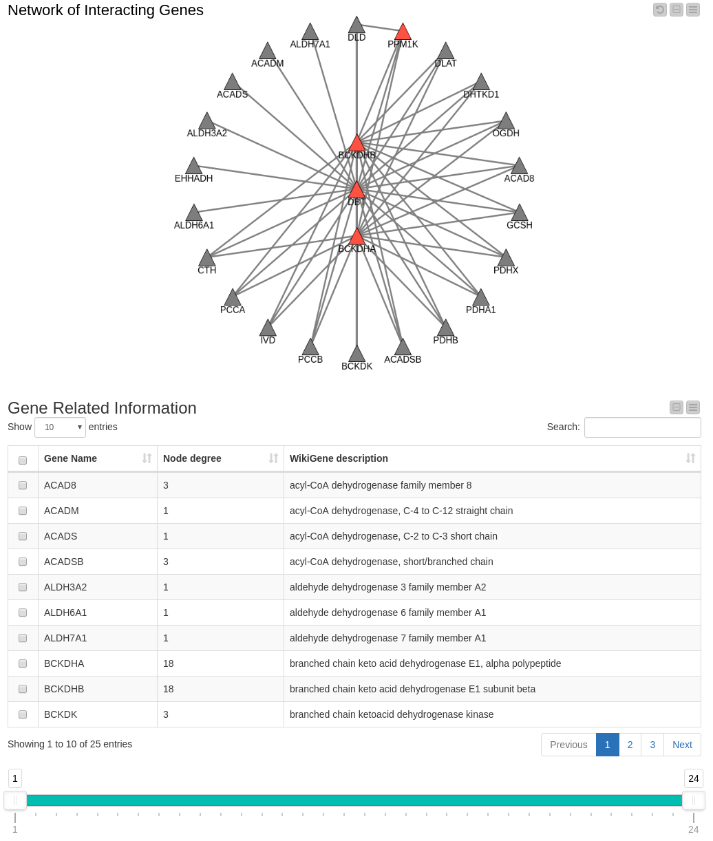
The genes known to be associated with the disease in our data set are represented by red triangles. Their interaction partners are represented by gray triangles.
A node’s degree in the network (the number of connections it has to other nodes) serves as an indicator of the importance of that node. The table below the network displays the Gene Name, its degree in the network and the WikiGene description.
Figure 4. Network Filtered by Degree. The range slider allows you to filter for genes within a specified degree range (in this case >= 4). You can select genes in the network or in the table below, where the gene description from WikiGene is also shown.
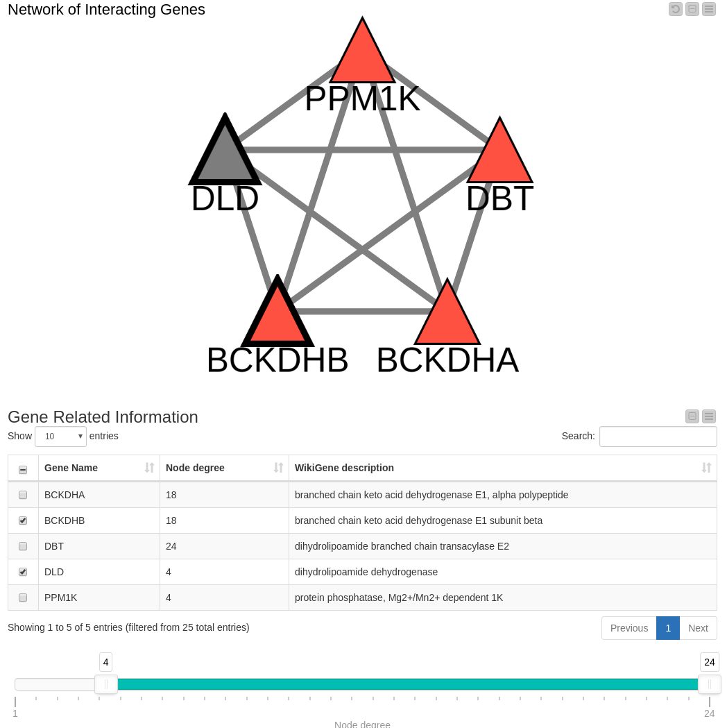
Since we think the node degree is important, we decided to include a range slider in our workflow which we can configure to show only those nodes within a specific degree range. (Note: By removing a node, edges connecting that node are also removed.) Filtering the data down to include only those nodes with a degree higher than four (Figure 4) results in a view containing all known genes associated with Maple Syrup Urine Disease along with one in gray that is not reported in our OMIM dataset: DLD. This is an interesting finding that we’ll follow up on in the next view.
Tag Cloud with Results of PubMed Query
The detection of a highly connected gene in the network can lead us to the hypothesis that DLD is involved in Maple Syrup Urine Disease. One way to test this hypothesis is to search the biomedical literature for articles mentioning the gene. The next step in our workflow enables this by allowing us to conduct a PubMed query and then summarizing the results. The genes of interest selected in either the table or the network (see Figure 4) are used to generate a PubMed query. The selected genes, DLD and BCKDHB in this example, are displayed in a text input field in the next view. This can be modified before submitting the query if you have other ideas or refinements.
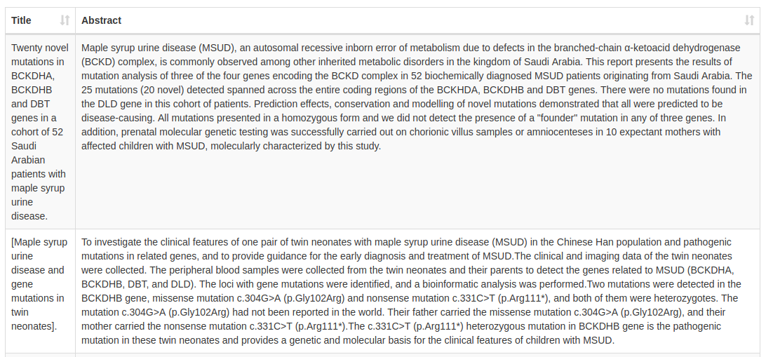
In our example, the PubMed search returned ten papers with the two genes as keywords. The first two are shown in Figure 5. Even though Maple Syrup Urine Disease was not part of the query, all hits investigate that particular disease. The results also include cases where DLD was investigated, but no mutations were found.
Figure 5. Abstract and Title Resulting from the PubMed Query. The first two results are shown.
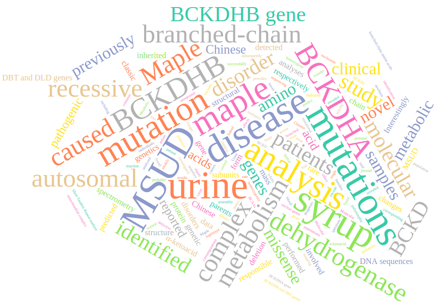
We use the documents resulting from the PubMed query to build a tag cloud containing frequent words in those documents. In Figure 6, we see the resulting tag cloud.
Figure 6. Tag Cloud of Frequent Words in the Document Resulting from a PubMed Query.
Data
We investigated disease-associated genes from the Online Mendelian Inheritance in Man (OMIM, https://www.ncbi.nlm.nih.gov/omim) database, which is a widely used catalog of human genes and genetic disorders and traits. Before starting, we downloaded information about genes (gene names and Ensembl ID) and the protein IDs for which they encode from the Ensembl BioMart. We can download associated phenotypes/diseases from the Ensembl BioMart, which also contains OMIM data. We also used the Ensembl BioMart to extract WikiGene descriptions for the genes in our analysis.
To investigate interactions on the protein level, we downloaded a file (9606.protein.links.v10.5.txt.gz) from the database STRING. We only kept high-confidence interactions — namely, those with a confidence score >= 900. We joined the downloaded data that share the same protein ID. This allowed us to investigate diseases, the associated genes, and their interactions on the protein level.
Summary
In this blog, we took advantage of the interactive data views in KNIME Analytics Platform to explore and visualize disease-related molecular data.
For a disease of interest, such as Maple Syrup Urine Disease, the associated genes in the OMIM database were displayed in a sunburst chart. Moreover, interactions of the proteins encoded by the disease-associated genes were shown in the same chart.
We then took a closer look at the network of disease genes (red nodes in Figure 3 and 4) and their interaction partners (grey nodes in Figure 3 and 4). We filtered for nodes with a high degree, assuming that those genes play a more important role in the disease. We found a gene whose association with Maple Syrup Urine Disease has not yet been reported in our dataset, which enabled us to hypothesize that it may be involved in the disease. To test this hypothesis, we performed a PubMed query containing this gene and looked at the abstracts of the resulting papers. In the last step, we presented frequent terms occurring in those papers in a tag cloud.