
Adopting a no-code approach for machine learning empowers individuals to build AI solutions without a software engineering background. But what about explaining the models they deploy? More regulations, such as the AI Act by the European Commission or the White House AI Bill of Rights Blueprint, are currently being drafted to make organizations liable for their models. How can they answer questions such as: “What column from the table was used by the model to make this prediction?”
To showcase how to answer these questions, we'd like to look an example from the healthcare industry. Artificial intelligence and machine learning in healthcare can help physicians make more informed clinical decisions by analyzing current and historical healthcare data to predict outcomes. However, it's often difficult for AI to be completely adopted in practical clinical environments because these so-called “black box” predictive models are hard to explain. Fortunately, “explainable artificial intelligence (XAI) is emerging to assist in the communication of internal decisions, behavior, and actions to healthcare professionals”, reports the Journal of Healthcare Informatics Research.
In this article, we look at LIME, an algorithm that can be used to understand the decision-making process of any prediction model, in our case we are going to explain a model predicting strokes from patients data.
Local Interpretable Model-Agnostic Explanations: LIME
To comprehend what the model is doing, we could either use global methods, which reflect the general behavior of the entire model, or local methods (which show how a single prediction is made) to describe how a black box machine learning model makes decisions.
Note. KNIME offers both global and local methods to answer your questions using a no-code approach. Recently we used the blog post “Let KNIME Explain with XAI Solutions on KNIME Hub” to announce the XAI Space: a collection of showcases for XAI solutions offered by KNIME. Most of those solutions rely on KNIME Verified Components from the Model Interpretability category, as well as KNIME ML Interpretability Extension on each possible ML regression and classification model.
Local explanations can answer questions regarding single model predictions. Here,In this article, we are going to explore Local Interpretable Model-Agnostic Explanations (LIME). Among other techniques KNIME covers, these can compute local explanations for any black box model. As the name suggests, LIME is model-agnostic; it can be implemented independently of the ML algorithm used in training. Instead of focusing on explaining the model in this case, we describe how and why it predicts a certain result for each data point, and examine which features are more crucial than others while making a prediction.
The Theory Behind LIME
The theory behind LIME — also described in the paper “Why Should I Trust You?” Explaining the Predictions of Any Classifier” — makes use of a local surrogate model trained on a local neighborhood. To understand what that means, look at Figure 2.
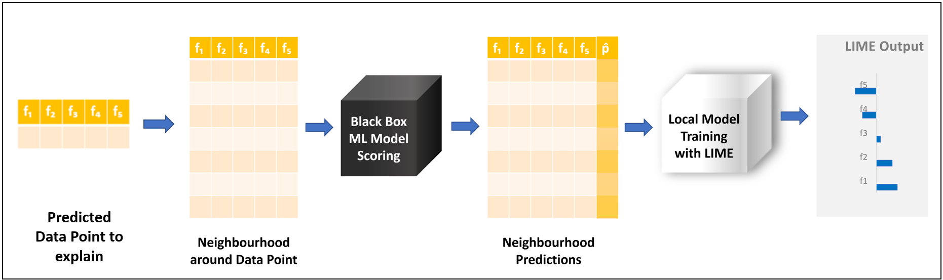
We take the predicted data point we want to explain. From this data point, we generate a data sample, called a neighborhood, which describes the features space locally around that data point. A neighborhood is generated by adding or subtracting small values around the features of the original data point. We then take the black box model and apply it to this artificially generated sample. The local surrogate model is then trained on the neighborhood, but we use the predictions generated by the black box model as a target.
We initially started this process to explain a single prediction, and now we have two models. You might wonder how this is useful. The important part is that the local surrogate model we just trained is within the list of interpretable ML models. These are models which explain themselves — for example, decision trees or logistic regression models. The local surrogate adopted by LIME is a Generalized Linear Model (GLM), which can be simply explained by looking at the coefficients adopted on the scoring function. These coefficients are represented in Figure 1 by the bar chart on the right.
So to explain the predicted data point, we generated a new local surrogate model from which we could extract the explanation. But how can we be so sure that the new model can explain this data? How can this work if the black box model is much more complex than the local surrogate model? To answer this question, look at a simple example in which a model was trained on only two features (Fig. 3).
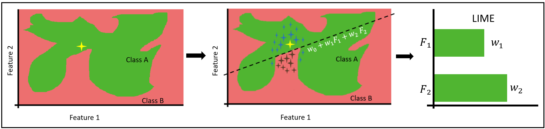
There isn't a clear rule or explanation for how the data point, marked in yellow, was predicted. An explanation can be given using the formula of the drawn line. This can work behind the intuition that any non-linear decision boundary — in our example, the border between red and green — becomes linear if we “zoom in” on a particular segment of the decision boundary around the data point.
A number of data points are formed in the vicinity of the point to be explained. Each of these points has a weight assigned to it; the closer the data point is to the original value to be explained, the higher its weight will be, elevating the significance of nearer points when training the GLM model. The GLM local surrogate model is represented by the dotted line dividing the two classes. From the GLM, we can extract the coefficients, which when plotted in a bar chart explain the predicted data point.
To generate the explanation ξ(x), we are training the local surrogate model, adopting the loss function Lg(f,πx), which takes into account all these different factors.
ξ(x) = L(f,g,πx)
-
x represents the data point that needs to be explained
-
f represents the black box model applied on the data point x
-
g represents the local surrogate model — in our case a GLM model
-
πx defines the proximity measure, or radius, around x until what neighboring data point needs to be considered for explanation. Thus wrongly classifying a data point far away from instance x does not affect the local explanation as compared to misclassifying the data points around x
-
To train g we minimize the loss function L using weighted least square error (WLS), which gives higher loss value for the datapoint nearer to the instance to be explained compared to the data point far away.
To make the prediction more intuitive, we recommend reducing the number of features for explanation. For this reason we apply LASSO regression before training the GLM surrogate model. LASSO makes some of the weights corresponding to the feature go to zero while giving more weight to the important features. The number of features to be used for explanation is controlled by the user, rather than the method itself.
How to Compute LIME with KNIME
The LIME method can be easily implemented in KNIME with drag-and-drop operations. We adopted the Compute LIME verified component, along with the LIME Loop Start node. We describe below how to use them to build the workflow “LIME Loop Nodes with AutoML.”
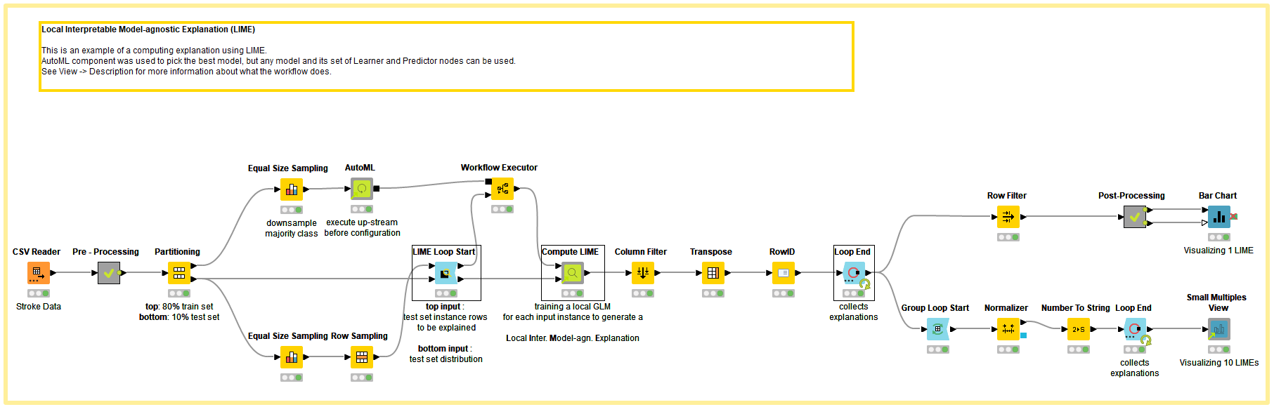
To demonstrate the LIME technique, we used the Stroke Prediction Dataset, which is labeled data consisting of 11 columns for predicting a stroke event. The target classes are 1 for “stroke” and 0 for “no stroke.”
Since most of the points in the dataset belong to the “no stroke” category, the majority class from the training dataset was downsampled using the Equal Size Sampling node before training the black box ML model. The downsampled training instance is passed to the AutoML Component, which automatically trains a classification model. For our example, the component trained Gradient Boosted Trees with a F-Measure of 0.82. To learn more about the AutoML component, read “Integrated Deployment - Automated Machine Learning” on the KNIME Blog.
The LIME Loop Start Node has two inputs. The first consists of the predicted data points to be explained, and second is the entire test dataset describing the feature space. In our example, ten data points are selected – five for each target class (stroke/no-stroke) – causing the loop to run ten times. After feeding the input, the LIME Loop Start node should be configured with these specifications:
-
Feature columns – Selecting which are the feature columns
-
Explanation set size – The size of the neighborhood – the number of neighboring data points around each predicted data point to be explained
After the node is configured, it will run for each instance that is selected for explanation, with two output tables of the same size:
-
Predictable table – The neighborhood sample with the original features to be fed to the original model for predictions
-
Local surrogate model table – The neighborhood sample, with feature engineering tailored for the local surrogate GLM model. The categorical features are transformed with special encoding based on the data point to be explained in each iteration, while the numerical features are left unchanged. Additionally, a weight column is added to train the GLM model using the weighted least-squared error measure
We apply the predictable table to the black box model, we append prediction columns to the neighborhood table.
We now apply the Compute LIME component to both tables. First, configure the component:
-
Explanation Size – the number of features to be considered for explanation
-
Prediction Column – the class probability column that needs to be explained which is interesting for the use case. In our case, we are interested in the class “stroke”
Within the Compute LIME component, for each predicted data point to be explained, the following steps are taken:
-
Feature selection performed with LASSO to reduce the number of features to the explanation size selected
-
Training of the local surrogate GLM model on black box model predictions, adopting with Weighted Least Square (WLS) loss function on the weight column
-
Extracting from GLM the coefficients representing the explanation which can later visualize
-
Attaching to each explanation the Root Mean Square Error (RMSE) achieved during training the surrogate model, as a measure of the explanation’s accuracy
For a regression case, the actual prediction, rather than the probability, would be the target of the surrogate model. So this same technique could be used with any custom regression model or on the AutoML (Regression) component output, as LIME is a model-agnostic method.
Visualizing LIME Explanations
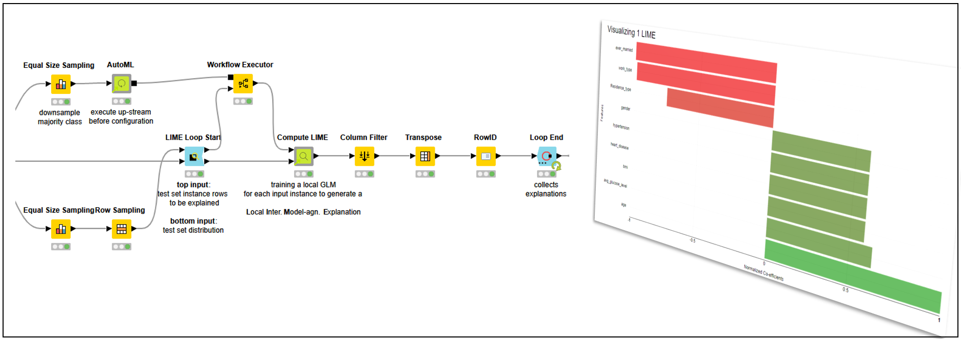
LIME explanations are useless if not properly visualized. In Figure 5, the prediction of a single patient predicted “stroke” is visualized in a colored bar chart. We can clearly see which features help predict the class “stroke” and which work against it.
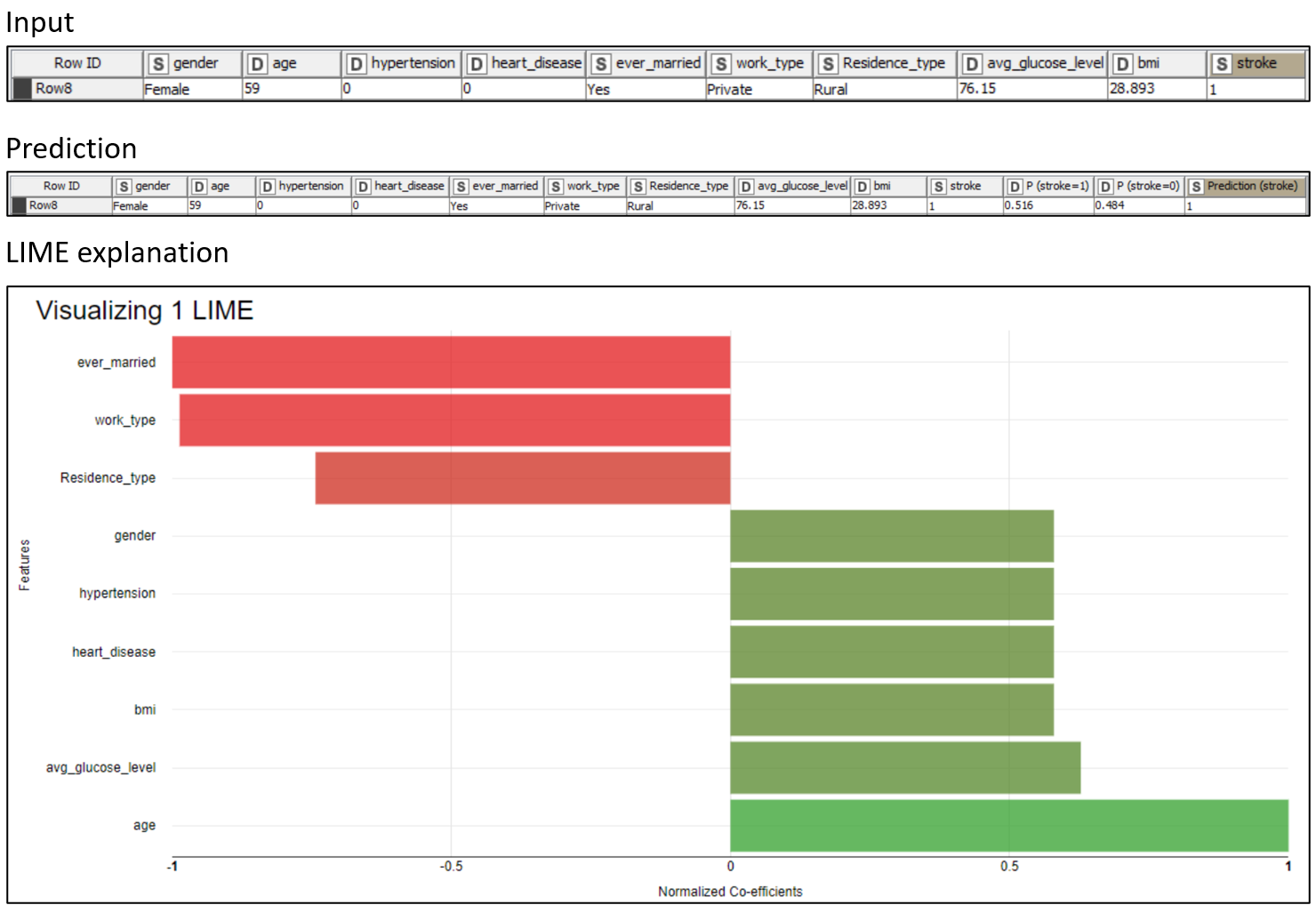
We can see that the “age” (59) and “avg_glucose_level” (76.15), in bright green, are the main factors toward the “stroke” prediction. On the other hand, “ever_married” (“Yes”) and “work_type” (“Private”), in bright red, are the main factors against the “stroke” prediction. That should not come as a surprise, as the model is using rules based on common-sense aspects of life.
-
The higher one’s age, the more likely they are to have a stroke
-
The higher one’s glucose level, the more likely they are to have a stroke
-
Being married decreases one’s risk of a stroke
-
The private sector is less stressful than other realms of work
Please consider that LIME provides different rules for each patient.
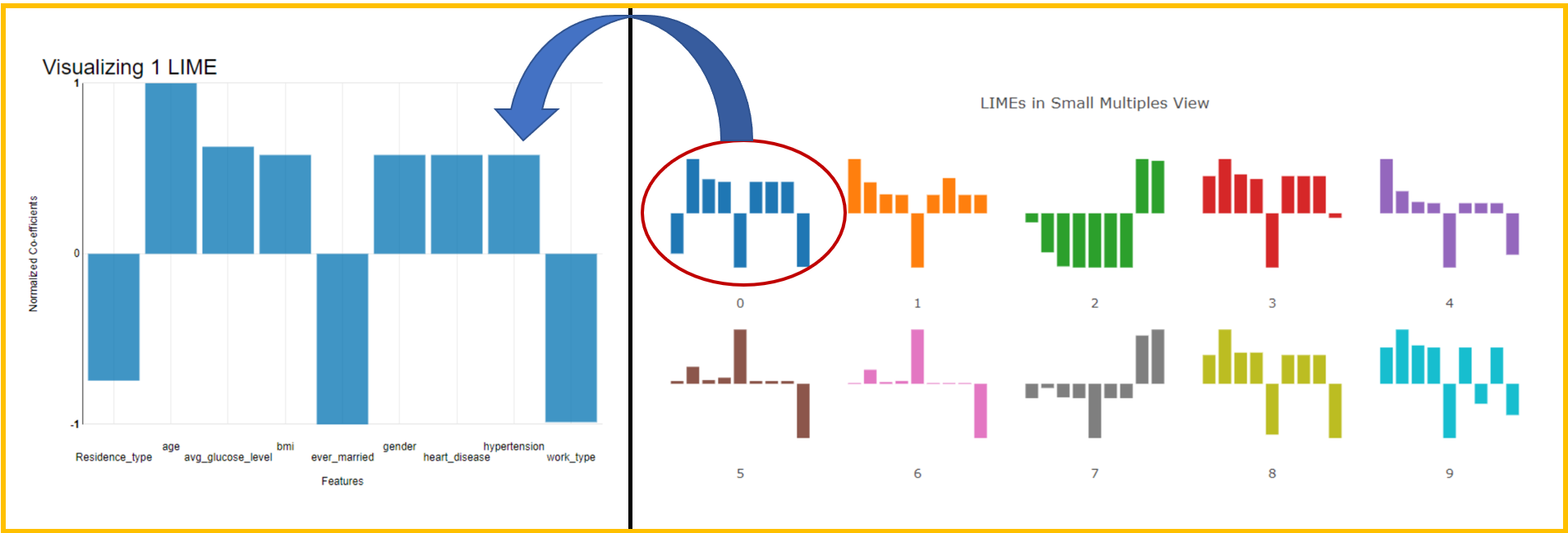
If we want to see a trend in predictions, we could use a small multiple view (Fig. 6). We can visually detect patterns when browsing similar patients. It can also be used to select outliers to be inspected later.
Explaining Black Box Models Prediction by Prediction
In this post, we discussed the theory behind one of the most-used local explanation methods, LIME. We saw how a Generalized Linear Model (GLM) and neighborhood sampling can train a local surrogate model to explain black box models, prediction by prediction. Finally, we visualized the explanations via a bar chart and small multiple view.
We've been able to demonstrate how LIME can be successfully applied in KNIME and enable physicians to understand how the stroke prediction model made its decisions. The visualizations are key to helping physicians interpret the data quickly, and clarify at a glance, which patient features predict the class “stroke” and which work against it.
Find more examples in the XAI Space on the KNIME Hub. Different kinds of machine learning problems are explained in just a few clicks!