
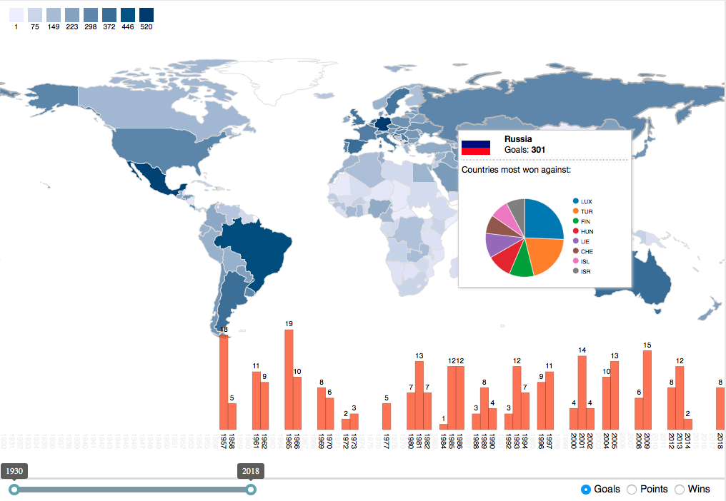
- A popup window, when hovering over a country that shows the countries that national team beat most often
- Finally, a bar chart displaying the yearly distribution of goals, wins, or points a national team scored, which is shown when the user moves the mouse over the corresponding country on the map.
Not to keep you in suspense any further, Figure 1 shows the screenshot of the final map! At the end of this blog post you also find the interactive version of the visualization. To try out all the features and trace the paths of champions you can download the workflow from the EXAMPLES server at 03_Visualization/04_Geolocation/08_FIFA_World_Cup03_Visualization/04_Geolocation/08_FIFA_World_Cup*.
The rest of the blog post takes you through the crucial code snippets that make the visualization come alive.
Figure 1. The final visualization with countries colored by the number of goals scored. Here we are hovering over Russia, which brings up the pop up window with the pie chart of the countries whose national team has been defeated over the years and the bar chart with the number of goals scored over the years.
The data behind this visualization was prepared earlier using another KNIME workflow. The original dataset was downloaded from linguasport.com using a Python script from sanand0 on GitHub.
The data we used for the visualization includes:
- A table with pie charts in SVG format created by the JavaScript Pie Chart node, showing the teams most won against for each country
- A CSV file with a mapping between 3-letter ISO country codes to URLs that point to images of the country flags
- A CSV file containing the match statistics for each team and year.
For the visualization we used three components:
- The choropleth
- The pie chart in the pop up window
- The bar chart in the lower part of the map
The choropleth was implemented with the Datamaps library in a Generic JavaScript View node, getting the statistics from the input data table; the pie charts were passed as static SVG images; and the bar chart was created using D3.js.
We still faced two main challenges:
- In addition to a game statistics table for the map and bar chart, to pass the pie chart SVG images and the URLs of the country flags to the Generic JavaScript View, which has only one table input.
- Arbitrarily scale SVG images.
Passing Additional Data to the Generic JavaScript View
To solve the first problem, i.e. to pass more data to the Generic JavaScript View node, we resolved to injecting flow variables. Flow variables can be of one of the basic types: Integer, Double, or String.
Passing an image or data table via a flow variable is not possible per se (there are no flow variables of type image). However, we can overcome this obstacle by encapsulating them in a JSON structure.
The image and data are converted into a JSON structure via the JSON to Table node. In the node, select the configuration option “Row key as JSON key”. The resulting JSON structure can be interpreted as a map with the country codes as keys. The JavaScript code within the Generic JavaScript View node then extracts the required parts from the injected JSON structure.
Combining the Table to JSON node with a Table Row to Variable node allows us to turn a table into a JSON-encoded flow variable and pass that to the Generic JavaScript View along with the actual statistics table.
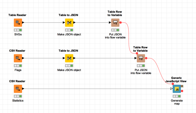
Figure 2. The workflow for reading the available data and creating the visualization.The first Table Reader node reads the pie chart SVG images; the second CSV reader .node reads the mapping between country and flag URL; the last node, still a CSV Reader, imports the statistics prepared earlier on in another workflow. URL maps and SVG images are encapsulated into a JSON object, converted to a flow variable, and passed to the Generic JavaScript View node.
Retrieving the Pie Charts from the JSON Object
Accessing the flow variables in the Generic JavaScript View is very simple. In the top left of its configuration dialog there is a list of available flow variables; double-clicking one of them inserts the variable with the correct syntax into the code.
The value of the flow variables is of type string and inserted verbatim and without quotes, therefore our JSON object can be assigned to a variable directly at the beginning of the code:
The flags table has a single column called iconURL, so we access the URL of the flag of the selected country, let’s say Germany as an example, using the code FLAGS["DEU"].iconURL. We can just as easily access the SVG image using PIECHARTS["DEU"].Image.
Note. The Generic JavaScript View has only one input port. However, to pass additional data, you can inject them via a flow variable. If the data are not of a simple type, you can wrap them into a JSON object and pass this object to the node.
Another way of passing multiple tables to a Generic JavaScript View node is to convert them into JSON using the Table to JSON node, collect them in a single table with the Concatenate (Optional in) node and finally pass the resulting table into the Generic JavaScript View node’s table input port.
Scaling the SVG Images
Scaling plain SVG in HTML is not easy if the SVG is simply inserted into the DOM: we have to manipulate the SVG’s dimensions, viewBox and preserveAspectRatio attributes. The standard img HTML-element allows easy scaling, requiring, however, URIs (not plain SVG code) for its src attribute.
There is a workaround that allows us to put our pie chart SVG images into normal image elements: encoding them into Base64, a text-based format for encoding binary data, and using the data URI protocol. We therefore create the following function for converting SVG code into an URI:
Displaying Data on a Map using Datamaps
Datamaps is a JavaScript library built on D3.js and Topojson. It simplifies the creation of interactive world maps. Datamaps provides shading of countries and states, bubbles and arcs, as well as different projections and zooming. Despite the slew of features its usage is very straightforward. We use the following code to create the map in the HTML element with the ID “container”:
There are several interesting parts in this code, the first of which is the done callback function. It is invoked once the map is fully rendered and the DOM nodes for all SVG elements exist. Once that has happened, we can use d3.js to select all subunits, i.e. countries, and attach a mouseenter event handler that updates the bar chart with the data for the country the mouse is currently hovering over.
Another important part is the popupTemplate, which creates the HTML code for the popup that is shown when the user hovers over a country and which contains the injected SVG pie chart and the country flag. To assemble the HTML for the popup, we create an array of strings and join them in the end with an empty string as separator. Since the popupTemplate function is called with geography information and the data attached to the country, we can access the country code using geo.id and then use that to find out the URL for the country’s flag and pie chart SVG.
But how does the data get into the map? For this we have to create a separate function that transforms our input KNIME table into the correct format, calculates the colors and assigns them to the map.
At first we retrieve the rows from the KNIME table, then we use the Array.reduce function to bring it into a format that Datamaps understands: an object where the key is the country code and the value is an object with a property called “numberOfThings”, which in our case may be the sum of goals, wins or points scored by the team in the selected range. Note that we are using a helper function called rowToObject, which transforms the array format of a row into an object where we can access the individual values by column name.
The variables toYear and fromYear are set by the slider control at the bottom of the visualization. The variable stats determines whether goals, points, or wins should be counted and is controlled by the radio buttons at the bottom right.
Now that the format is right and the data aggregated, the colors for the countries have to be calculated. D3’s extent function makes finding the minimum and maximum values easy and we only need to pass those to the domain setter of a linear scale to create a function for mapping values to a range of colors that we specify with the range setter. Finally the data structure we built before can be updated with the color scale and the map updated with the data. Datamaps will take care of redrawing the SVG.
Creating the Bar Chart
The next item in our map is the bar chart that we want to display at the bottom. It spans the whole width of the visualization and it is 200 pixels high, so that it slightly overlaps the map in some parts.
Using CSS we can make the bars slightly transparent so that the map is partially visible. The important part is the JavaScript code to create the plot, though:
Like in the map update function, we need to create a suitable data structure for the bar chart before we start drawing it. In this case a simple array with the values we want to display will suffice. We initialize an array of size 89 with zeros, one for each year of the world cup (1930 - 2018). If a country is selected, we go through its games and update the array according to the selected statistic (goals, wins, or points).
Now that we have the array of values, we can create the D3.js scales that are used for determining the dimensions of each bar. The height will scale linearly and for the x-axis we will use an ordinal axis, as it provides useful functionality for calculating ranges. We choose to have a maximal height of 140 pixels for the bars, because we need some extra space at the bottom for the year labels and at the top for the value labels. The ordinal scale is initialized with a domain from 0 to 89 and rangeBands that span the whole width of the visualization.
Now that we have the data and the scales, adding the bars is quite straightforward. We create a selection of all rectangles in the SVG, join it with the array we just created and instruct D3.js to create a rectangle for each value. Subsequently we initiate a transition which will be executed upon creation and every time the values update. In this transition the height of the bars is adjusted to the current values and the colors are changed to highlight the years that lie in the currently selected range of years.
For the year labels on the x-axis we use a similar process, selecting all texts with the class year and joining them with our data. We do not need the data to draw the labels, but the array needs to have the correct length for the purpose of creating one element per year. The index is passed as a second argument to the attribute setters of D3.js, so we can use it to calculate the x-position of the labels. Using the SVG transform attribute we can rotate the labels by 90 degrees. Since the transformation always rotates around the origin, we need to pass the coordinates of the rotation center as extra arguments to the rotate function. Using transitions we make sure that the labels will only be colored black if the bar is actually visible, and light gray otherwise.
We proceed similarly for the labels displaying the actual values on top of the bars, except that we do not rotate them and the transition updates the y-position. If no data have been recorded for that year, the label has no text and is therefore invisible.
Using a Range Slider to Select the Years
At the bottom of the visualization we want to have a slider for selecting the years for which the statistics and corresponding map colors are calculated. HTML5 comes with a slider control that is supported by the majority of browsers, however, we need a slider with two handles so the user can choose the start and the end of the time range for calculating the statistics. There is a variety of solutions available; we are using one provided by the jQuery plugin jQuery-asRange (https://github.com/thecreation/jquery-asRange). To use that slider, we need to enable jQuery at the top of the Generic JavaScript View’s configuration dialog.
With the slider plugin loaded, every jQuery selection can be turned into a slider with two handles using the asRange function. The parameters that we pass to the function set the minimum and maximum selectable values, the initial values, and the step size.
The double handled range slider provides a custom event called asRange::change. Adding a listener for it allows us to react to changes and update the map and bar chart accordingly:
When the range slider handles are dragged by the user, the change event fires rapidly, triggering many recalculations of the data to be displayed. To remedy this behavior, we debounce the event, meaning that when the event fires we wait for 100 milliseconds before reacting to it.
If the event fires again within that time, we reset the timer and wait again. Only if the 100 milliseconds elapse without a new event firing are the values retrieved and the visualization updated. To achieve this functionality, we make use of the setTimeout and clearTimeout functions. The first one schedules a function to be executed after a certain time and returns a token to reference that timeout. Passing that token to the latter function cancels the execution.
Summary and Next Steps
We have created an interactive choropleth of the world, describing the soccer statistics for the national teams involved in the FIFA world cup from 1930 till 2018. We have enriched the choropleth with a pie chart popup describing the most frequent match successes for each country and with a bar chart in the lower part for the yearly distributions of goals, points, or wins for the same country.
The choropleth and bar chart were created using a Generic JavaScript View node within a KNIME workflow. The pie charts had been prepared earlier in another workflow and injected into the JavaScript code via a JSON object in a KNIME flow variable.
All steps involved in the creation of this sophisticated interactive visualization have been described in detail in this blog post.
There is some extra code for glueing everything together and for importing the required libraries. If you would like to check out these parts, you can download them from the KNIME Examples Server.
The workflow is available on the EXAMPLES server under 03_Visualization/04_Geolocation/08_FIFA_World_Cup03_Visualization/04_Geolocation/08_FIFA_World_Cup*
Headline image created by Freepik
* The link will open the workflow directly in KNIME Analytics Platform (requirements: Windows; KNIME Analytics Platform must be installed with the Installer version 3.2.0 or higher)
Authors: Alexander Fillbrunn, Anna Martin