This blog post is part of a series "How KNIME uses KNIME". It describes how KNIME uses KNIME to create reports using the KNIME Reporting extension. The focus is on the challenges faced when creating a new report and how these can be solved.
Reports play a crucial role in decision-making. Consequently, there are typically numerous reports in almost every company. Each report is carefully created and then verified, which can be time-consuming, particularly for reports distributed daily or weekly. Companies must establish highly automated processes to minimize the effort involved in creating and checking reports.
With the low-code KNIME Analytics Platform, companies can implement these automated processes in a transparent and scalable way using KNIME’s Reporting Extension. The KNIME Reporting extension enables you to generate and distribute reports faster.
This article describes nine best practices to help enhance report quality by improving layout, readability, and overall presentation. This ensures the report effectively delivers the desired information to stakeholders. These tricks cover aspects such as adjusting graph sizes, optimizing node settings, and using advanced features like Apache ECharts and CSS formatting. By implementing these techniques, you can transform your reports into polished, professional documents that facilitate informed decision-making within your organizations.
We’ll demonstrate each best practice with an example which we continuously improve with each tip and trick.
Example use case: A workflow to generate a company CO2 emissions report
We are going to use sample CO2 data to create a company CO2 report.
Below you can see the KNIME workflow you can use to create the report. If it looks familiar to you, it is similar to a workflow we built for ESG reporting as a transparent way to calculate CO2 emissions.
The handy thing with the reporting functionality in KNIME is that you don’t have to learn something new. If you know how to build a data app, you know how to build a report, and vice versa.
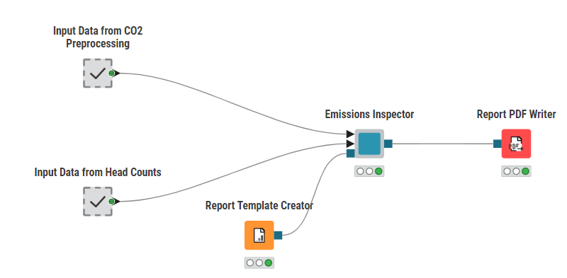
The workflow starts with two metanodes containing the input data for the report. The following component (Emissions Inspector) carries the individual visualizations. To enable the reporting functionality the usage of the “layout editor” is mandatory.
Best practice #1: Align visualizations to suit your user’s preferences
The layout editor appears inside of a component on the upper bar of the KNIME Analytics Platform. With this editor users can check the box “enable reporting” on the bottom left to connect the reporting nodes like the “Report Template Creator” node or the “Report PDF Writer” node. Besides this functionality the layout editor also enables the possibility to align all the views inside of the component according to user preferences via drag and drop. In this case the example looks like this:
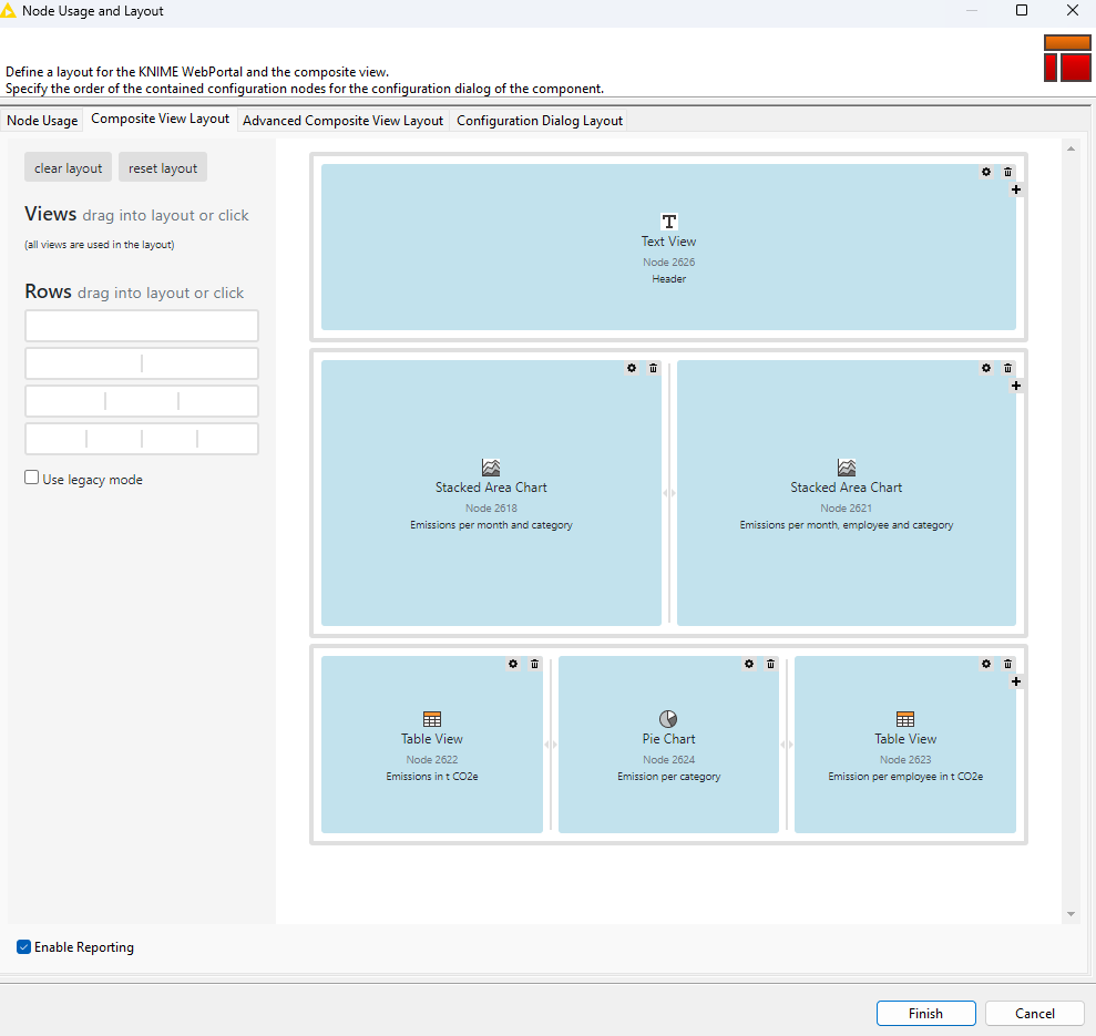
The “Enable Reporting” is checked and all charts and views are aligned due to user preferences. When a report is initially generated as a PDF using the 'Report PDF Writer' node, it appears as follows:
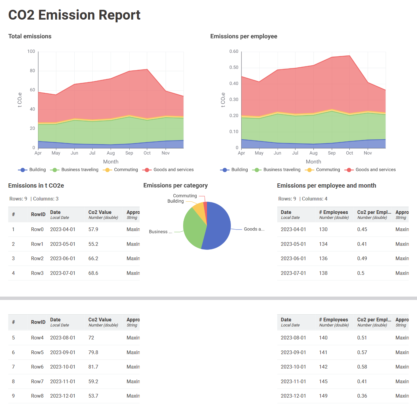
The report creation was quick and successful but there are some drawbacks. The report extends over two pages, while the goal is a one-page report. In addition, the tables are cut off, making them difficult to read. Moreover the last column is missing in one table. Furthermore, the pie chart could be replaced by something which suits better and the color assignment is not equal compared to the stacked area charts on the top.
With the following tips and tricks, we will tackle all these problems step by step to create a professional-looking and appealing report.
Best practice #2: Assign your corporate color scheme
Colors play an important role in a report to increase the understanding. In this case the color assignment is different between the graphs which can lead to confusions to the readers. To unify the color schema the “Color Manager” node is used, which is placed directly in front of the view node. In the Color Manager settings each column name is assigned to a color, in this case the corporate KNIME colors, which can be defined in several ways (RGB, CMYK, HTML…).
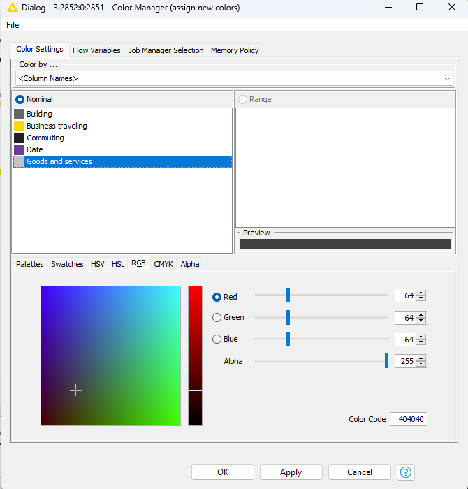
This was done for all three graphs which leads to the following result:
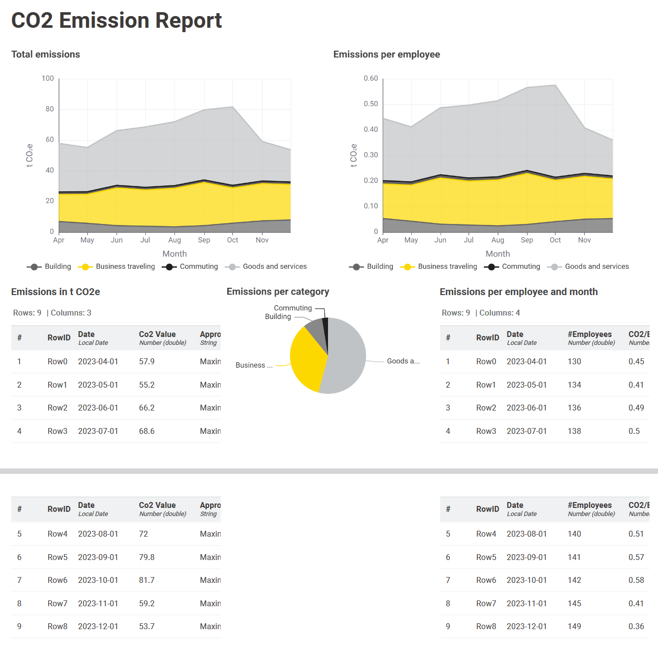
Due to the usage of the corporate colors, the report fits first better to the company and second the colors now have the same meaning in each graph which leads to a better understanding. After solving the color issues the focus is now on tackling the space problem in several ways.
Best practice #3: Ensure information in tables is visible at a glance
In this example, the aim is to reduce the size of the two tables so that they are easier to view at a glance. Each node in the workflow can be customized to a certain extent as you can see in the node settings, shown in the following illustration.
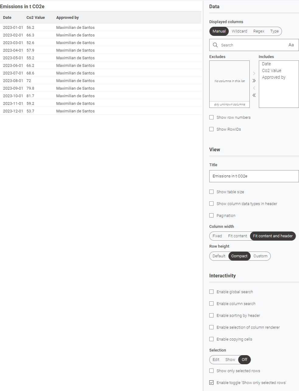
In the first step, it makes sense to uncheck all boxes in order to minimize the size of the table. In the next step, the "Row height" is set to "Compact" instead of "Standard". It is also advisable to change the column width from "Fixed" to "Fit content and header". In some cases, the setting "Fit content" is also a good option.
If these options are applied to both tables, the report will look like this:
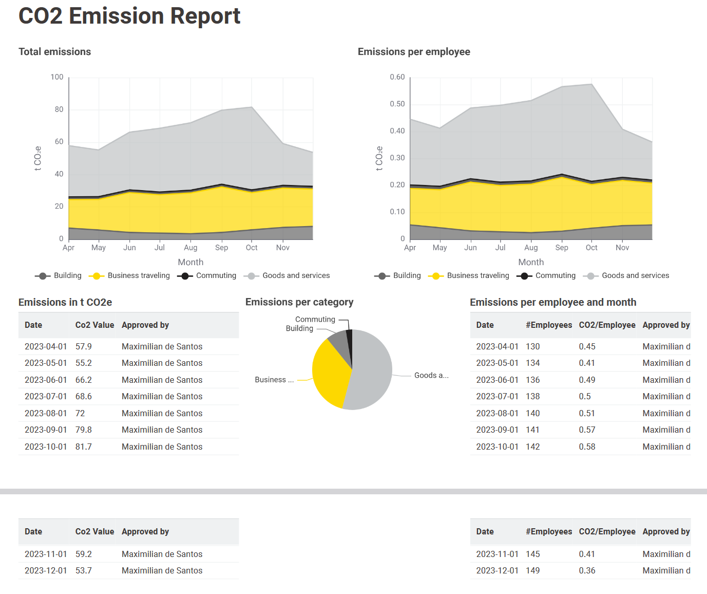
The size of the report decreased, but it still doesn't fit on one page. To achieve this target further adjustments in the layout editor have to be made.
Best practice #4: Improve report formatting by checking aspect ratios
A further strategy to improve the formatting of the report is to adjust the size of the charts. This task is accomplished by using the layout editor within the component, a setting that was already used when the report was originally created. By changing the setting for each visualization from "Aspect ratio" to "Auto" without a limitation the graphs were minimized. In the case of the text- and table views this setting works fine but for the stacked area chart the minimization is too strict as shown in the example below.

When encountering this issue the solution is to manually set a minimum boundary like in this case of 250 px.
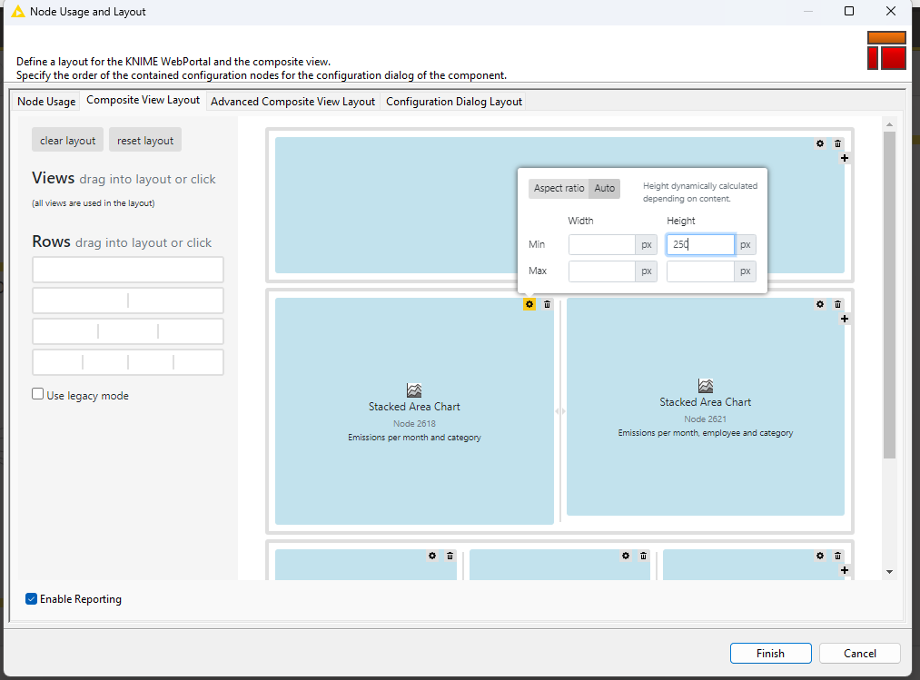
Please note that the size adjustment is highly dependent on the structure of the report, but 250 px is a valid starting point.
Reviewing the outcome below, the report size has indeed reduced slightly enough so that everything finally fits on one page.
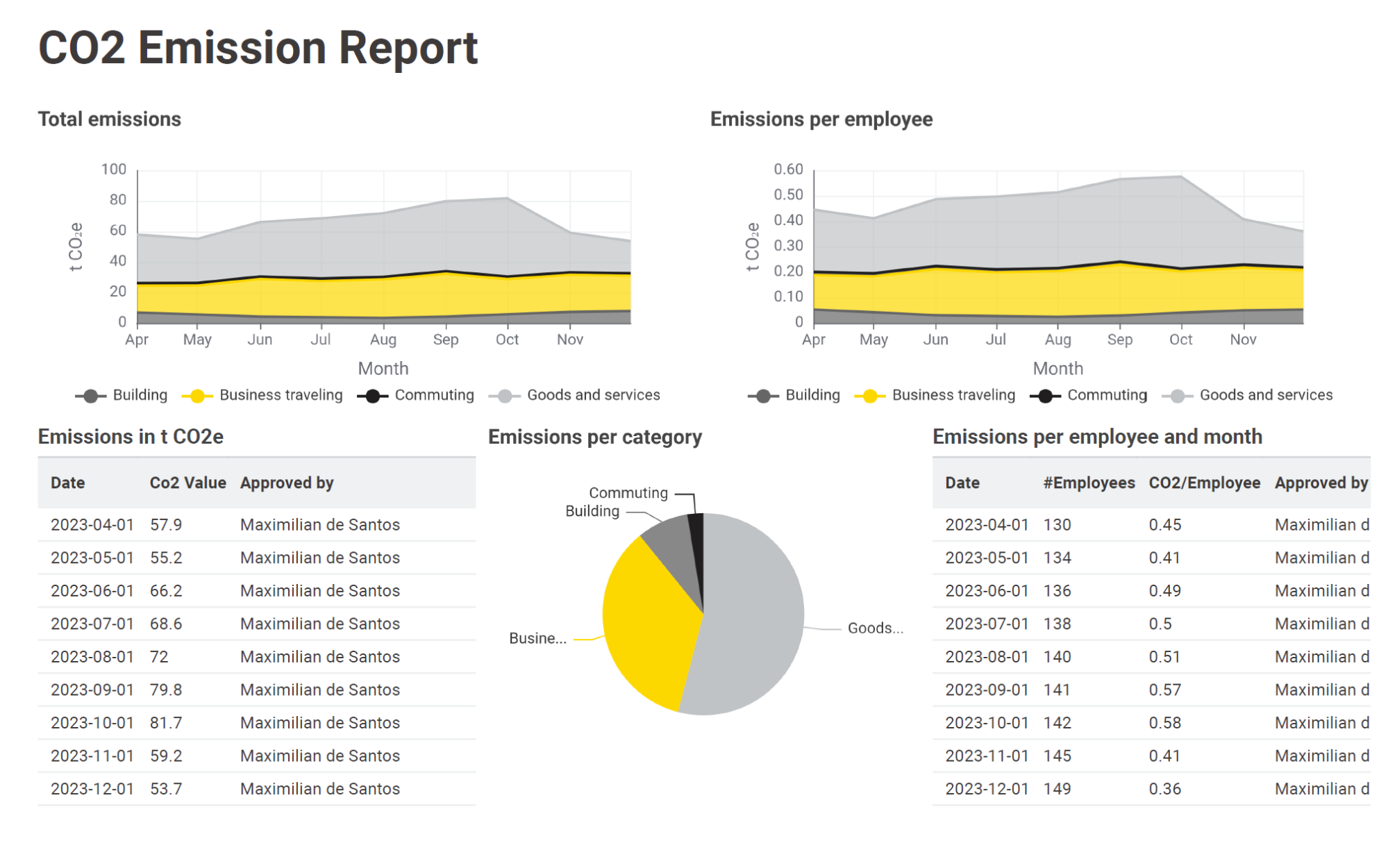
One target is achieved, but there are still some issues with the formatting of the right table and with the pie chart. First tackle the issue with the formatting of the right table.
Best practice #5: Improve text readability by adding line breaks
The table on the right hand side still contains one formatting issue. The content of the column is cut off and shortening the content wouldn’t be an appropriate option. A solution is to use line breaks. Line breaks can be inserted using the "String Format Manager" node. This node will be added before the “Table View” node.
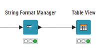
The following settings have been made:
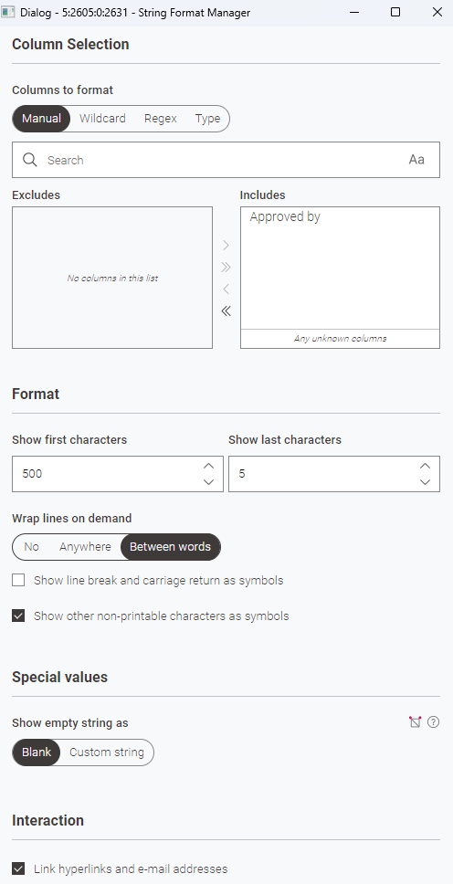
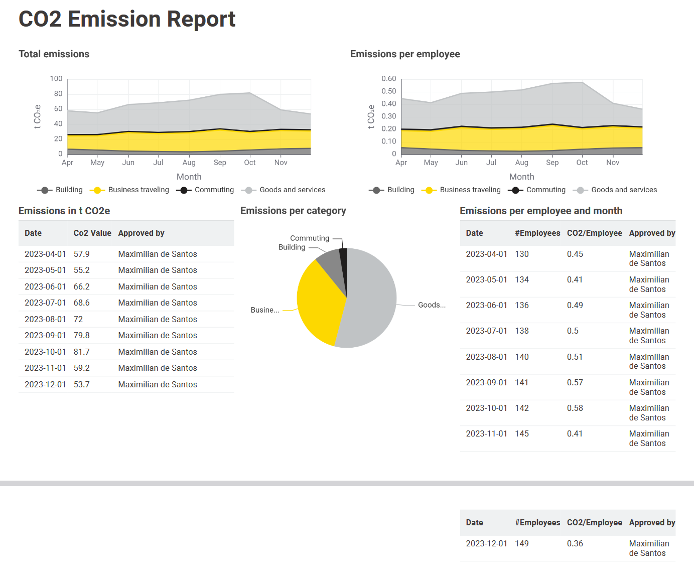
With this setting applied, a line break will be added between the words. The result looks promising. The entire column value is now visible, but unfortunately the report consists of 2 pages again.
Line breaks can also be inserted in a second, more advanced way which will be shown next.
Best practice #6: Adjust text size to keep report on one page
The insertion of the line breaks solved the initial problem but at the same time created a new one. To bring the report back to one page, we'll utilize the "Column Expression" node instead of the "String Format Manager" node. This is a second method to insert line breaks and at the same time also minimize the text size.
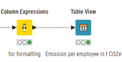
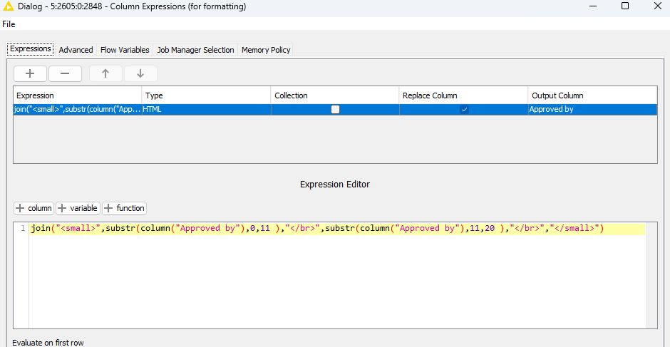
In this approach, the String column is converted to HTML, and the text size is decreased using the "<small>" tag.
The line break is manually inserted by splitting the String with the substring function, inserting HTML line breaks ("</br>"), and then joining everything together. It's worth noting that the numbers used in this process require manual adjustment based on the text structure.
While this solution may not be straightforward, upon reviewing the results, it's clear that the problem has been successfully addressed.
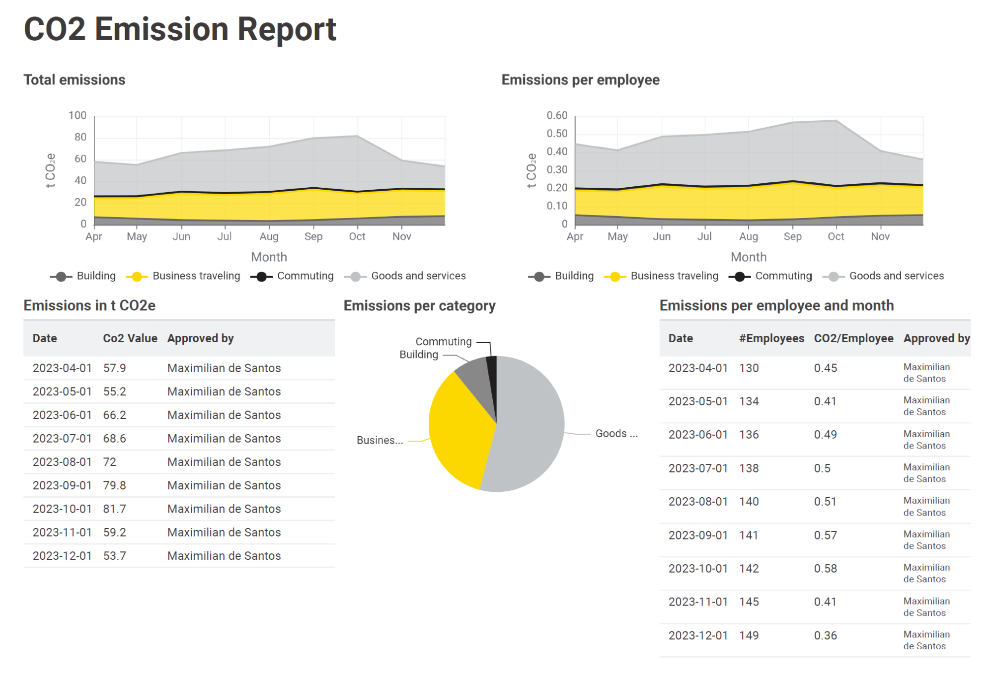
With all elements now fitting on a single page, observers can view all columns of the tables with their entire content. The overall report looks so far much more professional and clean compared to the starting point. As a final chart, we are now revising the pie chart. To illustrate this and to show you the flexibility of KNIME, the Apache ECharts are used for this.
Best practice #7: Ensure you show succinct, meaningful information with customized views
In KNIME it is possible to use Apache ECharts as described in this blog post. They provide enhanced flexibility for creating highly customized reports and dashboards. The usage of Apache ECharts is convenient. The "Generic ECharts View" node already proposes an appropriate graph format, such as a pie chart.
In our example we now want to replace the pie chart with something more special. Therefore it is possible to visit the Apache web page and search for something which suits the use case. In this case we choose the pie chart Pad-Angle.
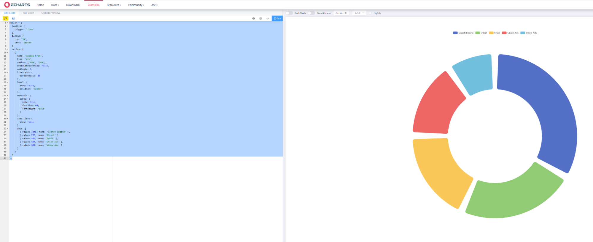
After copying the sample code of this chart into the ‘Generic ECharts View’ node, there are three ways to customize the chart. Adjust the code on the left manually – or use KNIME's chatbot K-AI as an assistant to help you implement the changes. We recommend using a mixture of both as described below.
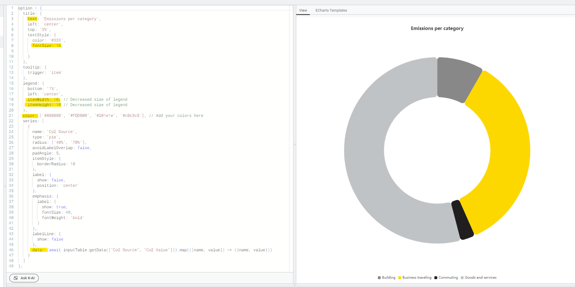
In this example, K-AI was used to apply the chart to the specific data and to insert the option to set the colors manually. Other settings such as the position of the legend or the size of the title were changed manually. A look at the report now shows the following.
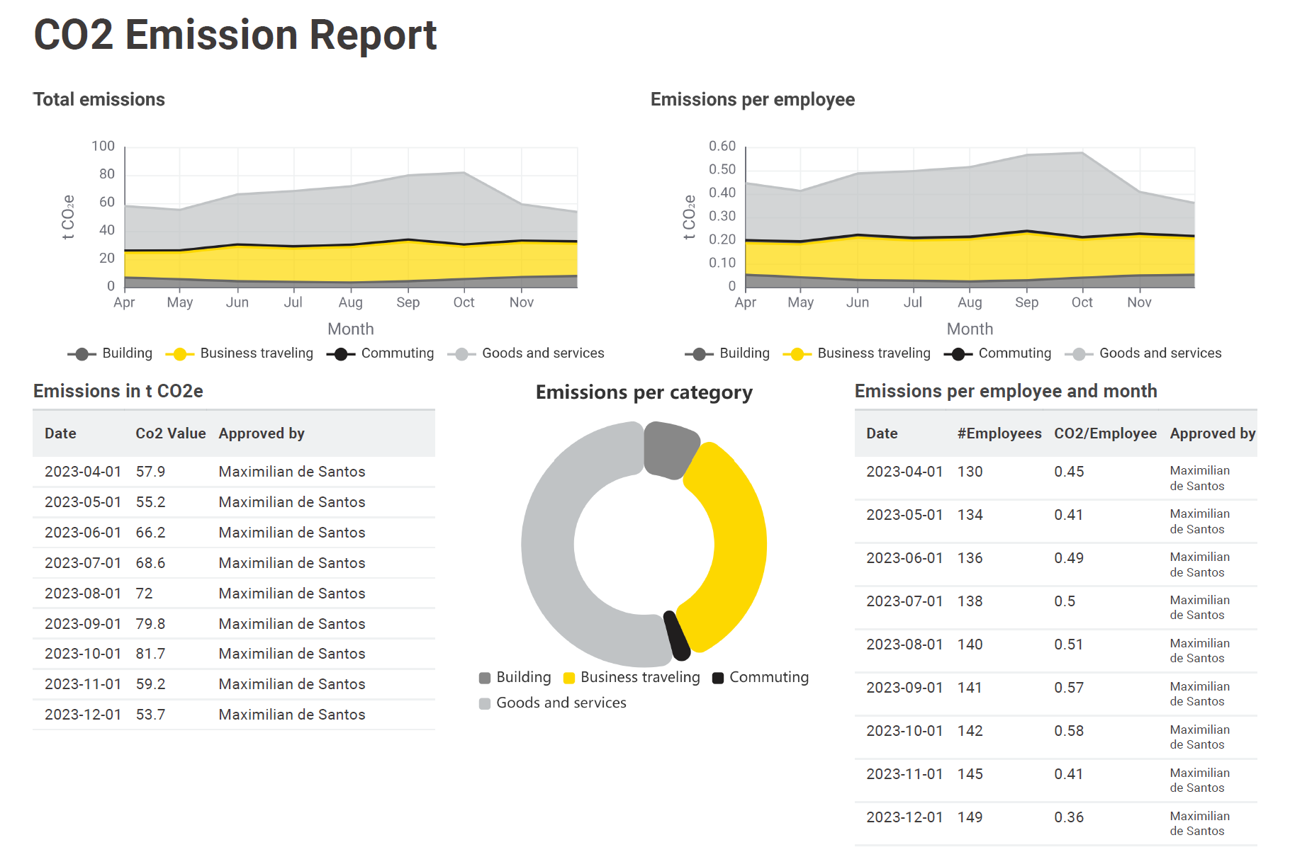
The report has improved significantly. Everything now fits on a single page and the individual charts are easy to interpret. In the last steps, we take care of the final details.
Best practice #8: Ensure clarity of information in report
Divider lines help the viewer to understand the report faster by structuring the report more clearly. An easy way to implement divider lines in a report is the usage of the “Text View” node. This node allows you to insert a divider line as shown below.
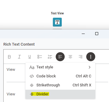
The only step afterwards is to go back into the layout editor and align the text view node between the graphs to be separated. Here it is also recommended to manually decrease the size as much as possible to prevent any layout issues especially when the page is very packed like in this example.
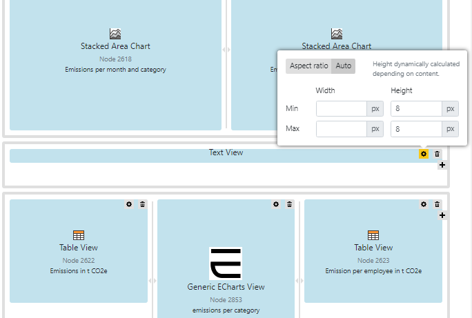
After the insertion of the line break the report looks even more well structured.
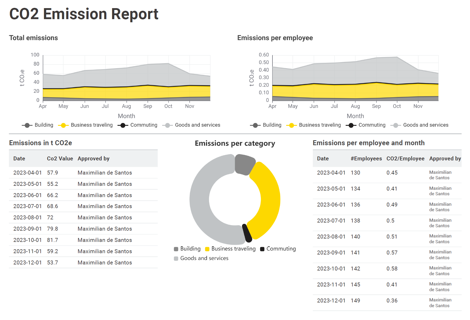
The last thing we are taking care of is the formatting of the header.
Best practice #9: Use custom layout styles to improve visual appeal and readability
The last technique is slightly more advanced, not just due to the utilization of the "Advanced Composite View Layout" - pardon the pun. Returning to a serious note, with the "Advanced Composite View Layout," users can implement custom styles in CSS format. This layout function is accessible via the "Layout Editor," located just one tab to the right of the "Composite View Layout." We will now use this feature to show you how to format the header, as an example.
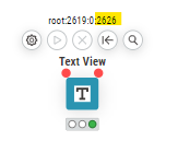
Initially, the Advanced Composite View Layout may seem somewhat complex, but adding new style elements like a box framing the header is actually an easy task. All it requires is pasting in a single line of code to the right position. Each JSON code block corresponds to one node with an individual number (nodeID), in this case 2626. The node represents in this case the header (Text view).
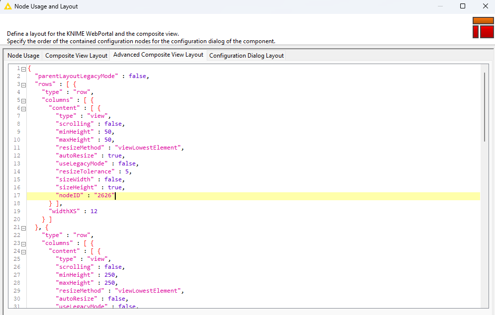
If it is not clear which node is linked to which ID, you can move the mouse pointer over the node icon, for example, as shown below.
To frame the header with a box, a single line of code needs to be inserted into the corresponding node code block:
"additionalStyles" : [ "border: 3px solid hsl(51, 100%, 49.6%);", "margin: 10 0 10px 20px;", "text-align: center;]".
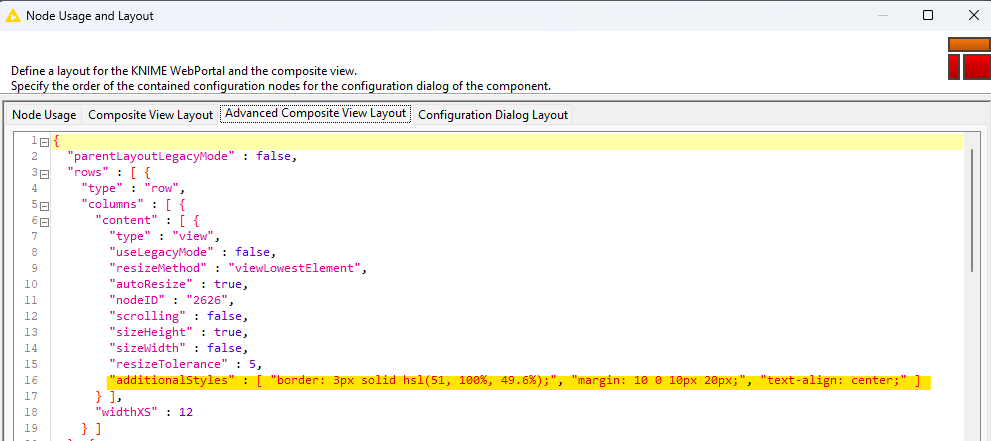
This line of code creates a border which is 3 pixels wide in a hsl-color-style. The spacing around the element is set to 10 pixels on top, 0 on the right, 10 pixels with units 'px' on the bottom, and 20 pixels on the left. The text inside the element is centered horizontally. “Additional styles” allows you to implement an arbitrary array of strings in CSS style. After implementation, the result will be as follows.
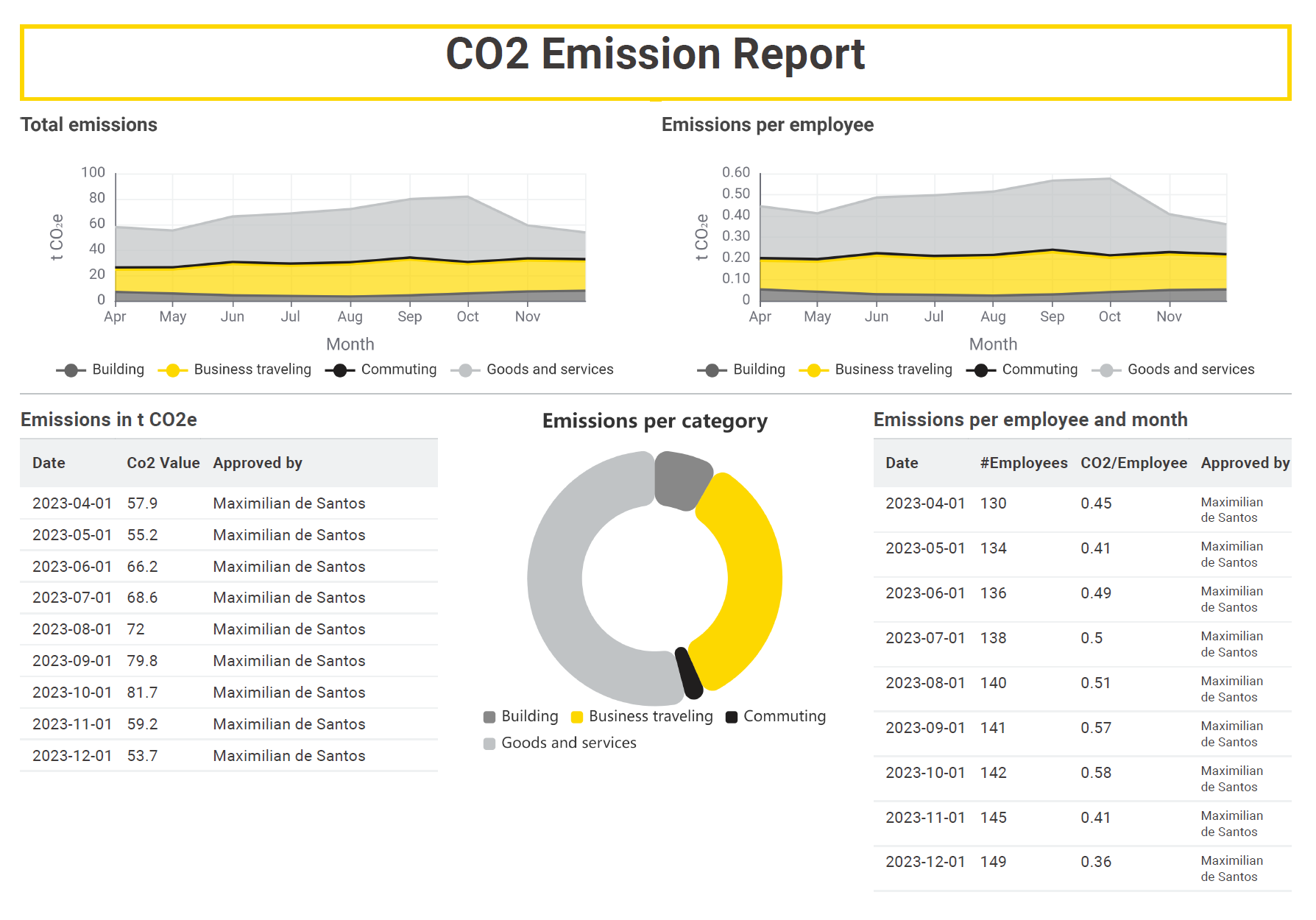
As always, colors, positions, or sizes can be adjusted according to user preferences.
Set up professional reporting once and reuse over and over again
Creating a report with KNIME Reporting is straightforward and once you’ve finished you can reuse and automate the workflow to run on a schedule.
