Data visualization plays a crucial role in effectively transforming raw data into a visually compelling narrative. Data visualization tools like Apache ECharts can be invaluable in this endeavor because of their rich features, versatility, and customization options. You can now build custom Apache ECharts visualizations for your analysis in the low-code KNIME Analytics Platform.
KNIME Analytics Platform is free and open-source software that you can download to access, blend, analyze, and visualize their data, without any coding. Its low-code, no-code interface makes analytics accessible to anyone, offering an easy introduction for beginners, and an advanced data science set of tools for experienced users.
The Generic ECharts View node in KNIME gives you full flexibility to generate views with the Apache ECharts library (spoiler: no coding skills needed! 😉). An in-built AI coding assistant lets you build custom visualizations for your analysis with a simple chat. This is particularly beneficial for users who may not have extensive coding experience as well as for experienced users who want to speed up the process of creating visualizations.
In this article, we want to show how you can use Apache Echarts in KNIME with the Generic ECharts View node and get K-AI, KNIME’s AI Assistant, to help customize a chart for you.
Key takeaways:
- Get an overview of KNIME’s Generic ECharts View node based on the Apache ECharts library, which includes an in-built AI coding assistant.
- Learn how to build and customize 3 ECharts to visualize a dataset of world unicorn companies and bring the views together in a static PDF report for ease of sharing.
- Get a free workflow from KNIME Community Hub to Build custom ECharts Views.
What is Apache ECharts?
Apache ECharts is a powerful, open-source JavaScript visualization library that enables you to transform complex datasets into dynamic, interactive and highly customizable visualizations. ECharts supports a wide range of chart types, including line charts, bar charts, scatter plots, funnel charts, 3D maps, treemaps, and more.
Why is Apache ECharts useful?
The versatility and customization options in Apache ECharts enable you to customize almost every aspect of the visualization to your specific needs, including colors, styles, labels, and more, to produce visually engaging views, which effectively communicate insights to stakeholders.
Apache ECharts in KNIME
As of KNIME Analytics Platform version 5.2, using Apache ECharts visualizations in KNIME workflows has become swifter and more convenient thanks to the Generic ECharts View node.
This node has the familiar visual framework of other KNIME scripting nodes and allows you to dynamically preview the chart as code edits are made.
Two key features make this node exceptionally handy and easy to use:
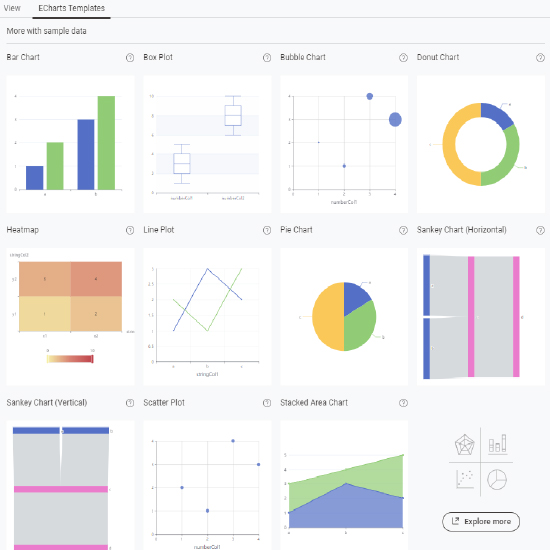
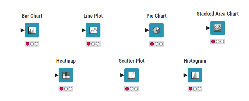
- Template Previews. An in-built template gallery of popular visualizations is used to suggest instantly which plot type(s) works well with the provided input data.
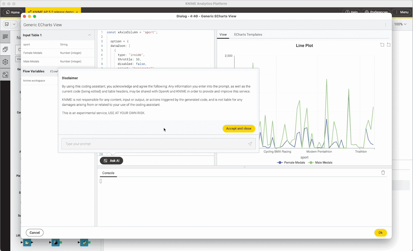
- AI Coding Assistant. K-AI, KNIME’s AI coding assistant, is built into the node’s code editor. This can be particularly advantageous for users with limited JavaScript coding experience, as well as for experienced users seeking to streamline the process of creating visualizations without having to know the ECharts API.
Apache ECharts was also used as a blueprint to develop the KNIME Views extension, and give KNIME’s data visualization capabilities a dynamic, flexible framework. So when you use the Generic ECharts View node you’ll experience the same look & feel and interactivity as other KNIME visualizations.
How to use the Generic ECharts View node to build 3 customized visualizations
Let's now dive into a hands-on application where we'll use the Generic ECharts View node to build 3 custom visualizations:
- A line plot with markers.
- A stacked bar chart with a line plot.
- A geomap with pie charts.
We’ll leverage the capabilities of the ECharts library to create visualizations that extend beyond the default offerings of KNIME View nodes. Additionally, we will utilize ECharts to customize the plots, including adjustments to the positioning and formatting of axis labels, title placement, legend configuration, and color schemes.
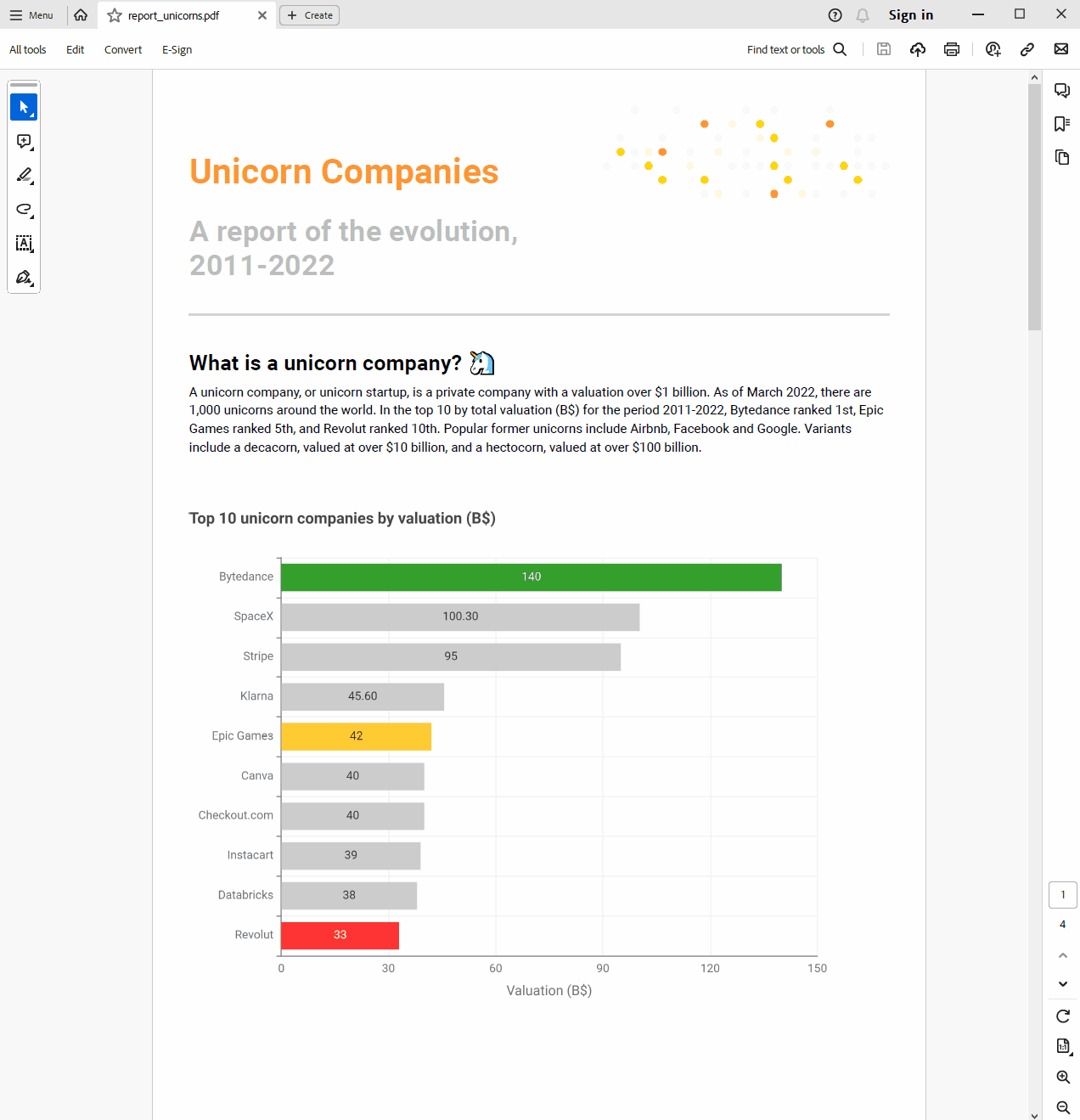
To build our custom visualizations, we’ll use a dataset of world unicorn companies (2011-2022) sourced from Kaggle. A unicorn company, also known as a unicorn startup, refers to a private company valued at over $1 billion. As of March 2022, there are currently 1,000 unicorns globally. Notable examples of past unicorns include Airbnb, Facebook, and Google.
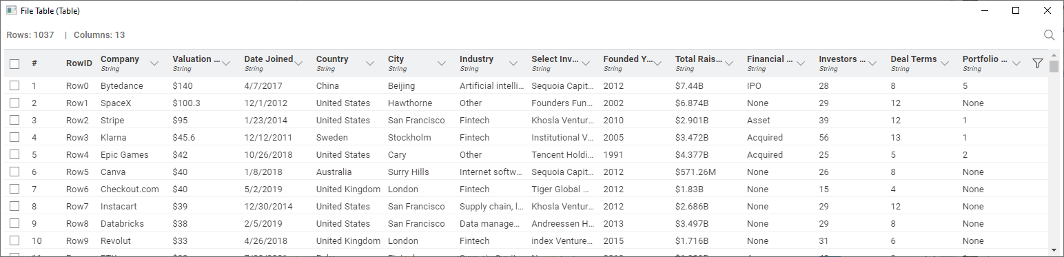
The dataset contains 13 columns with company-related information, such as the company name, valuation (in billions of dollars), industry, country of origin, date when the company reached the unicorn status, foundation year, financial stage, etc.
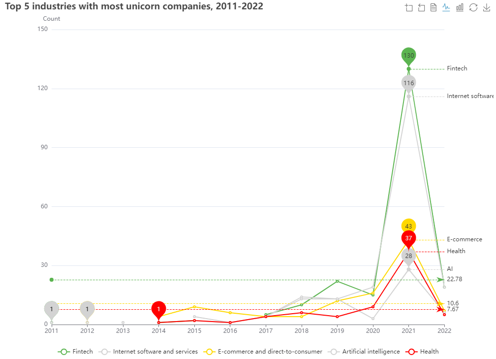
1. Build a line plot with markers to visualize the top 5 industries with most unicorn companies over time
For the first visualization, we want to represent the count of unicorn companies per industry over time. To do that, we would like to use a line plot where each line has a min and max value marker, as well as a mean reference line.
We start off by aggregating the data to obtain a pivot table where each column is an industry, and the rows contain the count of companies in each industry over time. We rank industries in descending order and retain only the top five.
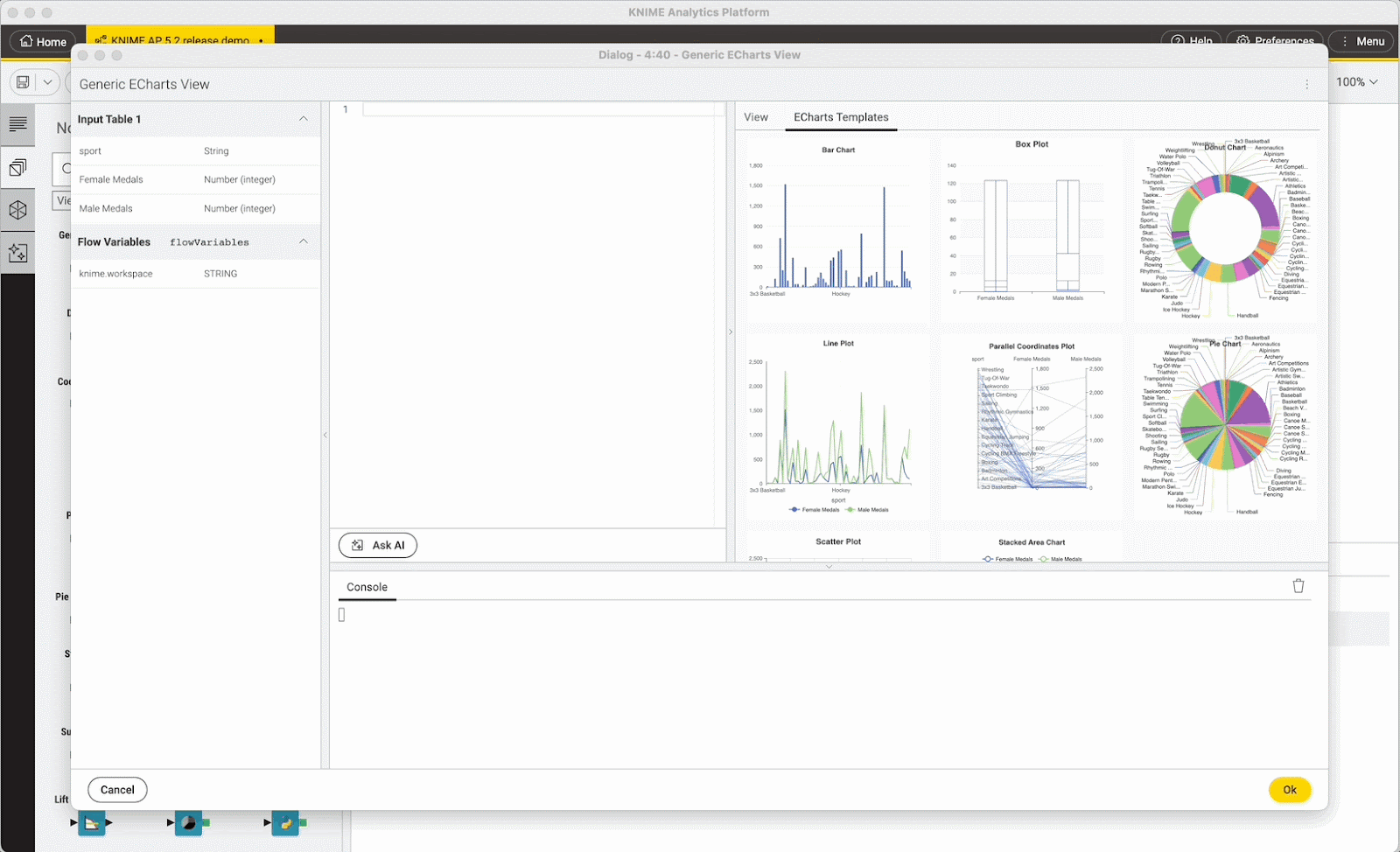
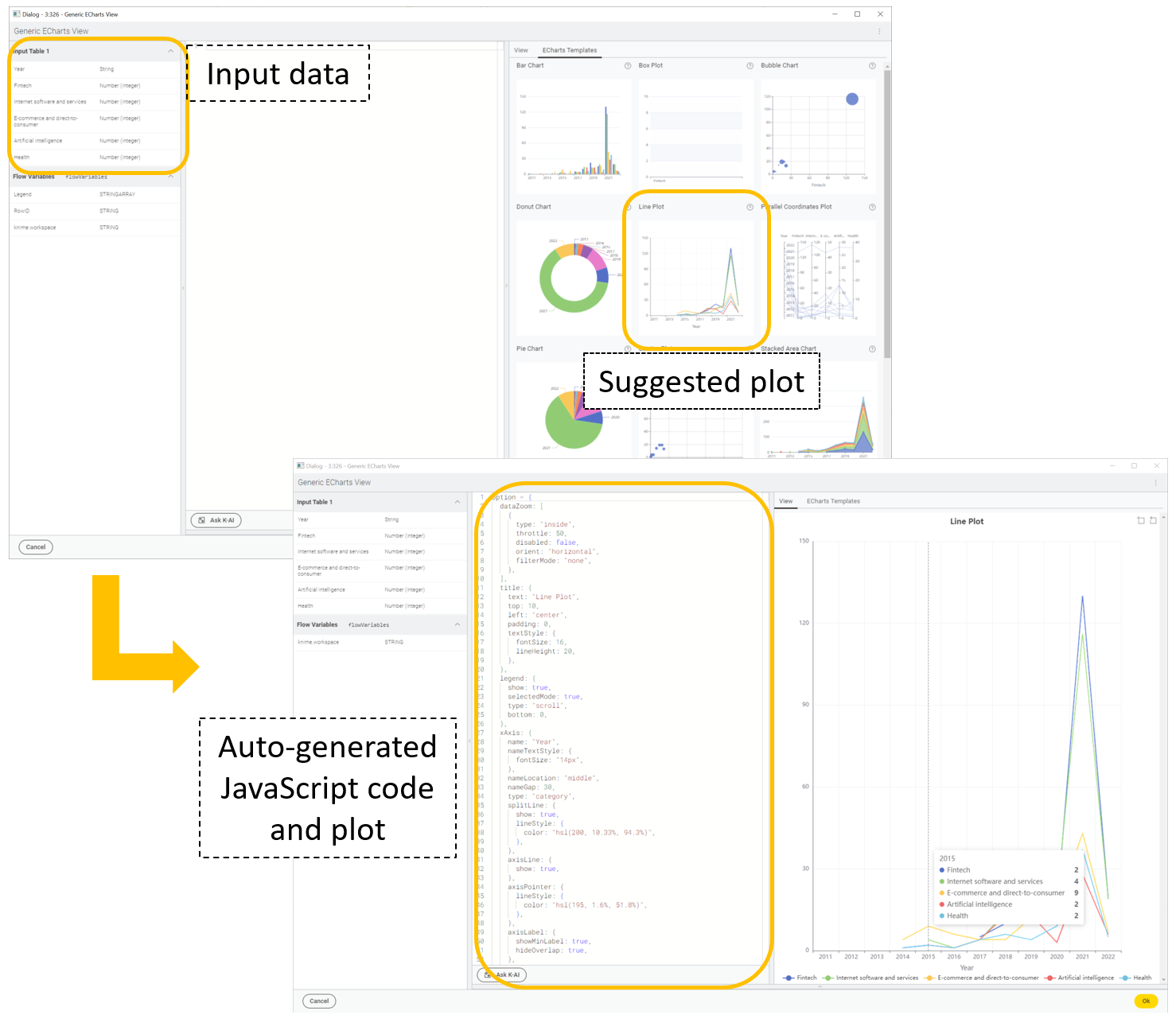
Now let’s use the Generic ECharts View node. The easiest way to start is to check whether the node’s in-built ECharts template gallery suggests a suitable starter plot based on the provided input data.
In our example, the node’s gallery template suggests a line plot –and that’s exactly what we want!
We can import the plot by simply clicking on it. The node code editor (the central section of the configuration menu) now contains the auto-generated JavaScript code; whereas on the left, the template plot visualizes our data.
Next, we want to customize the plot by adding markers and a color scheme to make it easier to read. We’ll do this by leveraging the flexibility of the ECharts library. To do that, we don’t need to be expert JavaScript coders. We just ask K-AI for help.
For example, we prompt K-AI to generate code that adds min and max makers on the lines, introduce a mean reference line for each industry, adjust the y-axis label position, and color the lines representing company counts for each industry with a traffic-light color scheme (green = highest, yellow = medium, red = lowest).
K-AI suggests edits to the existing code and shows them in a diff-view (differences between our current code on the left and the suggested code on the right). We can review K-AI’s suggestions and choose to apply or reject them. In the latter case, we can prompt K-AI again with new instructions.
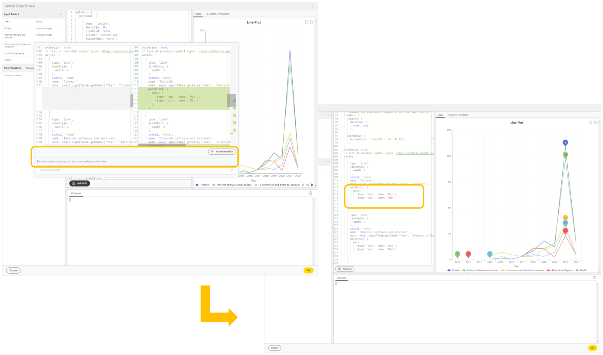
We keep interacting with the AI assistant until we are happy with the plot’s aesthetic appearance. In some cases, the interaction might require a few refinements but ultimately K-AI gets the work done and returns the plot as we envisioned it.
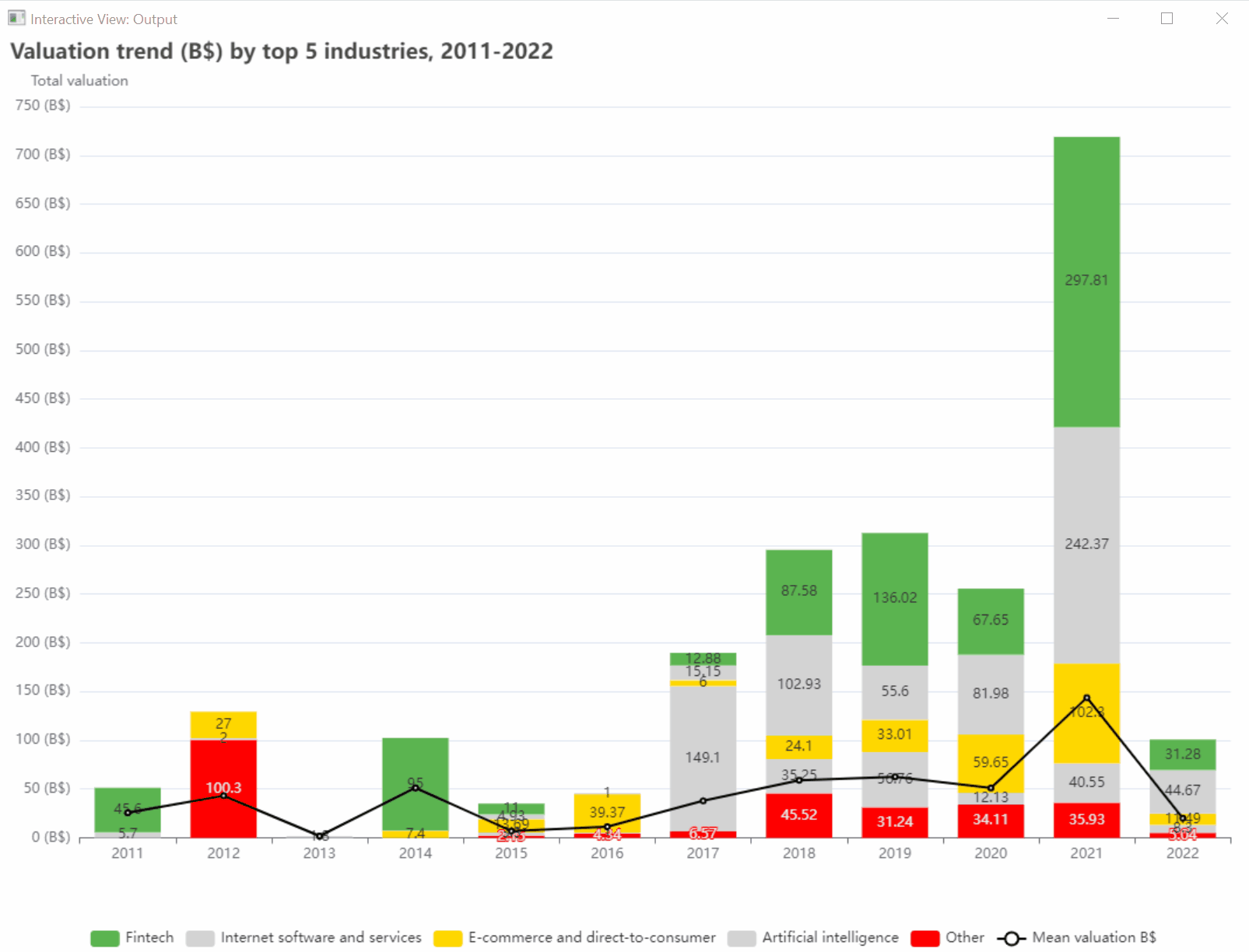
2. Build a stacked bar chart with a line plot to visualize valuations and average trend (B$) of the top 5 industries over time
For this visualization, we want to combine two plots in one: a stacked bar chart displaying yearly valuations of the top five industries, and a line plot stacked on top that gives an idea of the average valuation trend over time.
To prepare the data for the stacked bar chart, we create a pivot table where each column is an industry, and the rows contain valuation sums for each industry over time. We rank industries in descending order and retain only the top five.
For the line plot, we compute the yearly mean industry valuation using the GroupBy node.
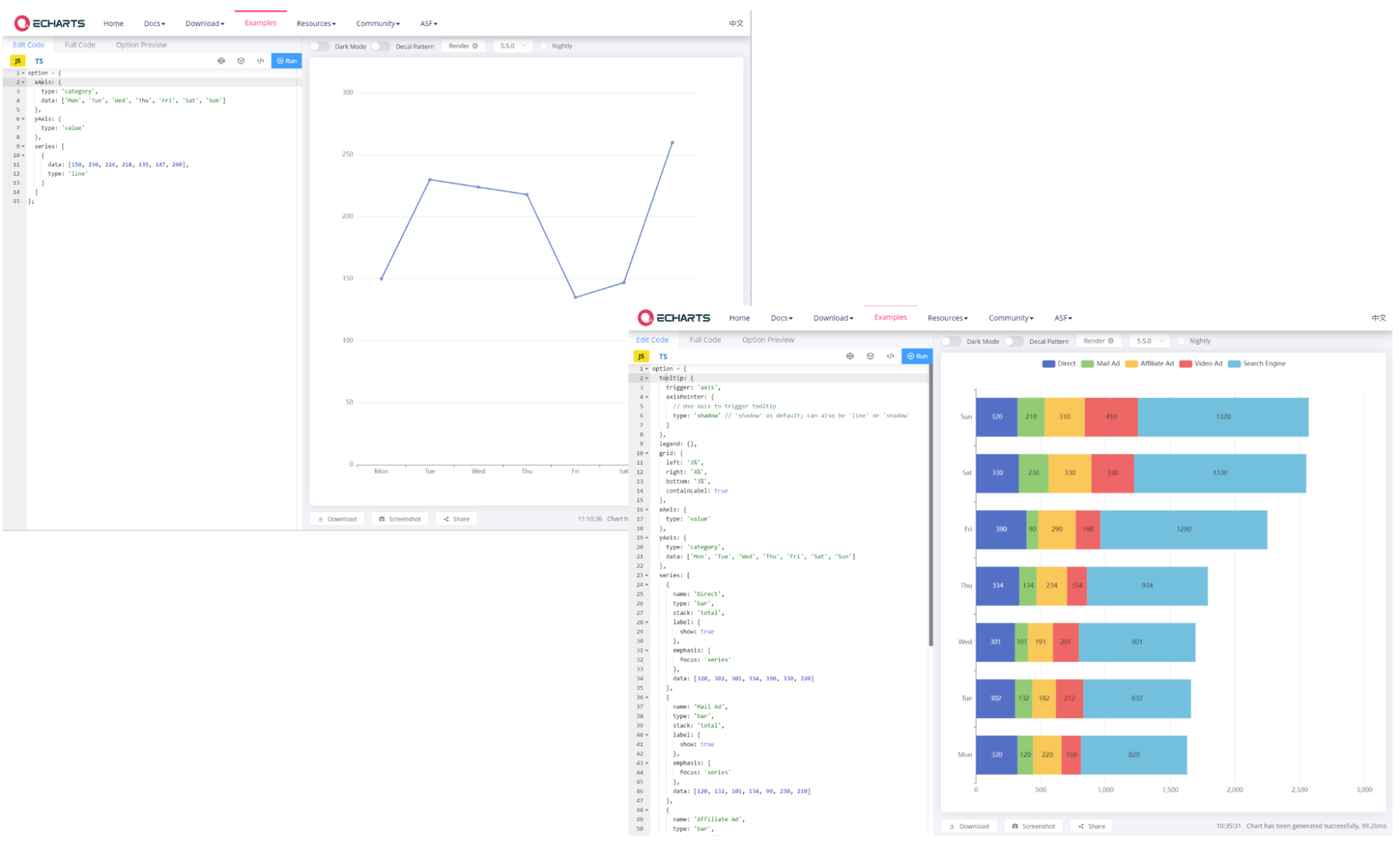
To visualize the data, the node’s in-built ECharts template gallery doesn’t suggest a single template that fits our specific needs. For these scenarios, there’s a handy “Explore more” button, positioned at the bottom of the node’s “ECharts Templates” tab, that points to the online “Examples - Apache Echarts” gallery.
We identify two different templates –a line plot and a stacked bar chart‒ and decide to combine them, taking what we need from each.
We start off by checking what shape and format the data should have. The plots expect data collections represented by arrays of strings or numbers. This data representation in KNIME Analytics Platform corresponds to traditional columns.
Next, we copy-paste the stacked bar chart template into the code editor of the Generic ECharts View node and identify the main edits to apply:
- Change the plot orientation to vertical;
- Update the data on the horizontal and vertical dimensions;
- Customize plot aesthetics.
To change the plot orientation, we ask K-AI for help. A few seconds later, the pertinent code lines are edited.
Updating the data on the axes is also very simple. The data of the input table is available in the top-left pane of the node, in the “Input Table 1”. All we need to do is to drag & drop the pertinent column (e.g., “Year”) to the right section of the code editor (e.g., assigning it to the x-axis). This action automatically places the “await” operator that requests the data asynchronously and makes it available to the plot:
xAxis: {
type: 'category',
� data: await inputTable.getColumn("Year")
}
We repeat the same drag & drop action five times in the “series” object to import the data for each industry.
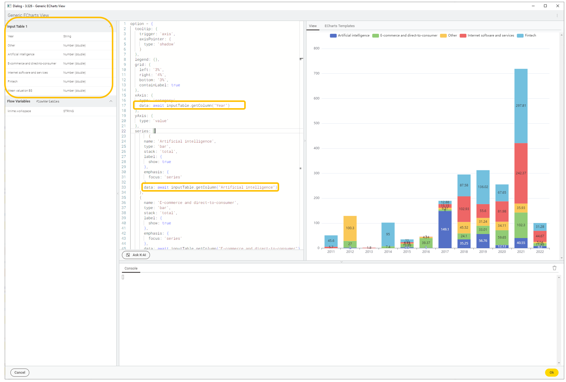
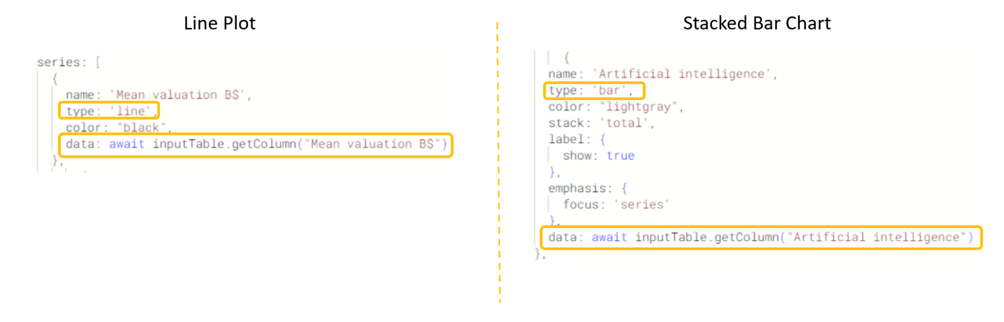
To add the line plot, we first take a closer look at the templates of the stacked bar chart and line plot. We notice that the “series” object of both templates have a similar core structure, i.e. an array of data points and a plot type (“line” or “bar”). Hence, all we need to do is to add the line plot template to the “series” object of the stacked bar chart template, and point the “data” item to the “Mean Valuation B$” column.
At this point, we can focus on customizing the plot, e.g. to add a title, change the legend position, the y-axis labels, and the color scheme. Once again, we prompt K-AI to suggest code edits and conveniently apply them with one click.
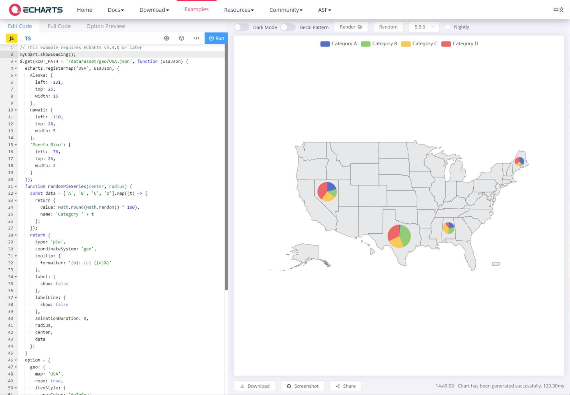
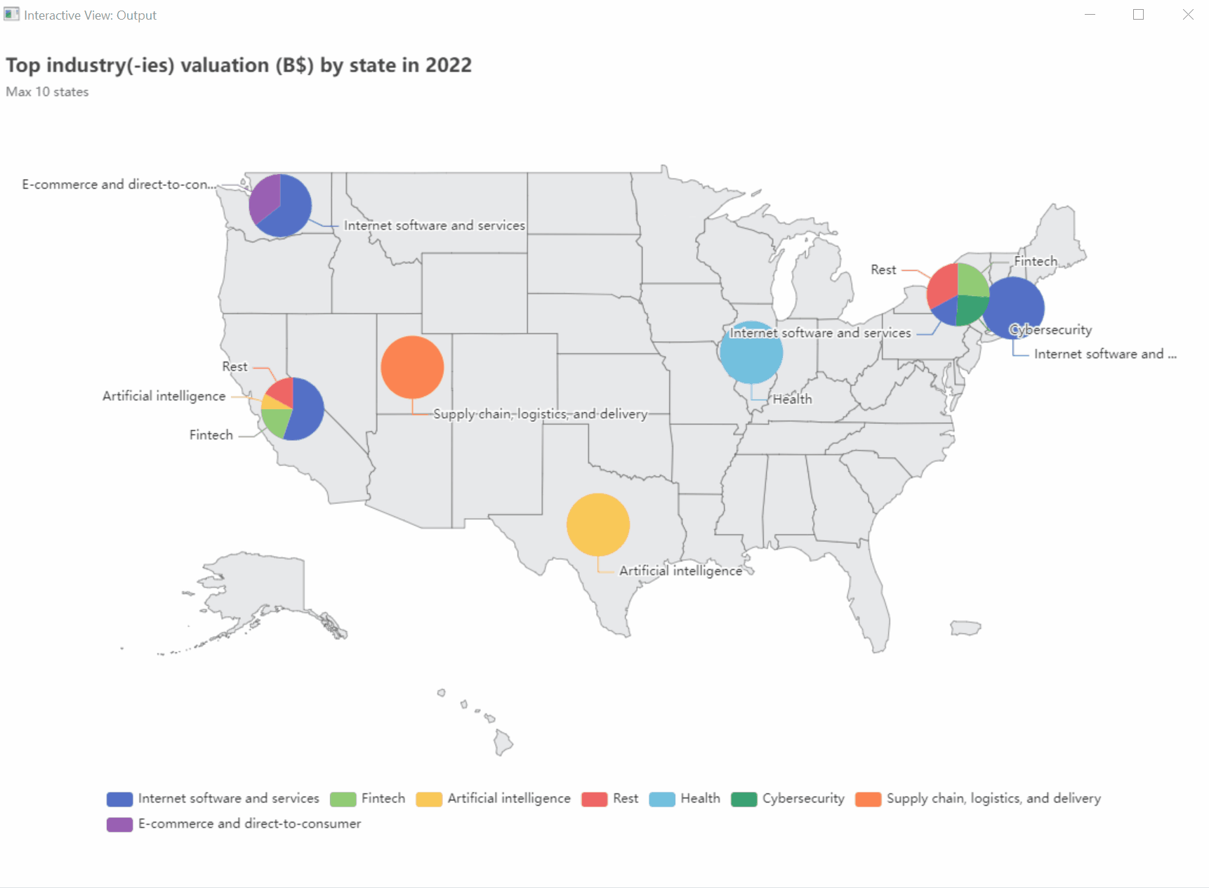
3. Build a geomap with pie charts to visualize top industry valuation(s) (B$) by US state in a given year
For the last visualization, we venture into a more advanced example sourced from the online “Examples - Apache Echarts” gallery.
We want to combine two plots again: a geomap and pie charts. The goal is to visualize the top industries by valuation (B$ and %) in a given US state and year. To avoid cluttering the plot, we set a limit of max three industries per state, and max ten states per year.
The dataset does not contain a column “State”, so we retrieve this information with the OSM Boundary Map node by looping over the joined city and country strings.
Next, we aggregate yearly industry valuations, calculate industry percentages, and keep the top three industries per state.
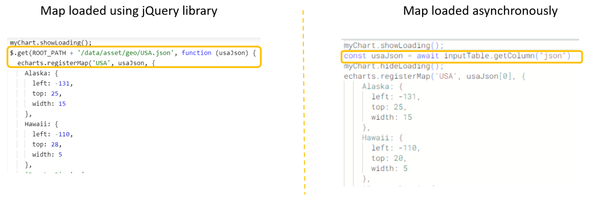
To adapt the ECharts template to our data, we first need to properly load the US geomap. The Generic ECharts View node supports only asynchronous data loading, so we cannot use the get() method of the JavaScript jQuery library.
We can easily solve this in two steps:
- We use the Get Request node to retrieve the JSON file containing the US geometry: https://echarts.apache.org/examples/data/asset/geo/USA.json.
- We make the JSON geometry available as a column to the Generic ECharts View node by drag & dropping it to the editor and assigning it to a constant variable.
Once the map is correctly loaded, we focus on the dynamic creation and update of industry pie charts according to state and selected year. Thanks to flow variables, parameterizing the plot to be responsive to data updates is very easy. For example, we can use the Value Selection Configuration node to select the year and update the view.
Additionally, to smoothly edit the code and make it flexible (e.g., we want to ensure that pie charts are built for different industries across states), we can prompt K-AI and get instant code suggestions for for-loops, if-statements, and beautification tips. In this way, even users with limited JavaScript coding experience can build their dream chart.
Bring it all into a PDF report
After creating and customizing the plots using ECharts, we need a fast way to generate and distribute the story our visualizations tell. Since the release of KNIME Analytics Platform 5.2 the KNIME Reporting extension enables users to generate and distribute static PDF reports for both one-off and recurring needs (learn more about reporting in KNIME).
We set the format of the report to be A4 with page orientation “Portrait”. We wrap each plot in a component and enable the reporting feature. Finally, we concatenate each component and export the report with the Report PDF Writer node.
Voilà, we are now ready to share our data story with our manager and colleagues!
Start customizing your visualizations with Apache ECharts in KNIME
Try using ECharts yourself, and download the workflow Build custom ECharts Views from the KNIME Community Hub.