
We’ve reached the point at which spreadsheets can break down.
The table of columns and rows for the corporate balance sheet made perfect sense five years ago. Now, though, we’re dealing with a lot more data, data types, and data sources.
That one neat table has become an intricate web of worksheets.
This is the point at which spreadsheets become hard to follow, hard to edit, and hard to debug. It’s when volume and complexity swamp what’s achievable within a spreadsheet.
Modern analysts want to have all their critical data at their fingertips to use easily, at any time, for more informed decision making. Stored data is growing five times faster than the world economy. We need data analysis techniques capable of generating insights from massive volumes of data, fast.
There's a new data literacy standard
Data literate individuals need to understand, interpret, and communicate with data. Excel is a valuable tool to becoming data literate, but it’s just one piece of the puzzle. Today's data is complex and huge. We need to expand our data literacy skills to truly make sense of it.
There's a new data literacy standard. It calls for a data literacy skill set with the analytic breadth and depth to enable us to work with all our data throughout its lifecycle. It calls for data mastery.
To meet the new data literacy standard, we need to
- Improve our data handling skills to contend with large datasets;
- Apply data integration techniques to merge complex data in multiple formats from multiple locations
- Acquire more expertise in advanced machine learning and AI to analyze huge volumes of data quickly
- Build interactive data visualizations to enable domain experts to inject expertise as we explore data
- Scale the impact of our analytics by sharing and communicating insight easily with colleagues
The biggest entry barrier to gaining this advanced skill set is user-friendliness of the tool.
Meet the new data literacy standard with low-code data science
Remember how VisiCalc, the seed that grew into the killer app we all have on our computers, gave us an intuitive user interface? It was revolutionary. It made personal computers more appealing to ordinary individuals, because it was no longer necessary to be a programmer to use one.
Today, low-code, no-code data science platforms give us an intuitive user interface to access and apply advanced analytics techniques.
User-friendliness of the tool makes it easier for individuals to not just build an analytics process, but understand the flow of processes and relationships between the different elements. Data analysis processes are assembled by dragging and dropping building bricks that each perform discrete actions on the data. When you run the analysis process, your step-by-step instructions are applied to the data. This clear, intuitive environment enables anyone to start dipping their toes into the world of data science.
Low-code, no-code data science tools let you visualize the process of what you're doing with data and provide you with that "program by example" view – that's a table shown for every output.
5 benefits of adding low-code data science to your skill set
The first steps to any analytic process are the same. You gather the data, clean it up, and then apply some calculations. We’re essentially following those steps no matter what, whether we’re preparing a balance sheet or a predictive model. These steps are very repetitive.
In Excel, we start with our data. We perform a number of calculations on it and get it into shape. When we’re finished, we have our table of clean data, but no historical record of what happened. We’ve lost the process, and next time, we have to repeat it.
In the data science tool, we start with the process. We define the series of operations to build a blueprint or “model” process. We run our process by sending the data through it. We never modify the source data. And we keep our process.
Let's have a closer look at common tasks performed in spreadsheets and how they can be improved when you add low-code data science to your skill set.
1. Automate data cleaning and improve data integrity
Bad data integrity is like a bad phone connection. When you’re missing half the words, the conversation won’t be very informational. Data is also pointless if you can’t get any information out of it. When it’s full of missing or duplicate values, it’s not workable. To make it informational, you need to prep and clean the data to make it workable. While there are ways to clean data with Excel, coverage of data operations is low, and you have to do each operation manually for each new task.
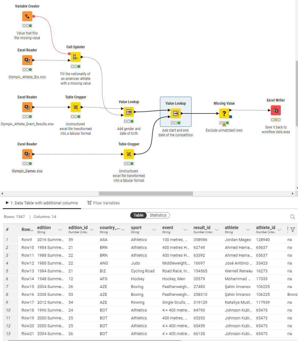
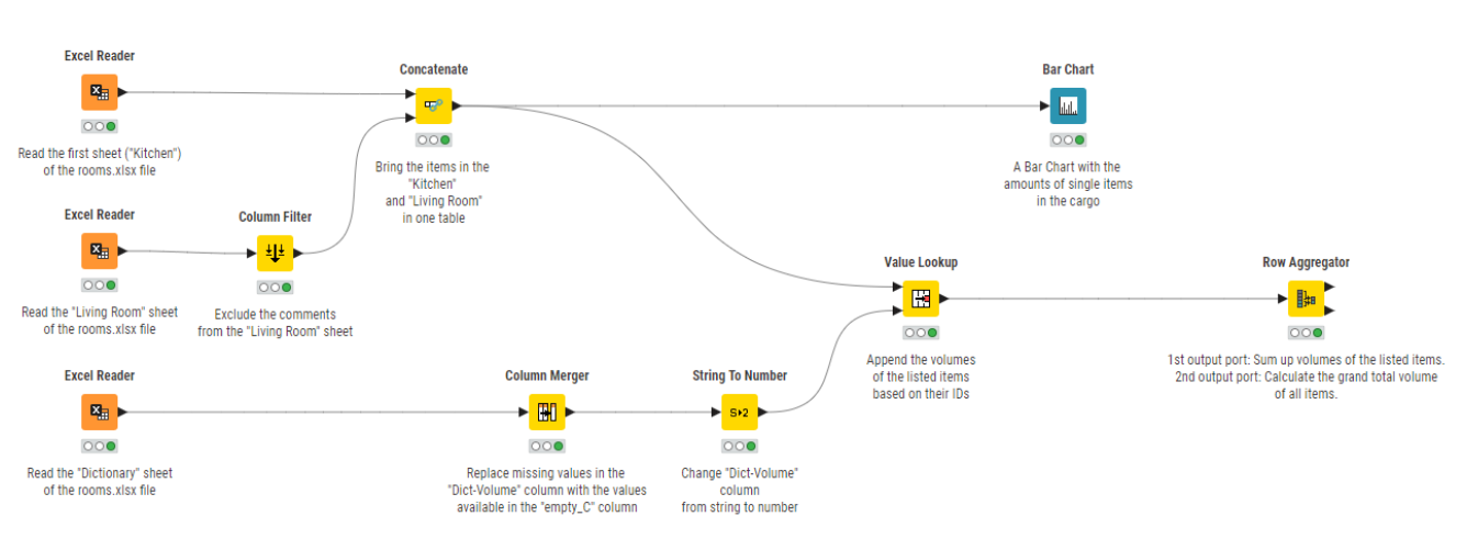
You can transpose these steps into a low-code workflow that you can reuse and share again and again. For the purposes of this guide, we'll use KNIME workflows as an example, but there are other low-code tools you can use. (Note, however, KNIME is open source and free to download.) Each step of the workflow is documented so that when shared, each team member easily understands what is happening to the data. You can export the clean data to any format your team members prefer, to their favorite BI tools, or even back to Excel. The entire workflow can also be bundled into a so-called component, and like a macro, used and shared in any workflow. When a change is required in the component, all edits are automatically rippled through to all the workflows that contain this component.
Explore these Excel automation resources around prepping data:
- Check out the cheat sheet: KNIME for Spreadsheet users
- Get an in-depth guide to data prep
- Read about KNIME components for sharing functionality
2. Merge multiple data sources – easily
When we’re using spreadsheets for data management, data is usually stored in one or more source columns in the spreadsheet, while the other columns contain the macros and formulas for the processing. For example, when you reuse the spreadsheet for this month’s analysis, you copy and paste the new data manually into the dedicated source columns. But when the data rows for the current month are more than the data rows for the previous month, the copy/paste of the data covers regions of the sheet where macros are as yet undefined, producing wrong, unverified sums and macro results.
The lack of a verified, reliable, repetitive way to collect data from multiple sources limits reusability of spreadsheets to very simple processes.
With more sophisticated techniques to pull and import data from multiple sources, you a) don’t have to use Excel anymore as your data source, but you can collect the data from where “it’s at” e.g., scrape the web, pick up data from an API, collect it from a database, and more. And b) you’ll get a verifiable, reliable, and reusable way to collect data. Using data science techniques, you’ll also have no limitations on the volume of data you’re pulling, and you’ll have an accelerated way of processing data.
Here’s some Excel automation inspiration for connecting to source data:
- Download the eBook Will They Blend? The Connector Connection to get an idea of the 300+ data sources and community-driven APIs you can connect to
- Check out the cheat sheet Connectors with KNIME Analytics Platform
3. Automate data visualization
The most important step in the whole data analytics process is communicating the results effectively. But “you have to undergo all manner of coding contortionism to programmatically export a picture via a damn chart object” said a VBA user on Reddit on a post about the worst and best of VBA. One of the most commonly (tediously) developed macros is one that generates summary statistics and pivot tables, and creates charts from raw data.
With the data science tool, you can choose from countless visualizations to display data in colorful charts—no contortionism required. You can choose from a large group of visualization components to simply plug in to your workflow. If you have a Python scripter on your team, they’ll be pleased to know that you can access the vast range of Python-based visualization libraries through KNIME—all without needing to learn to code in Python.
Here are three Excel automation resources on storytelling with data, including a few data viz examples:
- Get five easy plots and charts in Data visualization 101: 5 easy plots & charts
- Learn about visual data exploration in Data visualization: Why it's important & how to get it right
- Read how Python-based visualization libraries are accessed through KNIME
4. Reuse automated processes
Talk to a VBA expert and you’ll hear how brilliant macros are: pieces of code bundled to run repetitive tasks automatically, saving time, and hiking up efficiencies. Talk to IT and they’ll warn against all the harmful code they could contain; Excel’s own security feature even blocks or warns against running them. Talk to a non-VBA expert and you’ll hear about their frustrations when they need to adjust some of the macro’s functionality and then battle with code to do the edits.
While KNIME does require a basic understanding of data analytics concepts, the visual interface for building repeatable, reusable workflows removes the need to code. That means your workflows for data automation can be shared and understood by non-technical users. They’re versatile and can handle complex data pipelines and aren’t limited to a single application. Teams can use them to involve multiple data sources, transformations, and analytical processes across various applications.
- Read how a certified public accountant used KNIME to optimize one of the most time-consuming month-end processes: From paper ledgers to spreadsheets to data heroes.
5. Collaborate with 20/20 vision
There are times when you have to work with a spreadsheet someone else created. You open it and close it immediately. It’s so unwieldy. Your colleague works differently than you, and you know that before you can start working with it, you’re going to have to decipher formulas that extend over multiple rows, and maybe look into the VBA code of the macros. You’re thinking it’ll be faster if you just redesign it.
“Manual modifications to spreadsheets are often undocumented and consequently lost over time, making it hard to reproduce results”, said Michael Raithel, Senior Systems Analyst at Westat. Collaborating on spreadsheets that are not-documented is practically impossible.
In the low-code, no-code data science environment, the data underlies the formulas now, which makes it easy to follow. Arrows guide any user through the task; explanatory notes can be inserted underneath each step of the process; longer annotations can be added around groups of related steps. It’s also easier to make changes to individual parts of the process because you can isolate them. That’s trickier with a spreadsheet, because of all the dependencies that are created without any clear structure explaining them.
The inherent good documentation of the process provides transparency, easier sharing and re-application of processes throughout the team.
Learn how commonly used Excel functions and techniques are done in KNIME:
- Explore the ebook From Excel to KNIME
Join the data science club
When you’re considering what tools might be best to automate Excel data analysis, KNIME—as an open source, low-code, no-code platform—gives all users free access to a full data science framework, and all the advanced capabilities and automation this provides.
Most notably, KNIME Analytics Platform is:
- Open. There’s no need to replace Excel if you don’t want to. KNIME is integrative, so it will sit atop, alongside, or even inside your existing setup.
- Collaborative. Data teams can create and share work easily and integrate their favorite tools and technologies.
- Reusable. Repeatable processes are written once and can be wrapped into a “component” (like a macro).
- A community. You can get your questions answered quickly by community members on the KNIME Community Forum, and tap into KNIME Community Hub to find free solutions to download and use in your own projects.
Try it out yourself. Download KNIME—it’s open source and free of charge.