
Significant changes in the expression of a few key proteins are enough to disturb cell behavior and cause diseases like cancer. As a result, identification of specific amino acid sequences (as we discussed in the article Finding the Needle in the Haystack or Protein Identification in Mass Spectra with KNIME) is usually not enough on its own to answer research questions. In this follow-up post, we will extend the identification workflow to map the sequences back to proteins, quantify them, and compare their expression levels across multiple samples.
The ion intensity measured by a mass spectrometer is not directly proportional to the concentration of the molecules. Additionally, different peptides have distinct physical properties. Because of this, it’s very difficult to make an absolute quantification of peptides and proteins without standards. Instead, various methods for relative quantification between samples have emerged.
Note. To learn about the mass spectrometry method, read our previous blog post.
Current quantification methods mainly comprise two groups:
-
Labeled experiments allow measuring multiple samples in one run of mass spectrometry (MS). However, the cost and effort of labeling are significant, and the number of samples that can be measured at once is limited.
-
In contrast, label-free experiments are cheap and efficient, with no labeling needed. But it’s important to keep in mind that these methods require additional analysis steps (like alignment) to compare the intensities of peptides in different samples, and therefore benefit from a highly reproducible experimental setup.
This blog post presents a workflow for label-free quantification (LFQ) of proteins using the ProteomicsLFQ node from the OpenMS extension. We evaluated the workflow on a benchmarking dataset to test its capabilities to detect a set of proteins that have a significant difference in concentration across experimental conditions. The dataset contains multiple samples containing a constant concentration of background proteins from baker’s yeast and 49 well-known reference proteins from the universal protein standard (UPS) spiked-in in different concentrations that should show significant changes in abundance at the end of our workflow. This analysis can also be adapted to other tasks/inputs, and we will show along the way where those tweaks can be made in the workflow.
We will start with an overview of our final workflow, and work our way through the nodes in blocks.
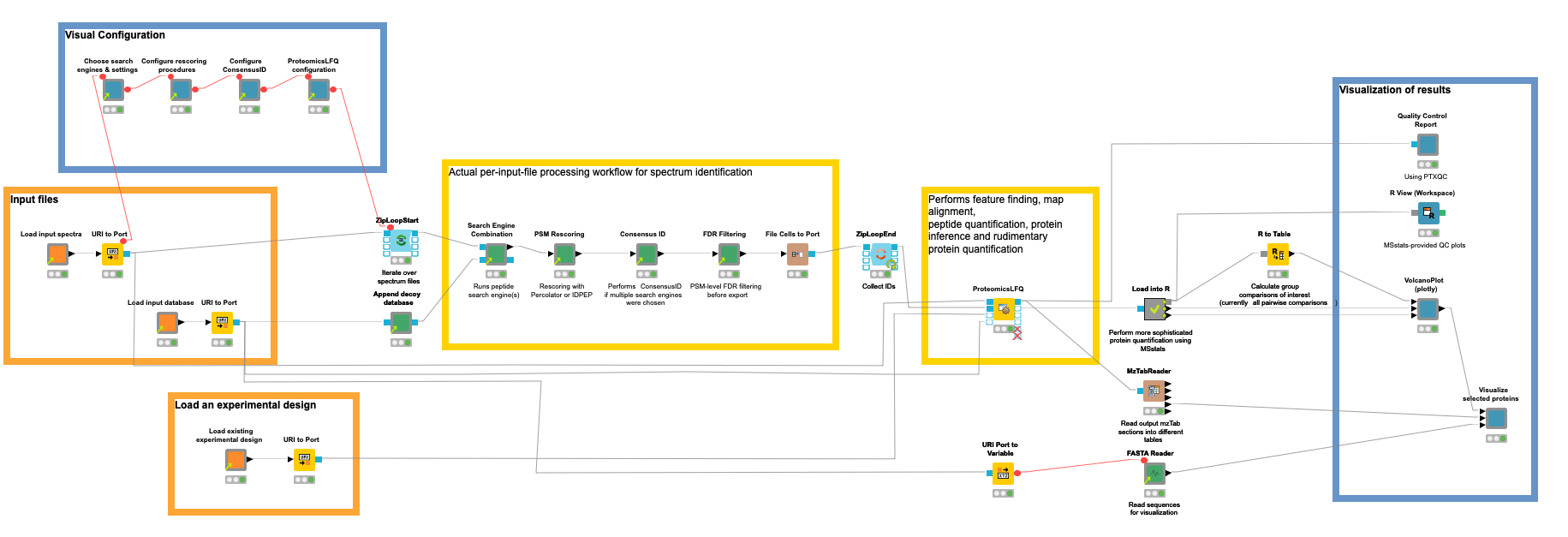
Our workflow for the quantification of proteins/peptides from mass spectrometry data can roughly be divided into the following steps: 1) read input data, 2) interactively configure data processing nodes, 3) peptide identification, 4) protein inference and quantification, 5) statistical evaluation, 6) visualization of results, and 7) quality control.
Step 1. Read input data
Orange nodes are input nodes that need to be configured by pointing to input files. For the mass spectrometry data, this should be a list of files in an open mass spectrometry format, here mzML (other formats can be used with an additional conversion step). A second input
asks for the input protein database in fasta format (a standard format for protein sequences) to guide the identification process in which proteins can be expected (see the blog post about identification for more details). For our benchmark dataset consisting of yeast background and UPS proteins, we downloaded the reference proteome of yeast from UniProt and concatenated the publicly available fasta for the 49 standard proteins.
Concerning metadata inputs, we further need an experimental design to tell the tools and statistical tests which samples belong to the same conditions that we want to compare later on. The design is a simple TSV file, and has the following entries for the used subset of our unfractionated example data:
For faster execution, we included only two biological replicates of two different concentrations. The “Label” column is always “1” for label-free experiments. Full documentation of the design is available here. Feel free to download more replicates and/or conditions if your computer or server has more power, or if you have more time.
Step 2. Configure processing nodes visually
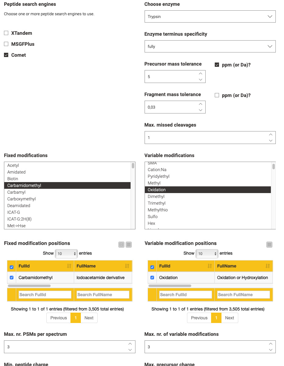
The second step is performed by the blue components on the left. They allow a visual configuration through a wrapped collection of interactive Widget nodes, as shown in the following figure for the search engine configuration. Only the most important parameters that apply to all possible tools are exposed. For advanced configuration, one has to navigate to the specific node by opening the corresponding green processing component.
Step 3. Peptide identification
Yellow boxes comprise the actual data processing nodes. Inside the (zip) loop, the identification workflow from the previous blog post is replicated to perform the identification of peptides per an input file. Since configuration happened visually in the metanodes (Step 2), no user action should be required here, unless you need advanced configuration or want to add visualizations per file (as shown in the previous blog post).
Step 4. Protein inference and quantification
With the help of the identified peptides, we can now perform an intensity-based quantification on the survey scans in your data that were measured around the time the fragment scan was taken that led to the identification.
This involves several substeps:
- Feature detection and quantification to collect and sum all the mass spectrometric peaks that belong to one potential peptide.
-
Sample alignment to reduce mass shifts introduced by differences in chromatography.
-
Feature linking to create the best possible associations between close features across all samples.
-
Protein inference to map the putatively identified peptides to their most likely proteins of origin.
The OpenMS plugin offers functionality for all these tasks with a multitude of nodes. However, we introduced the ProteomicsLFQ node to combine precursor correction, targeted and untargeted feature finding, map alignment, linking, protein inference, and basic quantification — all while considering a given experimental design (see Step 1) to hide the logic in a single node.
Step 5. Aggregation and statistical evaluation using the MSstats R library
Since the final goal is to find significant changes in protein regulation, our workflow uses the R library MSstats, which provides all means to go from raw peptide intensities to protein-level p-values for differential regulation according to specified contrasts.
We load the MSstats-compatible output CSV from the ProteomicsLFQ node, pass it to R with the Table to R node, and perform some preprocessing steps on the input data. The core of the R scripts essentially performs the following analysis:
-
Logarithmic transformation of the intensities
-
Normalization
-
Feature selection
-
Missing value imputation
-
Protein and run-level summarization
Lastly, the “groupComparison” function performs the statistical testing, which results in a p-value for every protein and every possible comparison.
Step 6. Visualization of results
The resulting changes in intensity (as logarithmized fold changes) and p-values can then be visualized by interactive volcano plots in which interesting proteins (such as those with high fold changes and low p-values) can be selected for filtering in a table and a heatmap (over all conditions), as well as for further inspection or export. A specific comparison/contrast can be selected on the top right of the view. Our example data only contain two conditions, so only one possible contrast can be selected. In our figure we can see that all selected proteins are spike-in proteins with UPS in their name. We could also go the other way around and search for UPS in the “Protein” column, then see where they are located in the volcano plot. Ideally, we want to see the rest of the proteins, like the yeast background with a log2 fold change of 0.

Another interesting visualization is the relationship between proteins that share peptides. Shared peptides are often left out for quantification, since most of the time they cannot be reliably associated with one particular parent protein and one’s intensity might be the result of a combination of the quantities of multiple parent proteins. Even identification can be hindered if only unreliable unique peptides exist for a protein. Due to this, it can be helpful to validate the coverage and uniqueness of peptides across selected proteins. We created an example of such visualization in a Generic JavaScript node with the help of the Nightingale library, then wrapped it in the Visualize selected proteins component.
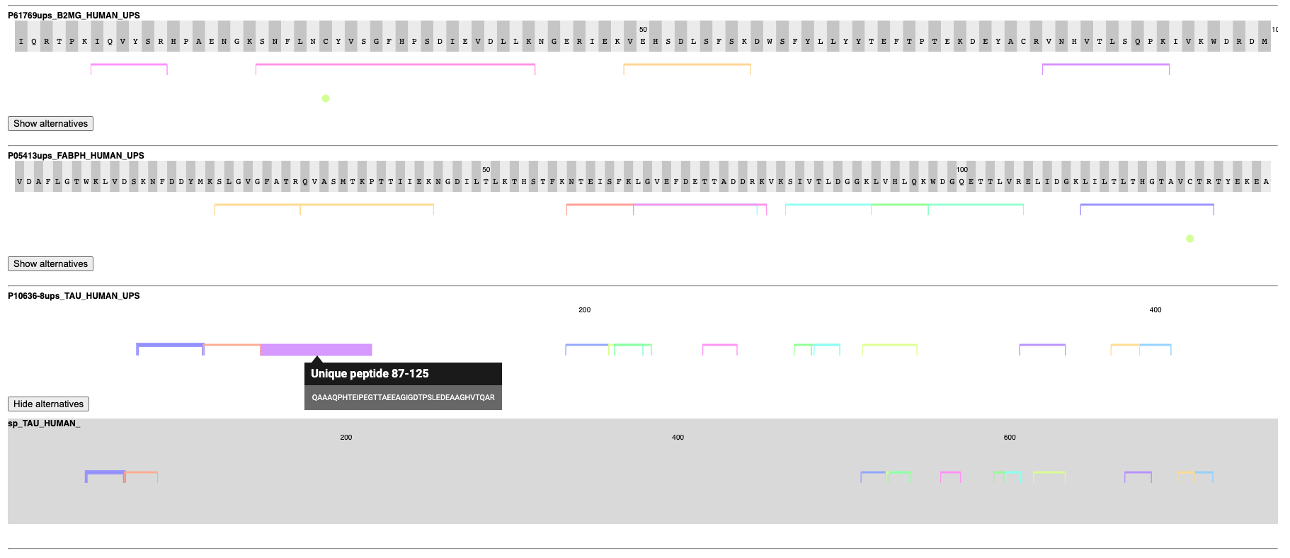
This component takes the selected proteins from the volcano plot and shows their sequences with all identified peptides and modifications, as well as potential alternative proteins that share peptides with the reported protein. In the figure, we can see that the algorithms found well-covered proteins that can often be distinguished by unique peptides from potential alternatives. If all peptides are shared between two possible proteins, they are reported as one indistinguishable group to still allow quantification (visible as a semicolon-separated list of proteins in the table of the volcano plot view).
Step 7. Quality control
Quality control should be performed at every step of the pipeline to catch anomalies early on. For the sake of simplicity, however, we use the PTXQC R package on the combined final results to generate a comprehensive HTML report. It analyzes the resulting mzTab file (from the ProteomicsLFQ node), then calculates and visualizes summary statistics about spectral properties, IDs, and quantities.
A part of the report can be seen in the following figure, while a full sample report can be found here. In this case, we can see that there are no anomalies in the two important metrics (missed cleavages in peptide sequences should be mostly zero and doubly charged peptides should be the majority).

Additional quality control plots can be generated with the MSstats library for more in-depth metrics specific to quantification. An example is shown in the R View (Workspace) node.
The Tools to Perform Proteomics Analysis are in KNIME
This concludes a two-part series about proteomics analysis with KNIME. It shows that high-throughput relative quantitative analysis of molecules in a cell does not have to stop at the transcriptome level. With mass spectrometry, (potentially modified) proteoforms can be elucidated, and their quantities compared across conditions.
The tools to analyze this data are right there in KNIME, so you do not even have to leave your favorite analytics platform. For readers who are already familiar with mass spectrometry, we want to emphasize that depending on the experimental setup, other types of analyses are also possible, such as targeted or SWATH experiments or different labeled quantification methods. Additionally, automated analyses of metabolites can be performed. But that’s a topic for another story!