Is 99% accuracy good for a churn prediction model? If in reality 1% of the customers churn and 99% don’t, the model is doing equally well as a random guess. If 10% of the customers churn and 90% don’t, then the model is doing better than the random guess.
Accuracy statistics, such as overall accuracy, quantify the expected performance of a Machine Learning model on new data without any baseline, such as a random guess or existing models.
That’s why we also need visual model evaluation - or scoring - techniques that show the model performance in a broader context: for varying classification thresholds, compared to other models, and also from the perspective of resource usage. In this article, we explain how to evaluate a classification model with an ROC curve, a lift chart, and a cumulative gain chart, and provide a link to their practical implementation in a KNIME workflow, "Visual Scoring Techniques for Classification Models".
Use case: churn prediction model
We’ll demonstrate the utility of visual model evaluation techniques through a Random Forest model (100 trees) for churn prediction.
We use a dataset with 3333 telco customers, including their contract data and phone usage, available on GitHub. The target column “Churn?” shows whether the customer churned (True) or not (False). 483 customers (14%) churned, and 2850 customers (86%) didn’t churn.
The accuracy statistics of the model are shown in Figure 1.
- The overall accuracy is around 94%, which means that 94 out of every 100 customers in the test data got a correct class prediction as Churn = True or Churn = False.
- The sensitivity value is around 59% for the class True. This implies that around 6 out of every 10 customers who churned were predicted correctly to churn, while the remaining 4 were predicted incorrectly to not churn.
- The specificity value around 99% indicates that almost all of the customers who didn’t churn were classified correctly.
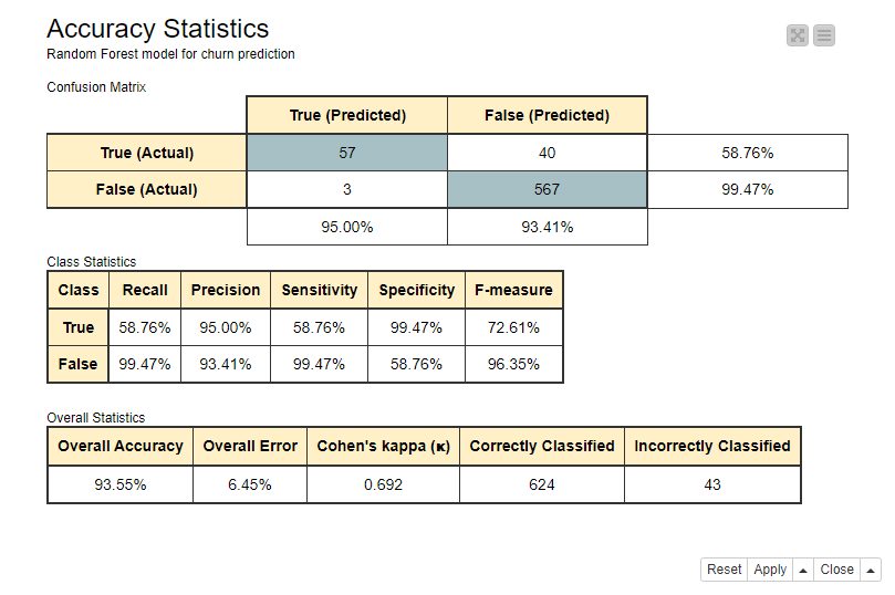
Figure 1. Confusion matrix, class statistics, and overall accuracy statistics of the Random Forest model for churn prediction
Comparing performances across classification thresholds
The accuracy statistics are calculated based on the actual and predicted target classes. The predicted classes, here True and False, are based on class probabilities (or scores) predicted by the model, ranging between 0 and 1. In a binary classification problem, the model outputs two probabilities, one for each class. By default, the class with the highest probability determines the predicted class, which in a binary classification problem means that the class with a probability above 0.5 gets predicted. However, sometimes a different classification threshold can lead to a better performance. If this is the case, we can find it out in an ROC curve.
ROC Curve
An ROC curve (Receiving Operator Characteristics curve) plots the model performance for varying classification thresholds using two metrics: the false positive rate on the x-axis and the true positive rate on the y-axis.
In a binary classification task, one of the target classes is arbitrarily assumed to be the positive class, while the other class becomes the negative class. In our churn prediction problem, we have selected True to be the positive class and False the negative class.
The number of true positives (TP), false negatives (FN), false positives (FP), and true negatives (TN), as reported in the confusion matrix in Figure 1, are used to calculate the false positive rate and true positive rate.
- The false positive rate
measures the proportion of the customers who didn’t churn, but were incorrectly predicted to churn. This equals 1-specificity. - The true positive rate
measures the proportion of the customers who churned, and were correctly predicted to churn. This equals sensitivity.
The first point of the ROC curve in the bottom left corner indicates the false positive rate (FPR) and true positive rate (TPR) obtained using the maximum threshold value 1.0. With this threshold, all customers with probability P(churn=True) > 1.0 will be predicted to churn, that is none. No customers are predicted to churn either correctly or incorrectly, and therefore FPR and TPR are both 0.0.
The second point in the ROC curve is drawn by decreasing the threshold value, for example by 0.1. Now all customers with P(churn=True) > 0.9 will be predicted to churn. The threshold is still high, but it is now possible that some customers will be predicted to churn, therefore producing small non-zero values of TPR or FPR. So, this point will be located in the ROC curve close to the previous point.
The third point is drawn by decreasing the threshold value some more, and so on, till we reach the last point in the curve drawn for the minimum classification threshold 0.0. With this threshold, all customers are assigned to the positive class True, either correctly or incorrectly, and therefore both TPR and FPR are 1.0.
A perfect model would produce TPR=1.0 and FPR=0.0. On the opposite, a random classifier would always make an equal number of correct and incorrect predictions into the positive class, which corresponds to the black diagonal line where FPR=TPR. This line is reported in each ROC curve as a reference for the worst possible model.
Notice that a model can of course perform worse than the random guess, but that might be a mistake of the data scientist rather than the model! It would be enough to take the opposite of the model decision to implement a better performing solution.
Figure 2 shows an ROC Curve, drawn for the Random Forest model for churn prediction. Notice the black line corresponding to the random guess.
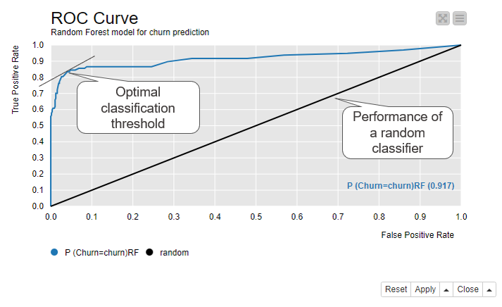
Figure 2. ROC curve shows the false positive rate on the x-axis and true positive rate on the y-axis for all possible classification thresholds from 0 to 1
The optimal classification threshold for the model is located as close as possible to the top left corner - with TPR=1.0 and FPR=0.0 - occupied by the perfect model. This optimal point has the closest tangent to (0.0, 1.0). With this optimal classification threshold we have the least false positives for each true positive. Our example model predicts on average

true positives for each false positive, when we use the optimal classification threshold, as shown in Figure 2.
If we compare these numbers to the class statistics in Figure 1, we can see that, after optimizing the classification threshold, the sensitivity increases quite a lot from 59% to 85%, while specificity decreases only a bit from 99% to 100% - 5% = 95%.
Comparing multiple models
An ROC curve is also useful for comparing models. Let’s train another model, a Decision Tree, for the same churn prediction task and compare its performance with the Random Forest model.
Figure 3 shows two ROC curves in the same view. The blue curve is for the Random Forest model and the orange curve is for the Decision Tree. A curve closer to the top left corner, in this case the blue curve of the Random Forest model, implies better performance. The view also shows the Area under the Curve (AuC) statistics for both models in the bottom right corner. It measures the area underlying each ROC curve and allows for a more refined comparison between the performances.
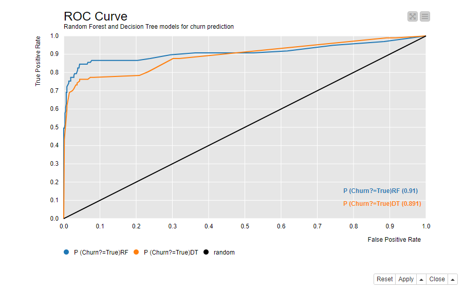
Figure 3. ROC curves of two models - a Random Forest and a Decision Tree - for churn prediction. The model which reaches closer to the top left corner and has a greater AuC statistics performs better.
Saving resources with a model
Besides getting accurate predictions, we can also save resources with the model. In our example of churn prediction, some kind of an action follows the prediction, and the action requires resources, such as less revenue or more time investment. A model can help us to use the resources more efficiently: apply fewer actions but still reach more of the customers who are likely to churn.
The lift and cumulative gain charts compare the resource usage against the correct predictions.
Lift Chart
A lift chart compares the number of target customers - here the customers who churn - reached in a sample that has been extracted based on the model predictions vs in a random sample.
Figure 4 shows the lift chart of the Random Forest model. The x-axis shows each decile of the data ordered according to their predicted positive class probabilities from the highest to the lowest. For example, if we have 100 customers in the data, the first decile contains 10 customers with the highest predicted positive class probability, that is 10 customers who are most likely to churn. In the second decile we have other 10 customers with a lower probability than the first 10 customers, but higher than the remaining 80 customers. The tenth decile contains 10 customers with the lowest probability; 10 customers who are least likely to churn.
The lift shown by the cumulative lift line (the blue line) is the ratio of target customers reached in a sample which is drawn from ordered data as shown on the x-axis vs in a random sample. The lift is about 6 for the first decile. Since 14% of the customers in the original data churn, the probability of reaching a target customer in a random sample is 14%. If we randomly sample 10 customers out of 100 customers, we expect to reach 0.14*10=1.4 target customers. If we sample 10 first customers from the ordered data, we expect to reach 6 times more, that is 6*1.4 = 8.4 target customers. If we increase the sample size by further 10%, the cumulative lift is around 4. We would now reach 0.14*20 = 2.8 target customers in a random sample, and 4*2.8 = 11.2 target customers in a sample from the ordered data. The more data we sample, the more target customers are reached also by random sampling. This explains why the difference between the cumulative lift and the baseline (the green line) decreases towards the tenth decile.
The lift line (the red line) shows the lift for each decile separately. The lift is above the baseline for the first two deciles and below it from the third decile forward. This means that if we sample the first decile from 100 customers, we expect to have 6*1.4 = 8.4 target customers. If we sample the second decile but not the first decile, we expect to have 2*1.4 = 2.8 target customers. If we sample any of the 3th to the 10th decile, we expect to have maximum 0.25*1.4=0.35 target customers, because among these 80% of the data, the lift stays at a very low level between 0 and 0.25.
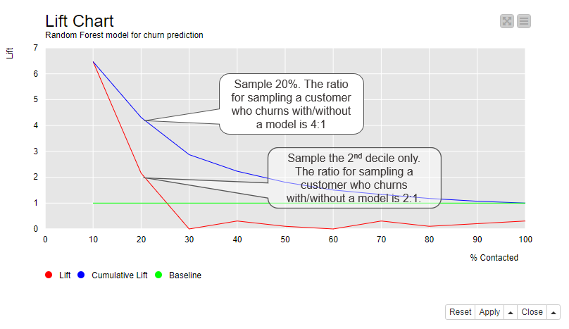
Figure 4. Lift chart shows the ratio of target customers reached in a sample which is drawn based on the model predictions vs in a random sample
Cumulative Gain Chart
A cumulative gain chart shows which proportion of the target customers can be reached with which sample size. Similarly to the lift chart, the cumulative gain chart shows the data ordered by their positive class probabilities on the x-axis. On the y-axis it shows the proportion of target customers reached.
Figure 5 shows the cumulative gain chart for the Random Forest model. If we follow the curve, we can see that if we only sample 10% of the customers, those with the highest probability (x-axis), we expect to reach around 60% of all customers who churn (y-axis). If we sample 20% of the customers, again those with the highest probability, we expect to reach more than 80% of all customers who churn. This point also has the closest tangent to the top left corner. With this number of sampled customers, the average sample size required to reach one target customer is the lowest.
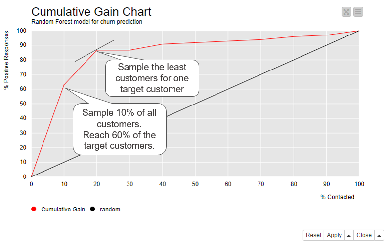
Figure 5. Cumulative gain chart shows which proportion of target customers we reach when we contact 10%, 20%, …, 100% of the customers ordered by their positive class probability
Visual Model Evaluation Techniques - Summary
Table 1 collects the techniques described above and summarizes what they report about the model’s performance. These visual techniques complement the accuracy statistics in that they show the optimal classification threshold, compare the performance to a random guess, compare multiple models in one view, and indicate the optimal sample size and quality.
The ROC curve shows the performances across different classification thresholds, compares the performance to a random guess, and also compares the performances of multiple models. The lift chart and cumulative gain charts show if the model enables us to invest less resources but still reach the desired outcome.
These visual techniques complement but don’t replace the accuracy statistics. For a comprehensive model evaluation, it’s good to take a look at both.
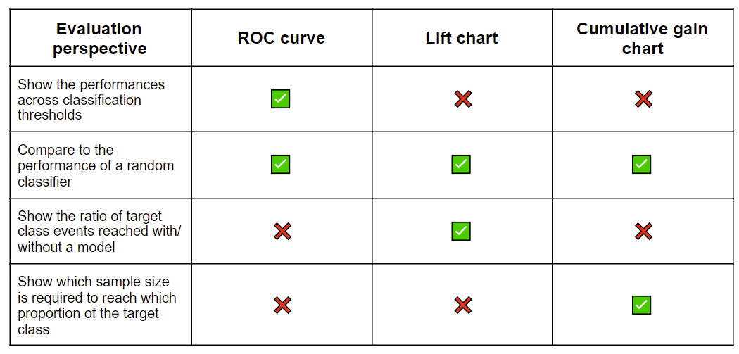
Table 1. Summary of the visual evaluation techniques for a classification model
Tips & Tricks
KNIME Analytics Platform provides a Binary Classification Inspector node that can be used to compare the accuracy statistics and ROC curves of multiple models and also find the optimal classification threshold. Its interactive view (Figure 6) shows:
- A bar chart for overall accuracy and class statistics
- An ROC curve
- The confusion matrix
- The distribution of positive class probabilities
- A slider widget for the classification threshold
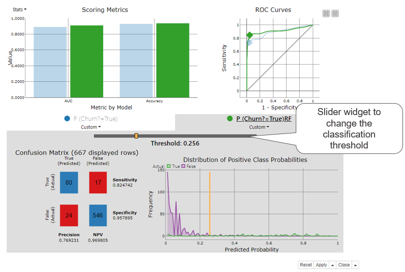
Figure 6. Binary classification inspector node’s interactive view displays a bar chart for accuracy statistics, ROC curve, confusion matrix, and distribution of positive class probabilities in one view for one or more classification models. All views will be updated when the slider widget is used to adjust the classification threshold.
The top part of the Binary Classification Inspector node’s view shows a bar chart for accuracy statistics and an ROC curve. Each model is displayed by a different color, here green for the Random Forest model and blue for the Decision Tree. We can select one of the models for a more detailed inspection by clicking on a colored bar. We’ve selected the Random Forest model in Figure 6. The bottom part of the view activates and shows the confusion matrix and the distribution of the positive class probabilities for the selected model. The purple and green line in the distribution chart show the number of customers for each predicted probability separately for the two target classes. The orange vertical line shows the current classification threshold.
The classification threshold is at 0.5 by default. Using the threshold slider widget we can change this value: to the left towards zero or to the right towards 1. When we do, all other charts and plots in the view are automatically adjusted according to the new classification threshold. For example, when we move it to the left, the diamond in the ROC curve moves to the right. We stop moving the threshold when the diamond reaches the point for the optimal threshold, in this case at 0.256 as shown in Figure 6. This is the optimal classification threshold for the Random Forest model. Quite a lot different from the default 0.5!
Binary classification inspector view and the visual model evaluation techniques introduced in this article are implemented in the "Visual Scoring Techniques for a Classification Model" workflow (Figure 7). You can inspect and download it for free from the KNIME Hub.