There are two main analytics streams when it comes to social media: The topic and tone of the conversations and the network of connections. You can learn a lot about a user from their connection network!
Let’s take Twitter for example. The number of followers is often assumed to be an index of popularity. Furthermore, the number of retweets quantifies the popularity of a topic. The number of crossed retweets between two connections indicates the livelihood and strength of the connection. And there are many more such metrics.
@KNIME on Twitter counts more than 6730 followers (as of August 2021): the social niche of the KNIME real-life community. How many of them are expert KNIME users, how many are data scientists, how many are attentive followers of posted content?
Let’s check the top 20 active followers of @KNIME on Twitter and let’s arrange them on a chord diagram (Fig. 1).
Are you one of them?
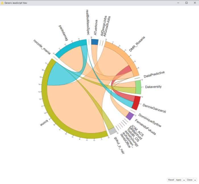
A chord diagram is another graphical representation of a graph. The nodes are represented as arcs along the outer circle and are connected to each other via chords.
The chord diagram displayed above refers to tweets including #knime during the week July 26-August 3, 2021.The number of retweeted tweets defines the size of the circle portion (the node). Each node/user has been assigned a random color. For example @KNIME is olive, @DMR_Rosaria is orange, and @paolotamag is blue.
Having collected tweets that include #knime, it is not surprising that @KNIME occupies such a large space on the outer circle.
The number of retweets by another user defines the connection area (chord), which is then displayed in the color of the retweeter. @DMR_Rosaria is an avid retweeter. She has managed to retweet the tweets by @KNIME and KNIME followers disproportionally more than everybody else and has therefore managed to make the color orange the dominant color of this chart.
However, moving on from orange, we can see that the second retweeter of KNIME tweets for that week was @paolotamag.
How to Build a Chord Diagram in KNIME Analytics Platform
We’d now like to show how we built the chord diagram using KNIME Analytics Platform.
Data Access
We access the data by using the Twitter nodes included in the KNIME Twitter API extensions. If you want to learn more about how to access Twitter data with KNIME, have a look at the Twitter Data Collection workflow or one of the other Twitter workflows on the KNIME Hub.
We gathered the sample of data around the hashtag #knime during the week July 26-August 3. 2021. Each record consists of the user name, the tweet itself, the posting date, the number of reactions and retweets and, if applicable, who retweeted it.
Let’s build the network of retweeters. A network contains edges and nodes. The users represent the nodes and their relations, i.e. how often user A retweets user B is represented by the edges. Let’s build the edges first:
- We filter out all tweets with no retweets or that consist of auto-retweets only.
- We count the number of retweets a user has retweeted tweets of another user.
To clean the data and compute the edges of the network all you need are two Row Filter nodes and a GroupBy node.
The Matrix of Nodes and Interactions
Now we want to build a weighted adjacency matrix of the network with usernames as column headers and row IDs, and the number of retweets by one username on the tweets of the other in the data cell. We achieve that by addressing the following steps (Fig. 2).
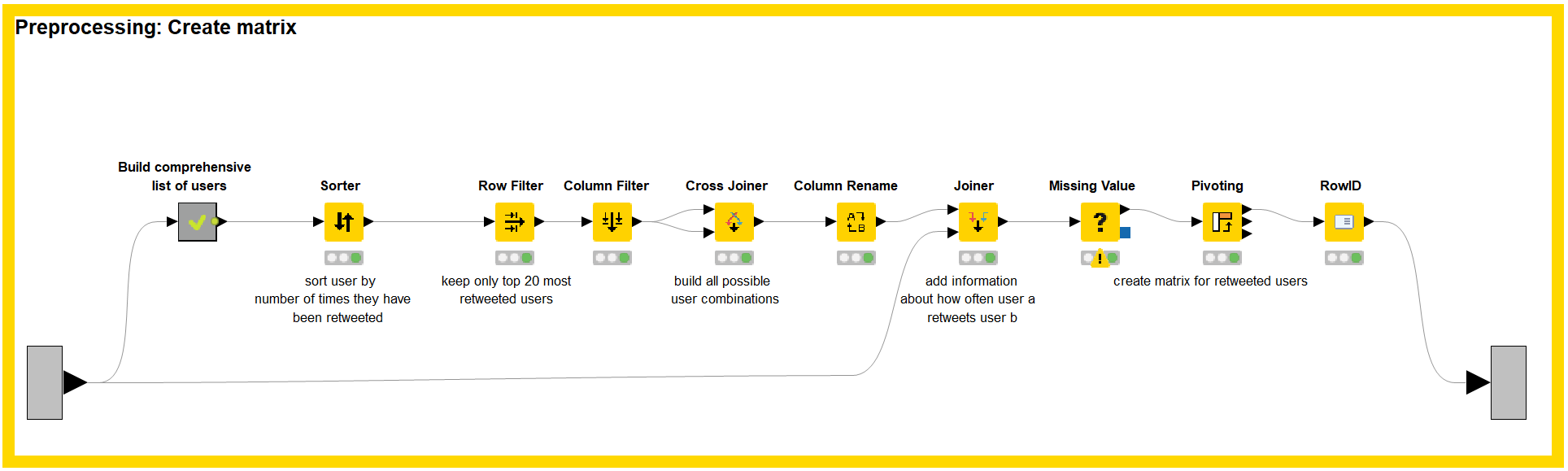
- We build a comprehensive list of all users (usernames), both tweeting and retweeting, and count the number of times their tweets have been retweeted overall. These numbers will fill the nodes of the network.
- We narrow our analysis down to investigate only the 20 topmost retweeted users. That is why we sort them in descending order with respect to the number of retweets on their tweets and keep only the top 20.
- Using a Cross Joiner node, we build the pairs of users. From an original set of twenty users we end up with 400 different user pairs.
- To these user pairs we add the previously computed edges by using a Joiner node.
- The Pivoting node then creates the matrix structure from the (username1, username2, count of retweets) data table.
You can read it like this: “The user named in Row ID’s row was retweeted n times by the user named in the column header’s column.”
Drawing the Chord Plot
- The matrix we created is the data input for a Generic JavaScript node.
- The Generic JavaScript node draws the chord diagram.
- To draw the chord diagram, we need the D3 library which can be added to the code in the Generic JS node.
- The JS code required to draw this chart is relatively simple and is shown here.
More Formal Network Analysis Technique
If you would prefer a more traditional method to visualize your results, there are also common KNIME nodes to analyzing your social media network in the “classic” and more formal way. Using these nodes also means that you don’t have to use any JavaScript programming. What we want to do is analyze the same network of the 20 most active followers of @KNIME on Twitter, but this time with the KNIME Network Viewer node (Figure 3).
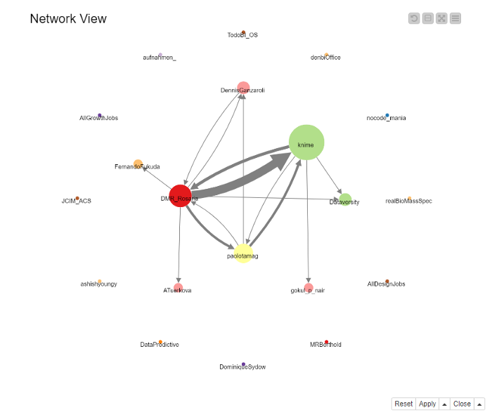
This network map displays the graph with the following key elements: nodes are represented by a specific shape, size, color, and position. We arbitrarily chose circles for the shape. Each node is colored and labeled with respect to the user it represents. The circle’s size is dependent on the overall number of times the specific user’s tweets have been retweeted by other users. The position of nodes in this case is defined by their degree. The more input and output connections a node has, the higher its degree and the more centric it is displayed on the network map.
Note. For ease of visualization, in Figure 3 we have manually rearranged the position of the @KNIME and @DMR_Rosaria nodes to distinguish edges more accurately. This is why these nodes do not have a centric position.
Another key element are the edges, which connect the nodes. They are visualized as arrows, as we visualize a directed graph. The direction of the arrow shows which user has retweeted somebody else’s tweets, while its size depends on the number of retweets.
Conclusion
In this article, we have shown an alternative approach to the more traditional network visualization techniques by using a chord diagram. We did this by leveraging the flexibility of the Generic JavaScript View node. The JavaScript code required is an adaption of an existing D3 template and the crucial parts are displayed above.
The workflow is available on the KNIME Hub here https://kni.me/w/7dFF-d8OmeREN72O