Geospatial data is location data at a specific time. The additional dimensionality of ‘location’ and ‘time’ can be used to uncover unprecedented connections between variables, as well as identify patterns and trends within the data. From retail to finance to supply chain, geospatial data is being used in multiple use cases – to define the best location for stores, to identify clusters of suspicious activity and detect fraud, to pinpoint optimal routes between facilities, and more.
In this tutorial, we will use KNIME Analytics Platform and its Geospatial Analytics extension to carry out a few geospatial tasks:
- Task 1: Visualize a location (e.g., a city) on a map.
- Task 2: Visualize a country with its representative point.
- Task 3: Visualize the KNIME Data Connect events by region.
- Task 4: Visualize the closest KNIME Data Connect with an interactive dashboard.
What is KNIME?
KNIME Analytics Platform is free and open-source software that you can download to access, blend, analyze, and visualize your data, without any coding. Its low-code, no-code interface makes analytics accessible to anyone, offering an easy introduction for beginners, and an advanced data science set of tools for experienced users.
The Geospatial Analytics Extension for KNIME
First of all, we need to download and install the free Geospatial Analytics extension, which has been co-developed by the research team of Dr. Guan at the Center for Geographic Analysis at Harvard University and included in KNIME Analytics Platform version 4.7 (December 2022).
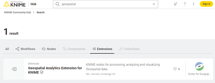
On the KNIME Community Hub search “geospatial” in the “Extensions” section, then drag & drop the row “Geospatial Analytics Extension for KNIME” (Figure 1) onto your KNIME Analytics Platform to install it.
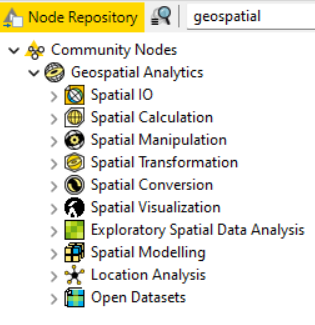
Once installed, you should see a folder named “Geospatial Analytics” under “Community Nodes” in the Node Repository of your KNIME Analytics Platform (Figure 2). This folder contains a very large number of nodes for accessing, calculating, manipulating, transforming, converting and visualizing geospatial data.
For example, you will find the GeoFile Reader and Writer nodes to read and write geospatial files in different formats (.shp, .gpkg, .geojson); the Area node to compute the area of each geometry, the Bounding Box node to generate rectangles representing the envelope of each geometry, the Spatial Join node to merge tables based on their spatial relationship, or the US2020 Census Data node to retrieve US 2020 Census Redistricting Data –just to mention a few. In total, there are 63 different nodes.
We will see some of these nodes in action in the next sections.
Task 1: Visualize a Location on a Map
Let’s start with a simple task: the visualization of a location, on a world map. Let’s take the city of Cambridge (MA, USA) as an example.
Geospatial analytics relies mostly on two basic shapes: (multi)polygons and points. Polygons enclose a city or a country within its geographical boundaries; points indicate just the location without any information on boundaries.
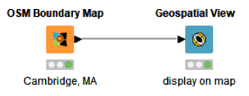
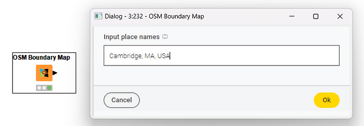
Let’s try to display the city of Cambridge with its boundaries on the world map. For this simple task, we just need two nodes: the OSM Boundary Map node and the Geospatial View node (Figure 3).
The OSM Boundary Map node relies on Open Street Map (OSM), an open geographic database, to retrieve boundary information. The boundaries of a place are expressed via a polygon. The node receives as input the name of the place (Figure 4) –either country, city, or village–, retrieves the required information from the database, and outputs the corresponding boundary polygon. Data such as points or polygons are stored in a new data type: the Geometry type.
Let’s add the OSM Boundary Map node to the workflow and configure it to export the polygon around the city of Cambridge (MA).
Another interesting node contained in the “OSM Datasets” folder of the Node Repository is the OSM POIs node. This node extracts all points of interest for a selected category in the region(s) enclosed in the polygon(s) in a Geometry type column.
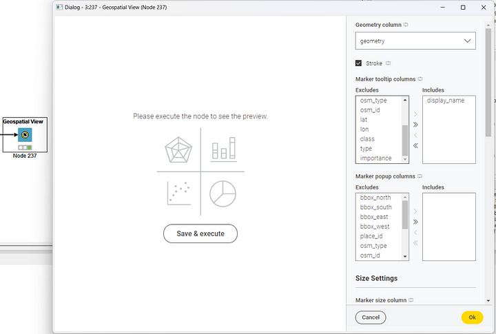
The second node we need is a visualization node: the Geospatial View node. This node visualizes a polygon or a point object – stored in a Geometry type column – on a world map. The key setting in the configuration window (Figure 5) is the Geometry type column to display. On top of that, a number of additional visualization settings can be configured, such as the tooltip content, the marker popup, size and color, the marker classification method, the base map, and legend. The base map is an interesting parameter, since different types of map display a different representation of the polygon. We choose the Open Street Map for this example.
This node offers a visualization preview on the left-hand side of the configuration window. This preview can be refreshed every time we change one or more settings. To refresh, just click the button “Save & execute”.
To confirm the setting update, click the button “OK” in the lower-right corner. If you have refreshed the preview, the node is already executed, and the final view is readily available.
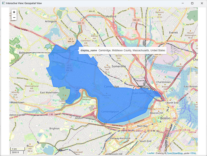
The node has a View, like all visualization nodes. To explore it, right-click on the node and select “Interactive View: Geospatial View”. The node displays an interactive map with the city of Cambridge’s boundaries colored in blue (Figure 6). Notice the zoom in / zoom out buttons in the top-left corner of the view.
Before we move to Task 2, let’s see an interesting fact about workflow automation and control for these new nodes. Flow Variables are KNIME’s solution to parameterize nodes and automate execution.
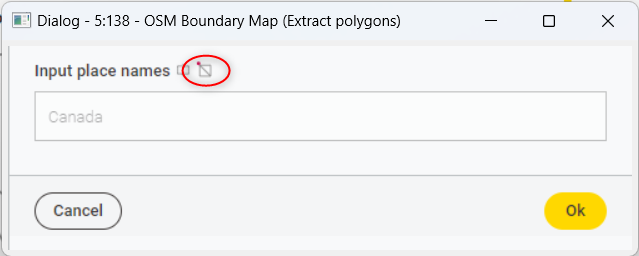
To configure your settings via flow variables, you need to right-click the node and select “Configure Flow Variables…”. This opens up a window that allows you to overwrite configuration settings via flow variables. Once a configuration setting is controlled via a flow variable, a little barred square with a red dot at the top appears close to that setting in the configuration window (Figure 7).
Task 2: Visualize a Country with its Representative Point
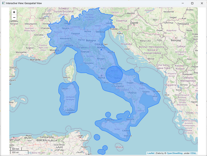
Let’s now learn how we can solve a more complex task. In this case, the goal is to visualize on a map a country polygon and its representative point. For this example, let’s visualize Italy.
In the OSM Boundary Map node now we type “Italy” as the input location. The polygon around Italy is then produced and stored in a Geometry type column. Coordinates in the Geometry type column are expressed in degrees by default.
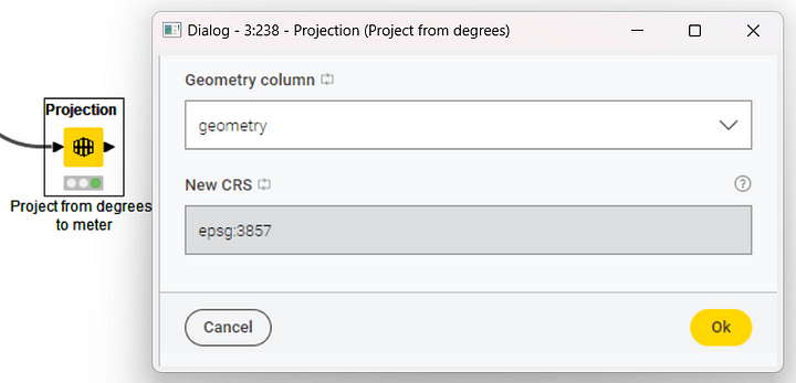
For ease of distance calculation and interpretation, we might want to change the units of measurement related to the coordinates, and move from the degree system to the metric system. To do that, we need the Projection node (Figure 8).
The Projection node transforms the Coordinate Reference System (CRS) of a Geometry type column into a new system for mapping coordinates (and the related units of measurement, i.e., degrees or meters) using predefined EPSG codes. The configuration window requires the selection of the Geometry type column that we want to transform and the new coordinate system. The output data table has the same content as the input data table, but the Geometry type column now uses the new reference system.
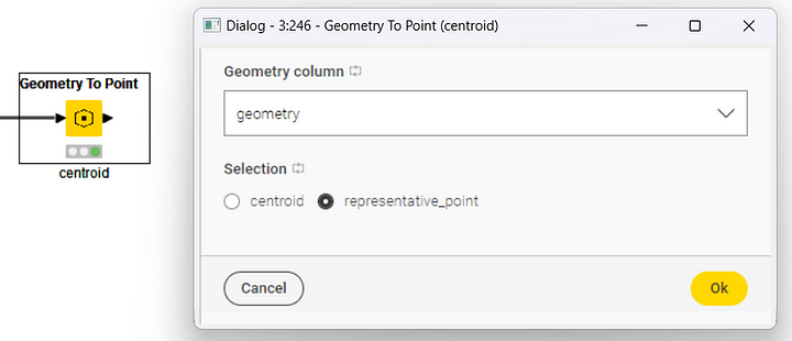
Next, we want to identify a representative point for the region that we have previously selected. The node to do that is the Geometry To Point node.
The Geometry To Point node returns a point representing each geometry. There are two types of points: centroids and representative points. Centroids are calculated depending on the shape of the polygon and can happen to be located outside of the main region of interest. This is especially relevant for vast multipolygon regions, e. g. France, that include many oversea territories. On the other hand, representative points are fixed and are guaranteed to be within each polygon.
All that the configuration window (Figure 9) needs here is:
- The Geometry type column containing the polygons
- The type of point we want to draw, either the centroid or the representative point
After execution, this node produces a description of the point based on its latitude and longitude, and stores the point in a new Geometry type column.
The visualization of a point is usually very tiny and hard to distinguish especially if compared to the size of the country. To ensure clearer visualization, we use the Buffer node to pad the point with some extra space on the map. The only settings required by the Buffer node are (Figure 10):
- The Geometry type column containing the point
- The buffer size (aka distance)
The Buffer node transforms the point into a polygon containing the padding space. This polygon is saved in yet another Geometry type column
Tip: Before creating a buffer area, use the Projection node to map the coordinates to a system whose unit of measurement is meter. Doing so allows you to picture more easily how large the buffer area is going to be.
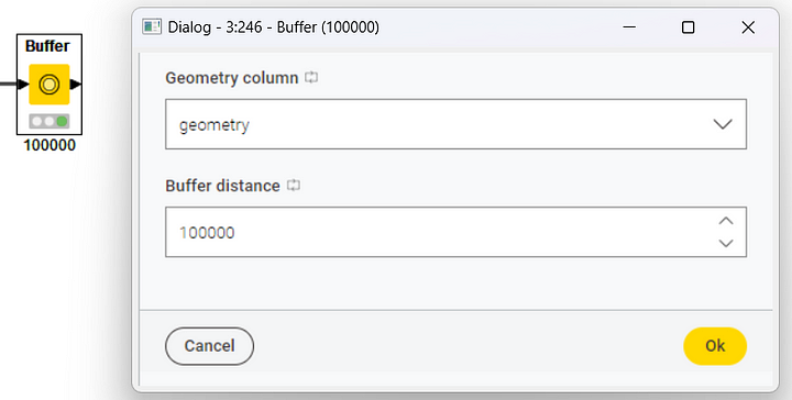
We used a buffer size of 100 000 (Figure 10). The output data table, thus, will contain a larger point stored as a polygon in the new Geometry type column.
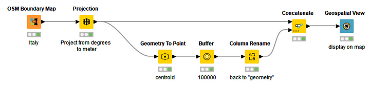
At this point, we keep and arrange all polygons – country and buffer area around the representative point – via a Column Rename and a Concatenate node, and we feed them to the Geospatial View node for the visualization. The final workflow is displayed in Figure 11. The final visualization is shown in Figure 12.
Task 3: Visualize the KNIME Data Connect Events by Region
Let’s raise the bar and visualize a number of regions on a world map, corresponding to one or more countries. For this exploratory task, we can use the data from the KNIME Data Connect events in 2022.
KNIME Data Connect Events
Data Connects are free hybrid events organized by and for the KNIME community all around the world to discuss and share knowledge about data science. You can find them on meetup.com by searching for “KNIME” and for a specified location. We report here, as an example, the event hosted at Harvard University on January 25th, 2023 for a series of talks around the usage of the new Geospatial Analytics extension.
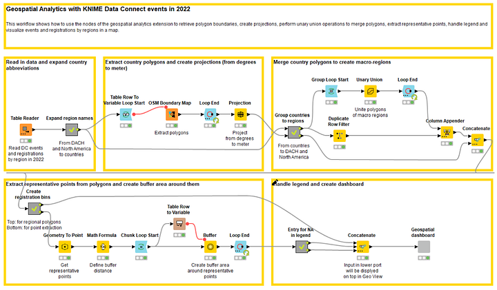
The Workflow
Data about Data Connect events in 2022 was stored in a .table file, including region, number of events, and total number of registrations (partial value).
The first node will then be a Table Reader node to access the region and event information. Since macro-regions, like DACH or North America, are not defined on a world map, we need to break them down to the underlying countries.
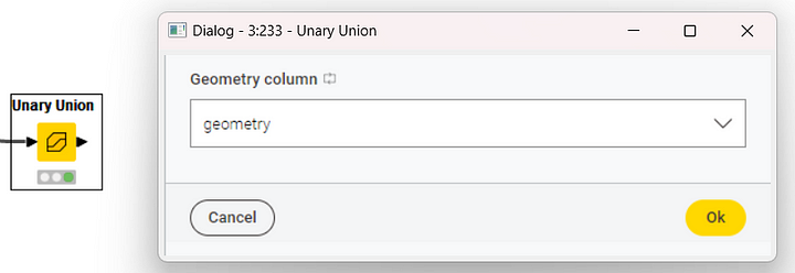
After that, the boundaries of each country are extracted using the OSM Boundary Map node within a loop iterating on each country in the input data table. Now that we have the countries and their polygons, we need to reconstruct the macro-regions. For that, we use a new node: the Unary Union node. The Unary Union node aggregates polygons from two or more countries to create the polygon for a macro-region. In the workflow, this node operates within a loop iterating on the small set of macro-regions.
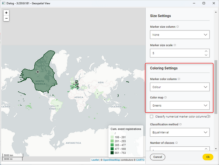
At this point, we define a bin system for the number of registrations which will be used later to color the countries by a scale of greens. The darkest green-colored countries had the highest number of registrations, whereas the lightest green-coloured countries had the lowest number.
Then again, we calculate the representative point for each macro-region using the Geometry To Point node and we buffer it in size proportionally to the total number of registrations.
Finally, we create the color legend, concatenate all these pieces of information, and visualize the polygons and their representative points via a Geospatial View node contained in the Geospatial Dashboard component.
Notice that the bins derived from the registration numbers are used as the color column in the Geospatial View node. In the configuration window of this node, we can also select the color palette by tweaking the “Color map” setting. In our example, we choose a scale of greens (Figure 15).
Note. The final workflow is shown in Figure 16 and can be downloaded for free from the KNIME Community Hub
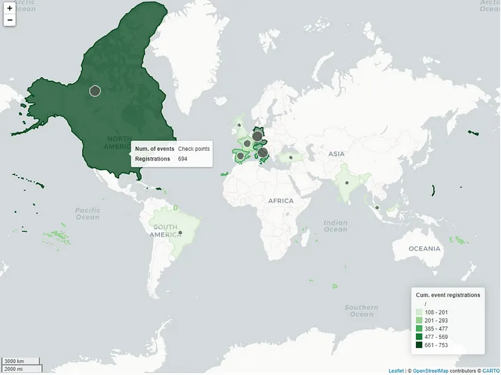
Let’s execute the workflow and open the component view. The world map is shown in Figure 17.
Task 4: Visualize the closest KNIME Data Connect with an Interactive Dashboard
Let’s take one final step and build an interactive dashboard that leverages the geospatial nodes to find the closest KNIME Data Connect event in North America in 2023.
We want to be able to type our current location and let the dashboard visualize on a map when and where the closest KNIME Data Connect event will take place, along with all other planned events sorted by ascending distance.
KNIME Data Connects in the US & Canada in 2023
In Figure 17, we can see that Data Connect events were very popular in North America in 2022, gathering a large number of registrations across several events. The community in that region is very eager to keep learning, sharing and coming together. So much that we decided to plan ahead several events around different topics together with our local community organizers. But let’s not get ahead of ourselves just yet. Rather, let’s see what the dashboard discloses for us!
The Workflow
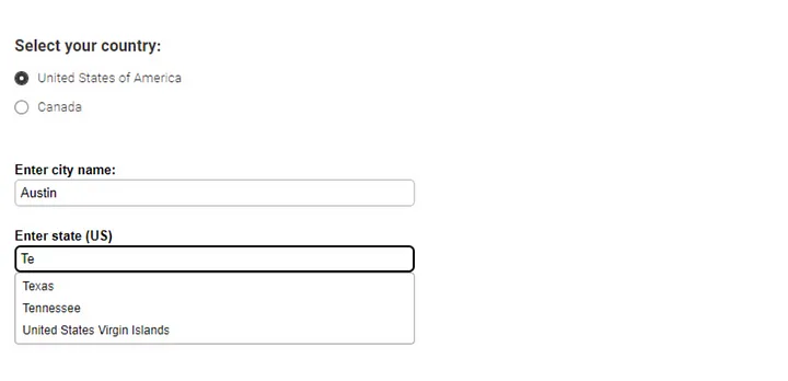
To create an interactive event finder dashboard, we need data coming from two different sources. On the one hand, we import a .table file containing information (i.e., location, date, topic, speaker) about planned events in North America in 2023. On the other, we need a user-defined location in the US or Canada. To get this information, we create the “Current location” component and let the user select the country and enter the city name and state in the interactive view (Figure 18). For example, we input Austin, Texas (US) as our current location.
We start off using the OSM Boundary Map node to:
Extract the polygons of the user-defined location.
Extract polygons of all locations where events are planned in 2023. To do so, we place this node within a loop and iterate through all locations.
It is worth noting that this node also returns a few additional information, such as lat/lon coordinates and boundary types.
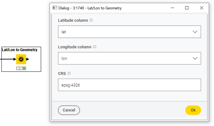
Next, we need to transform the polygon stored in the Geometry type column into a point. We already saw how to do that using the Geometry To Point node, if we are interested in getting a point based on the polygon centroid or representative point. However, if the point we want to extract is to be based on the values of latitude and longitude, we need the Lat/Lon to Geometry node. To configure the Lat/Lon to Geometry node, all we need is (Figure 19):
-
The column contains latitude values
-
The column contains longitude values
-
The EPSG code of the Coordinate Reference System to use (keep the default value)
After that, we use the Projection node to compute a metric projection of the point, and the Buffer node to pad the point with some extra space on the map. So far, we have extracted and transformed the user-defined location and the event locations in two parallel branches of the workflow. Now, let’s bring them together.
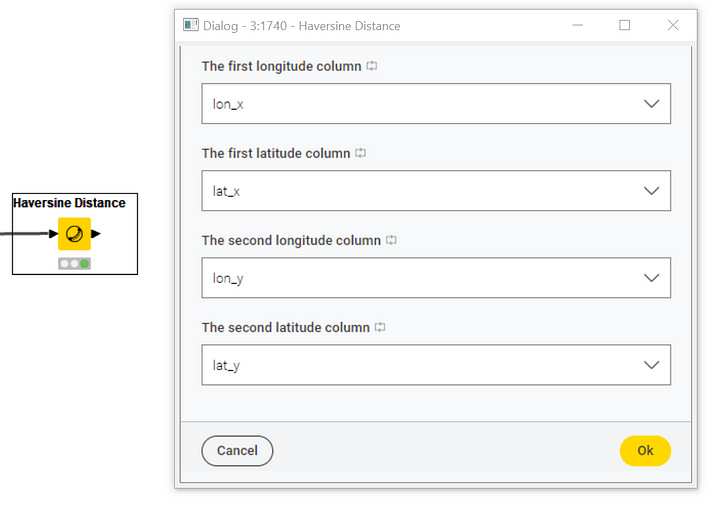
Remember: our goal is to find and visualize the closest Data Connect event for a given user-defined location. To do that, we need to compute distances between the user-defined location and each and every event location. The Haversine Distance node comes in very handy. This node determines the great-circle distance between two points on a sphere given their longitudes and latitudes, and it is especially used in cartography and navigation. To configure the Haversine Distance node, we need to specify (Figure 20):
-
The lat/lon coordinate columns of all event locations (lat_x, lon_x)
-
The lat/lon coordinate columns of the user-defined location (lat_y, lon_y)
We sort the output of the Haversine Distance node in ascending order and convert km to miles. Alternatively, we can compute the distance between two points using the Euclidean Distance node.
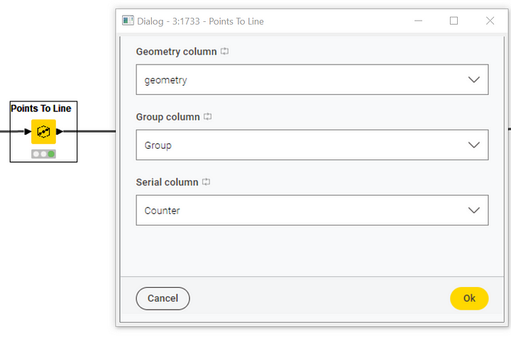
To effectively visualize the distances between the user-defined location and each event location on a map, we can draw linestrings. Linestrings are an additional geospatial shape consisting of a line connecting the coordinates of two points. To do that, we need the Points To Line node and we need to place it within a loop to iterate the process for each location pair. To configure the Points To Line node, we need to set (Figure 21):
-
The Geometry type column containing the points
-
The group id of type String for the points. This setting allows you to create different connections for different groups of points
-
The serial label of type Numeric for each group. This setting allows you to define a sequence for each group
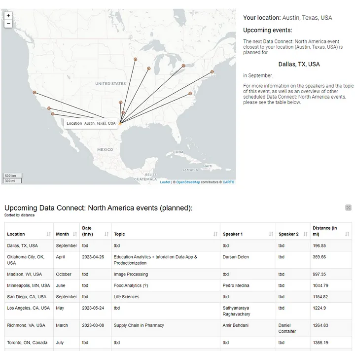
Finally, we concatenate the extracted geometries, handle missing values and use the Geospatial View node to visualize the map (Figure 22). We find out that the closest Data Connect event to Austin will take place in Dallas, Texas (197 miles) in September, followed by Oklahoma City (360 miles) in April. For the event in April in Oklahoma City, we even know that Prof. Dursun Delen plans to talk about Productionization of Data Apps for education analytics.
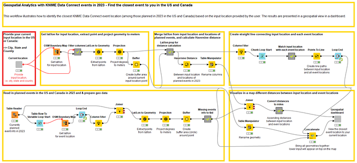
Note. The final workflow is shown in Figure 23 and can be downloaded for free from the KNIME Community Hub.
Final Thoughts
That’s it! Easy, uh?
Some of the main challenges with geospatial analytics are that it often requires specialized skills, tools or resources to be performed effectively. In this tutorial, we tried to show that it is no longer the case with a visual programming-based tool and using the nodes of the geospatial extension.
Now it’s your turn to start leveraging the full potential of your data, building interactive geospatial maps, and delivering insights into the world from a whole new perspective.