
In early 2020, the world was hit by a deadly virus. It not only took millions of lives, but also crippled the global economy, bringing it to standstill. Amid efforts to reduce the impact of the virus, Johns Hopkins University stepped in to track COVID-19 data from sources from across the world. It introduced a coronavirus tracker web service to query data, whether from the wider world or specific countries. This Swagger interface used to look through all web services definitions can be found here.
There are two versions of these web services. The first version, or “V1,” has four REST endpoints, none of which take any input parameters. Anyone can query data for all countries for each date for the last two years, or simply get statistics on confirmed cases, recovered patients, or number of deaths reported so far. Version two, or “V2,” lets users query not only Johns Hopkins, but also the New York Times (NYT) and Conference of State Bank Supervisors (CSBS). However, NYT and CSBS return results for the USA only. Check out the Github documentation for a detailed description of the web services.
Let me walk you through how I access the V2 web service using the GET Request nodes in KNIME and the two COVID-19 components I've built to create dashboards to track this disease. This dashboards can be deployed as a so-called data app, a browser-based application that can be used centrally or shared with others.
Tracking Disease in the COVID-19 Dashboard
I make a data query in KNIME using multiple “GET Request” nodes. In the first node (Fig. 1), I call the “V2 latest” webservice to get the latest numbers on reported cases and deaths, both for the world as a whole and each individual country. The following component, “COVID-19 Main,” processes the output data and visualizes it. The second component, “COVID-19 Country,” calls another web service, “V2 locations,” to query country-specific data. The country is selected in the dropdown menu, and the corresponding data is visualized accordingly.
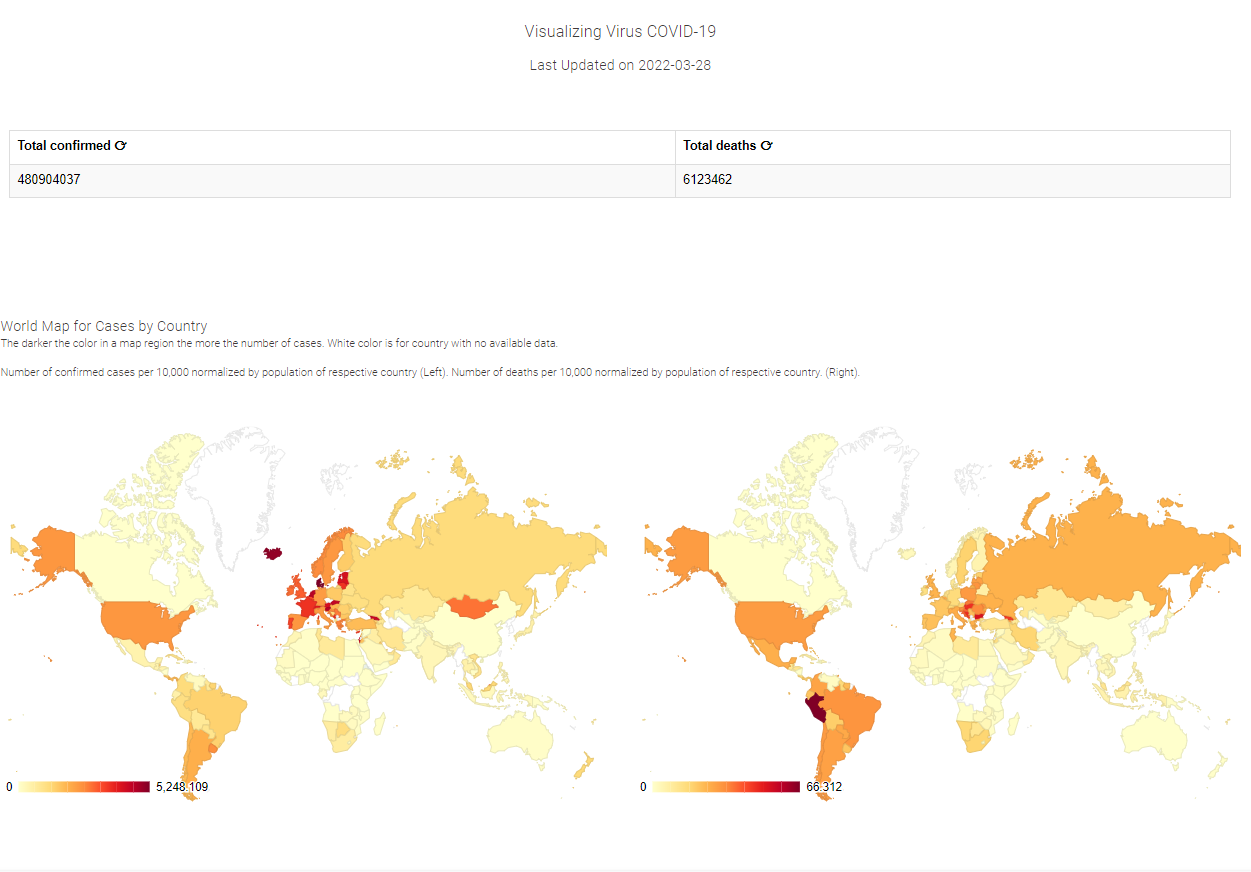
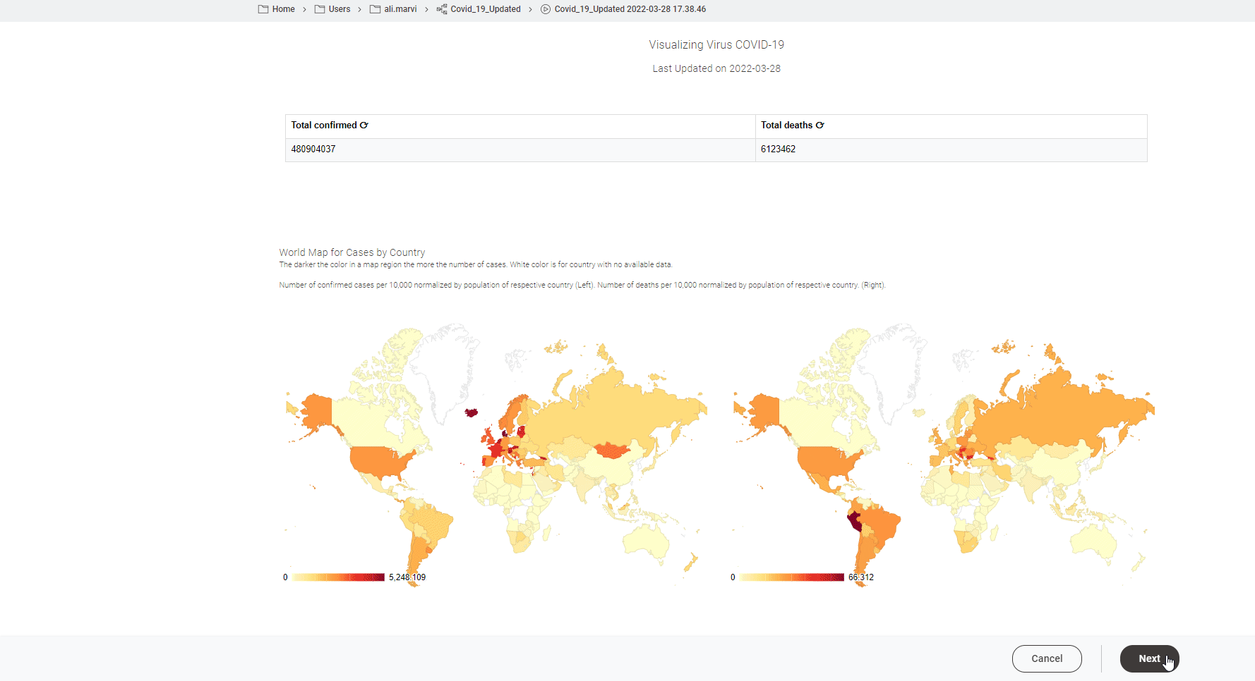
Overview of Confirmed COVID-19 Cases to Date
This dashboard has two parts. The “COVID-19 Main” component gives an overview of the total confirmed cases and total death cases to this day, and two choropleth maps show reported numbers normalized with respect to the population of the country up to the last 24 hours. One map reflects the confirmed cases, and another the deaths so far (Fig. 2).
Visualize Country-Specific COVID-19 Data
The “COVID-19 Country” component returns country-specific data for the past two years. This dashboard has four important segments:
-
numbers reported each day over the last two weeks (Fig. 3, top left)
-
numbers reported in the last 24 hours (Fig. 3, top right)
-
interactive line plot of cases in the selected country (Fig. 3, bottom left)
-
logarithmic scaled line plot of cases reported (Fig. 3 bottom right)
This dashboard is visualized through a browser-based data app, but it can be also visualized locally on your machine as a local "Interactive View".
Note. This dashboard is inspired by COVID-19 Live Visualization using Guided Analytics and Visualize COVID-19 in Italy.
Download COVID-19 Dashboard Workflow
To try this application out yourself, explore the Digital Healthcare space on the KNIME Hub. A link to the dashboard can be found on the KNIME Hub in the Digital Healthcare space by the name Covid_19_Dashboard.