
Your inventory holds everything your business wants to sell. It’s the most important asset, and needs to be kept optimized for best-possible future planning. Efficient inventory management is crucial to organizing and tracking stocks, ensuring that orders are well-managed, and shortages avoided.
A quantifiable approach to inventory optimization involves measuring inventory valuation towards the end of any time period.
In this article, we show how you can measure inventory valuation, produce a dashboard to visualize the results using KNIME, and make the analysis shareable with business users as a data app.
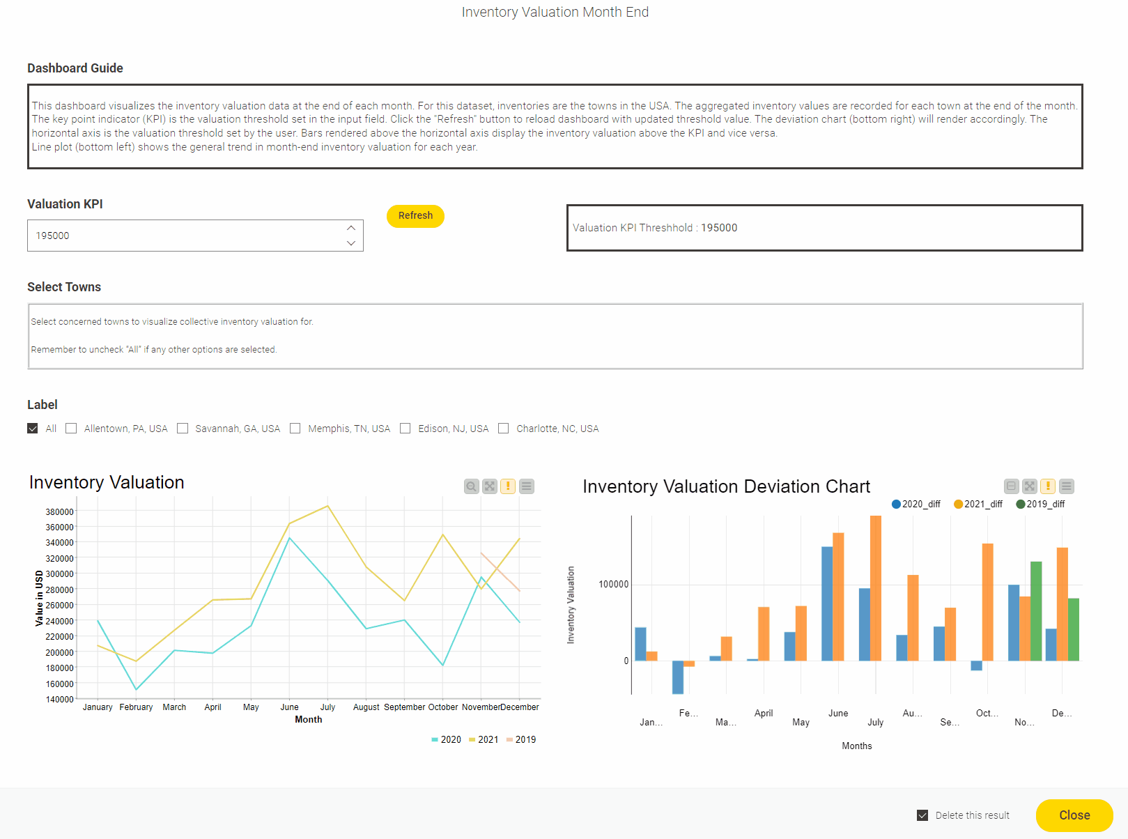
Our use case takes data from a fictional company named Abc Inc., which measures its inventory at the end of each month. The head of our fictional supply chain department requested a KNIME dashboard to monitor overall inventory valuation with a cut-off value of $195,000 USD. This cut-off value is the Key Performance Indicator (KPI) for the inventory.
As long as the measured value is less than the cut-off or KPI, the business is performing well. In a perfect world, the inventory value should be zero but that is not always the case. Therefore a bearable threshold value is set by the executives.
A shareable data app provides instant insight on inventory
The company has warehouses in five locations in the USA. KPI for individual warehouses can vary as per the decision of the executives. The dashboard in our data app gives at-a-glance information on how the inventory is doing, for more informed inventory planning.
It includes individual filters which business users can set to see exactly the type of information they are interested in. For instance, they can adjust the KPI metric to show for a specific warehouse or group of warehouses.
The underlying KNIME workflow to this data app includes visualization widgets which are consolidated into a component to produce the complete view.
The underlying inventory valuation workflow
The data is read into the workflow using the Excel Reader node. It is then pre-processed to introduce an additional category “All” to be visualized. This category gives business users the flexibility to view aggregated visuals for all the warehouses.
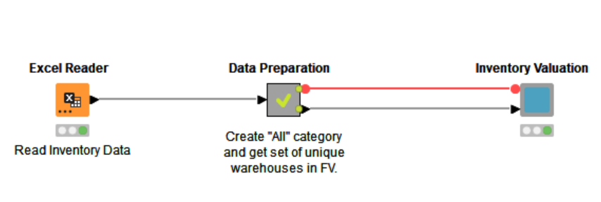
All warehouse categories are converted into a flow variable of type “set”, and are then propagated into the visual component of the workflow. This component comprises multiple static and interactive widgets. The integer input visual is used to assign inventory KPI. This input can be adjusted by the user according to the selection of respective warehouses to visualize.
The data app includes two main charts: The Line Plot plots data for each month for all available years. This is helpful to compare month-to-month inventory valuation with respect to the years. The Bar Chart - or the deviation chart visualizes the inventory valuation with respect to the KPI. Hence value on the horizontal axis is the actual KPI. All bars above it show that the month-end valuation is more than the KPI or vice versa.
Try out the inventory valuation data app on the KNIME community server
Check out the data app yourself on the community server and experiment by changing the KPI values according the selected locations. You can download the underlying workflow from the KNIME Hub and adjust to suit your own use case.