
Company KPIs are mostly associated with financial information. However, there is a set of non-financial KPIs that are used to monitor a company’s health. One of those is employee turnover.
Shifts in the number of employees are what we call employee turnover. If employee turnover is low, the company has been successful in retaining its workforce throughout the year. This indicates a positive work environment, satisfied employees, and a stable team. A high employee turnover can indicate dissatisfaction among employees, issues with work culture, or challenges in retaining talent.
While some turnover is inevitable within the normal functioning of a company, it can become worrisome if the rate grows too fast and passes an alarming value, or if the trend is negative. The employee turnover KPI can be used to initiate action to prevent negative trends and revert to healthier values.
This is part of a series of articles to show you solutions to common finance tasks related to financial planning, accounting, tax calculations, and auditing problems all implemented with the low-code KNIME Analytics Platform.
In this article we want to show you how you can calculate Employee Turnover KPI with KNIME. Watch the video below to get an overview of how to calculate it or a more detailed walk-through of all the steps in the write-up below.
The task: Calculate employee turnover KPI
We want to build a KNIME solution that will automatically calculate a monthly employee turnover KPI.
Employee turnover KPI is defined as:

Let's look at the steps to calculate the Employee Turnover KPI.
- Retrieve employee data from the HR System
- Count all employees who joined and left in the selected year
- Calculate the average number of employees per month, taking into consideration new hires and quits
- Compute the monthly Employee Turnover KPI, according to the formula
- Visualize the KPI in a dashboard that can be shared via a browser-based data app
You’re typically using internal data to calculate employee turnover KPI e.g., human resources records, time monitoring systems, supervisor feedback, and workforce management platforms.
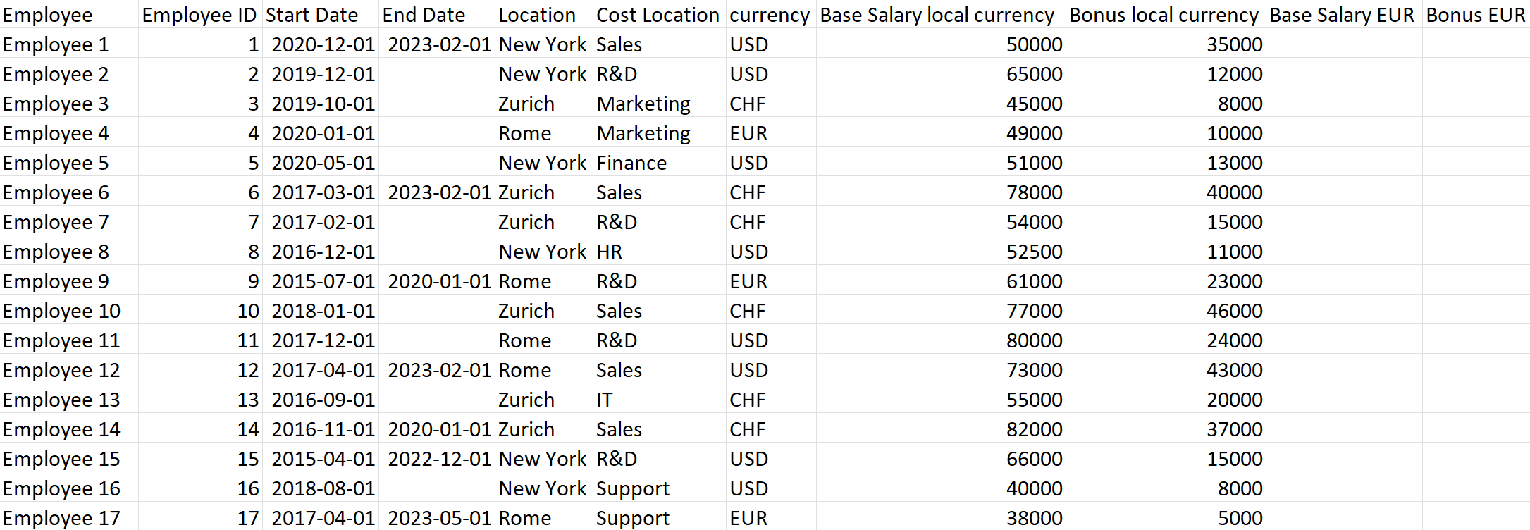
Below is a screenshot of a typical employee dataset coming from an HR system. Notice the columns Start_Date and End_Date, showing respectively the date of start and termination of the employment contract. Other columns in the dataset include salary amount, salary currency, and employee ID.
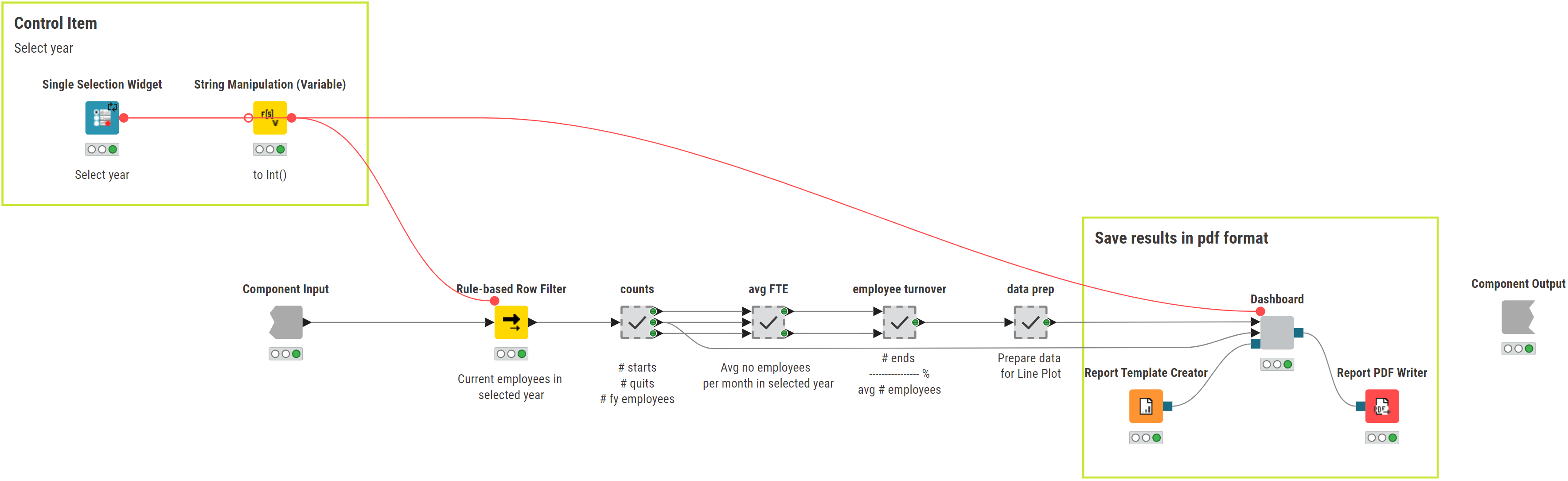
The workflows: Calculate & visualize monthly employee turnover KPI with a data app
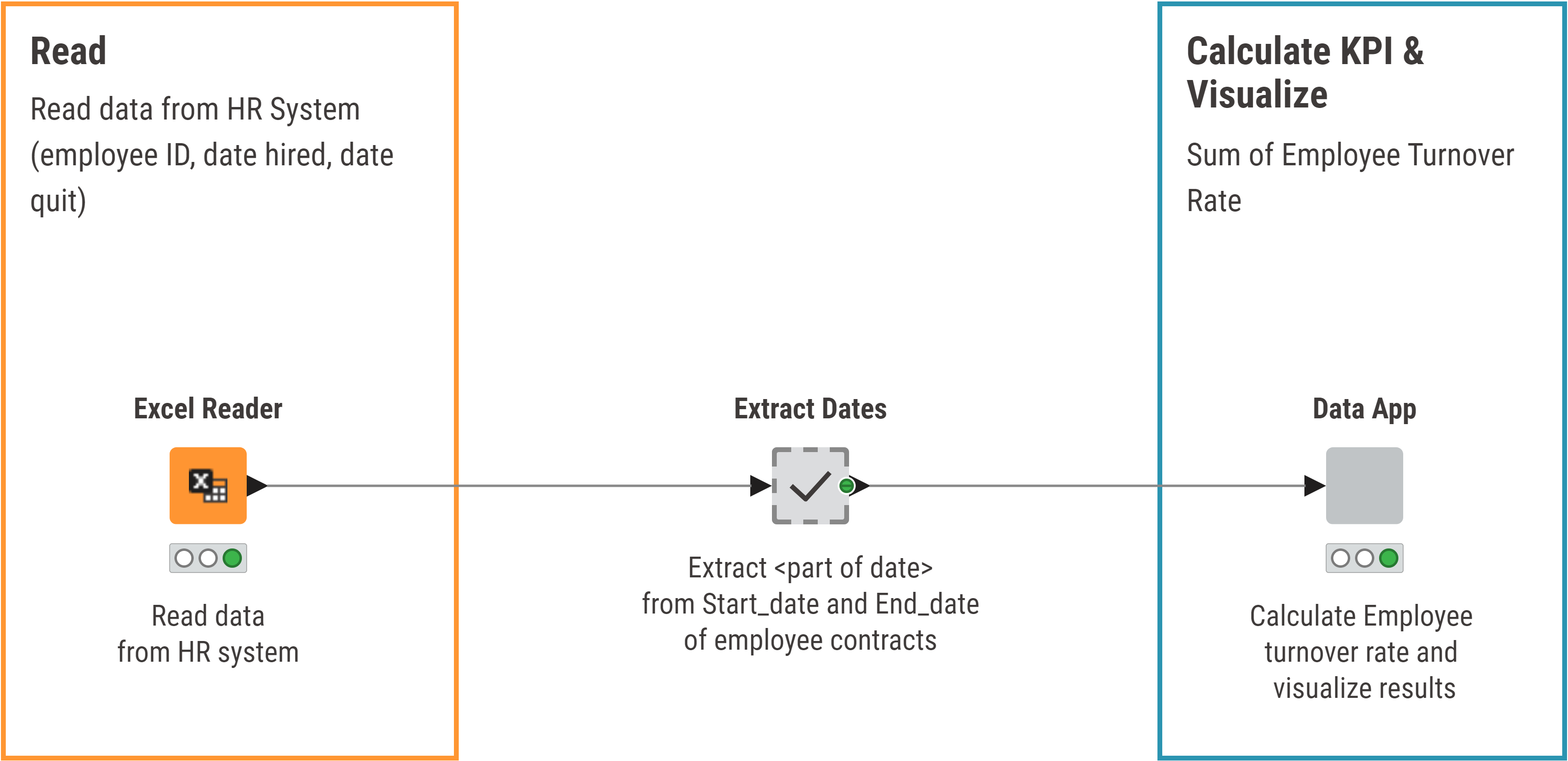
The KNIME workflow Employee Turnover KPI Monthly calculates the Employee Turnover KPI for a company and is available and free to download from the KNIME Community Hub.
The workflow includes the following steps to:
- Read data from the HR system with the appropriate reader node. In our example, we exported the data to an Excel file and therefore we used an Excel Reader node. The wizard node here to access an HR system live is the GET Request node, that implements a GET Request for a REST service.
- Extract <Part of Date>, Year, Quarter, and Month from columns Start_Date and End_Date from employee contracts.
- Calculate and visualize the KPI within a Data App. This is the last component in the workflow.
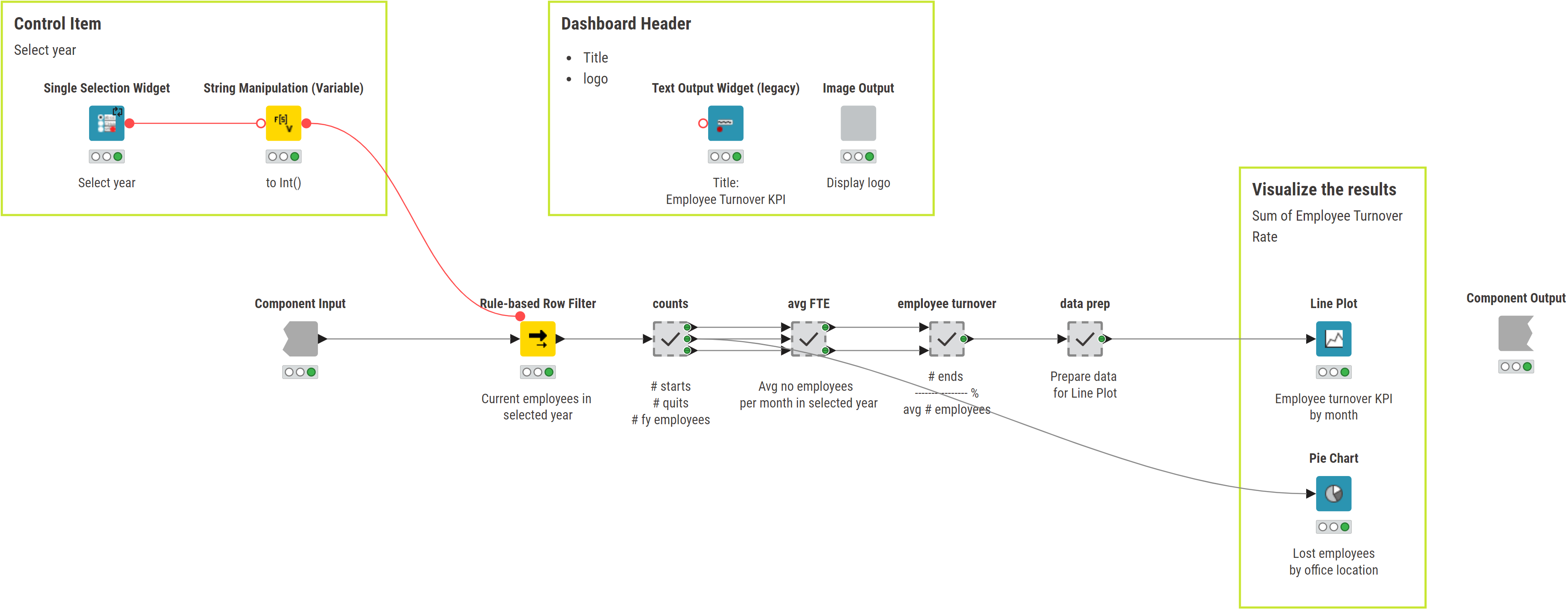
The data app component:
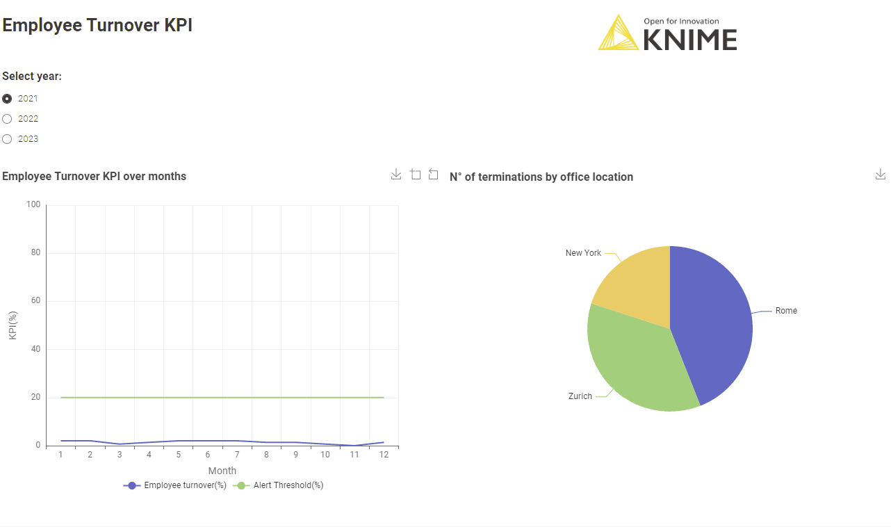
- Enables the user to select the year for the calculation of the KPI values via a Single Selection Widget node, which generates a dropdown menu showing the years you can select from.
- Extracts data for the selected year.
- Identifies all employees who joined and left in the selected year (In the "counts" metanode) and counts the total number.
- Calculates the monthly average number of employees (In the "avg FTE" metanode) using this formula:

- Calculates the monthly employee turnover KPI (in the “employee turnover” metanode).
- Prepares the KPI values for visualization, by adding the month names.
- Visualizes the data in a line plot and a pie chart. The line plot displays the trend of the KPI values over months. The pie chart displays the total number of employee departures across different office locations. This is sometimes useful to understand if an office has a worse dynamic than others. Notice that an alarm line has been added to the line plot: if the KPI trend passes this line (which could for example be the external benchmark for that KPI), then the high value of the KPI denotes a worrisome situation within the company.
Adds a title to the dashboard (using the Text Output Widget node) and a company logo. Here we used the"Display Logo" component to display the KNIME logo.
Export KPI to a PDF document
While the data app is shareable and lets any user select the year and check out the employee turnover KPI on the fly you might also want to share the KPI as a PDF.
New functionality in the latest release KNIME Analytics Platform 5.2 lets you export a view of the data app into a PDF formatted document.
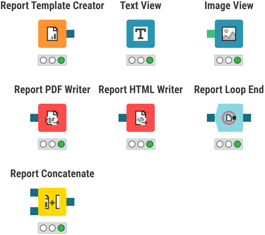
- The Report Template Creator node defines the settings for the report, such as page and orientation.
- The Text View node creates a text display by also changing the format.
- The Image View node displays an image.
- The Report PDF Writer writes the data app to PDF format.
- The Report HTML Writer writes the data app to HTML format.
- The Report Loop End collects all reports from a loop, showing a summary at the end.
- The Report Concatenate merges several data apps together into a report.
Let’s walk through how to create a PDF document from the view of the “Data App” component that will show a line plot and pie chart in a dashboard.
First, create a new component within our “Data App” component with just the Line Plot and the Pie Chart nodes. We’ll call this component “Dashboard” (the workflow in this component is shown below).
Add the Text View and Image View nodes to make the report more pleasing. Titles and images have been included to ensure a more engaging and easily understandable experience for readers.
Create a report template that we’ll use to contain the view from the “Dashboard” component. Do this by adding two nodes: one before (“Report Template Creator”) and one after (“Report PDF Writer”) the “Dashboard” component.
This workflow, Employee Turnover KPI PDF now performs the same KPI calculations as the previous workflow, Employee Turnover KPI Monthly, but it exports the view of the “Dashboard” component to a PDF report. These two workflows are freely accessible for you to download from KNIME Community Hub.
The results: Explore the KPI year by year with an interactive data app and/or PDF report
In this article, we’ve shown how to build an interactive data app that calculates the monthly Employee Turnover KPI, based on the year selected by the user, and transform the data app view for a selected year into a static PDF report. The GIF below shows the data app in action as controlled by the end user.
You can see that while the Employee Turnover KPI remains within acceptable boundaries on average, there are problematic office changes from year to year.
4 key benefits of the solution at a glance
- It's shareable and interactive: You can easily share the browser-based data app with colleagues and they can dive into the analysis and get the KPI for the year they’re interested in.
- It's easy to integrate new charts & diagrams: KNIME offers a wide range of visualization options, which makes it easy to extend the current data app and build out your dashboard to provide a more comprehensive view of the business trends.
- It's automated: When your input data varies, the KNIME workflow recalculates the KPI without you needing to do any manual adjustment, typical when working with spreadsheets and macros.
- It's got universal connectivity: With access to 300+ data sources plus community-driven APIs, you’ll be able to connect up to your data wherever it is.
KNIME for Finance
KNIME is a low-code/no-code data science tool. The visual interface is user-friendly and lowers the entry barrier to using data science techniques. It enables you to quickly develop automated solutions as you don't need any programming experience to start using it.
Download KNIME (it's open source and free to use) and explore the workflows described in the article.