
Customer segmentation, also known as market segmentation, is a technique to optimize a company’s marketing strategy. The idea is simple: grouping together a company’s target audience based on certain criteria, such as age, geography, or income, with the overall goal to maximize a customer lifetime value by better targeting different customers.
Customer segmentation is a valuable process applied in various fields. It helps companies earn a greater market share, detect their most valuable customers, and identify the most effective ways to reach those customers. In this article we want to give you an overview of the different customer segmentation types and techniques and then walk you through how to build a browser-based data app. The customer segmentation app enables the marketing analyst to investigate the different customer segments. They can inject their own domain expertise so that meaningful insight can be directly recorded and shared easily with others in the data app.
Customer Segmentation Types
Segmenting customers depends on the industry and size, as well as the marketing analyst's expertise and domain knowledge. Different types of customer segmentation exist:
Geographic segmentation
Splitting customers based on their geographic locations, as they might have different needs in different areas. For example, segmenting them based on country or state, or the characteristics of an area (e.g. rural vs. urban vs. suburban).
Demographic segmentation
Splitting up customers based on features like age, sex, marital status, or income. This is a rather basic form of segmentation, using easily accessible information. This is hence one of the most common forms of customer segmentation.
Psychographic segmentation
Splitting up customers based on mental and emotional characteristics — interests, values, lifestyles etc. These characteristics provide insights on why customers purchase the product.
Behavioral segmentation
Splitting up customers based on their behaviors, i.e. how they respond and interact with the brand. Such criteria include loyalty, shopping habits (e.g. the dropout rate on a website), or the frequency of product purchases.
Customer Segmentation Techniques
Regardless of what type of customer segmentation is desired, the techniques applicable depend on one’s level of expertise and domain and target knowledge. Roughly, customer segmentation can be divided into three categories:
Rule-based segmentation
Customers are segmented into groups based on manually designed rules. This usually involves domain and target knowledge, and thus requires at least one business expert. For example, segmenting customers based on their purchase history as “first-time customers,” “occasional customers,” “frequent customers,” or “inactive customers” is highly interpretable, and an expert will know which customer counts in which group. A drawback is that this type of segmentation is not portable to other analyses. So with a new goal, new knowledge, or new data, the whole rule system needs to be redesigned. Implementing rule-based segmentation in KNIME Analytics Platform can be done using the Rule Engine node.
Segmentation using binning
This is simple and easily implemented, binning data based on one or more features. This does not necessarily require domain knowledge, but some knowledge about the target is required — i.e. the business goal must be clear. For example, when considering a clothing line designed for teenagers, the age of the target audience is clear and non-negotiable. In KNIME Analytics Platform, a Binner node can be used.
Segmentation with zero knowledge
If nothing is known about the domain or target, common clustering algorithms can be applied to segment the data. This is applicable to different use cases. There are many clustering algorithms in the KNIME Analytics Platform, like k-Means and DBSCAN.
A Basic-Clustering-Based Customer Segmentation
For this blog post, we decided to tackle customer segmentation using clustering through k-Means, as it is one of the most popular clustering algorithms.
The Telco Dataset
This is a simple use case in which we have some customer data for a telephone company. The data was originally available on Iain Pardoe’s website, and can be downloaded from Kaggle. The data set has been split into two files: the contract-related data (ContractData.csv), which contains information about telco plans, fees, etc., and the telco operational data (CallsData.xls), which contains information such as call times in different time zones throughout the day and corresponding paid amounts. Each customer is identified by a unique combination of their phone number (“Phone”) and its corresponding area code (“Area Code”).
The Customer Segmentation Workflow
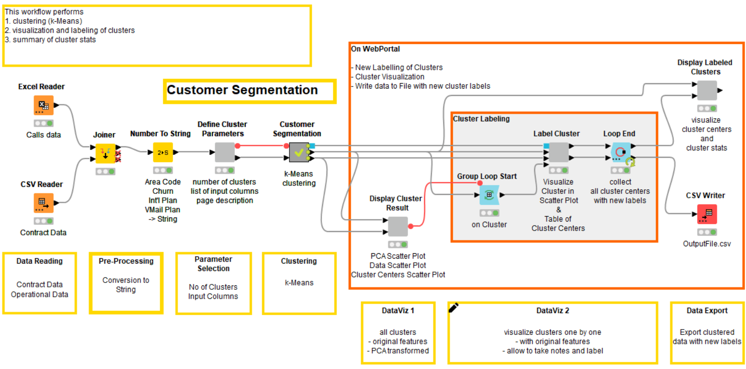
As we do not hold any domain or target-specific knowledge, we apply k-Means clustering to segment our data. The corresponding workflow is displayed in Fig. 1.
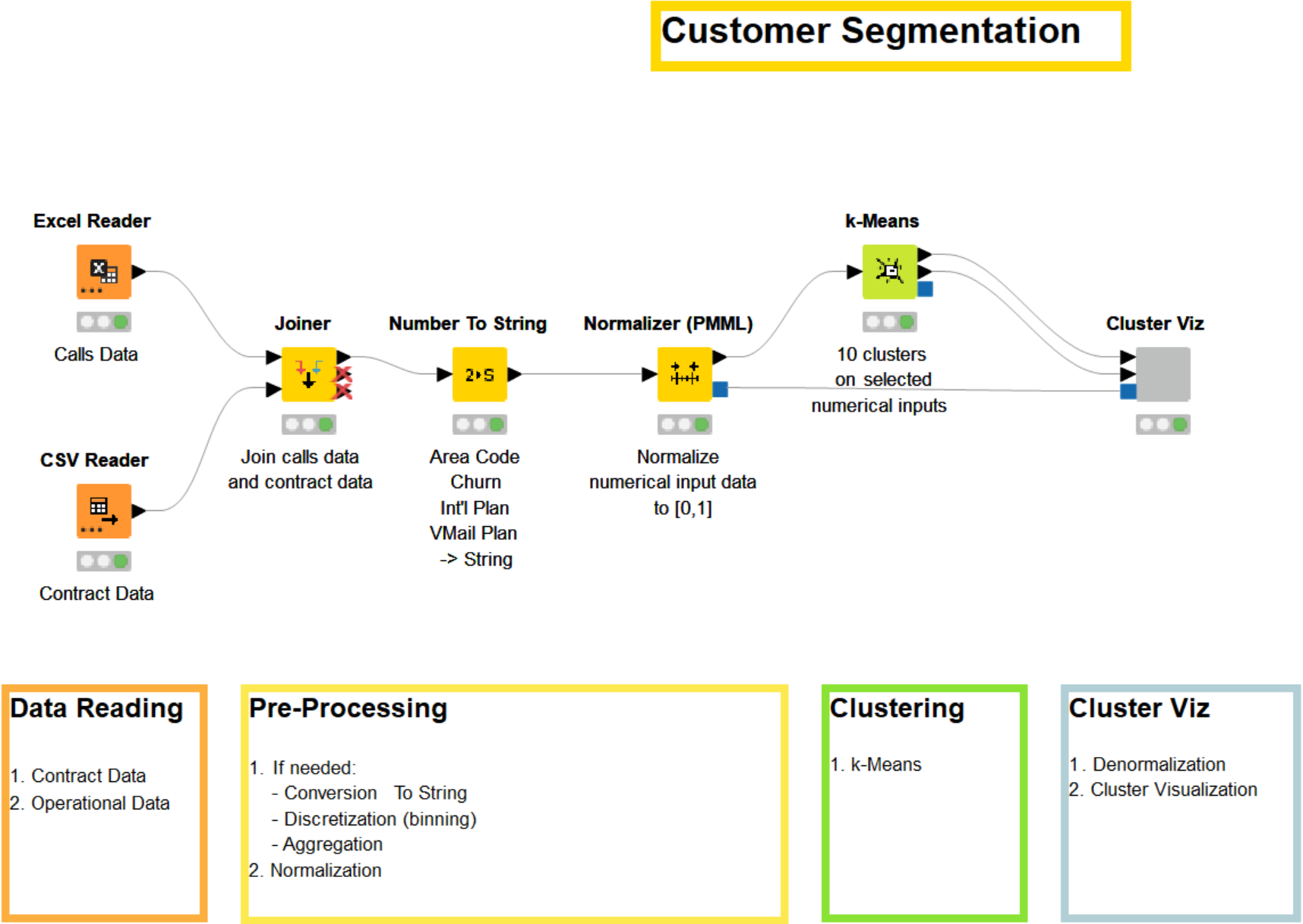
After reading and rejoining the two datasets, the data is preprocessed. The preprocessing tasks depend on the nature of the data and the business. In our case, we first join the information about each customer from the two datasets by the telephone number. Then we convert the columns “Area Code,” “Churn,” “Int’l Plan,” and “VMail Plan” from integer to string. The “Area Code” column is a part of the unique identifier, which is why we don’t include it as an input column for the clustering. The other columns are excluded because they are categorical values to which the k-Means algorithm is not applicable, as categorical variables have no natural origin. Lastly, we normalize all remaining numerical columns.
Note. It is usually recommended that you normalize the data before clustering, especially when dealing with attributes with vastly different scales.
Other preprocessing tasks could be added, like aggregation, discretization via binning, or a conversion from String to Integer to increase the number of input numerical columns. We did not do this here for the sake of clarity.
After reading and preprocessing the data, we reach the crucial part of the workflow: the clustering node. The k-Means node allows us to segment the data into k clusters. The number of clusters, k, must be defined beforehand in the configuration dialog of the node. Here we set k to 10. The node has two output ports — the first outputting the data and its assigned cluster, the second the cluster centers.
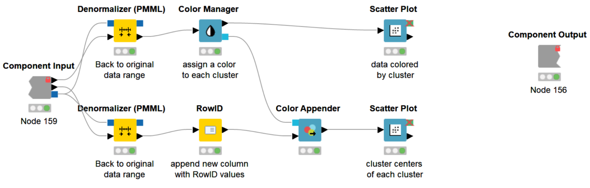
Lastly, with the help of the Cluster Viz component, we visualize both the clustered data and the cluster centers (Fig. 3). This step is optional, but visualizing the data often helps in detecting underlying patterns and better understanding the customer segmentation. A component is a group of nodes, (i.e. a sub-workflow) that encapsulates and abstracts the functionalities of the logical block. Components serve a similar purpose as nodes, but let you bundle functionality for sharing and reusing. In addition, components can have their own configuration dialog, and custom interactive views.
Inside our Cluster Viz component (Fig. 2) is a workflow that first denormalizes the data back to its original range (the Denormalizer (PMML) node), then assigns a color to each cluster (the Color Manager & Color Appender nodes), and finally visualizes the clustered data colored by cluster, with the cluster centers in one scatter plot each (the Scatter Plot node). To access the interactive view of our component, right-click the component and select “Interactive View: Cluster Viz.” Because our component encapsulates two scatter plots, our interactive view also contains two scatter plots.
Investigating the Customer Segments
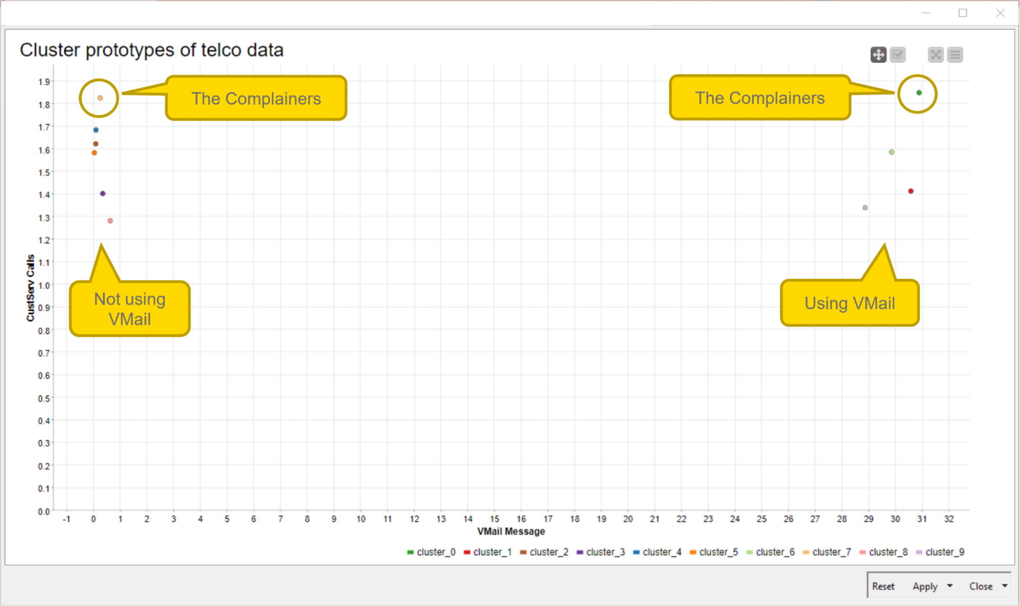
The composite view of the component contains two scatter plots: the visualization of the telco data, colored by cluster, and the prototypes (i.e. centers) of each cluster. In Fig. 3, the view of the second scatterplot is displayed. It shows the attributes “VMail Message” (the number of voicemail messages) on the X-axis and “CustServ Calls” (the number of customer service calls) on the Y-axis. From there, some implications can be drawn.
-
The group of data points on the right shows the prototypes of the clusters of customers who use voicemail, and the group of data points on the left shows the prototype of the clusters of customers who don’t use voicemail.
-
The data points in the top left and top right corners show the cluster representatives of those customers who complain a lot. On average, they call customer service almost twice a day.
We can now easily change the view of the scatter plot by changing the axes of the plot directly from the interactive view without changing the node settings. In the interactive view (Fig. 4), click the settings button in the top right corner (list icon), then change the X and Y columns as you'd like.
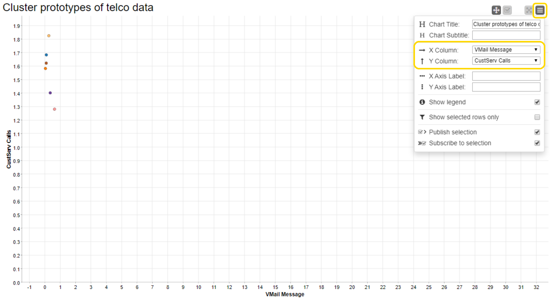
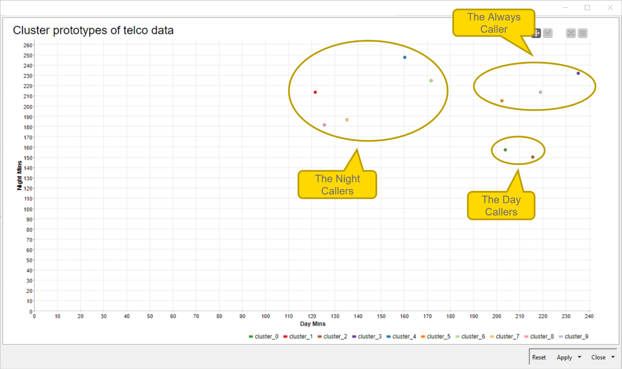
The resulting plot when changing the axes to “Day Mins” (minutes during day time) vs. “Night Mins” (minutes during night time) is shown in Fig. 5. Here we can distinguish between customers who have significantly higher call minutes during the day (the Day Callers) and those who have significantly higher call minutes during the night (Night Callers). The cluster representative in the top-right corner indicates the group of customers who call a lot during the day as well as at night (the Always Caller).
Et voilá, after only a handful of nodes, you have already performed a customer segmentation. Without any particular domain or target knowledge, you were able to gain some meaningful insights about your customers.
Interacting with Customer Segments from a Web browser
The previous customer segmentation workflow works fine and produces interesting results. However, we might want to go one step further and add some interactivity to the application so that it can be called from a web browser and offer some level of interactivity so the domain experts can add notes and to-do tasks
Involving a domain expert is frequently beneficial, as they have valuable knowledge about the data and the business case. With the help of an interactive implementation of the customer segmentation workflow from a web browser, the domain expert can be guided through all phases of the analysis, and can immediately interact with the analysis and the results. This allows the domain expert to gain deeper insights on the detected customer segments, which improves the quality and interpretability of the customer segmentation. In addition, by allowing the domain expert to add notes and annotations during each step of the execution, meaningful insights can be directly recorded and easily passed on to others.
Calling the Application from a Web Browser
In order to call the workflow from a web browser, we need to connect to KNIME Server. One of the most useful features of KNIME Server is the KNIME WebPortal, an extension that provides a web interface allowing the deployment of workflows as browser-based applications. It allows interaction with the workflow at predetermined points, or the adjustment of certain parameters. When executing the workflow, users are guided through each step using a sequence of interactive webpages. Each composite view of the deployed workflow becomes a webpage. The following section introduces a data app implemented on the KNIME WebPortal making use of several Widgets nodes.
Introducing more touchpoints in the data app
Implementing the workflow via a data app provides more touchpoints between the domain expert and the analysis. The features of the KNIME WebPortal enable the analyst to directly integrate their expertise and interact with the segmentation result — easy and smooth via a web browser. The data app enables:
-
Customizing the parameters of the customer segmentation.
-
Visualizing the cluster results and changing the views of the scatter plot.
-
Injecting expert knowledge by adding notes and comments.
Let’s see how these touchpoints are implemented. The workflow deployed to the KNIME WebPortal is shown in Fig. 6. It is an extended version of the basic example provided above (cf. Fig. 1).
1. Set the customer segmentation parameters
With the help of the Integer Widget and Column Filter Widget node, the user can define the parameters of the clustering (Fig. 7). This is the number of clusters, k, and the attributes used as input columns. The two nodes are wrapped inside the Define Cluster Parameters component shown in the workflow in Fig. 6.

Once the customer segmentation parameters are defined, the k-Means clustering is performed. The corresponding nodes of the clustering are collapsed inside the Customer Segmentation metanode, following the Define Cluster Parameters component in Fig. 6.
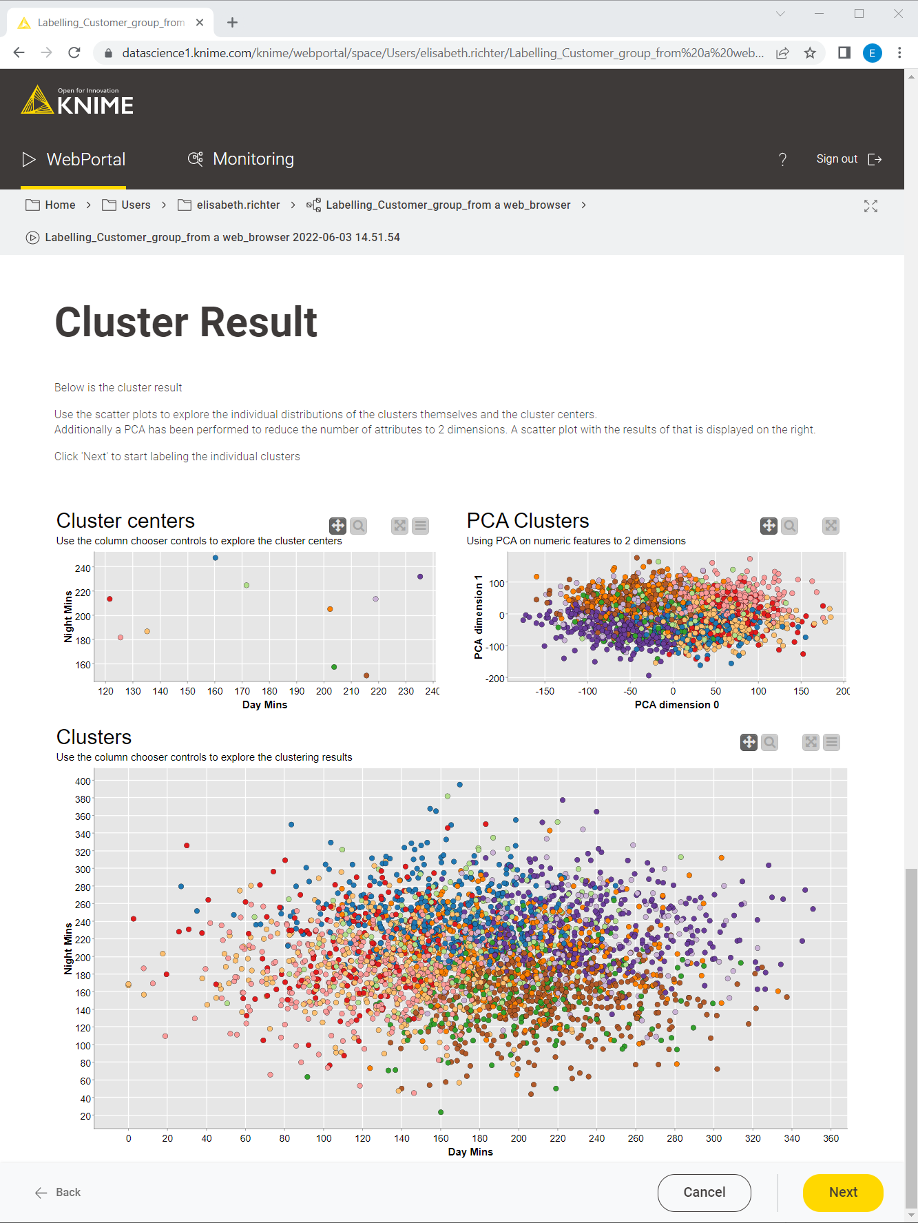
2. Visualize the cluster results
Once the data has been clustered, the results are displayed on the next webpage (Fig. 8). The Display Cluster Results component in the workflow in Fig. 6 contains the nodes responsible for visualizing the results. The composite view of the component contains three scatter plots: the cluster centers (top left), the PCA-reduced telco data colored by cluster (top right), and the non-reduced telco data colored by cluster (bottom). Also on the KNIME WebPortal, the views of the scatter plot can be easily changed by changing the X and Y axes, as described above (cf. Fig. 4).
3. Inject expert knowledge: Add notes and comments to each customer segment
Once the data is clustered, the workflow iterates over all clusters, presenting a cluster-wise visualization and providing the possibility to add comments and annotations for each customer segment (Fig. 9). These cluster-wise visualizations are implemented inside the group loop within the Label Cluster node, shown in the workflow displayed in Fig. 6. Here the expert analyst can take advantage of their knowledge and annotate the clusters accordingly.
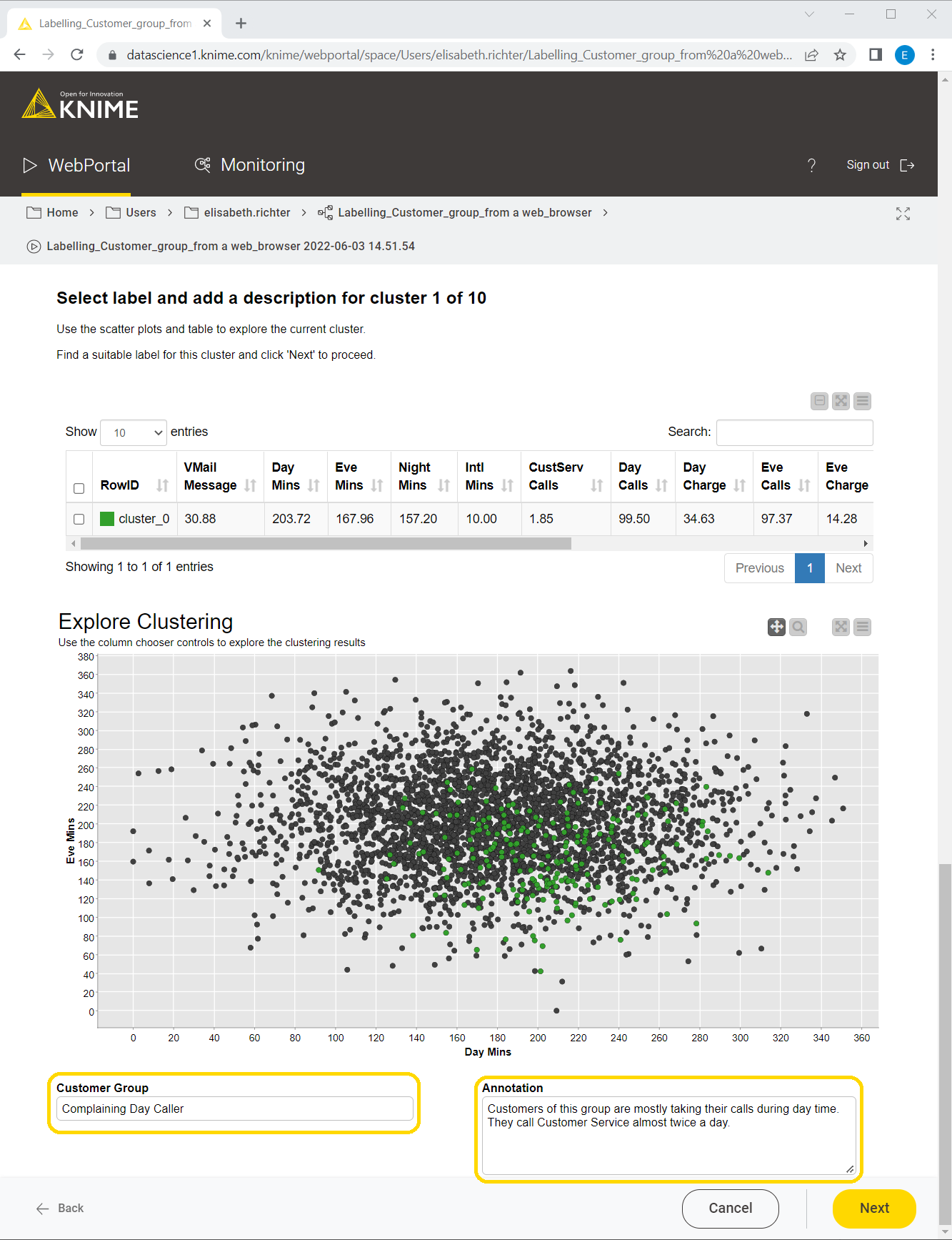
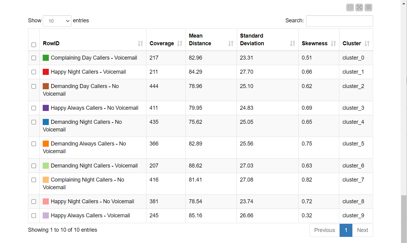
After the group labels and annotations have been assigned, the clusters are updated accordingly. This last webpage of the data app refers to the Displayed Label Clusters component of the workflow in Fig. 6. This dashboard shows not only the cluster centers and the colored scatter plot, but also the cluster statistics (Fig. 10). Note that each customer group now has a meaningful name that clearly distinguishes it from the others. The more detailed description of the customer group from the annotation box was added as a “Cluster Annotation” column.
Share Valuable Insight from Interactive Customer Segmentation
Here we walked through how to build a data app that enables you to do customer segmentation without any knowledge, all from a web browser! However, the implications derived from the segmentation are quite meaningful.
For once, it is clearly observable that there are two groups of highly complaining customers, of which one uses voicemail and the other doesn't. Hence whether one has a voicemail plan or not, that’s probably not the reason for the complaints.
Another valuable insight might be that the customers who mainly call during the daytime are also those who call Customer Service many times. An implication could be that more disturbances happen during the day, which the telco company could further investigate. In contrast, customers who distribute their calls equally throughout the day don’t call Customer Service as often.
The workflows described in this post are based on the two Customer Segmentation workflows accessible via the Machine Learning and Marketing space on the KNIME Hub. However, they have been slightly adjusted to suit this article. The adjusted versions can be downloaded from the KNIME Hub here.