
You’re a social scientist on a team that’s monitoring CO2 emissions by country.
Every week the boss wants the latest updates in their inbox by Monday at 8 AM. Every week you have to remember to run your analysis in time to generate and send your boss the report.
As the data expert on the team, you’re also generating all kinds of different reports for your team members. That means you’re often opening your laptop on a Sunday evening to get all your – and their – work done.
In this article, we’re going to show you how to build an online report designer. It will be accessible to the entire team via a browser-based data app and will enable any of your team members to to design and generate their own custom reports, without needing to be familiar with the underlying process. And it automatically sends the report to the boss in time for the 8 AM Monday deadline.
We’ll build the report designer using the intuitive functionality available in the KNIME Reporting extension. As we walk through the solution, you’ll get to know some of its more advanced reporting features and get a heads-up on plans for how the KNIME Reporting extension will be further developed.
Note: You may have already read our previous blog post Generate reports faster with KNIME Reporting and tried the provided example workflow. If so, you already know how to generate a PDF/HTML report out of your composite views in KNIME. We’re going to now use that workflow example as the starting point here.
How to build the report designer
At its core, the data app generates a customized report and sends it via email. Our example demonstrates a case where we have three individuals involved in the process: Alex, the manager, who receives the report, Marina, a data analyst, who can customize and generate the report, and Emilio, a data scientist, who builds the data app with KNIME.
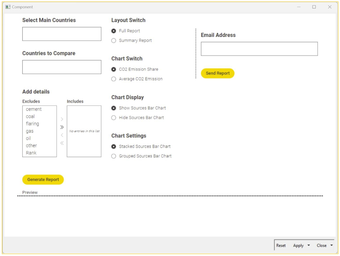
The data app will enable users to:
- Select the main countries to be included in the report
- Select other countries for comparison with the main countries
- Select the sources of CO2 emissions to be included in report
- Select between multiple report designs
- Switch between different charts
- Select to show or hide a chart
- Configure the charts in the report
- See a quick preview of the report without the need to switch windows
- Send the report via email
Taking our workflow example as the starting point, let’s now modify the preprocessing metanode by including the “World” value (in the countries) and passing the top 15 countries to the next node in the flow (instead of just 3). This will give Marina, the data analyst, more options to choose from in the app.
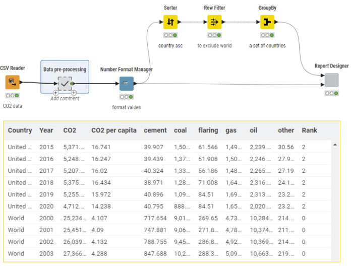
Also, using the GroupBy node, we create a set of countries to provide Marina with country selection options. Later, this set will be passed to the Multiple Selection Widget nodes (inside the Report Designer component) as a flow variable.
Let’s open the “Report Designer” component and check what's inside:
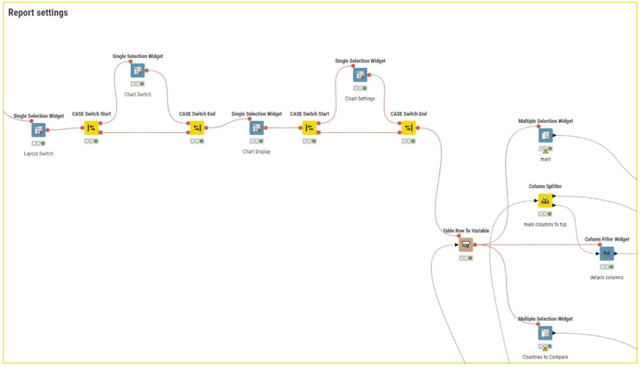
In this part of the component, we have nodes to let Marina choose which kind of charts she wants to include in the report:: widgets to switch between pie chart and a bar chart to visualize CO2 emissions, an option to display or hide the bar chart that shows the sources of emissions, and the ability to choose between a stacked or grouped bar chart.
The first Single Selection Widget node lets Marina choose from two different report layouts. In the “Report layouts” section, you can see the two components with the report output ports:
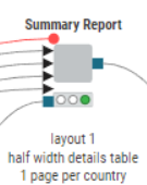
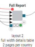
Each component produces a different layout. The Summary Report component generates 1 page for each main country, while the Full Report component creates a report with 2 pages for each selected country. The Summary Report layout is a simplified report: it includes fewer charts, and displays the Table View in half-width. By using components, Maria can add as many layouts as she needs in a single workflow without having to build a new workflow for each layout.
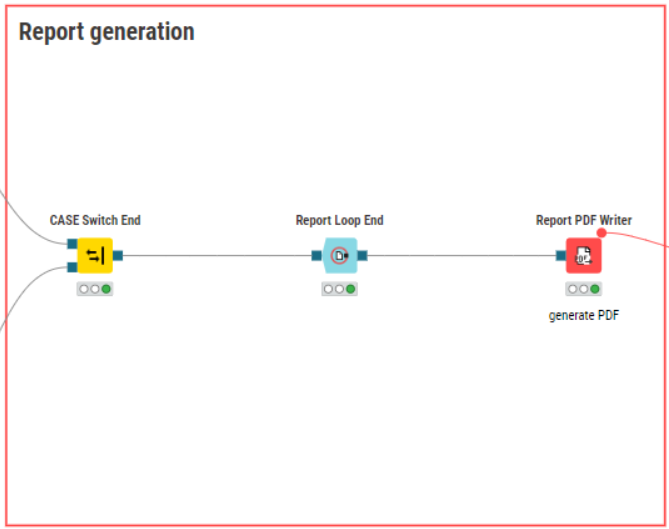
In the “Report generation” section, the PDF file is written in the data area of the workflow so we can access it by the File Download Widget and Send Email nodes.
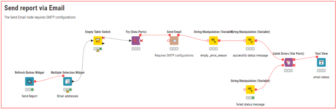
Finally, a Multiple Selection Widget is used to get the Email address(es), and the Send Email node is used to send the report.
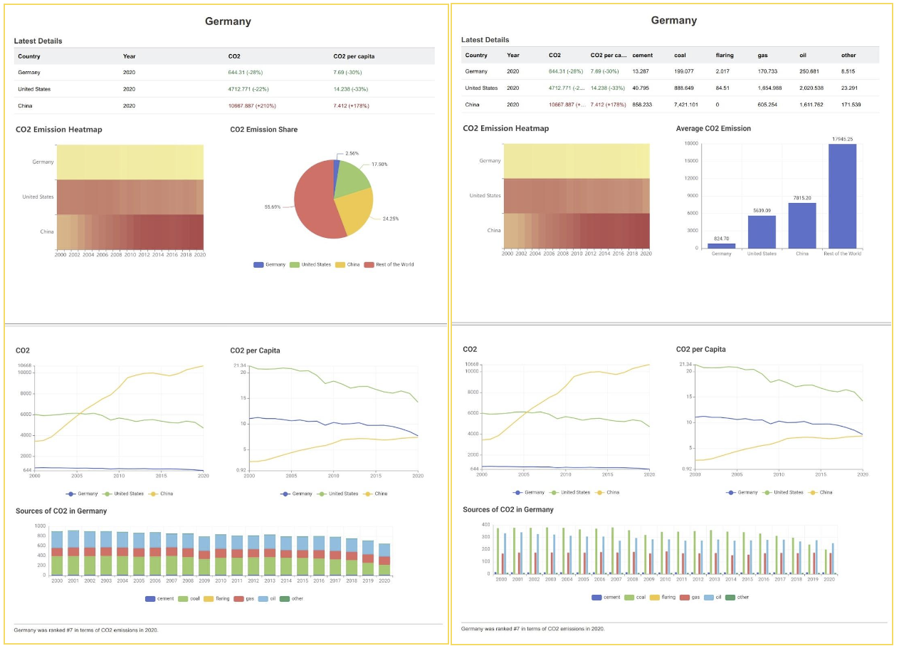
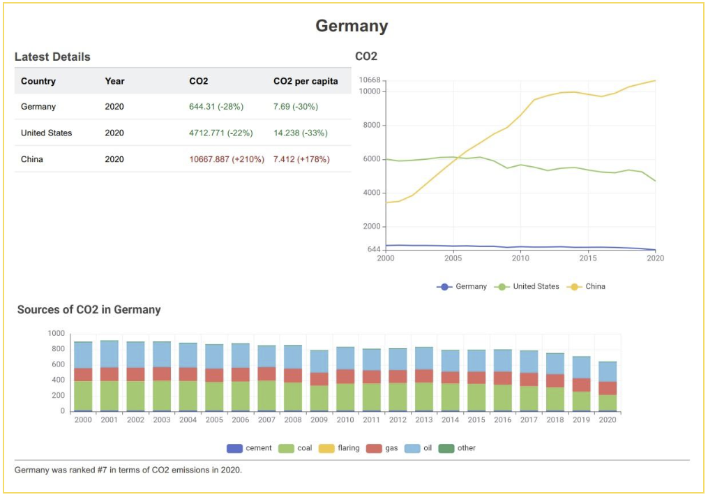
Below you can see a few example reports generated by applying different settings in the data app.
Take your first steps with KNIME Reporting on KNIME Community Hub
We’re excited to see new reports created with the KNIME Reporting extension! What will you create? You can add the “KNIME Reporting” tag to your workflows and share them on KNIME Hub.
You can download the workflow behind the Report Designer data app in this article from the KNIME Hub here.
Explore more workflows that demonstrate how you can use the Reporting extension to automatically generate and distribute static reports for regular events such as month-end close, quarterly performance, or on-demand statistics in the First Steps with KNIME Reporting collection.