
Paolo Tamagnini is a senior data scientist at KNIME with many years of experience in machine learning interpretability, autoML, human-in-the-loop analytics, and data visualization. In this article, which was first published in DevPro Journal he shares his top 5 data viz examples, each one a simple chart to build and powerful for visualizing analysis.
No matter how complex the data analysis, every data scientist needs to deal with an important final step: communicating their findings to the different stakeholders — decision-makers, managers, or clients. This final step is vital because if the findings cannot be understood, trusted or valued, then the entire analysis will be discarded and forgotten.
Besides the usual set of soft skills, data scientists can use data visualization to send a clear message in just a few slides. Data visualization uses colors, shapes, position, and other visual channels to encode information so that humans can understand data way faster than by reading some text or looking at an Excel spreadsheet.
Below you will find my personal top five preferred charts to visualize data, which are all generated with the low-code KNIME Analytics Platform.
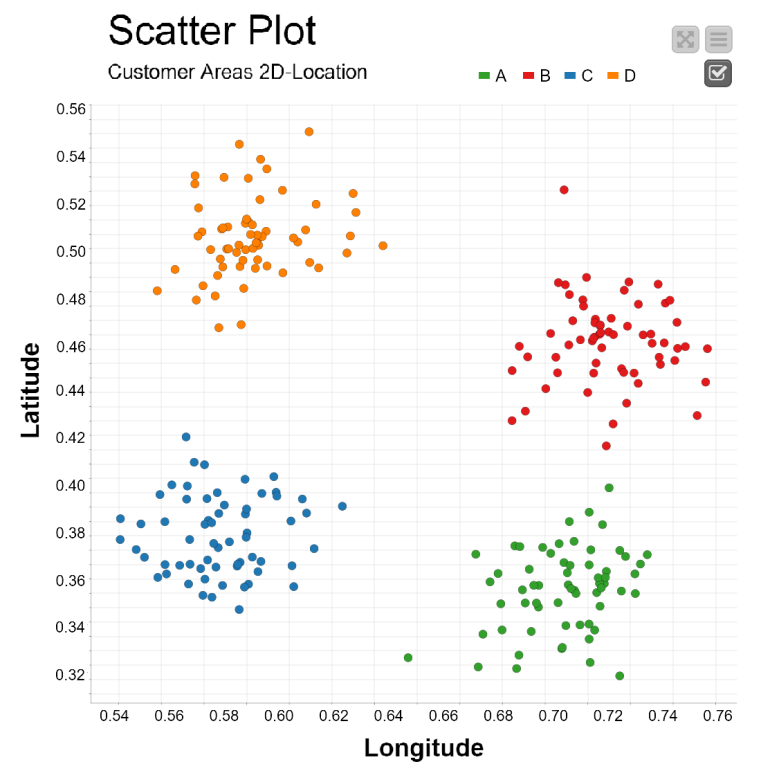
The scatter plot
A scatter plot represents input data rows as points in a two-dimensional plot. It is useful for bivariate visual exploration as you can easily display in a two-dimensional space a strong relationship between two features (columns) in the data. Interactively experimenting with different input columns on the x-y axis and with different graphical properties can be an efficient strategy to find those relationships.
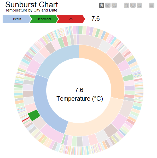
The sunburst chart
A sunburst chart displays categorical features through a hierarchy of rings. Each ring is sliced according to the nominal values in the corresponding feature and to the selected hierarchy. This is a powerful chart for multivariate analysis.
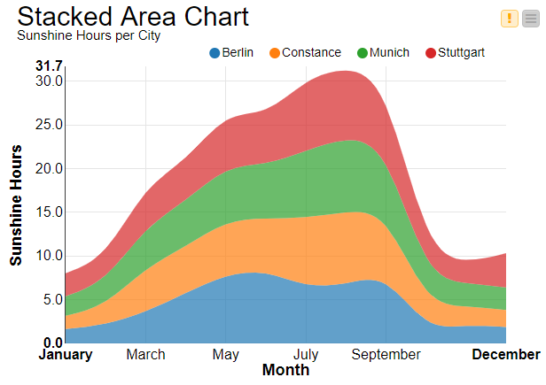
The stacked area chart
The stacked area chart plots multiple numerical features on top of each other using the previous line as the base reference. The areas in between the lines are colored for easier comparison. This chart is commonly used to visualize trending topics.
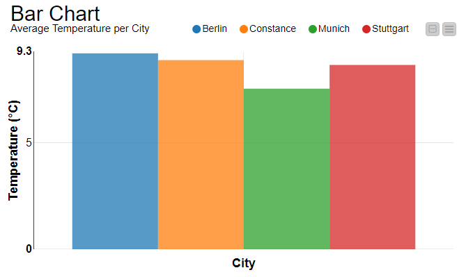
The bar chart
A bar chart visualizes one or more aggregated metrics for different data partitions with rectangular bars where the heights are proportional to the metric values. The partitions are defined by the values in a categorical feature.
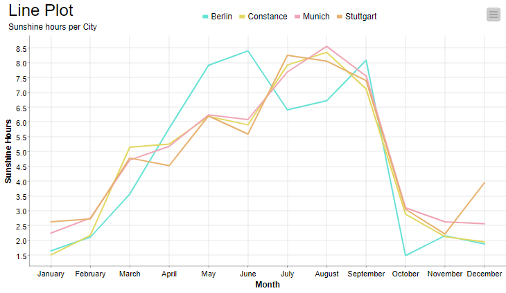
The line plot
The line plot maps numerical values in one or more data features (y-axis) against values in a reference feature (x-axis). Data points are connected via colored lines. If the reference column on the x-axis contains sorted time values, the line plot graphically represents the evolution of a time series.
I have shown you my personally preferred charts to visualize data: scatter plot, sunburst chart, stacked area chart, bar chart, and line plot charts. They are very basic charts but yet very powerful. Interesting information can be understood from these charts about bivariate analysis and the relationship between pairs of input features (scatter plot), multivariate analysis of nominal input features (sunburst chart), feature evolution over time (stacked area chart) such as topic trending, comparison of aggregated metrics instead of investigating the single data points (bar chart), and finally evolution over time of time series (line plot).
These are, of course, not the only available charts to visualize and gain insights about the data we are analyzing. Tell me which charts you like to use to visualize data? Shoot me an email at blog@knime.com