
Do you remember the Iron Chef battles? It was a televised series of cook-offs in which famous chefs rolled up their sleeves to compete in making the perfect dish. Based on a set theme, this involved using all their experience, creativity, and imagination to transform sometimes questionable ingredients into the ultimate meal. Hey, isn’t that just like data transformation? Or data blending, or data manipulation, or ETL, or whatever new name is trending now? In this blog series requested by popular vote, we will ask two data chefs to use all their knowledge and creativity to compete in extracting a given data set's most useful “flavors” via reductions, aggregations, measures, KPIs, and coordinate transformations. Delicious!
Ingredient Theme: WebLog Data for Clickstream Analysis
Today’s dataset is the clickstream data provided by HortonWorks, which contains data samples of online shop visits stored across three files:
1. Data about the web sessions extracted from the original web log file. It contains user ID, timestamp, visited web pages, and clicks.
2. User data. This file contains birthdate and gender associated with the user IDs, where available.
3. The third file is a map of web pages and their associated metadata, e.g. home page, customer review, video review, celebrity recommendation, and product page.
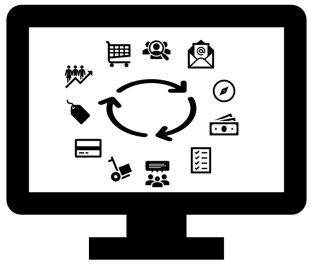
Clickstream analysis is the branch of data science that collects, summarizes, and analyzes the mass of data from users by detecting patterns and relationships between actions and/or users. Some example metrics are shown in Figure 1. With this knowledge, the online shop can optimize their services, including temporary advertisements, targeted product suggestions, better web page layout, and improved navigation options.
Our data chefs are going to approach the clickstream data from three different perspectives. Haruto will focus on demographics, Momoka on web site visit behavior, and Hiroyuki on revenue. Let’s see what they find out!
Topic. Clickstream Analysis
Challenge. From web log file, web page metadata, and user data extract patterns and relationships about online shop visits
Methods. Aggregations and Visualizations
Data Manipulation Nodes. GroupBy, Pivoting, Date&Time nodes
The Competition
The data aggregations and visualizations produced by data chefs Haruki, Momoka, and Hiroyuki make the basis to train a prediction model, or to build a dashboard to investigate follow-up actions.
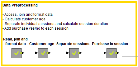
As shown in Figure 2, the data undergoes some preprocessing before being presented to the data chefs, involving data access, data blending, data cleaning, and feature generation. Here the raw web log file is joined with user and product data. Visits are separated based on a user ID and time-out value. User age is calculated based on the timestamp of the visit and user birthdate. The visit purchase information is generated by checking whether any click in the visit led to purchasing a product.
Now it’s time for the data chefs to begin their battle. Read on to see how each chef goes about their challenge.
Data Chef Haruto: User Demographics
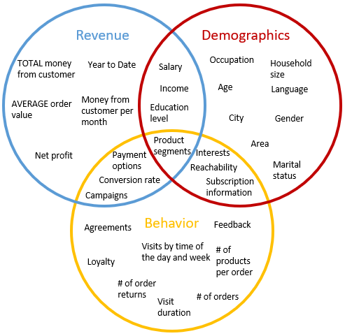
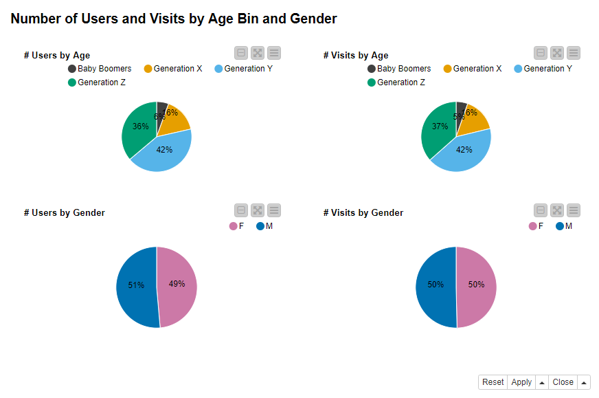
Following the schema shown in Figure 1, Data Chef Haruto focuses on the demographics of customers and visitors to the online shop, which you can see in Figure 3 and are explained below.
Aggregations
Haruto’s ingredients are user age and gender. Here’s the recipe.
First, he bins user age with the Numeric Binner node into:
- “Generation Z” (24 years old or less);
- “Generation Y” (between 25 and 39 years old);
- “Generation X” (from 40 to 59 years old);
- “Baby Boomers” (over 55 years old).
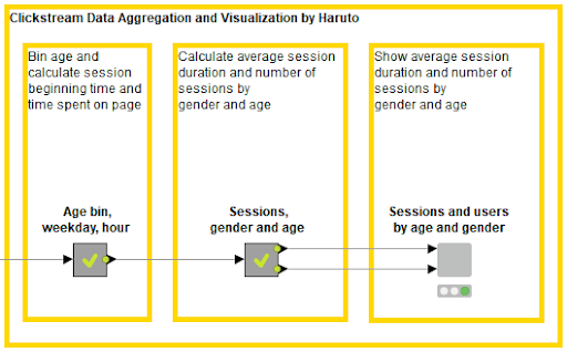
Next, he calculates the number of visits and number of users according to gender and age bin.
Visualizations
Figure 4 shows the aggregated metrics by Haruto. He finds out that
- The number of users and the number of visits follow a similar pattern across the four age bins. The user basis is dominated by “Generation Z” and “Generation Y”, which together make up for more or less three quarters of all users and all visits. This reflects the general trends that the younger segment of the population is more prone to internet shopping.
- The web site is visited by men and women in equal measure and both genders are equally active in terms of number of visits. From these pie charts there comes no hint about possible marketing actions targeting women vs. men.
Data Chef Momoka: User Behavior
Following the original schema in Figure 1, Data Chef Momoka quantifies the behavior of the web site visitors. This is shown in Figure 5 and explained below.
Aggregations
Momoka’s ingredients are time, web page categories, and click sequences. Here’s her recipe.
First, she calculates the number of clicks and average visit duration according to weekday, time of the day, and web page category.
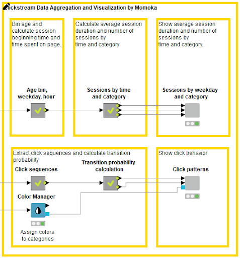
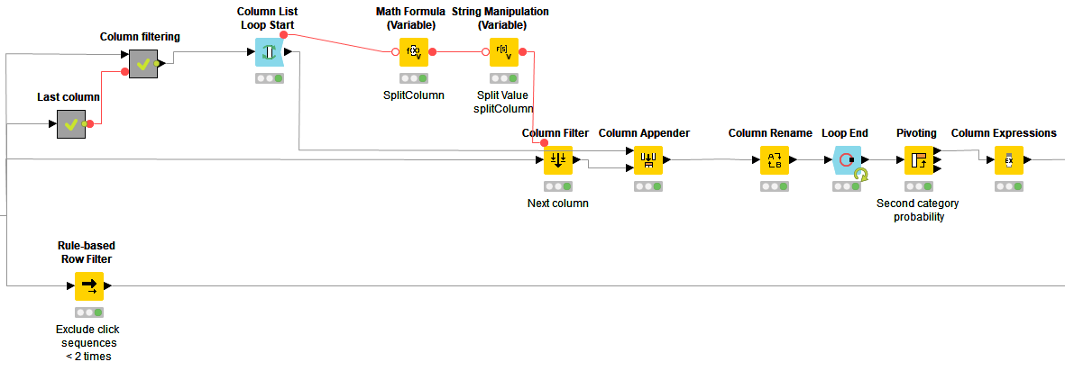
Next, she tracks the click behavior by following these steps, also shown in Figure 6:
- She starts with a Column List Loop Start node and iterates over the columns representing subsequent clicks. Each iteration creates pairs of columns containing web page categories accessed by subsequent clicks.
- She concatenates the results from each iteration and calculates the transition probability for each pair of web page categories
- She extracts click sequences and then extracts those occurring at least twice
Visualizations
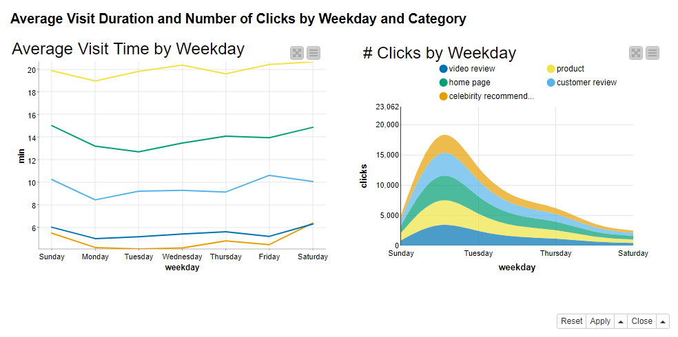
Figures 7 and 8 show the aggregated metrics by Data Chef Momoka. She finds out that:
- There is a slight increase over the weekend in time spent on the web site, as shown by the line plot on the left in Figure 7. Probably people have more time to gather information about their possible purchases at weekends. However, the difference across business days and weekend days is really minimal. On the other hand, there is a clear difference between the time spent on the product pages and, for example, time spent reading celebrity recommendations.
- There is a peak on Monday in the number of clicks on all page categories, as shown by the stacked area chart on the right in Figure 7. It seems that users read throughout the week, mainly on weekends, and proceed with more exploration, or even purchase, on Mondays. The popularity of the categories is the same as for the average visit time: the pages with most clicks are the home page and the various product pages, whereas the page with celebrity recommendations has the least number of clicks. Apparently most users do not care about what celebrities think when it comes to purchase.
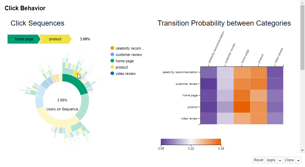
Now have a look at the click behaviour in Figure 8, which shows click behavior.
The sunburst chart represents sequences of clicks occurring at least twice. Colors are associated with different page categories. The first clicks make the innermost donut. Further clicks are located in the external rings. Selecting one area inside an external ring produces the sequence of previous clicks as shown in Figure 8.
The heatmap shows the page category for the first click on the y-axis, and the page category for the next click on the x-axis. The color transfers from purple (low likelihood) to orange (high likelihood).
Data Chef Momoka finds out that:
- Almost three of four visits start at either the home page or a product page, as shown by the green and yellow sections that make almost 75 % of the number of clicks in the innermost donut in the sunburst chart in Figure 8.
- About half of the visits stop already at the home page or at a product page, since both the green and yellow sections in the innermost donut in Figure 8 are divided in two - one part with further clicks and one part without.
- The most probable next categories are home page and a product page for all categories according to transition probabilities between two page categories shown by the heatmap in Figure 8.
- Celebrity recommendation and video reviews represent the least probable next clicks for all categories. These findings are in line with the category popularity shown in Figure 7.
Data Chef Hiroyuki: Contribution to Revenue
Again, following the original schema we showed in Figure 1, Data Chef Haruto approaches the clickstream data from the perspective of generating revenue. You can see his steps in Figure 9, and they are explained below.
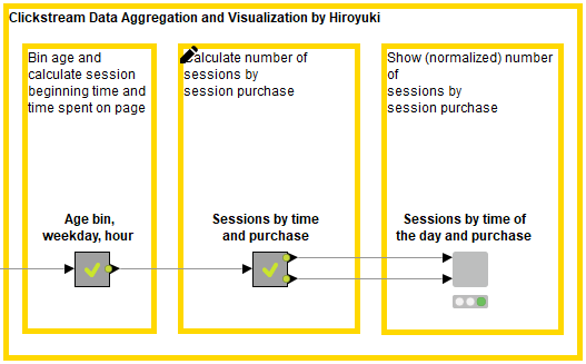
In his recipe, he calculates the number of visits according to weekday, time of the day, and visit purchase information.
The line plots in Figure 10 show the number of visits with and without a purchase on each day and at each time of day, normalized by the total number of visits for the same day or time of day. The purchase information defines the colors: blue for a visit with “purchase” and orange for a visit with “no purchase”. The bar charts in Figure 10 show the absolute numbers of visits by the same categories.
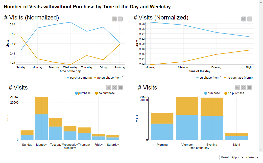
Data Chef Hiroyuki finds out that:
- As shown by the line plot on the left, circa 60% of all visits end in a purchase during business days against 40-50% during the weekend.
- As shown by the line plot on the right, the percentage of visits with a purchase decreases towards the evening and night. The highest percentage of purchases happens during working hours.
- Monday is again the busiest day in number of visits, either ending with a purchase or not, as shown by the bar chart on the left in Figure 10.
- The most popular times to visit are afternoon and evening, as shown by the bar chart on the right in Figure 10.
The Jury
The three data chefs complement each other perfectly, since each data chef selected a different approach. But which of them prepared the starring data dish? It’s time to find the winner.
If Haruto had had more ingredients, his data dish would have been adventurous. He only aggregated by age and gender, though. Safe bet, but unsurprising.
Momoka was creative in generating measures with just a few ingredients. She decided to aggregate by the anonymous features that every user leaves on the web page: time, order, and web page category of a click. Abreast of the times!
Apparently Hiroyuki rates being useful over being explorative. His calculations are easy to apply, though something that every online shop administrator should have been measuring for a long time already. Plus for practicability, minus for underestimating the audience.
We have reached the end of this competition. Congratulations to all of our data chefs for wrangling such interesting features from the raw data ingredients! They have all individually produced interesting results, which work extremely well together to give a more complete representation of the customer. Ultimately, the best recipe is when you put them all together!
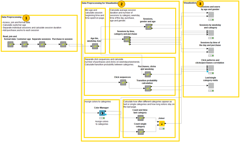
The workflow in Figure 11 shows the clickstream analysis process, combining the approaches of all three data chefs. It is divided in three parts: data preprocessing (1), data preprocessing for visualization (2), and data visualization (3).
Do you want to try it yourself? Find and open/download the workflow shown in Figure 11 from the KNIME Hub here.
Coming next …
If you enjoyed this, please share it generously and let us know your ideas for future data preparations. We’re looking forward to the next data chef battle. Want to find out how to prepare the ingredients for a delicious data dish by aggregating financial transactions, filtering out uninformative features or extracting the essence of the customer journey? Follow us here and send us your own ideas for the “Data Chef Battles” at datachef@knime.com.