
Update from Dec 5, 2020: Originally just the cases of the last 45 days were taken to fit the model, however 90 days seems to give more accurate results. The Jupyter file on the KNIME Hub and on git-hub have been updated accordingly.
Find out how to make COVID-19 projections for the next 30 days by combining KNIME for data integration, Jupyter to fit the models, and Tableau to create visualizations.

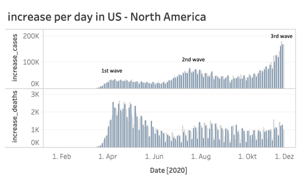
While the USA is already in the midst of the third COVID-19 wave, Austria has just declared the second lockdown.
The increase in cases in Europe has risen sharply in recent weeks and the big question remains: How long will this second wave last and will the situation have calmed by Christmas?
To answer this question we will use, on the one hand the official COVID-19 data from the John Hopkins Institute, which is the source of this well known dashboard, and on the other hand three of the best (in my opinion) data science tools that are available for free:

KNIME + Jupyter Notebooks + Tableau Public
And of course we will need also some math’s to calculate the projected values.
Let’s start!
We will divide our task in four parts:
- Search for appropriate data source
- ETL i.e. load and transform data for proper use
- Calculate the projections for the next 30 days
- Visualize the cases and projections for every country and continent
1. Search for the appropriate data source
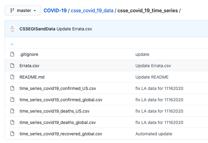
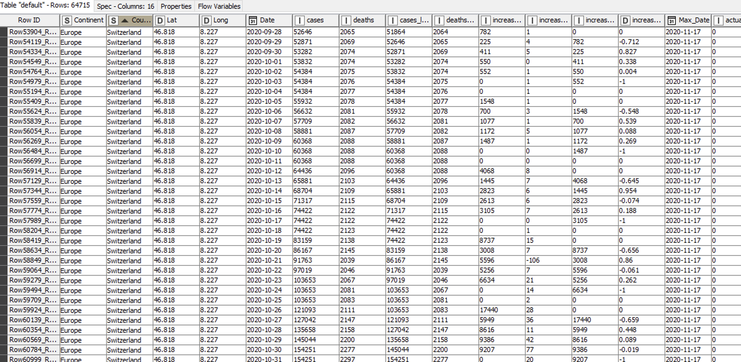
For the data source we will use the official data provided by the John Hopkins Institute. They have a github-site with the raw data here, which provides different files. For our analysis we will use the time series files “confirmed global” and “deaths global” (see picture below).
2. ETL - load and transform the data
There are different tools and ways to load and transform data. But in my 18 years of experience in the Data Science- and BI Reporting world I find that one point is still key: the ability to provide fast valuable results.
With KNIME you you will achieve this result:
- First because it’s a visual programming framework that helps you to focus on the problem instead on the software
- Second because it’s scalable with plugins for R, Python, Tableau, Weka and many many more
- Third: it’s open source :-)
Let’s load the csv-files from the github-site from the John Hopkins Institute into KNIME with a CSV Reader node and transpose the data. Then we join the two new structured tables (cases and deaths) together.
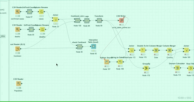
Since we want to show the stats and projections not just for every country but also for every continent, we will join this new dataset with a self made table enriched with the continent information for every country.
Finally, we write out this new table as a csv-file.
Now we add a little magic and use Jupyter code in KNIME.
You'll find a quick introduction to connecting the two tools here (and more in the next section).
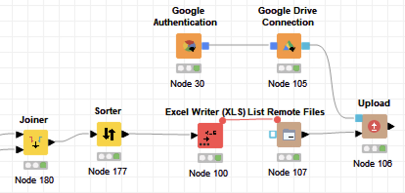
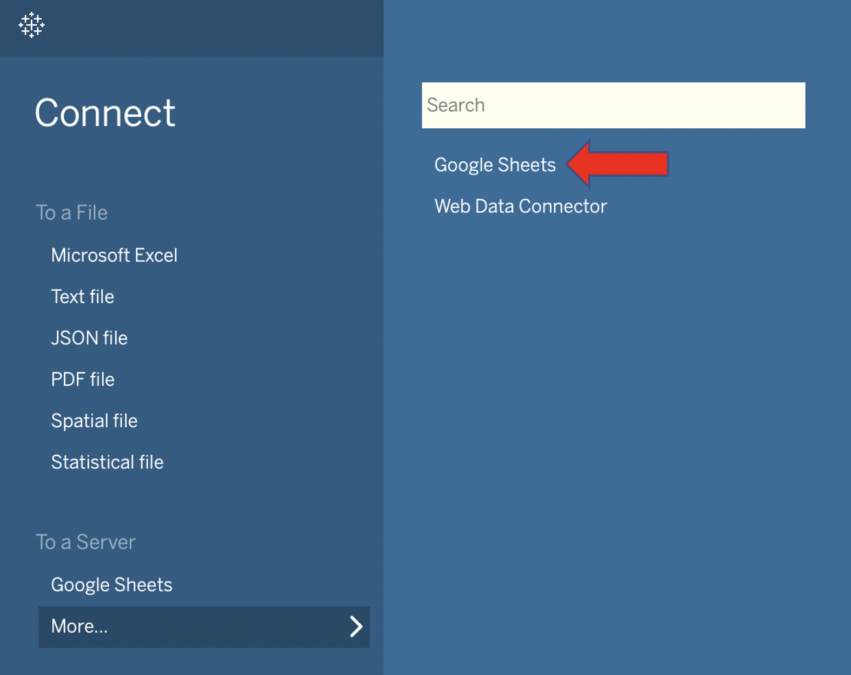
At the end we upload the data to our private Google Drive. This is necessary since we need to upload the data directly into Tableau Public. A refresh of the data in Tableau Public is only possible if the imported Excel file is located on a Google Drive.
KNIME provides an easy solution with dedicated nodes here as well. You don’t have to create any keys or APIs. Just use your Google login and go.
My KNIME workflow, COVID-19 Projections with KNIME+Jupyter+Tableau, is available on the KNIME Hub here.
3. Calculate the projections for the next 30 days
KNIME is my first tool when it comes for ETL and has quite a lot of nodes to perform machine learning models and also a good Deep Learning integration. (In case you are new to KNIME: the nodes are theses colored squared icons.
They allow you to perform different operations like load data, sort, filter etc.)
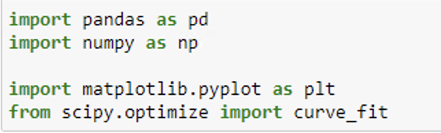
In my case, today, I just want to perform the fit of a logistic model and Jupyter seems to have the best solutions available with the scipy and curve_fit package.
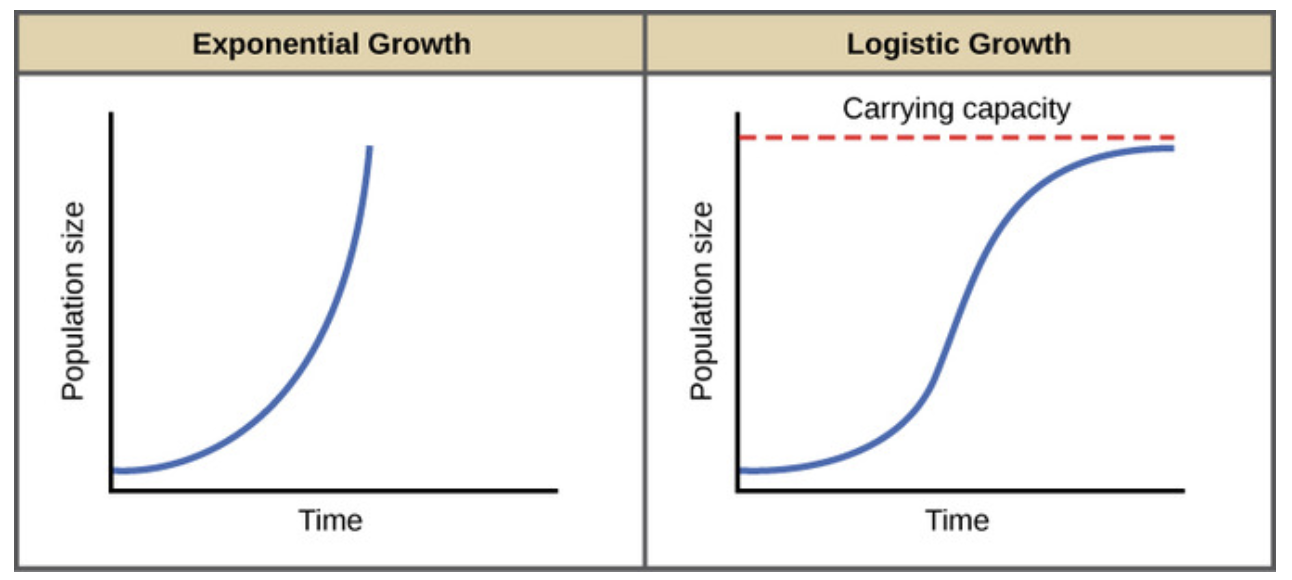
The logistic population growth model is the best choice to fit a virus spread. In 1838 the Belgian mathematician Pierre François Verhulst introduced the logistic equation, which is a kind of generalization of the equation for exponential growth but with a maximum value for the population (K).
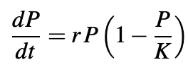
When the population P(t) is small compared to the parameter K, then P/K is nearly zero and we get the approximate equation:
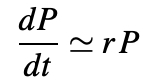
whose solution is:
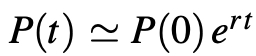
i.e. exponential growth. The growth rate decreases as P(t) gets closer to K.
Finally, after rearrangement, we get the equation:
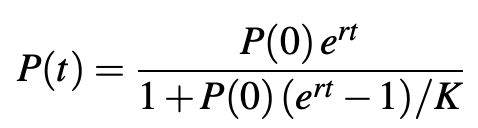
The total population increases progressively from P(0) at time t = 0 to the limit K.
Let’s implement this formula in Jupyter with Python.
To fit the logistic model to the data we want to use the scipy package with curve_fit.
To fit the model we take into account just the cases of the last 45 days. (Update from Dec 5, 2020: 90 days seem to give more accurate results.) The reason behind this filter is that we only want to fit the last wave of the spread. Otherwise our assumption of the logistic model will not be correct and the model will not fit. With the parameters found we are able to project the cases for the next 30 days.
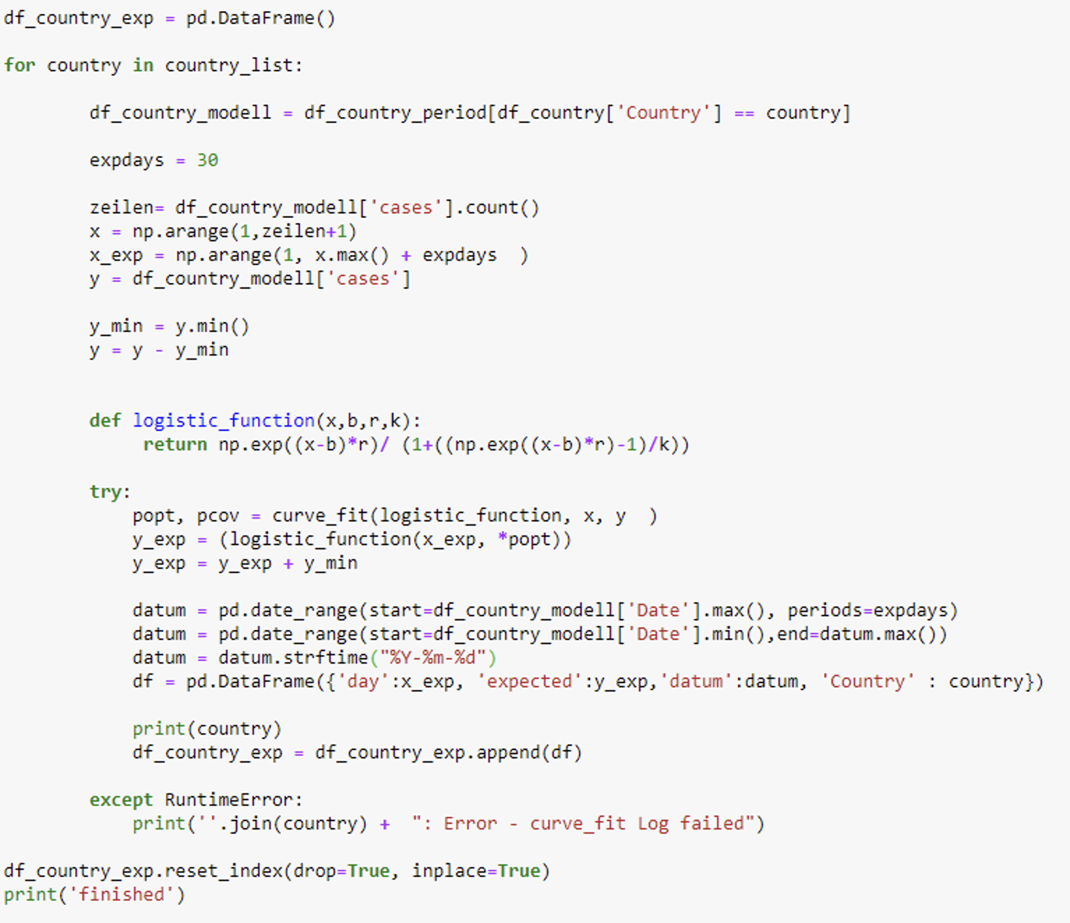
The code is available on my github-site here.
So first, we loaded the COVID-19 data from the John Hopkins Institute in KNIME.
Next we restructured, joined the data, and wrote it out as csv-file.
To load the csv-file in Jupyter and fit the data we now need a Python Source node.
In this node we call the desired Jupyter notebook.
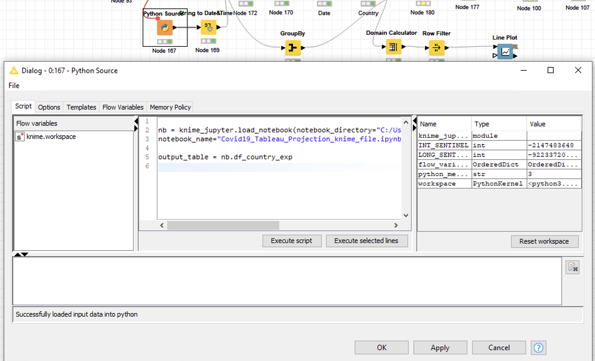
The following video demonstrates how to implement this step.
Note that you don’t need to have a Jupyter Server running in order to run the Jupyter notebook in KNIME.
4. Visualize the cases and projections
The last step is to visualize the cases and the projections for every country and continent. To accomplish this we upload the data as an Excel file from KNIME to our Google Drive.
In Tableau Public we load the data as a Google Sheet file.
Finally in Tableau Public we create our desired dashboard. And the best part of it: we are able to refresh the data any time without needing a Tableau-Server.
The Tableau Dashboard is published with the actual data nearly every day on my Tableau-Public site here.
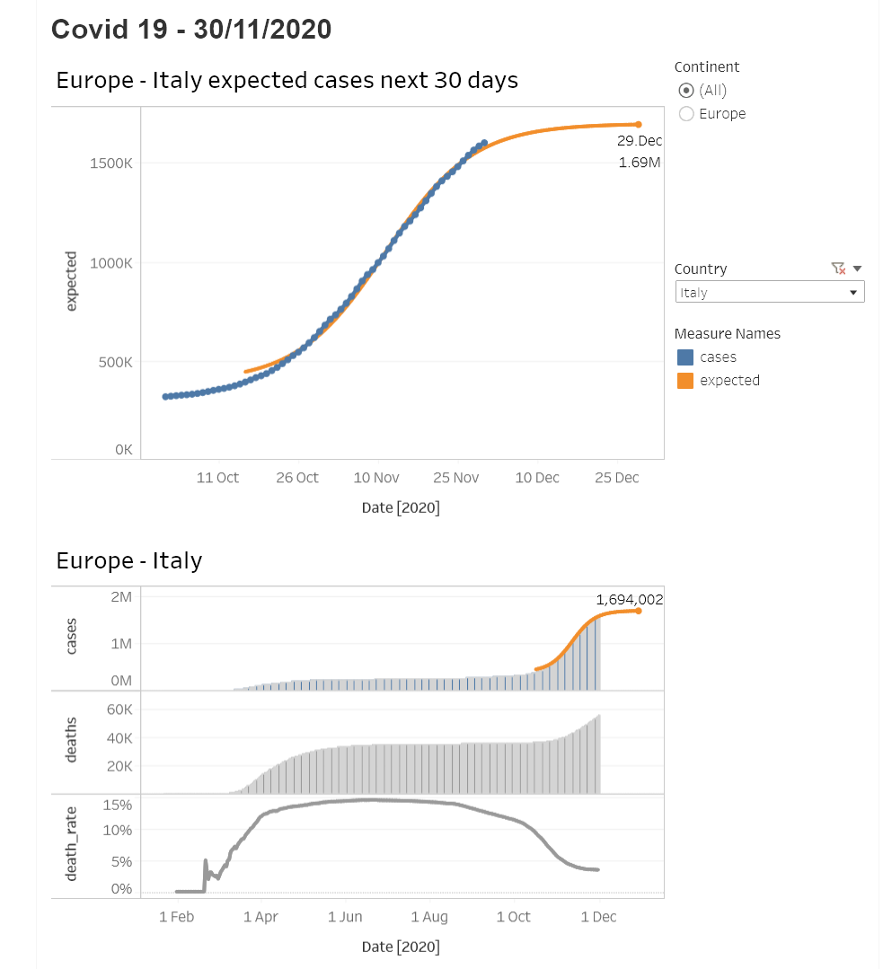
To answer the initial question
At the start of the article, the question was:
“How long will this second wave last and will the situation have calmed by Christmas?”
-> The answer for Europe is - if our model is right - yes!
Do bear in mind that in both the US and in Iran a third wave is already in progress. So we are still a long way from this situation being over.
Meanwhile: Stay safe, stay healthy, stay well!
Thanks for reading!
Material for this project
- KNIME workflow: KNIME Hub
- Jupyter code: github
- Tableau dashboard: Tableau-Public