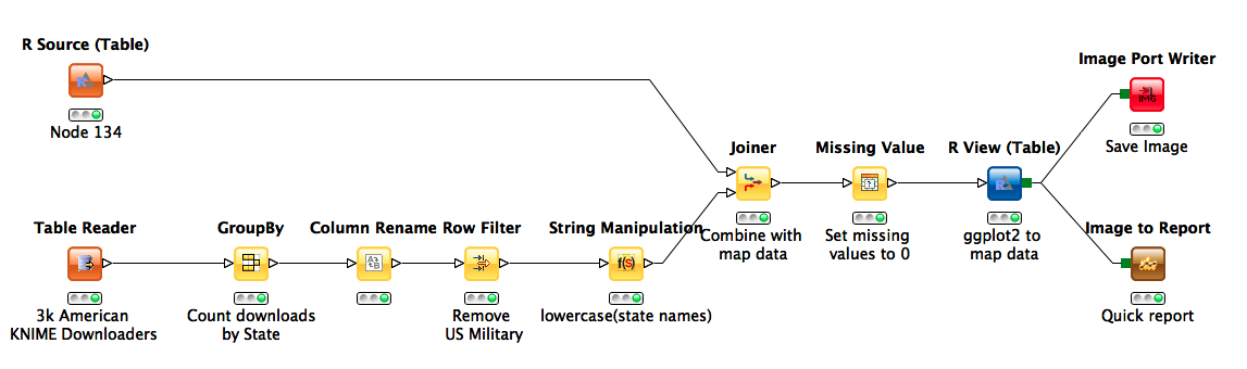
Familiar from common applications such as demographic analysis, visualizing election results, and mapping the outbreaks of disease, choropleths are an important visualization technique for aggregating spatial data. Today I want to discuss some techniques for generating such graphics in KNIME. So, to get us started, lets look at a very simple workflow to build such a visualisation.
US State Map from R
Conceptually, choropleths are relatively simple: you just need a map and some data to color it with. For the purpose of this post, I'm pulling our map from ggplot2, a very nice graphics package available in the R programming language. The data is formatted as a series of lat/long points that are grouped together by region and ordered so as to define a polygon when plotted consecutively. Using the new R source node, we can write some very simple R code to bring this data into KNIME:
This snippet assigns the data frame containing shape data for US states to a data frame named "knime.out". From here, the R Source node grabs the data and automatically converts it into a KNIME table.
Geographic Distribution of KNIME Downloads via IP Addresses
Once we have the shape data, all we need to do is find a way to join it with whatever information we want to overlay on our maps. In this example, we are looking at KNIME download statistics. The downloads data set was derived from 3000 randomly selected registered downloads from users who self identified as being located in the USA.
We used the IP addresses associated with each registered download to estimate locations using a public web service (freegeoip.net). The geolocation of IP addresses may make for another interesting blog post some day, but for now the actual addresses have been excluded from the analysis. After aggregating by state and counting downloads (GroupBy) we use a left outer join to add download statistics to our map data. Finally, we replace missing values in the download counts with “0” in order to indicate no observed downloads. Now we can send the data back into an R View node and generate our plots, using ggplot2.
Our initial code looks like:
This gives the following:
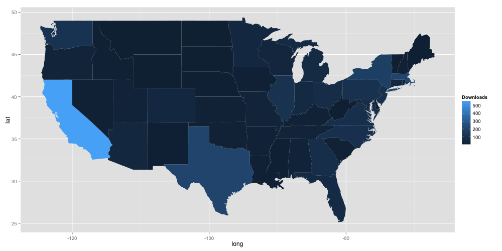
Information Scaling
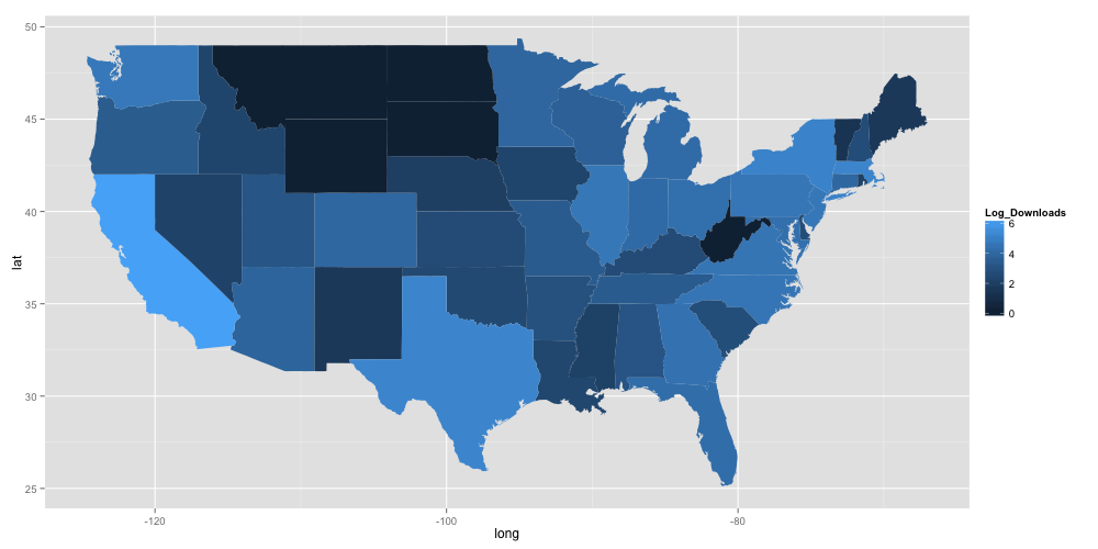
So KNIME is big in California! Unfortunately, little else about the data is easily discernible. The problem is one of scaling: there are so many downloads in California, that no other trends are really visible. In this case, we can likely increase visibility of the information in the plot by taking the log of the number of downloads in the R code:
Which gives:
Further refinements to the plot to optimise its appearance are possible, but might fit better in a future post dedicated to plotting in ggplot2.
The KNIME workflow used to create the images is available for download in the attachment section of the blog.
Hopefully this was useful, if you have any follow-up questions, please write us an email.