
An intrusion in network data, a sudden pathological status in medicine, a fraudulent payment in sales or credit card businesses, or the breakdown of a piece of machinery are all examples of unknown and often undesirable events, deviations from the “normal” behavior.
Unsupervised Learning Models to Predict the Unknown
Predicting the unknown in different kinds of IoT data is well established and high value, in terms of money, life expectancy, and/or time, is usually associated with early discovery. Yet it comes with challenges! In most cases, the available data are non-labeled, so we don’t know if past signals were anomalous or normal. Therefore, we can only apply unsupervised models that predict unknown disruptive events based on the normal functioning only.
In the field of mechanical maintenance this is called “anomaly detection”. There is a lot of data that lends itself to unsupervised anomaly detection use cases: turbines, rotors, chemical reactions, medical signals, spectroscopy, and so on. In our case here, we deal with rotor data.
The goal of this “Anomaly Detection for Predictive Maintenance” series is to be able to predict a breakdown episode without any previous examples.
In this first part, we define two different types of anomalies, preprocess the data, and perform explorative analysis via a number of visualizations. In the following two parts, we’ll move on to forecasting using a control chart and an auto-regressive model.
Dynamic and Static Anomalies
Anomalies as unexpected events can be divided into two categories, dynamic aka collective anomalies, and static aka point anomalies.
A dynamic anomaly occurs as a collection of data points over time. For example, when a rotor is slowly deteriorating, one of the measurements might change gradually until eventually the rotor breaks.
A static anomaly is an unrecognized pattern that is different from its neighbors. Like a random unknown heartbeat in the middle of a series of standard normal heartbeats during an ECG session. In case of a rotor, however, static anomalies might occur every now and then, and it might be a bit primitive to howl the sirens months before the actual breakdown.
Today’s Approach: Exploratory Data Analysis
In exploratory data analysis we analyze the visual patterns of the signals during normal functioning, with old and new mechanical pieces. The Anomaly Detection. Time Alignment & Visualization workflow in Figure 1 shows the procedure.
IoT Time Series Data
The data consist of 28 Fast Fourier Transformed (FFT) pre-processed data files from 28 sensors that monitor 8 different parts of a mechanical rotor. Table 1 lists the mechanical pieces monitored by the sensors.
Each file contains a matrix of spectral amplitudes for a timestamp and a frequency value (Table 2). The time range of the data is from January 1, 2007 to April 20, 2009. Each sensor reports the data independently, so the times of the dates and even dates are different in all files.
The data show only one breakdown episode on July 21, 2008. The breakdown is visible only from some sensors and particularly in some frequency bands. After the breakdown, the rotor was replaced, with much cleaner signals being recorded afterwards. The source of the data is anonymous. You can download the AnomalyDetectionFullDataSet.zip file via this link.
Data Preprocessing - Standardize Time and Frequency
Before we start with the visual exploration, we need to standardize the time and frequency references in all files. At the end we want to have only one table where the data for the different sensors are reported for the same frequency values and timestamps.
Figure 2 shows the standardization steps implemented inside the “Read all data” metanode. For each file at a time, we bin the frequency values into 100Hz-wide frequency bands and aggregate the timestamps into dates. We then calculate the average amplitude values across each date and frequency bin. Next, we make sure that the time series is equally spaced with the Timestamp Alignment component. Equally spaced means that the time series contains all timestamps within its time range. If the data are weekly, then it should contain a timestamp for every week within the time range. If the data are daily, then a timestamp for every day, and so on.
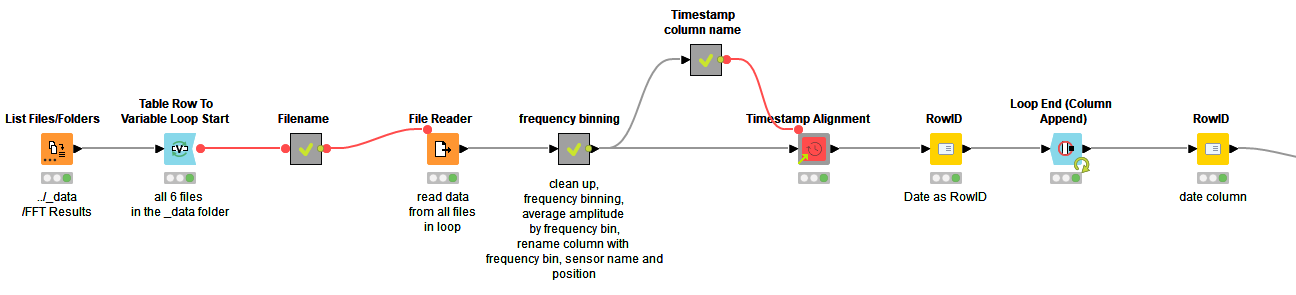
In the final table, the amplitude values refer to a date and a frequency band of a single sensor. The frequency bands of the 28 sensors make altogether 313 single columns! (Table 3.)
The final table can be observed from two different perspectives (Figure 3):
- A time series of spectral amplitudes on a single frequency band
- A vector of spectral amplitudes across frequency bands evolving over time
Here we take the first perspective and apply time series analysis techniques. The second perspective would be a task for pattern recognition. The philosophy, however, remains the same: to predict normal functioning, to trigger an alarm when predictions are failing!
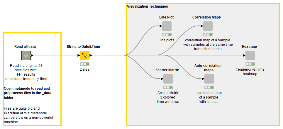
Visual Exploration of the Sensor Data
Now that we have data preprocessed, we can start to look for visual patterns as hints of the imminent rotor breakdown. We demonstrate this for one sensor (A1-SV3) using the following visualizations:
- Line Plot
- Scatter Matrix
- Heatmap
- Correlation Matrix
- Auto-correlation Matrix
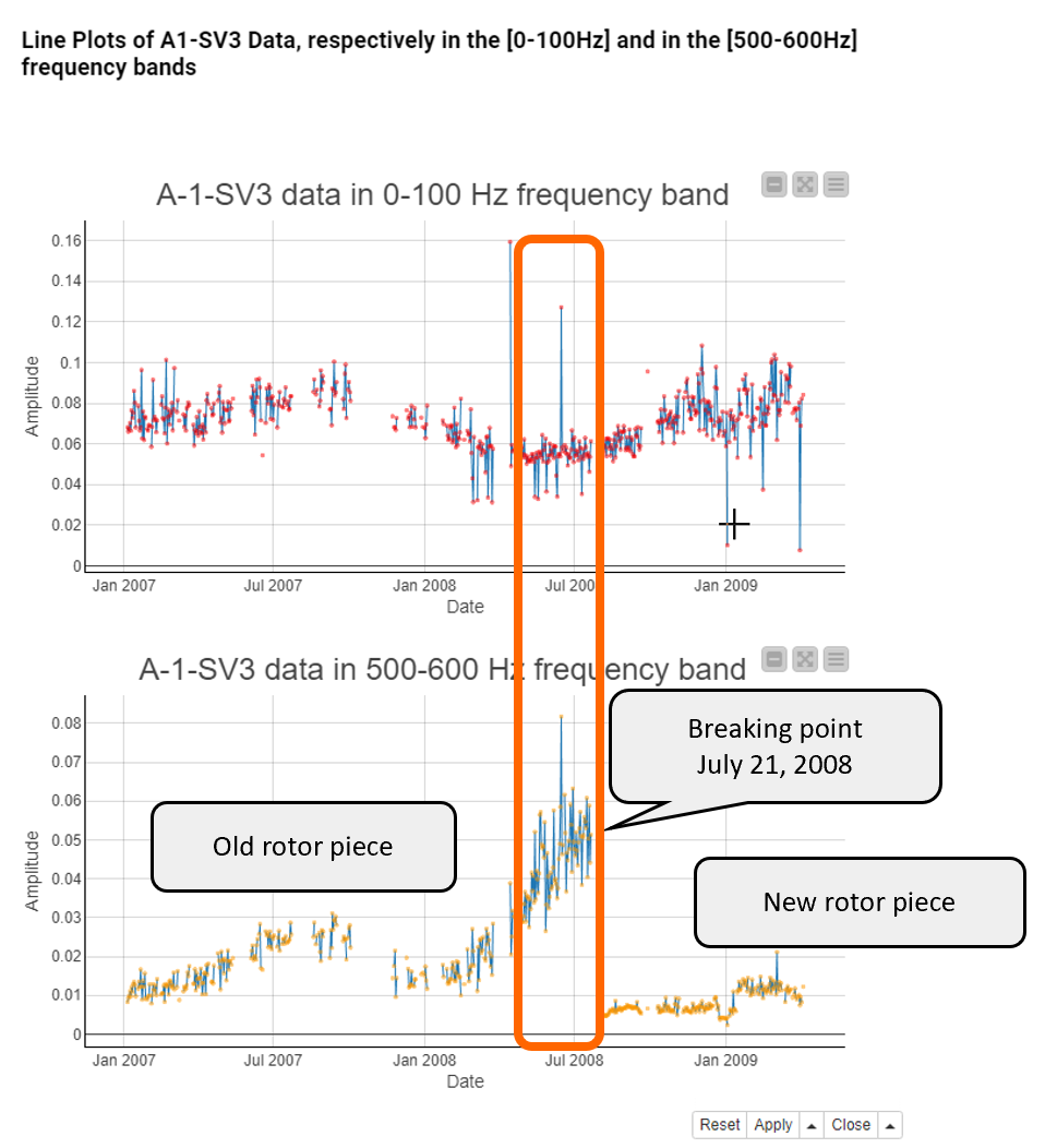
Line Plot Reveals Trends and Seasonality
A line plot shows the amplitude values against time. By looking at the line plot, we can identify a trend, seasonality, long term cycles, outliers, turning points, and gaps.
Figure 4 shows two line plots with the amplitude values on the [0,100Hz] (top) and [500,600Hz] (bottom) frequency bands. The amplitude values on the [0,100Hz] frequency band are not different before and after the rotor breakdown on July 21, 2008, so this frequency band doesn’t seem to be affected by the deteriorating rotor at all. On the [500,600Hz] frequency band the amplitude values get higher and higher until July 21, 2008, and then there’s a gap. So this frequency band seems to be more informative of a rotor malfunctioning. In the right end of the line plot you can see that the amplitude values on this frequency band returned to a low level after the rotor malfunctioning was rectified.
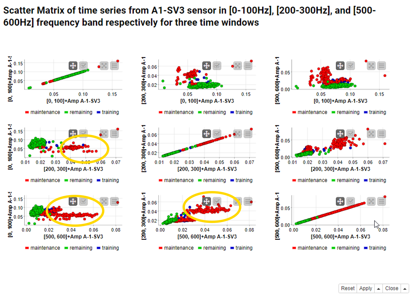
Scatter Matrix Visualizes Correlations over Time Windows
A Scatter Matrix node generates a view of nxn scatter plots for n selected data columns. In a 3x3 scatter matrix, 9 permutations of pairs of 3 columns are displayed in 9 scatter plots. The scatter plots on the matrix diagonal represent a column vs. itself, and therefore show a diagonal line. Both sides of the matrix diagonal compare the same columns with their x- and y-coordinates switched.
Figure 5 shows a 3x3 scatter matrix of the [0-100Hz], [200-300Hz], and [500-600Hz] frequency bands. The colors in the scatter matrix represent three time windows based on the time difference to the rotor breakdown on July 21, 2008:
- Training window from January to August 2007 (blue)
- Maintenance window from September 2007 to July 21, 2008 (breakdown date) (red)
- Test window after July 22, 2008 (green)
The red dots seem to wander off from the blue and green dots, which means that the deteriorating rotor widens the range of possible values but asynchronously on the different frequency bands.
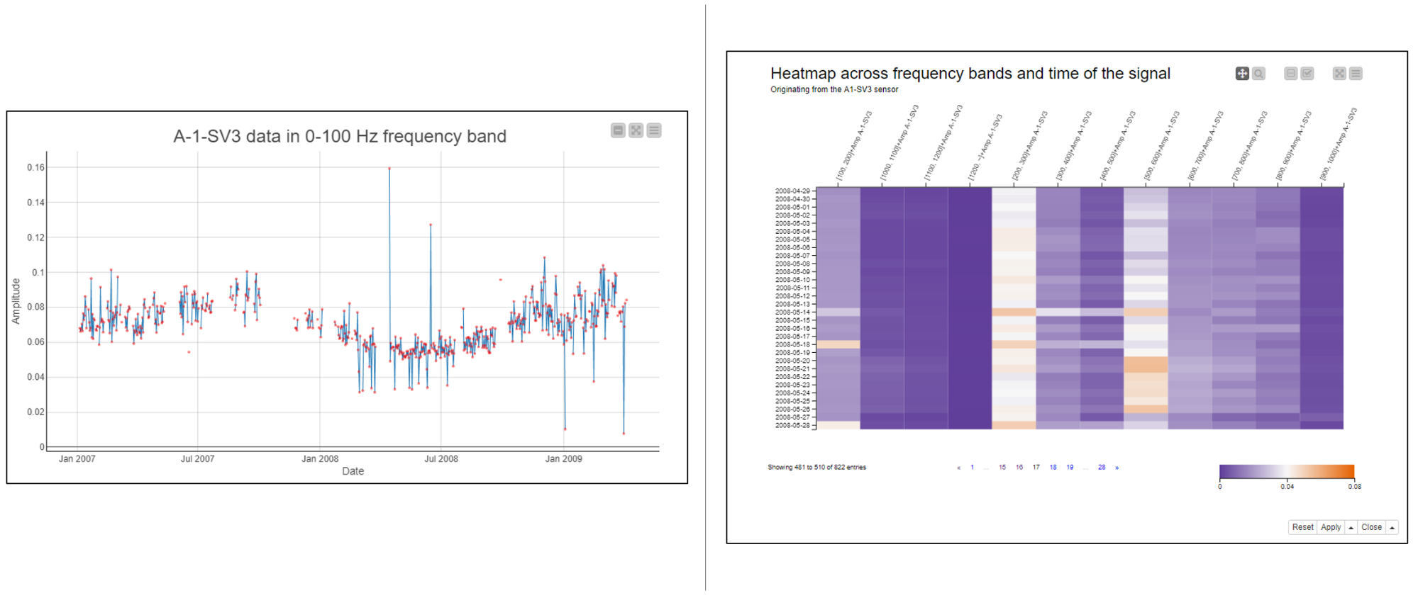
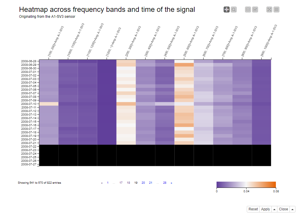
Heatmap Depicts Frequency Bands and Time of Signal
A heatmap visualizes a number of columns in a matrix with a row label on the y-axis and the column names on the x-axis. The column numerical values are represented graphically with the cell colors.
Figure 6 shows the heatmap of all frequency bands with dates on the y-axis, the frequency bands on the x-axis, and amplitude values as cell values. The blue-white-red color progression indicates increasing amplitude values. Missing values are shown as black cells.
The rotor breakdown on July 21, 2008 is shown by the black area at the bottom of the heatmap. Before the breakdown, especially the [200-300Hz] and [500-600Hz] frequency bands reach their maximum amplitude values, as shown by the white and red cell values in the two columns in the middle.
Correlation Matrix and Auto-Correlation Matrix - Highlight Signs of Malfunctioning
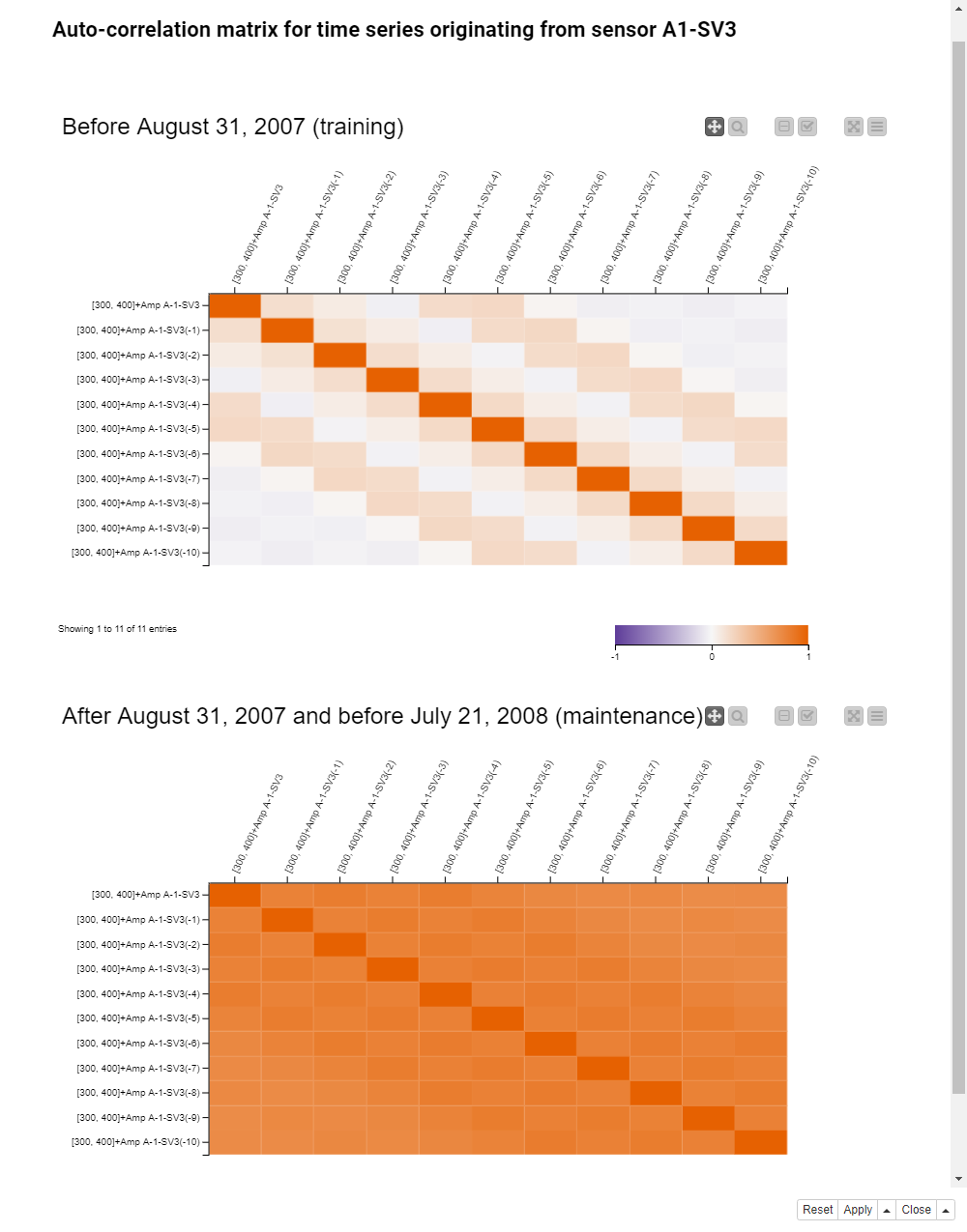
A correlation is calculated between all values in a column and all values in another column. If the two data columns are numeric, it is calculated as Pearson’s Product Moment Coefficient, and if they are nominal, as the Pearson’s Chi Square Test. No correlation is defined for numerical vs. nominal data columns. Normalization is required before correlation calculation for data columns to fall into the same numerical range. An auto-correlation is calculated between a column at time point t to and a column with its lagged values at time point t-k, where k=1,2,3,....
Figure 7 shows the correlation matrix of the frequency bands as a heatmap during the training window (top) and the maintenance window (bottom). On the x- and y-axes are the column names, i.e the frequency bands. The cells indicate the correlation between the columns defined by the x- and y-coordinates. The colors indicate the strength and type of the correlation: Blue for strong negative correlation, white for weak correlation, and red for strong positive correlation.
During the training window, the correlation matrix is quite colorful. This means that when the rotor is functioning normally, some frequency bands are positively correlated, some negatively correlated, and others not at all.
During the maintenance window, the correlation matrix is almost fully red, and a strong positive correlation between all frequency bands seems to be a sign of the rotor malfunctioning.
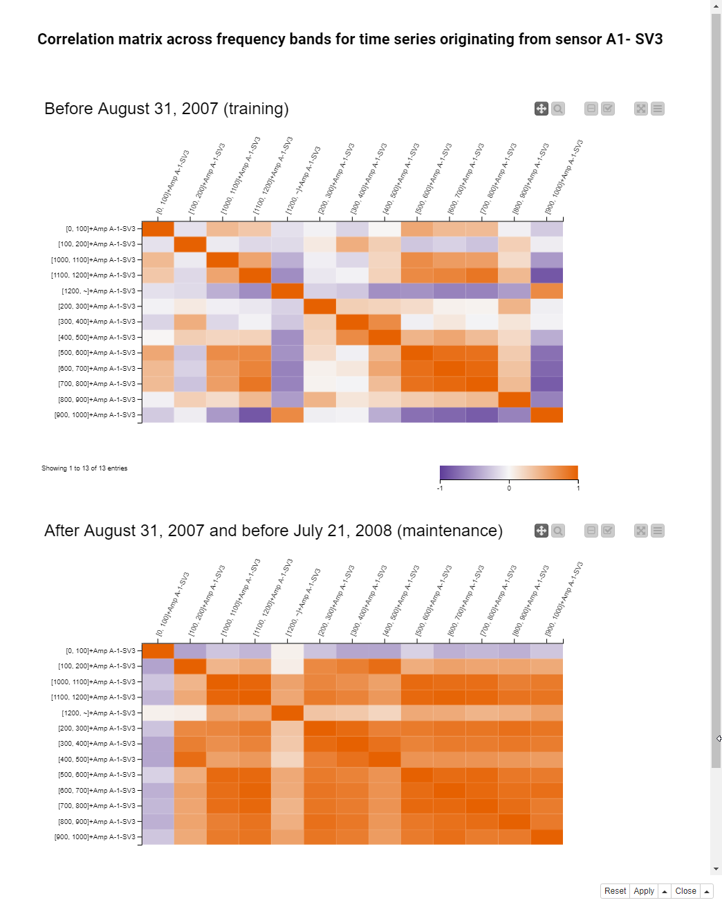
Figure 8 shows the auto-correlation matrix of the [300-400Hz] frequency band. In the auto-correlation matrix the columns on the x- and y-axis indicate past values at different lags from 1 to 10. Before building the auto-correlation matrix, we used the Lag Column node. This node puts the past values of the input column into the same data row as the current value, each lag into a separate column.
During the training window (the top heatmap), the right end of the first row is almost white, so there’s hardly any auto-correlation after the 5th lag. During the maintenance window (the bottom heatmap), the correlation matrix is fully red, which means that the auto-correlation becomes much stronger on this frequency band as the rotor starts malfunctioning.
Reuse Techniques for other IoT Applications
In this article, we preprocessed and visually explored FFT processed time series data from a network of sensors monitoring a working rotor, which features a breakdown episode on July 21, 2008. We averaged the spectral amplitudes by date and frequency bin, and performed time alignment of the data coming from different sensors.
We explored the time series evolution using five different visualization techniques: line plot, scatter matrix, heatmap, correlation matrix, and auto-correlation matrix. Our visualizations clearly show the advent of the breakdown episode in some of the frequency bands.
Time alignment, frequency binning, and visual exploration are not uncommon procedures in the analysis of sensor data. The steps described here could easily be reused for other IoT applications.
After cleaning the data and visually exploring normal functioning, the next step would be to predict the breakdown episode from no other examples than the available data history of normal functioning, with simple and complex analytics techniques.