
This is part of a series of articles to show you solutions to common finance tasks related to financial planning, accounting, tax calculations, and auditing, all implemented with the low-code KNIME Analytics Platform.
Regular monthly and year-to-date (YTD) aggregations provide essential information to monitor a company’s financial performance across time periods, evaluate the impact of specific events, and communicate the financial status.
In fast-paced business environments quick monthly or YTD aggregations provide up-to-date information and enable informed decisions in a timely manner. But it involves pulling together the data from multiple sources, which is complex and time-consuming. Delayed calculations can result in outdated or inaccurate information.
Easy integration of multi-source data is pivotal to quick data aggregation.
In this post, with accompanying video, we show how you can quickly calculate monthly and year-to-date aggregations in KNIME.
The open source and free KNIME Analytics Platform lets you build visual workflows to automate and augment spreadsheet work. That means you can more efficiently combine and process data from numerous sources in a way that’s repeatable. You spend less time on data aggregation.
Before we start, let's recap on what monthly revenue and year-to-date aggregation mean.
What is monthly revenue aggregation?
Monthly revenue aggregation is the sum of all revenues for each month. It will show total sales revenue for each month and enable analysts to identify sales patterns, peak periods, and trends.
What is year-to-date (YTD) revenue aggregation?
Year-to-date (YTD) revenue aggregation is the sum of the monthly revenues from the beginning of the year till the current month. For example, if it is April, the YTD revenue is given by the sum of the monthly revenues of January, February, March, and April.
The Task: Calculate & visualize monthly and YTD aggregates
Today’s task is to display monthly and YTD revenue aggregations over months for two different years.
Let’s imagine we’re dealing with a restaurant business. Each evening, all dinners served and paid for are recorded. Up to 2022, these transactions were recorded in an Excel file. Starting from 2023, the recording system moved to a Google spreadsheet, so we’ll need to access our data from both sources.
Let’s break down the calculation into the processes we have to go through:
- Import restaurant transactions from Excel files and Google spreadsheets for 2022 and 2023
- Aggregate amounts by month to create monthly revenues
- Calculate year-to-date revenues for each month
- Visualize monthly revenues over months for year 2022 and 2023 in a bar chart, side by side
- Visualize YTD revenues over months for both years 2022 and 2023 in a line plot to provide an easy way to compare over years, if required.
The Workflow: Monthly and YTD revenues
The workflow “Monthly and YTD Revenues” is available and free to download from the KNIME Community Hub.
Let’s see how our above processes translate into our workflow, below. You can see that we have three main steps:
- Retrieve the restaurant transactions for 2022 and 2023
- Aggregate the monthly and year-to-date (YTD) revenues
- Visualize the calculations in a bar chart and a line plot
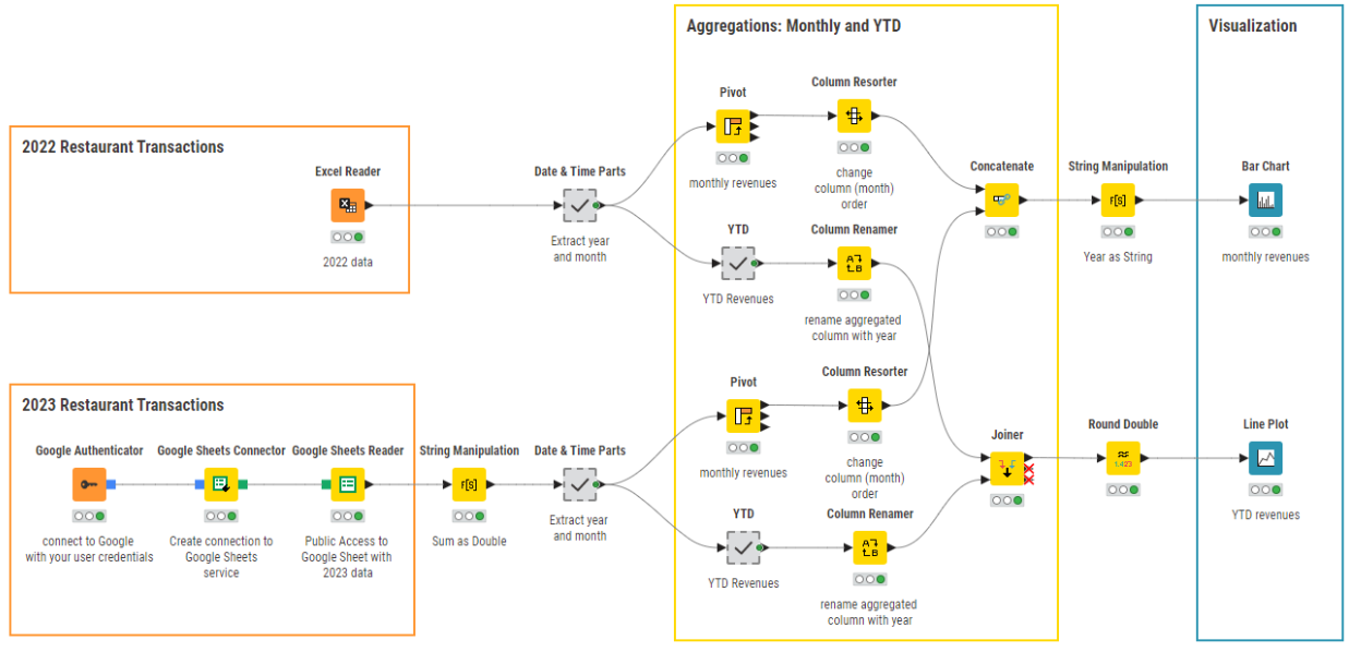
Step 1: Retrieve restaurant transactions
- Import transactions for 2022 from an Excel spreadsheet with the Excel Reader node.
- Import transactions for 2023 from a Google spreadsheet with the sequence of nodes Google Authenticator – Google Sheets Connector – Google Sheets Reader
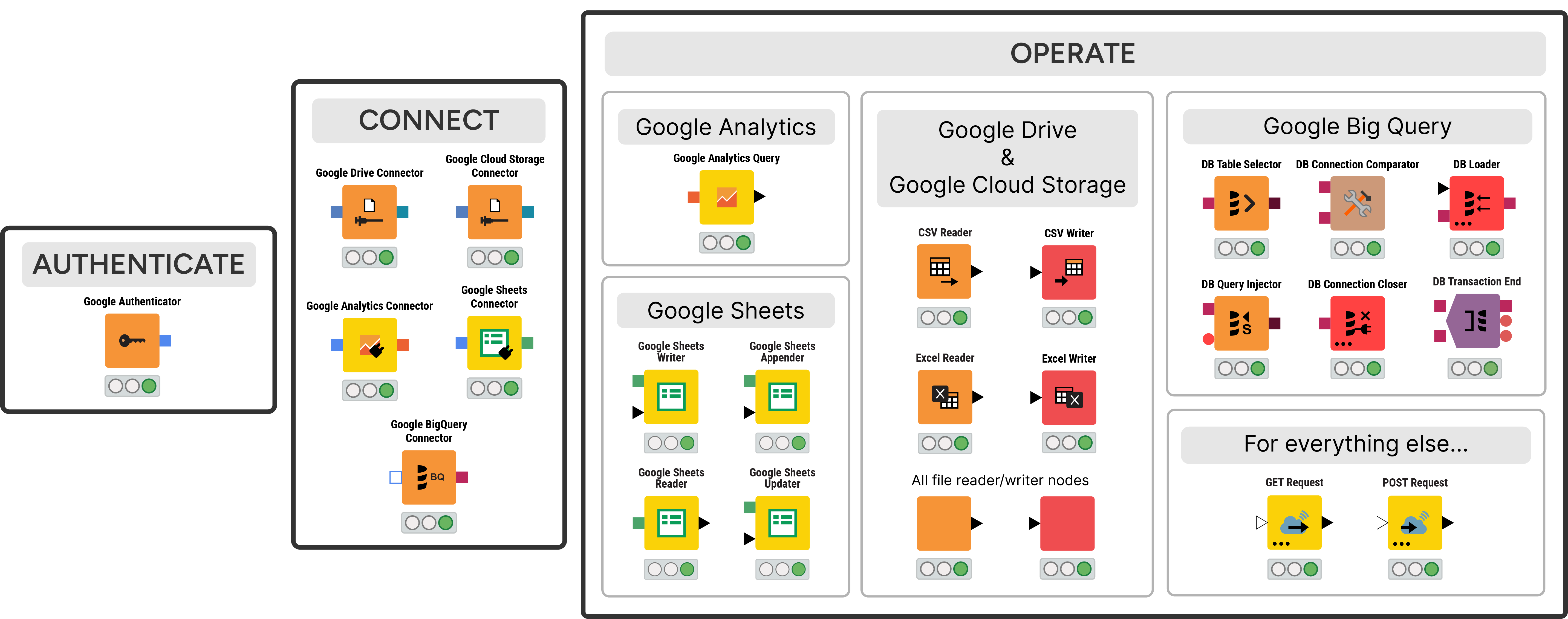
Note that when you read in data from a Google spreadsheet you’ll need a few additional steps, mainly for authentication. KNIME Analytics Platform offers a large number of nodes to integrate with Google resources. It all starts with the Google Authenticator node. This node gets you authenticated on Google and then allows you to access the Google services you have signed up for.
After authentication, KNIME Analytics Platform offers several connector nodes: to Google Analytics, to Google Sheets, to Google Big Query, to Google Drive, and to Google Cloud Storage. After connection, other nodes allow you to implement specific operations compatible with the selected service (see below).
Step 2: Aggregate monthly revenues and year-to-date revenues
Let's aggregate the monthly revenues first:
- Aggregate transactions by month to obtain monthly revenues. We could have used a GroupBy node here. However, in order to display the monthly values for different years side by side, the Bar Chart node requires a column for each month and a row for each year. This is the aggregated output format produced by the Pivot node.
- Concatenate monthly revenues for year 2022 and for year 2023.
And now we'll aggregate the year-to-end revenues for each month:
- Aggregate transactions as YTD. The output format required by the Line Plot node consists of one column for the months and one column for the corresponding YTD value. So, here, we first aggregate the transactions for each month with a GroupBy node and then we calculate the Year To Date value with the Moving Aggregator node, all inside the YTD metanode.
- Join YTD revenues for year 2022 and year 2023.
Step 3: Visualize monthly and YTD revenues
- Visualize monthly revenues over months for 2022 and 2023 with a Bar Chart node, grouping by year
- Visualize YTD revenues over months for 2022 and 2023 with a Line Plot node. The months on are the x-axis and the YTD values are on the y-axis
Tips to improve performance
- We could have performed all aggregations within the Bar Chart node. In this case, all totals are recalculated every time we open the bar chart, which can lead to very long loading time, especially for large amounts of data. This waiting time might be sub-optimal for the end user, even more so if the bar chart is part of a data app. We opted for pre-calculated values before the visualization in the bar chart.
- In the YTD values, after all the aggregations, there might be a long sequence of decimal digits. They do not carry much meaning beyond the second or third digit. So, we rounded the numbers up to the first two decimal digits.
- In the bar chart, group values can only be of type string. So, we transform the year values from number to string to perform the grouping in the Bar Chart node.
The Results: Identify trends in visualizations
Here's the bar chart showing the monthly revenues for the year 2022 and the year 2023 side by side.
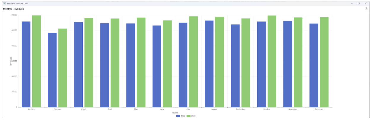
You can see that the pattern is similar for both years, February being a lower revenue month, and that 2023 has produced a bit more revenues than 2022.
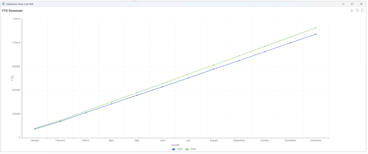
This last observation is confirmed in the view of the YTD revenues in the line plot. In the YTD plot (below) the line for 2023 is clearly above the line for 2022.
KNIME for Finance
Data experts spend 70-80% of their time wrangling and preparing data before they can start performing aggregations and analyzing it. This becomes even more complex when the data is unstructured, large in size, and has to be pulled from various sources and types.
KNIME, as a low-code data analytics platform, offers a solution. With versatile functionality offered by its nodes like the Joiner, Concatenate, Groupby, VLOOKUP, and more, finance departments can merge diverse datasets with precision and quickly perform complex data aggregation and joining tasks.
You can download KNIME and try it out for yourself. It’s open source and free to use.