
Do you remember the Iron Chef battles? It was a televised series of cook-offs in which famous chefs rolled up their sleeves to compete in making the perfect dish. Based on a set theme, this involved using all their experience, creativity and imagination to transform sometimes questionable ingredients into the ultimate meal. Hey, isn’t that just like data transformation? Or data blending, or data manipulation, or ETL, or whatever new name is trending now? In this new blog series requested by popular vote, we will ask two data chefs to use all their knowledge and creativity to compete in extracting a given data set's most useful “flavors” via reductions, aggregations, measures, KPIs, and coordinate transformations. Delicious!
Ingredient Theme: Customer Transactions – Money vs. Loyalty.
Data Chefs: Haruto and Momoka

Ingredient Theme: Customer Transactions
Today’s dataset is a classic customer transactions dataset. It is a small subset of a bigger dataset that contains all of the contracts concluded with 9 customers between 2008 and now.
The business we are analyzing is a subscription-based business. The term “contracts” refers to 1-year subscriptions for 4 different company products.
Customers are identified by a unique customer key (“Cust_ID”), products by a unique product key (“product”), and transactions by a unique transaction key (“Contract ID”). Each row in the dataset represents a 1-year subscription contract, with the buying customer, the bought product, the number of product items, the amount paid, the payment means (card or not card), the subscription start and end date, and the customer’s country of residence.
Subscription start and end date usually enclose one year, which is a standard duration for a subscription. However, a customer can hold multiple subscriptions for different products at the same time, with license coverages overlapping in time.
What could we extract from these data? Finding out more about customer habits would be useful. What kind of information can we collect from the contracts that would describe the customer? Let’s see what today’s data chefs are able to prepare!
Topic. Customer Intelligence.
Challenge. From raw transactions calculate customer’s total payment amount and loyalty index.
Methods. Aggregations and Time Intervals.
Data Manipulation Nodes. GroupBy, Pivoting, Time Difference nodes.
The Competition
There are many different ways to describe a customer based on their series of transactions. Some describe the customer buying power, others loyalty over time, and others buying behavior. All approaches are valid. They simply produce different ”flavors” of information, which can be combined together to get the full picture of the customer.
Data Chef Haruto: Customer Buying Power
Haruto has decided that for this experiment, money is the most informative feature. The “amount” column contains information about money for each contract data row; “amount” is the price paid by the customer for that subscription.
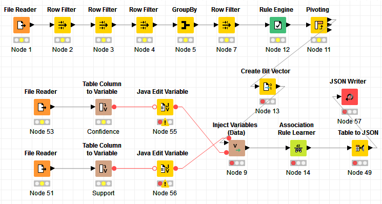
In figure 1, the workflow upper branch - embedded in the “Money” labelled square – is from Data Chef Haruto.
Buying Power as the total amount paid throughout the years
The simplest and most direct way to describe a customer buying power is to just sum up all values in the “amount” column. This will give us the full monetary worth of the customer from the first contract to today’s date. The isolated GroupBy node at the top of the branch performs exactly this aggregation, by grouping on “Cust_ID” and calculating the sum(“amount”) for each detected group.
Buying Power as the total amount paid year after year
A second maybe more sophisticated approach is to calculate the total amount of money generated each year. For this, Haruto used a Date Field Extractor node to extract the year from the contract date. Then he calculated the sum of values in the “amount” column for both each year and each “Cust_ID”. Here, this aggregation is performed by a Pivoting node and not by a GroupBy node. The Pivoting node indeed produces the same integration (sum on groups) as the GroupBy node, but:
- Groups are identified by values in at least 2 columns
- The output data table is organized in a matrix-like style, showing values from one or more groups as column headers – in our case the years – and values from the other group(s) as RowID – in our case the Cust_IDs.
The advantage of this second approach is provided by the additional details in customer spending behavior across time.
The two resulting features can be joined on Cust_ID with a Joiner node. The final data table describes each customer through the total paid amount for all of the years and the amount paid year after year.
The Pivoting node will necessarily generate empty data cells for those years where a customer did not buy any of the company’s products. In this case, though, missing values correspond to 0 money value. We can fix that, using a Missing Value node to replace all empty data cells with a 0.
Figure 1. Final Workflow 02_Customer_Trx_Money_vs_Loyalty. Upper part named "Money" describes customers’ buying power. Lower part labelled "Loyalty" associates a loyalty index to each customer. This workflow is available on the KNIME EXAMPLES Server under 02_ETL_Data_Manipulation/06_Date_and_Time_Manipulation/02_Customers_Trx_Money_vs_Loyalty02_ETL_Data_Manipulation/06_Date_and_Time_Manipulation/02_Customers_Trx_Money_vs_Loyalty*
(click on the image to see it in full size)
Data Chef Momoka: Customer Loyalty
Momoka has a more idealistic view of the world and decided to describe the customers in terms of their loyalty rather than money. Again, there are many ways to spell “loyalty”.
The workflow lower branch - embedded in the “Loyalty” labelled square – is provided by Data Chef Momoka.
Loyalty as the number of days between the first and the last subscription start date
The easiest way to describe loyalty is probably by the number of days the customer has held a subscription. This number of days can be calculated in a number of different ways.
- As number of days between the start of first and start of last subscription. This could be achieved by calculating the range in column “start_date” with a GroupBy node. However, this does not cover the full extension of the last subscription.
- As number of days between start of first subscription and end of last subscription. This could be obtained by sorting the data by Cust_ID and “start_date” and by extracting the first “start_date” and the last “end_date” for each customer; then by calculating the number of days in between with a Time Difference node. However, we must remember that this approach is not bullet-proof either, as it does not take into account possible periods of time without any subscription.
- As total number of days covered by subscriptions on a given product. In this case, a GroupBy node grouping on “Cust_ID” and “product” and calculating the number of days between first “start_date” and last “end_date”, as described above, could have worked. However, this would not take into account subscriptions to different products overlapping in time.
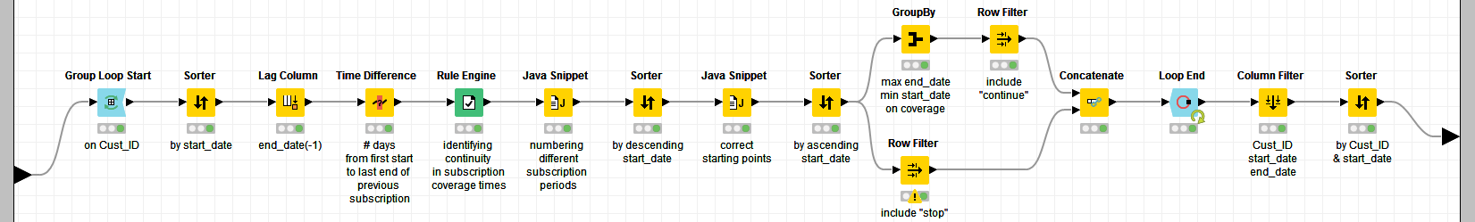
- As total number of days covered by subscriptions on one product or the other.This leads to a more detailed time alignment procedure, contained in the Time Alignment metanode and shown in figure 2. The Time Alignment metanode is located in the second branch of the Loyalty part of the workflow. A Time Difference node follows the Time Alignement metanode and calculates the number of days between the “start_date” and the “end_date” of each one of these coverage periods for each customer. The final GroupBy node sums up all those number of days for each customer. This feature is named “effective #days”.
Figure 2. Content of Time Alignment metanode. For each “Cust_ID”, the number of days between current subscription/row “start_date” and “end_date” for the previous subscription/row is calculated. If this number of days is > 0, the current subscription/row is just an extension of the previous one. If < 0 then is a new subscription start.
(click on the image to see it in full size)
The absolute number of days is already an interesting loyalty feature. Momoka though decided to express it as the ratio in [0,1] of the effective number of days over the total number of days between the very first subscription and the current date (Feb 1 2017). To do that, the GroupBy and the Time Difference node – in the upper branch of the “Loyalty” part of the workflow in figure 1 - calculate the total number of days between the “start_date” of the earliest subscription in the data set and the current date (Feb 1 2017). The loyalty index is then obtained as:
The final workflow can be admired in figure 1 and can be found on the EXAMPLES server in: 02_ETL_Data_Manipulation/06_Date_and_Time_Manipulation/02_Customers_Trx_Money_vs_Loyalty02_ETL_Data_Manipulation/06_Date_and_Time_Manipulation/02_Customers_Trx_Money_vs_Loyalty*
The Jury
The final part of the workflow joins the money describing features together with the loyalty index to feed a Javascript Scatter Plot node.
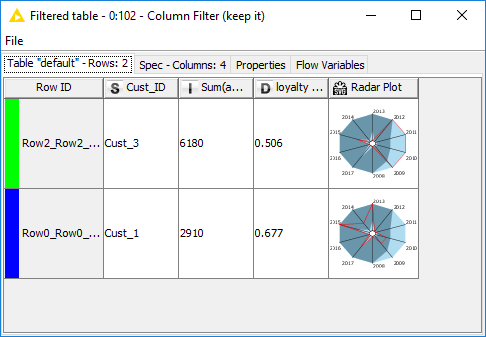
The Interactive scatter plot visualizes all 9 customers on a money vs. loyalty space. On the y-axis we find the loyalty index and on the x-axis the total amount of money derived from the customer contracts across all years. Here we manually selected the top 2 customers, which happen to have Cust_ID “Cust_1” and “Cust_3”. The following 2 nodes automatically extract the data rows for these two selected customers. The Radar Plot Appender node at the end produces a radar plot for the amount of money paid each year by each customer.
In the resulting table (Fig. 3) we see that “Cust_3” has bought subscriptions for more than 6000$ over the years, mainly between 2009 and 2012. Therefore the corresponding loyalty index is only 0.5. On the other hand, “Cust_1” has bought subscriptions for less money, yet he has spread them more evenly across the years, producing a higher loyalty index of 0.67 (Fig. 3).
Figure 3. Resulting Data Table, where selected customers are described in terms of loyalty, buying power, and purchase distribution across all years.
We have reached the end of this competition. Congratulations to both our data chefs for wrangling such interesting features from the raw data ingredients! Oishii!
Coming next …
If you enjoyed this, please share it generously and let us know your ideas for future data preparations. Want to find out how to prepare the ingredients for a delicious data dish by aggregating financial transactions, filtering out uninformative features or extracting the essence of the customer journey? Follow us here and send us your own ideas for the “Data Chef Battles” at datachef@knime.com.
We’re looking forward to the next data chef battle. The theme ingredient there will be a time series dataset describing energy consumption.
* The link will open the workflow directly in KNIME Analytics Platform (requirements: Windows; KNIME Analytics Platform must be installed with the Installer version 3.2.0 or higher)