As first published by Snowflake
Data Manipulation, Analysis and Visualization for Everyone
Whether you are a novice, Excel user or advanced data scientist, the low-code, no-code KNIME Analytics Platform opens up access to data analysis at all levels of sophistication.
The ease of use of visual programming means that “non-coders, occasional coders, or expert coders'' can all leverage KNIME to build anything from basic ETL processes to advanced AI solutions. Start with accessing and managing data directly in Snowflake and if desired sprinkle in some SQL; combine data from Snowflake with data from any of the multiple sources supported by KNIME: and apply advanced techniques such as statistics, machine learning, model monitoring, and artificial intelligence to make sense of it; and finally, send analysis results, including learned models, back to Snowflake (or to any other KNIME-integrated system). Further, you can automate repetitive tasks and operationalize results via a data app or an API with just a few mouse clicks.
In this article we cover the journey from data loading and manipulation, to learning and deploying a customer churn prediction model and exposing the results as an interactive, browser based data app.
Note: If you’re new to KNIME, go to the Download KNIME webpage to install. KNIME Analytics Platform is open source and free to download and use. Refer to our KNIME Snowflake Extension Guide at any time for detailed setup and connection instructions. To get started with Snowflake either use an existing account or apply for a 30-day free trial at: https://signup.snowflake.com/.
Build a Churn Predictor Data App
Let’s get started by using Snowflake and KNIME to analyze and make churn predictions based on customer data.
Customer data usually include demographics (e.g. age, gender), revenues (e.g. sales volume), perceptions (e.g. brand liking), and behaviors (e.g. purchase frequency). While “demographics” and “revenues” are easy to define, the definitions of behavioral and perception variables are not always as straightforward since both depend on the business case.
For our solution, we’re going to use a popular simulated telecom customer dataset, available via kaggle.
We split the dataset into a CSV file (which contains operational data, such as the number of calls, minutes spent on the phone, and relative charges) and an Excel file (which lists the contract characteristics and churn flags, such as whether a contract was terminated). Each customer can be identified by an area code and phone number. The dataset contains data for 3,333 customers, who are described through 21 features.
1. Prepare and Explore the Customer Data
The data preparation and exploration workflows in Fig. 1 and 2 start by reading the data. Files with data can be dragged and dropped into the KNIME workflow. In this case we’re using XLS and CSV files. Note that you can read from very different sources as KNIME supports almost any kind of file (e.g., Parquet, JSON). In addition to files, KNIME supports a wide variety of external tools and data sources (e.g. Salesforce, SAP, Google Analytics, etc.).
Note that data loading can also be automated and scheduled to always have the latest data in Snowflake by using the schedule execution feature of the KNIME Server. (Read more about KNIME Server and data science in the cloud.)
Once the data is loaded into KNIME the user has two choices, which are illustrated in figures 1 and 2:
In Figure 1 the extracted data is first loaded into Snowflake tables and then transformed within Snowflake. This procedure is also often called data Extraction, Loading, and Transformation (ELT).
In Figure 2 the extracted data is first transformed in KNIME before loading it into a Snowflake table. This procedure is also called Extraction, Transformation, and Loading (ETL).
In both workflows the two data files are joined, using their telephone numbers and area codes as keys. Once joined, the “Churn” column is converted from a numerical column (0 and 1) to a nominal column (0=No Churn and 1=Churn) to meet the requirement for the upcoming classification algorithm.
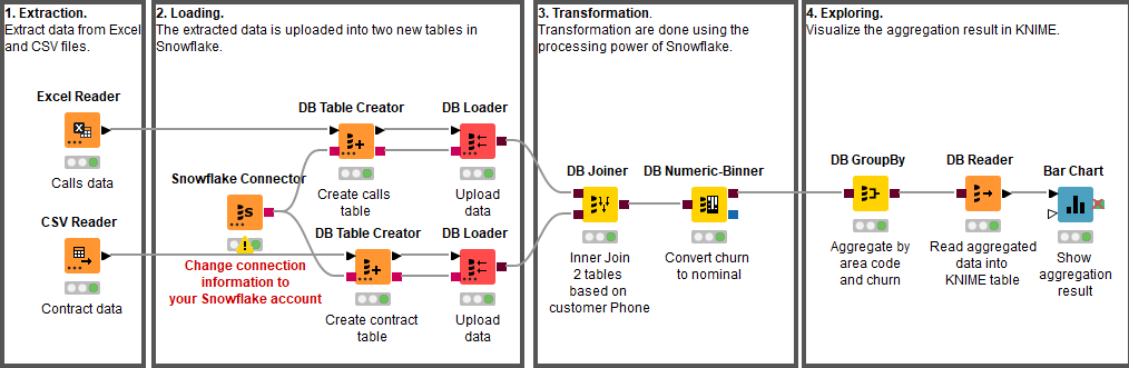
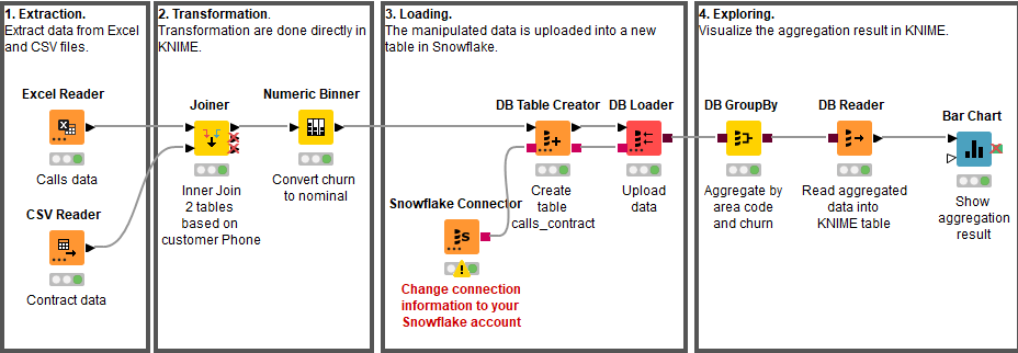
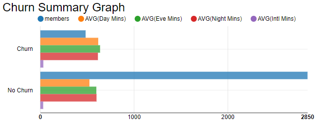
To get a first impression of the customers we use the processing power of Snowflake to aggregate the prepared data by Churn and Area code and compute the average for the different call minute columns (Day Mins, Eve Mins, Night Mins, and Intl Mins). The result is read into KNIME for visualization (see Figure 3).
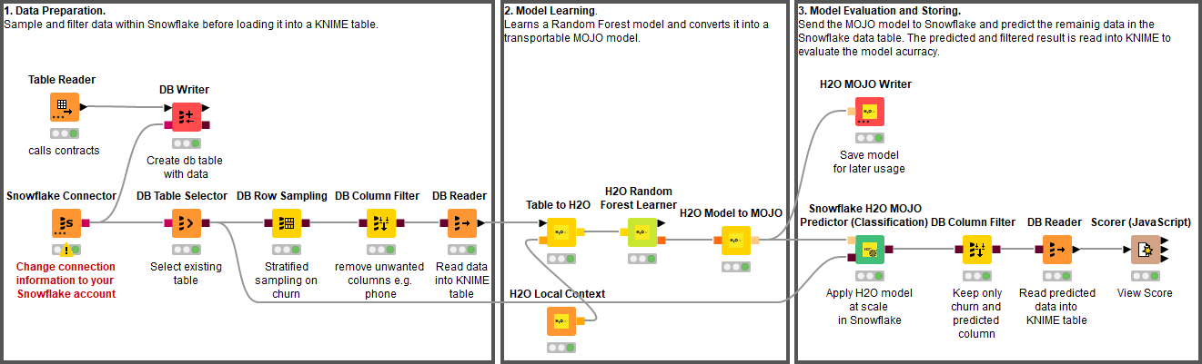
2. Train and Test the Customer Churn Predictor
For a classification algorithm, we chose the random forest, implemented by the H2O Random Forest Learner node. Any other machine-learning-supervised algorithm would have also worked, from a simple decision tree to a neural network. Random forest was chosen for illustrative purposes, as it offers the best compromise between complexity and performance.
The data that is used to learn the model within KNIME is a stratified sample on the Churn column of all customer data from the Snowflake table. The sampling and filtering of all unwanted columns is performed within Snowflake to utilize its processing power and to minimize the amount of data sent to KNIME.
The sampled data is then processed by the H2O Machine Learning integration to learn the customer churn prediction model. The learned model is written to disc for later usage. In addition, the model is converted into a Snowflake User Defined Function (UDF) and applied to all the historical customer data for testing.
The predictions produced by the UDF and the known Churn column are read back into KNIME and consumed by an evaluator node, like a Scorer node or an ROC node, to estimate the quality of the trained model.
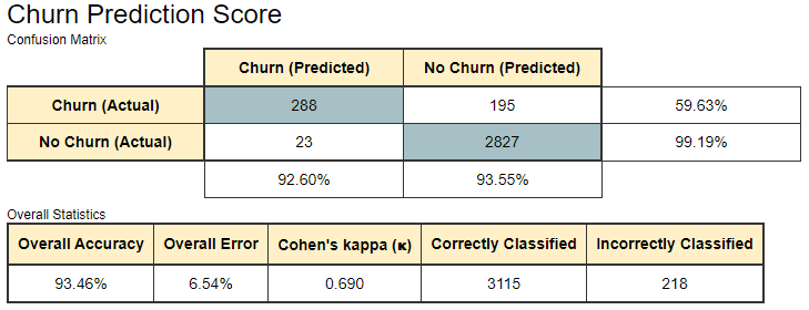
The Scorer node matches the random forest predictions with the original churn values from the dataset and assesses model quality using evaluation metrics such as accuracy, precision, recall, F-measure, and Cohen’s Kappa. For this example, we obtained a model with 93.46% overall accuracy (see Figure 4). Better predictions might be achieved by fine-tuning the settings in the H2O Random Forest Learner node.
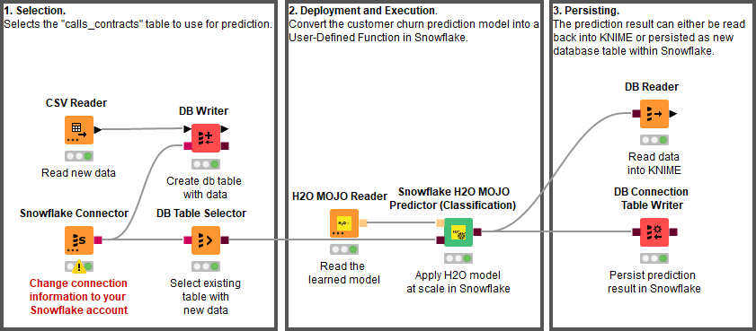
3. Deploy the Customer Churn Predictor
Once the model has been trained and evaluated and the domain expert is satisfied with its predictive accuracy, we now need to apply real data. This is the task of the deployment workflow (Figure 6).
The best-trained model is read (H2O MOJO Reader node), and data from new customers are acquired (DB Table Selector node). The model is deployed into Snowflake (using the Snowflake H2O MOJO Predictor (Classification) node) and applied to the data defined by the incoming database query.
The prediction results can either be read back into KNIME for further analysis or persisted as a new database table in Snowflake with the DB Connection Table Writer node.
The learned model can be also deployed on the KNIME Server using the H2O MOJO Predictor (Classification) node. This would enable us to benefit from the Server’s automation and deployment features e.g. as a REST API to call the model from other services or on KNIME Edge to bring the model prediction to the factory floor.
4. Provide Prediction Results as an Interactive Data App
The last workflow in this blog post concludes by providing the prediction results as an interactive Data App.
The workflow in Figure 7 selects the database table to work with and performs some of the data preparation before handing over the database connection to the Churn Visualization component.
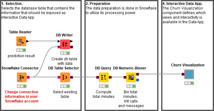
Components that contain graphical nodes inherit their interactive views and combine them into a composite view (right-click → “Interactive View”). Figure 8 shows the interactive view of the component as seen from within KNIME. Once the workflow is deployed to KNIME Server the interactive data app can be accessed from any standard web browser.
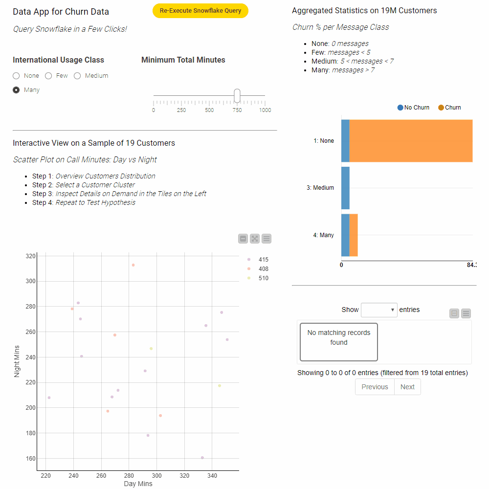
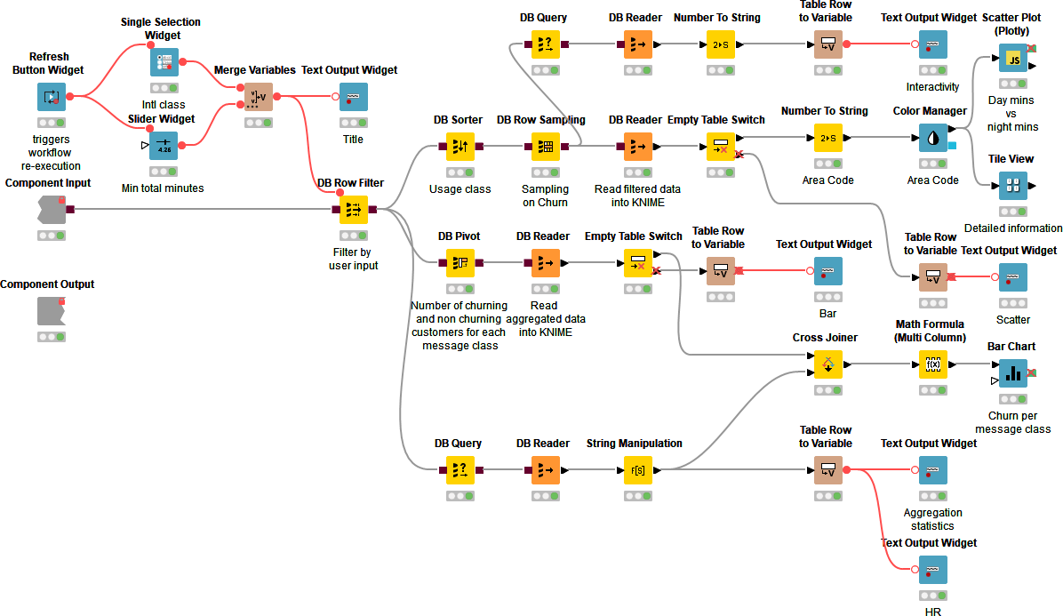
Creating interactive data apps does not require any programming skills. Figure 9 shows the inside of the Churn Visualization component. The component contains blue nodes that represent items like the value slider or the different visualizations – the scatter plot and bar chart for example. In addition it contains yellow and orange nodes that take input from the data appt to filter the data and compute the statistics within Snowflake prior to reading it into KNIME for visualization.
Clicking the Re-Execute Snowflake Query button triggers re-execution of the component to get the results for the updated filter values. For more information on how to design interactive data apps using the refresh button see this article.
Wrapping Up with Resources!
We have presented here one of the many possible solutions for churn prediction based on past customer data using KNIME and Snowflake.
We first showed how data from different sources can be loaded and transformed in KNIME and Snowflake. The loaded data was then prepared and sampled prior to learning a random forest model that can predict customer churn. The model is deployed into Snowflake to perform churn prediction of new customers directly within Snowflake. Finally, the last workflows expose the prediction results as interactive data app, which can be consumed by anyone with a standard web browser.